
 简体中文
简体中文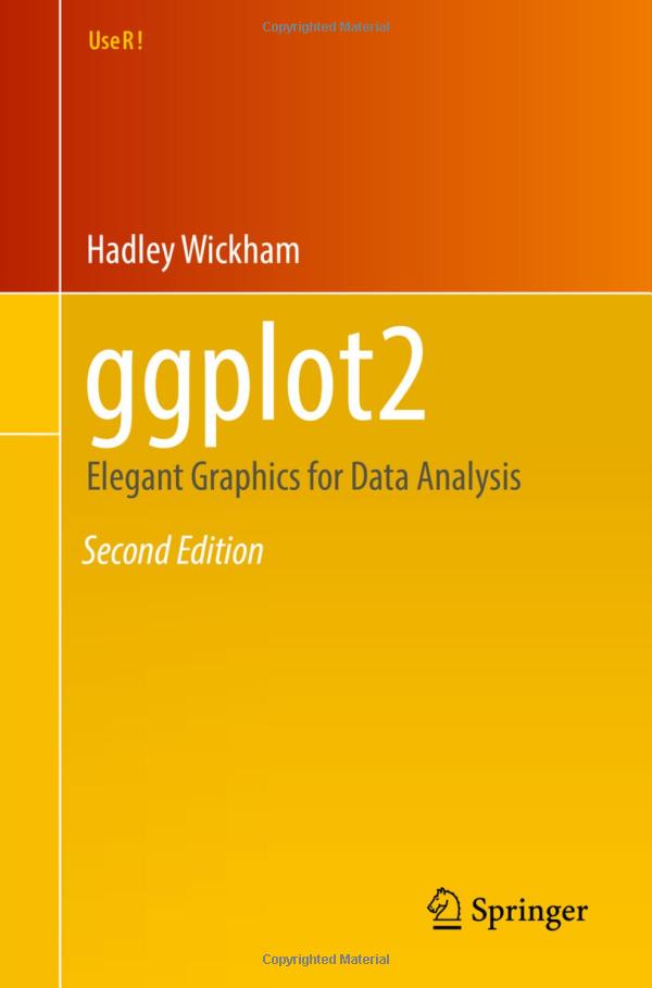
ggplot2-book.org
At a glance
- Category
- Data & Analytics
- Language
- English
- Paid-content signal
- No paid content foundObserved
- Registered
- 2019
- Hosting
- FastlyInferred
- HTTPS certificate trusted
- PassedObserved
- Last updated
Related questions
More questions →What is ggplot2-book.org?
ggplot2-book.org is the online, work-in-progress version of the 3rd edition of ggplot2: Elegant Graphics for Data Analysis, published by Springer. It is written by Hadley Wickham, Danielle Navarro, and Thomas Lin Pedersen. The site is best understood as a theory-and-details companion to ggplot2 rather than a recipe collection: its stated focus is explaining the Grammar of Graphics that ggplot2 uses and describing the full details of the system.
Who it is for
The book's own framing sets clear expectations:
- Good fit if you already use ggplot2 and want to understand why it works the way it does, so you can tailor plots to your own needs.
- Poor fit if you want a cookbook. The site explicitly says it is not a cookbook and "won't necessarily help you create any specific graphic that you need."
In other words, it teaches the underlying model, not a catalogue of finished charts.
What it covers
The site presents a table of contents as its main navigation, and the welcome text describes two layers of content:
| Layer | Description |
|---|---|
| Basics | Some details on the fundamentals of ggplot2 |
| Primary focus | The Grammar of Graphics that ggplot2 uses, plus full details of the system |
The authors also note that the Preface explains what changed from the 2nd edition, which is useful if you are migrating from the earlier book.
How to use it
- Open the table of contents and pick the chapter matching the layer you need — basics first, grammar and details after.
- Read the Preface if you have prior experience with the 2nd edition, to see what has changed.
- Treat each chapter as conceptual grounding, then apply it to your own plot rather than searching for a ready-made example.
Expected result: a working understanding of the grammar behind ggplot2, which you then use to build or adapt graphics for your own data.
Common sticking points
- Expecting recipes. Because the book is not a cookbook, searching it for "how do I make chart X" may not give a direct answer. Use it to understand the components, then assemble the plot yourself.
- Assuming it is finished. The site describes itself as a work-in-progress 3rd edition, so treat it as an evolving draft rather than a frozen reference.
- Confusing it with the package documentation. This is a book about the grammar and details, not the API reference for individual functions.
Quick answer
If you want to confirm what the site is: it is the free online draft of the 3rd edition of the ggplot2 book by Wickham, Navarro, and Pedersen, published by Springer, focused on the Grammar of Graphics and the full details of ggplot2 — not a cookbook for specific graphics.
What Does It Mean to Work With Data? A Beginner's Guide to Data Visualization and Statistics
Working with data means turning raw records into understanding. In practice, that breaks into five repeatable activities: collecting data, cleaning it, exploring it, visualizing it, and interpreting what the results do and do not support. Data visualization and statistics are two halves of the same job — statistics tells you whether a pattern is real and how uncertain it is, while visualization shows you the shape of the pattern and communicates it to others. You do not need a math or programming background to start; you need a question, a small dataset, and a tool simple enough that you spend your time thinking about the data rather than the software.
The Five Core Activities of Data Work
Most data projects, from a personal budget spreadsheet to a public health dashboard, move through the same stages.
1. Collecting
You gather observations: survey responses, website logs, sensor readings, government tables, or a hand-built spreadsheet. The key decision here is what counts as one row (a person? a day? a transaction?) and what each column measures. Getting this "unit of observation" wrong causes problems that no amount of later analysis can fix.
2. Cleaning
Real data arrives messy. Cleaning means handling missing values, fixing inconsistent categories ("USA," "U.S.," "United States"), correcting types (a date stored as text), and removing duplicates. Beginners are often surprised that this is the most time-consuming step. It usually is.
3. Exploring
Before making charts for others, you look for yourself. What is the range of each variable? Are there outliers? How are two variables related? Simple summaries — counts, averages, minimums, maximums — and quick scatterplots answer most early questions.
4. Visualizing
You encode values as position, length, color, or size so that patterns become visible. A good chart answers one question clearly. A bad chart hides the answer behind decoration or distorts it through a misleading axis.
5. Interpreting
You decide what the pattern means, how confident you should be, and what alternative explanations exist. This is where statistics and careful reasoning matter most.
Visualization vs. Statistics: How They Complement Each Other
These are not competing approaches. They answer different questions about the same data.
| Question | Better served by |
|---|---|
| Is there a relationship between two variables? | Visualization (scatterplot) |
| How strong is it, and could it be chance? | Statistics (correlation, regression, confidence intervals) |
| Are there clusters, gaps, or outliers? | Visualization |
| How much uncertainty is in this estimate? | Statistics |
| How do I explain this to a non-expert? | Visualization |
| Did this change actually happen, or is it noise? | Statistics |
A practical rule: visualize to discover, model to confirm, visualize again to communicate. A scatterplot might reveal that one region behaves completely differently from the rest; a statistical model then tests whether that difference holds up; a final chart shows the finding to an audience.
Beginner-Friendly Tools and Formats
You can start with tools you already have.
- Spreadsheets (Excel, Google Sheets): Best for datasets under a few thousand rows. Built-in chart types cover bar, line, scatter, and pie. Learn to sort, filter, and use pivot tables.
- Chart types to master first: bar charts for comparisons, line charts for change over time, scatterplots for relationships, and histograms for distributions. These four cover most everyday questions.
- Simple code options: If you want to go further, R (with ggplot2) and Python (with matplotlib or plotly) are common. Both have large free learning communities. Start with one, not both.
- Design principles that matter more than the tool: label your axes, start bar charts at zero, avoid 3D effects, use color to encode meaning rather than decoration, and put the most important comparison in the most prominent position.
A Realistic Starting Path
If you have no data background, this sequence works:
- Pick a question you actually care about. "How has my city's rent changed over ten years?" beats a generic tutorial dataset.
- Find a small, public dataset. Government open-data portals and statistical agencies publish free tables.
- Load it into a spreadsheet and clean it. Fix types, remove duplicates, note missing values.
- Make three charts. One bar, one line, one scatter. Write one sentence under each describing what you see.
- Ask what could be misleading. Is the sample representative? Is the time range fair? Could a third factor explain the pattern?
- Repeat with a slightly harder question. Add a second variable, or try a simple statistical summary like a correlation or a group comparison.
Expect the first project to take longer than you think, mostly in cleaning. That is normal, not a sign you are doing it wrong.
What Data Can and Cannot Answer
Data can describe what happened, compare groups, estimate relationships, and quantify uncertainty. It cannot, on its own, establish causation without a proper study design, tell you what you should value, or compensate for a biased sample. A dataset collected from volunteers will not represent the general population no matter how sophisticated the analysis. Treat every result as "what this data suggests under these conditions," not as a final verdict.
Where to Go Next
FlowingData (flowingdata.com) focuses on data visualization and statistics for people who want practical, well-designed charts rather than academic theory. It is a reasonable place to browse examples, see how real datasets are turned into clear graphics, and pick up habits you can apply in your own work. Pair it with one spreadsheet tutorial and one public dataset, and you have everything you need for a first project.
The short version: working with data is a craft of asking clear questions, cleaning messy inputs, looking before you model, and communicating honestly. Start small, start visual, and let the statistics grow as your questions get harder.
Who Are the Authors of *ggplot2: Elegant Graphics for Data Analysis (3e)*?
The 3rd edition of ggplot2: Elegant Graphics for Data Analysis is written by Hadley Wickham, Danielle Navarro, and Thomas Lin Pedersen, and published by Springer. The online version at ggplot2-book.org is a work-in-progress edition of that book.
Author Roles and Why They Matter
All three authors are closely tied to the ggplot2 ecosystem, which is the main reason the book carries authority as a reference on the Grammar of Graphics rather than a generic plotting guide.
| Author | Relevance to ggplot2 |
|---|---|
| Hadley Wickham | Original creator of ggplot2 and long-time lead of the tidyverse |
| Danielle Navarro | Contributor to the R and data-visualization community, co-author of this edition |
| Thomas Lin Pedersen | ggplot2 maintainer and author of many extension packages |
If your goal is to understand the theory behind ggplot2 — not just copy a recipe — the authorship is a signal that the material comes from the people who design and maintain the package.
Publication and Edition Status
- Publisher: Springer
- Edition: 3rd edition, described on the site as a work-in-progress
- Format: An online version is available at ggplot2-book.org
- Changes from the 2nd edition: Summarized in the book's Preface
Because the online text is explicitly labeled work-in-progress, treat it as a living draft: content may still change, and it is not presented as a finished print edition.
What the Authors' Background Implies for Readers
The book states that its primary focus is explaining the Grammar of Graphics that ggplot2 uses and describing its full details. It is not a cookbook and will not necessarily help you produce one specific graphic you have in mind.
That framing matches the authors' positions: they are the people who define how ggplot2 works, so the book explains the underlying model rather than cataloging finished plots. If you want to tailor plots to your own needs by understanding the system, this is the intended audience. If you want a lookup table of ready-made charts, the book itself says it may not be the right fit.
Quick Answer
- Authors: Hadley Wickham, Danielle Navarro, Thomas Lin Pedersen
- Publisher: Springer
- Online version: work-in-progress 3rd edition at ggplot2-book.org
- Purpose: Explain the Grammar of Graphics behind ggplot2, not serve as a cookbook
Is *ggplot2: Elegant Graphics for Data Analysis (3e)* a Cookbook for Making Specific Plots?
No. The book's own introduction states that it is not a cookbook and "won't necessarily help you create any specific graphic that you need." Its primary focus is explaining the Grammar of Graphics that ggplot2 uses and describing the full details of the package. If you need a recipe for one particular chart type, a cookbook or a gallery of examples will serve you better. If you want to understand why ggplot2 works the way it does — so you can tailor any plot to your needs — this is the book's stated purpose.
What the book actually is
According to the site, ggplot2: Elegant Graphics for Data Analysis (3e) is the on-line version of the work-in-progress third edition published by Springer. It is written by Hadley Wickham, Danielle Navarro, and Thomas Lin Pedersen.
The introduction describes its scope in three parts:
- It gives some details on the basics of ggplot2.
- Its primary focus is the Grammar of Graphics that ggplot2 uses.
- It describes the full details of the package.
The stated payoff is understanding the underlying theory, which the authors say gives you "the power to tailor any plot specifically to your needs."
Cookbook vs. this book: how to choose
| Your goal | Cookbook-style resource | This book |
|---|---|---|
| Reproduce a specific chart quickly | Fits well | Not the stated purpose |
| Look up a ready-made recipe | Fits well | Not the stated purpose |
| Understand the Grammar of Graphics | Not the focus | Primary focus |
| Learn the full details of ggplot2 | Partial | Covered |
| Adapt plots to unusual requirements | Limited by recipes | The stated aim |
The distinction is about what kind of help you need. A cookbook answers "how do I make this exact plot?" This book answers "how does this system work, so I can build the plot I need?"
Who should read it
Consider this book if:
- You already have some familiarity with ggplot2 basics and want to go deeper.
- You keep hitting cases where no existing example quite matches what you want.
- You want to understand the theory behind the syntax rather than memorize code.
Look elsewhere first if:
- You are brand new to R and data visualization and need quick wins.
- You have a deadline and one specific graphic to produce.
- You want a reference of chart types rather than an explanation of a system.
A note on the edition
The site describes this as the on-line version of the work-in-progress third edition. The Preface explains what changed from the second edition, so if you have used the 2e material before, that section is the place to check differences. Because it is a work in progress, treat the online text as the current state of that edition rather than a frozen final release.
Bottom line
If your question is "which code makes this one chart?", this book is not designed to answer it. If your question is "how do I think about ggplot2 so I can make whatever chart I need?", that is exactly the ground the book says it covers.
What Content Is Available on ggplot2-book.org?
ggplot2-book.org hosts the online, work-in-progress 3rd edition of ggplot2: Elegant Graphics for Data Analysis, published by Springer and written by Hadley Wickham, Danielle Navarro, and Thomas Lin Pedersen. The site is organized around a table of contents, with a Preface that describes what changed from the 2nd edition. It is aimed at readers who want to understand the Grammar of Graphics behind ggplot2 and the full details of how the package works — not at readers looking for a recipe book of ready-made plots.
What the site contains
The site presents the book's content in a single navigable structure:
- A table of contents that serves as the main entry point to the chapters.
- The Preface, which explains the differences between the 2nd and 3rd editions.
- The full book text covering the Grammar of Graphics and the details of ggplot2.
Because the edition is described as work-in-progress, the online version may not be identical to a final print edition.
What the book focuses on
The site states its primary focus directly: explaining the Grammar of Graphics that ggplot2 uses, and describing the full details of the system. The stated goal is to give you the understanding needed to tailor any plot to your own needs.
It is explicitly not a cookbook. According to the site, it "won't necessarily help you create any specific graphic that you need." That distinction matters when deciding whether this is the right resource for you.
Who it is for
| If you want to… | This site is… |
|---|---|
| Understand the theory and structure behind ggplot2 | A good fit — that is its stated purpose |
| Learn the details well enough to customize plots yourself | A good fit |
| Find a copy-paste recipe for one specific chart | Not the intended use |
| See what changed since the 2nd edition | Start with the Preface |
How to start reading
- Open the site and go to the Table of contents.
- If you already know ggplot2 and want to know what is new, read the Preface first — it is where the changes from the 2nd edition are described.
- Otherwise, work through the table of contents in order, since the book builds an understanding of the Grammar of Graphics rather than presenting isolated examples.
A practical note on expectations
The most common mismatch for this site is treating it as a lookup tool for a specific graphic. The site itself sets that expectation: it is about the underlying theory and full details, and the payoff is the ability to tailor plots rather than to copy a finished one. If your immediate need is a single specific chart, this resource is better used alongside, not instead of, a recipe-style reference.
Website Overview
An established domain and managed infrastructure suggest continuity of operations and may support dependable delivery, although neither guarantees service quality. Several search or sharing settings need attention. Together they may make snippets, preview images or preferred URLs less consistent across platforms.
Domain and Registration
Registered in 2019, this domain has about 7 years of history. That suggests continuity, although ownership and purpose may have changed. Transfer-protection status is present, helping reduce the risk of unauthorized domain transfers. The registrar is Tucows Domains Inc., a widely used domain service provider. The domain uses the common .org extension, which is not an independent safety signal.
DNS and Email
Nameservers are provided by Amazon Route 53, indicating managed DNS hosting. No CNAME was found; the observed records resolve directly to addresses. No MX record was found. A conventional explicit inbound-mail route is not configured. DNSSEC signatures were not detected, so this additional DNS authenticity protection is not confirmed. The lowest observed DNS TTL is 300 seconds.
TLS and Certificates
The certificate uses an RSA 2048-bit public key, offering broad client compatibility. The server supplied a complete certificate chain. No organization name is present in the certificate; the available fields are consistent with domain validation. The certificate was issued by Let's Encrypt, commonly associated with automated certificate services. The certificate's total validity is about 89 days, consistent with a short renewal cycle.
HTTP and Browser Security
The checked browser-security headers were not detected, leaving fewer explicit browser-side safeguards. CORS permits any origin to read this response. This is common for public resources; sensitive responses need narrower handling. No X-Powered-By header was found, reducing one common source of backend fingerprinting information. The x-cache, x-served-by, via response header indicates a CDN or caching proxy in the delivery path. No obvious internal addresses or debug information were found in the headers.
Technology Stack Analysis
The public page identifies quarto-1.10.18, Google Analytics, Fastly without precise versions, leaving fewer clues for version-specific scanning.
Search and Social Sharing
No homepage meta description was detected, leaving snippet selection more dependent on page text. The Generator tag identifies quarto-1.10.18, making the publishing system easier to fingerprint. No homepage canonical URL was detected. If duplicate URLs exist, consolidation may be less explicit. No Open Graph metadata was detected, so social previews may depend on platform inference. The title has 48 characters, within a common display range.
Hosting and Email
 Amazon Route 53
 Fastly
 United States
Inferred
185.199.108.153
United States
Inferred
185.199.108.153
Registration details
| Registrar | Tucows Domains Inc. |
|---|---|
| Registered | 2019-06-21 |
| Expires | 2027-06-21 |
| Domain status | client transfer prohibited、client update prohibited |
| Nameservers | ns-1.awsdns-00.com、ns-1152.awsdns-16.org、ns-1672.awsdns-17.co.uk、ns-566.awsdns-06.net |
| DNSSEC | unsigned |
DNS records
| Type | Name | Value | TTL | Priority |
|---|---|---|---|---|
| A | ggplot2-book.org | 185.199.108.153 | 300 | — |
| A | ggplot2-book.org | 185.199.109.153 | 300 | — |
| A | ggplot2-book.org | 185.199.110.153 | 300 | — |
| A | ggplot2-book.org | 185.199.111.153 | 300 | — |
| AAAA | ggplot2-book.org | 2606:50c0:8000::153 | 300 | — |
| AAAA | ggplot2-book.org | 2606:50c0:8001::153 | 300 | — |
| AAAA | ggplot2-book.org | 2606:50c0:8002::153 | 300 | — |
| AAAA | ggplot2-book.org | 2606:50c0:8003::153 | 300 | — |
| NS | ggplot2-book.org | ns-1.awsdns-00.com | 172800 | — |
| NS | ggplot2-book.org | ns-1152.awsdns-16.org | 172800 | — |
| NS | ggplot2-book.org | ns-1672.awsdns-17.co.uk | 172800 | — |
| NS | ggplot2-book.org | ns-566.awsdns-06.net | 172800 | — |
TLS and certificates
HTTP response headers
| Header | Value |
|---|---|
| content-type | text/html; charset=utf-8 |
| cache-control | max-age=600 |
| server | GitHub.com |
| access-control-allow-origin | * |
Identified technologies
Pages, Search and Sharing
| Meta description | Not detected |
|---|---|
| Canonical URL | Not detected |
| Language | English (default) |
| Twitter Card | Not detected |
Unknown
robots.txt (opens in a new tab)
0 rulesNo rules found
No matching rules.
Sitemaps
1Recent Updates
- Website images
- Screenshots
- Network details
- Website Technologies
- Pages and Search Information
- HTTP Response Information
- TLS and certificates
- DNS Information
- Domain Registration
- Website profile
- Website Name
- Website profile
- Website Description
- Website Name
User reviews (0)