Website profiles · Technology insights · Alternatives

chromatone.center No paid content found

Categories: Other

Visual Music Language Research Hub

Visit website

Updated: 2026-10-03 06:50 Language: English (default) Access: Normal

Profile views 3 Outbound visits 2
Chromatone Full homepage screenshot
Editorial Review

Website Review

What is Chromatone?

Chromatone is an open-source research and design project that builds a visual music language: a system for mapping musical notes, intervals, chords and scales to color so that music theory becomes something you can see rather than only hear. Its stated aim is to make abstract concepts easier for beginners, and to give performers and researchers a shared visual vocabulary. The project describes itself as covering theory, practice, experiments and projects, with a strong emphasis on web apps and printed materials.

H3 What it actually offers

  • A color-coding system linking the twelve notes to twelve colors, extended to intervals, chords, scales, rhythm and harmony.
  • Practice web apps for music education and independent research, covering areas such as pitch, chords, scales, chroma, rhythm, MIDI, synthesis, generative music and sequencing.
  • Physical materials — durable vinyl stickers for instruments plus printed music-theory memos — for people who want the colors on their instrument rather than on a screen.
  • Tutorship, described as personal guidance through music theory using visuals and the web apps, for those who want structured learning rather than solo exploration.
  • An open-source, collaborative angle: the site invites code contributions, shared links and donations to support ongoing development.

H3 Who it suits

Reader Likely value
Beginners struggling with conventional notation and theory Colors and shapes as an alternative entry point
Teachers and app builders Ready-made visual framework and interactive tools to reuse
Instrumentalists Stickers that put the color system directly on the keys or fretboard
Researchers into synaesthesia, perception or music pedagogy A stated scientific framing and room to experiment

The main trade-off is that this is a niche, evolving system rather than a standardized convention. Colors only help if you and the people you play or study with use the same mapping, so the benefit grows with consistency — and beginners still eventually need to engage with standard notation and theory if they want to work with other musicians.

H3 A concrete next step

Start with the Practice section rather than the theory pages: open one web app, pick a single key, and play through its chords while watching the colors. If the mapping clicks, order a sticker set for your instrument so the association carries over to real playing. If you would rather be guided, use the contact route on the site to ask about Tutorship. For broader background on music theory alongside this, Music Theory and Teoria are established free resources you can compare against.

How does the Chromatone color coding system map colors to musical notes?

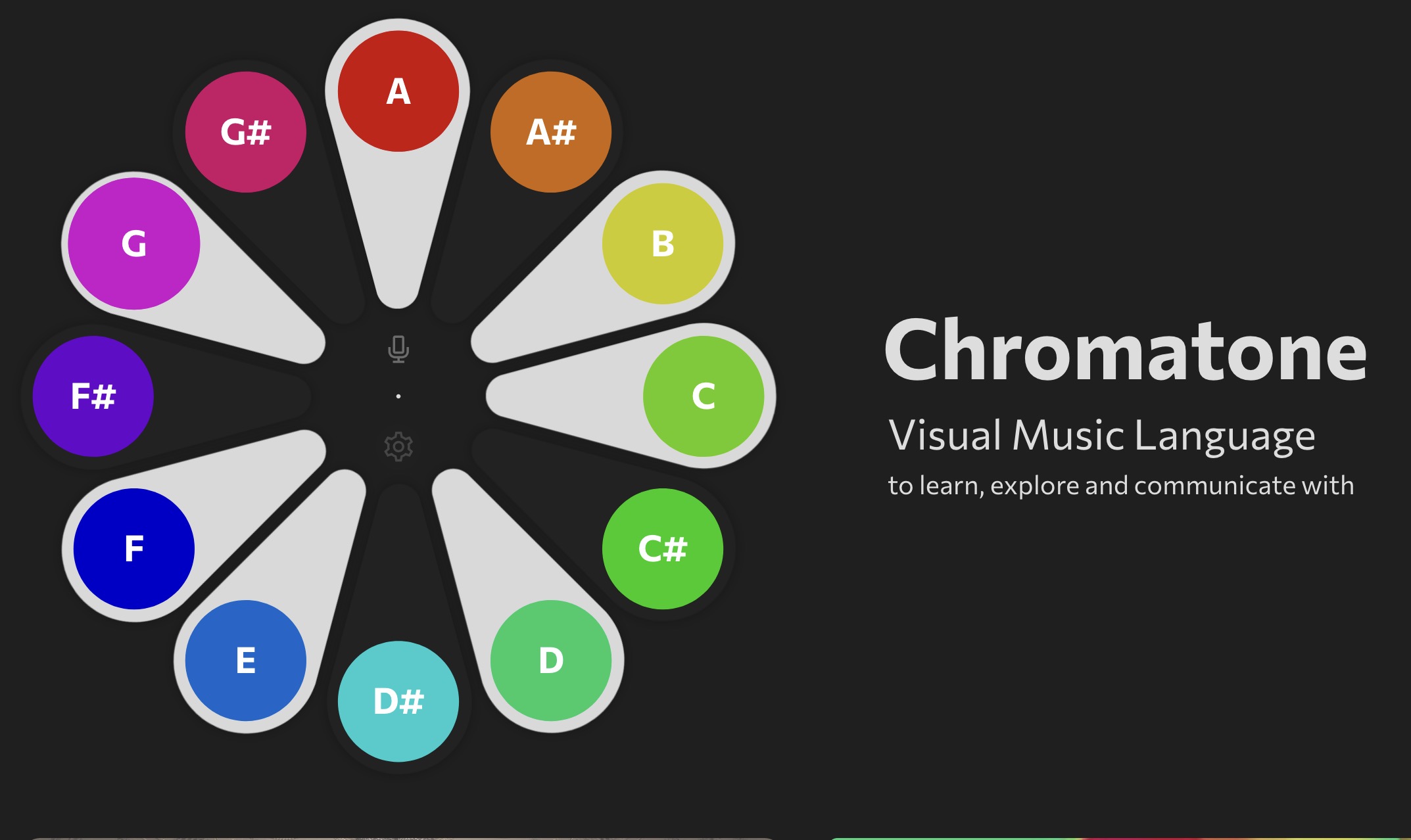
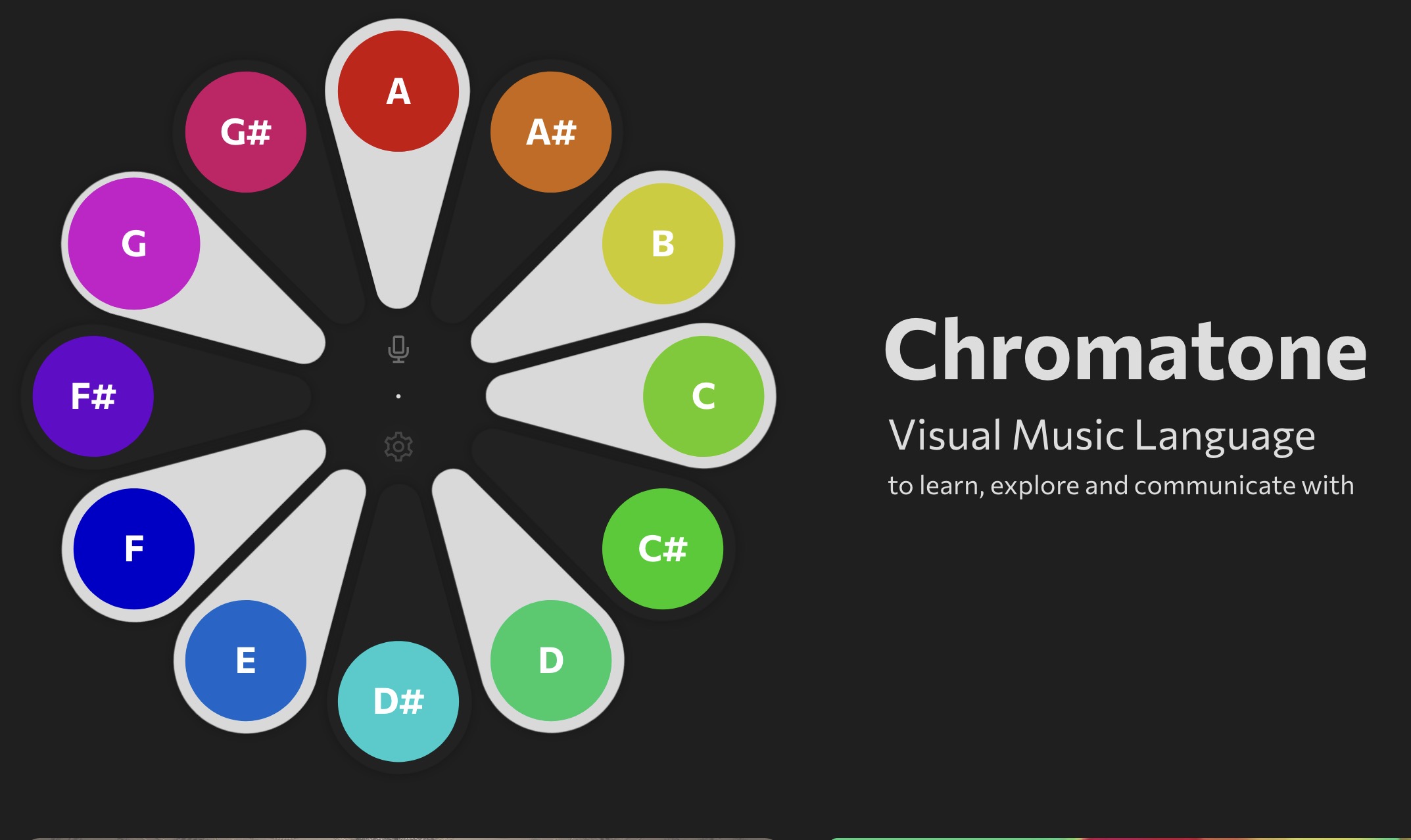
Chromatone maps the twelve chromatic pitches to twelve distinct colors, so that each note name has a fixed visual identity across every context. The page shows the sequence as A, A#, B, C, C#, D, D#, E, F, F#, G, G# paired with its color coding, and describes the system as a "Visual Music Language" in which notes, intervals, chords, scales, rhythm, harmony and melody all become visible through that same mapping. The underlying claim is consistency: once a note is assigned a color, that color should follow the note into scales, chords and written material, letting learners recognize patterns by sight rather than by memorizing abstract symbols alone.

In practice, the mapping is best understood as a fixed index rather than a mood palette. The twelve pitch classes form a repeating cycle, so the twelfth note wraps back to the first, and every octave reuses the same colors at higher or lower pitch. That is what makes the system useful for recognizing transposed shapes: a major chord or a scale mode keeps the same color pattern when moved to a new starting note, even though the note names change.

Chromatone extends the mapping beyond single notes. Its materials connect intervals to gradients, chords and scales to palettes, and rhythm to shapes, which means the color logic is meant to carry structural information, not just decorate labels. The project also offers practice web apps for music education and independent research, and a sticker shop for putting the colors onto instruments and printed theory memos.

Who it suits, and the trade-off

Reader Likely benefit Main trade-off
Beginners Color cues can make scales, intervals and chords easier to spot before notation feels fluent You still need conventional note names and theory to communicate with most musicians
Instrument learners Stickers and printed memos put the mapping directly on keys, frets or fingerboards Depends on the physical materials matching your instrument layout
Teachers and researchers A shared visual vocabulary for explaining patterns and running experiments The system is an evolving research project, so conventions may develop over time

The honest limitation is standardization. The page itself asks what would happen "if we once agree on a standard way to interconnect colors and notes" — an explicit acknowledgment that this is a proposed shared language rather than a universal convention. Anyone learning it should expect to use it alongside standard notation, not as a replacement, and should check that any stickers or printables match the instrument they actually play.

A useful next step: pick one scale you already know, such as C major, write out its seven notes, and assign each the Chromatone color from the twelve-note sequence. Then transpose the same scale to two other starting notes and compare the color patterns. If the shapes stay recognizable to you, the system is doing its job as a learning aid; if you find yourself translating back to note names constantly, treat it as a supplement rather than your primary framework. For the full sequence, app links and printed materials, see Chromatone.

Can I use Chromatone's interactive web apps to learn music theory without prior training?

Yes — Chromatone is explicitly built for beginners with no prior training. Its stated aim is to help newcomers grasp music concepts by mapping the 12 notes to 12 colors, so intervals, chords, scales and rhythm become something you can see rather than only hear. The site describes a "Visual Music Theory" study plus a Practice section of interactive web apps, so the intended path is: start with the color system, then use the apps to explore.

What a beginner can realistically do

  • Learn note names and the 12-tone layout through consistent color coding.
  • See how intervals, chords and scales are built as patterns of color rather than abstract numbers.
  • Explore rhythm, harmony and melody visually, using the web apps as practice tools rather than passive reading.
  • Move at your own pace; the project is framed as open exploration, not a graded course.

Trade-offs to expect

  • The color system is Chromatone's own convention, not a universal standard. It helps you learn here, but it won't automatically match notation or other teaching methods, so expect some translation if you later study with a teacher or textbook.
  • Visual aids make patterns obvious, but they don't replace ear training or instrument practice. Use the colors as a scaffold, then deliberately practice without them.
  • The material is broad (theory, synthesis, rhythm, MIDI, generative tools), which can be overwhelming without a plan.

A practical first step

Pick one small goal for two weeks — for example, being able to name and hear major and minor thirds. Use the color mapping to spot the interval, then play it on an instrument or a keyboard app and sing it back. If you want structured guidance rather than self-directed browsing, the site mentions personal Tutorship with the author, and physical vinyl stickers for instruments if you prefer learning away from the screen.

For complementary free theory references, Music Theory offers structured lessons and exercises, and Teoria provides drills that pair well with a visual approach.

What do the physical Chromatone stickers and posters look like and how do I apply them to my instrument?

Chromatone's shop sells durable vinyl stickers and printed posters, but the page evidence does not describe their exact appearance, sizes or an application method. What it does establish is the underlying idea: a fixed mapping of 12 notes to 12 colors, so a sticker set carries that same color code onto a physical instrument.

H3 Practical expectations

  • Stickers are intended for musical instruments, so the likely use is marking keys, frets or pads so the color-note link is visible while you play.
  • Posters act as printed theory memos, reinforcing the same color system away from the screen.
  • Because the system pairs notes with colors, intervals, chords and scales, the stickers should be applied consistently with that scheme rather than as arbitrary decoration.

H3 How to apply them sensibly

  1. Confirm the note naming and color order on Chromatone before placing anything.
  2. Start with one octave only, so you can check the mapping is comfortable before committing.
  3. Clean and dry the surface; vinyl adheres poorly to dusty or oily keys and fretboards.
  4. Position each sticker so the color is readable from your normal playing angle.
  5. Test with a simple scale or chord to confirm the colors match what you see in the web apps.

If your instrument has a curved or textured surface, or you expect to resell it, test one sticker in a low-visibility spot first. For a beginner, marking a single octave of a keyboard is the lowest-risk starting point; for a fretless or heavily used instrument, posters may be the better purchase since they carry no adhesion risk.

How does personal Tutorship with the author work for guided music education?

Personal Tutorship at Chromatone is a one-to-one arrangement with the project's author, pitched at learners who want to go beyond self-directed exploration with the web apps and get personal guidance through music theory using the project's color-and-shape visual system. That is the extent of what the site itself commits to: it describes tutorship as "personal guidance through complexities of music with easy to grasp visuals and web apps," requested directly rather than bought off a shelf.

What that implies in practice

  • Format: Individual guidance rather than a cohort course, so pacing and topics can bend to what you already know.
  • Method: The teaching leans on Chromatone's visual language—colors mapped to the twelve notes, shapes for rhythm, gradients for intervals, palettes for chords and scales—rather than starting from notation alone.
  • Materials: The free Practice web apps sit underneath the tutorship, so lessons can point you at tools you keep using afterwards.
  • Access: You request it; scheduling, length and any cost are agreed with the author, not published on the page.

Who it suits, and who it doesn't

Reader Fit
Beginner intimidated by standard theory notation Strong: the visual coding is designed to make abstract concepts concrete
Self-taught player stuck between scattered tutorials Strong: a human can sequence what you actually need next
Experienced theorist wanting conventional conservatory drill Weak: the value here is the visual method, not traditional curriculum
Someone wanting a fixed, published syllabus with set prices Weak: terms are negotiated, not listed

A concrete scenario

Say you play guitar, know some chords, and keep bouncing off modes and intervals. You work through the Chromatone web apps on your own, then request tutorship to have the author connect what you're seeing—color relationships, interval gradients—to the fretboard and to real pieces. Between sessions you keep practising in the apps; the tutorship supplies the order and the correction that self-study can't.

Next step

Before requesting, write down three things: what you can already do, the specific concept that keeps defeating you, and how much time per week you'll practise. Send that with your request—it lets the author judge whether the visual approach fits your goal and propose a realistic scope. If you'd rather sample the method first, spend time in the free Practice apps and the theory material at Chromatone before committing to guided sessions.

How can I contribute code, share links, or donate to support Chromatone's open source research?

The site lists three ways to support the project: share links, contribute code, or donate funds. These are named on the Support section of the homepage, but the supplied page information does not include a contribution form, repository URL, or donation link, so you will need to reach the team through the contact route on the site to get the current specifics.

Practical paths

  • Code: Chromatone describes itself as an open source research and design project, so code contributions are welcome in principle. Ask which repository and license apply, and whether issues or pull requests are preferred over patches sent by message.
  • Links: Sharing the project is explicitly requested. Useful sharing is targeted: send it to music teachers, instrument learners, or developers working on music education tools rather than posting it broadly.
  • Donations: The site mentions donating funds to ongoing research and development, but no payment details appear in the supplied information. Request the current donation method directly.

What to check before contributing

  • Confirm the license and contribution guidelines, since these determine whether your work can be reused.
  • Ask what is actively needed. A visual music project spanning theory, web apps, and print materials may value design, translation, or documentation help as much as code.
  • If you donate, ask how funds are allocated if that matters to you. The project describes itself as ongoing research and development rather than a registered charity in the supplied text.

A concrete next step

Write a short message through the site's contact channel stating what you can offer, for example: "I can contribute front-end code to the practice web apps, or translate theory pages into Spanish." Specific offers get useful answers; general expressions of interest often do not.

For context on the wider field of open music tools, you can look at GitHub to see how comparable projects structure contribution guidelines, or Creative Commons if you want to understand open licensing before committing work. Neither is affiliated with Chromatone; they are simply useful references for the questions above.

Related questions

More questions →
Chromatone Posters: What They Are and How to Use Them for Visual Music Learning

Chromatone posters are wall-sized reference charts that map the project's 12-note / 12-color visual music language onto the theory topics you actually practice — notes, intervals, chords, scales, and rhythm. They exist for the same reason the stickers do, but at a different scale: stickers mark individual instruments so you can find a note by color, while posters put the whole system in front of you while you study, compose, or jam. If you already use the Chromatone web apps and want the color-note mapping available off-screen, a poster is the natural companion. If you only want to label a keyboard or fretboard, stickers are the better fit.

What the Chromatone visual music language actually is

Chromatone is an open-source research and design project built on one premise: if colors and notes were standardized against each other, music perception could borrow the strength of vision — "most humans primary sensory channel," as the project puts it. The system assigns the 12 chromatic notes (A, A#, B, C, C#, D, D#, E, F, F#, G, G#) to 12 colors, then extends that same coding across the rest of music theory:

  • Notes and pitch — the base 12-color mapping
  • Intervals — represented with gradients
  • Chords and scales — represented as palettes
  • Rhythm — represented with shapes
  • Modal interplay, temperaments, harmony, melody, composition, synthesis — all listed as topics the language covers

The point of a poster is that this mapping stops being something you look up and becomes something you absorb by seeing it every day.

Posters vs. stickers: which one do you need

Posters Stickers
Format Printed / printable wall reference Durable vinyl, applied to surfaces
Primary use Learning, practice, composition, visual reference Marking musical instruments
Where it lives Wall, studio, practice space On the instrument itself
Best for Studying theory, spotting chord/scale patterns, teaching Finding notes by color while playing

The site describes its shop as offering "durable vinyl stickers for musical instruments and other printed and printable music theory memos." That phrasing matters: the same shop covers both physical instrument markers and printable theory references, so posters and stickers are two formats of one idea rather than competing products. Choose stickers to change how you play; choose posters to change how you study.

What a Chromatone poster covers

Because the language is organized by theory topic rather than by instrument, a poster can carry more than a note-name chart. Expect the visual treatment of:

  • The 12 notes and their 12 colors
  • Intervals as gradients
  • Chords and scales as palettes
  • Rhythm as shapes
  • Modal and harmonic relationships

This is what separates it from a conventional circle-of-fifths wall chart: the organizing principle is color, so the same visual logic that explains a scale also explains a chord voicing or a rhythmic pattern.

How to pair a poster with the Chromatone web apps

The posters are meant to work alongside the interactive tools, not replace them. A practical loop:

  1. Pick one topic — say, scales. Read it off the poster to get the color palette for a given scale.
  2. Open the matching web app in the Practice section (the site lists apps for color, sound, pitch, chords, scales, chroma, rhythm, MIDI, synthesis, generative work, sequencing, and jam/visuals).
  3. Play the same material in the app and watch the colors behave the way the poster showed you.
  4. Return to the poster to test recall — can you name the notes from the colors alone?

The intended result is that the color-note link becomes automatic, so theory you'd normally memorize by rote becomes something you recognize visually.

Getting posters and printable versions

Chromatone's shop is the entry point for physical goods, and the site explicitly notes "printed and printable music theory memos" — so if a physical poster isn't what you want, printable versions serve the same reference purpose. For anything beyond self-study, the project also offers Tutorship: personal guidance through music theory using the same visuals and web apps, requested directly from the author. That's the path if you want the poster system taught rather than self-directed.

Who this is for

  • Beginners who find conventional notation and theory abstractions hard to hold onto and want a visual anchor.
  • Self-taught players already using the Chromatone apps who want the color mapping visible while away from a screen.
  • Teachers and tutors who want a shared visual vocabulary on the wall.
  • Visual music explorers interested in the project's broader research direction — merging colors with notes, shapes with rhythm, gradients with intervals.

If your goal is simply to label your instrument, skip the poster and get stickers. If your goal is to think in the visual music language, the poster is the piece that keeps it in view.

Chromatone Stickers: What They Are and How to Use Them for Visual Music Learning

Chromatone stickers are durable vinyl decals that map the 12 notes of Western music to 12 distinct colors, turning any instrument or surface into a visual music theory reference. They suit beginners learning scales, intervals, and chords, as well as educators who want a hands-on companion to Chromatone's web apps. You can browse and buy them in the Sticker Shop section of chromatone.center. If you already read music fluently and don't benefit from color-coded note references, they add little.

What the stickers actually encode

Chromatone is an open-source research and design project built around a "Visual Music Language." Its core premise is a simple, consistent color coding system that links:

  • Notes — the 12 pitch classes (A, A#, B, C, C#, D, D#, E, F, F#, G, G#)
  • Intervals — represented through gradients
  • Chords and scales — represented through palettes
  • Rhythm — represented through shapes

The stickers carry this same mapping onto physical surfaces. Because the system is designed to be coherent across notes, intervals, chords, and scales, a sticker isn't just a label for one note — it's a fragment of a larger visual grammar you can extend as you learn.

Where to put them

The site describes the stickers as intended for "musical instruments and other printed and printable music theory memos." Practical placements include:

Surface What it helps with
Keyboard or piano keys Spotting scales and chord shapes by color
Guitar fretboard or neck Locating intervals and patterns visually
Notebooks, binders, practice journals Keeping a color-coded theory reference at hand
Music stands or practice-room walls Quick visual recall during practice

The exact sticker formats, sizes, and note coverage aren't specified in the available page content, so check the Sticker Shop listing for what's actually included before buying.

How to use them with the rest of Chromatone

The stickers are one piece of a larger system, and they work best alongside it:

  1. Learn the color-note mapping first. The Practice section of chromatone.center hosts interactive web apps covering color, sound, pitch, chords, scales, chroma, rhythm, MIDI, synthesis, and generative sequencing. Use these to internalize which color means which note.
  2. Apply the stickers to your instrument. Once the mapping is familiar, the stickers act as a physical reminder rather than a crutch.
  3. Practice recognizing intervals and chords by color. Because intervals map to gradients and chords to palettes, you can start seeing relationships instead of memorizing them abstractly.
  4. Go further if you want guidance. Chromatone offers personal Tutorship — guided educational programs with the project's author — for learners who want structured progression beyond self-directed exploration.

Who this is for

Good fit:

  • Beginners who find traditional notation or abstract theory hard to visualize
  • Teachers looking for a color-based teaching aid
  • Anyone already using Chromatone's web apps who wants the system off-screen

Poor fit:

  • Musicians who already navigate theory fluently without visual aids
  • Anyone expecting the stickers alone to teach theory — they're a reference layer, not a course

Buying and support

The Sticker Shop is the purchase entry point on chromatone.center. The project also accepts support through sharing links, contributing code, or donating funds to its ongoing research and development. Pricing, shipping, and payment details aren't covered in the available page content — confirm those directly in the shop.

What Is PubPeer and How Does Post-Publication Peer Review Work?

PubPeer is a website where people can discuss published, peer-reviewed research after it has appeared in a journal. It is best understood as a platform for post-publication peer review: comments, questions, and criticism that happen after formal journal peer review is complete. A paper being discussed on PubPeer does not, by itself, mean the paper is wrong, retracted, or fraudulent. It means someone has raised a point that others can read, evaluate, and respond to.

How PubPeer Differs From Journal Peer Review

Traditional journal peer review happens before publication. A small number of invited reviewers assess a manuscript confidentially, and their comments usually stay private. PubPeer reverses several of those features:

Feature Journal peer review PubPeer discussion
Timing Before publication After publication
Visibility Confidential Public
Participants Invited reviewers Anyone who registers, often anonymously
Permanence Not usually published Comments remain visible
Outcome Accept, revise, or reject Conversation, correction, or further scrutiny
Moderation Editorial decision Limited; claims are not formally verified

The two are complementary, not equivalent. Journal review filters work before it enters the record. Post-publication review examines work that is already part of the record and may be widely cited.

How the Site Is Structured

PubPeer is organized around individual publications. Each paper has its own page, and discussion happens in a comment thread attached to that page.

  • Publication pages are linked to a specific article, usually identified by its DOI or other bibliographic details.
  • Comment threads hold the conversation. Comments can include text, links, and images such as figures or gel images.
  • Anonymous participation is a core design choice. Commenters can post without revealing their identity, which the site presents as a way to lower the risk of retaliation.
  • Search lets you look up a paper, an author, or a topic and see whether it has an existing thread.

Because comments are public and persistent, a thread can accumulate over months or years, with original authors, other researchers, and anonymous readers all taking part.

Who Participates, and Why Anonymity Matters

Participants typically fall into a few groups:

  • Researchers in the same field, who may recognize problems with methods, statistics, or figures.
  • The paper's own authors, who can respond, clarify, or dispute a point.
  • Readers and critics, including people doing image or data checks across many papers.
  • Journal editors and institutions, who sometimes monitor threads relevant to their publications.

Anonymity matters because public criticism of published work can carry professional risk. A junior researcher questioning a senior figure's paper may face pressure, and anonymity reduces that barrier. The trade-off is that anonymous comments carry no verifiable identity or credentials, so readers must weigh the argument on its merits rather than on who made it.

How to Interpret a Paper Being Discussed

The most common mistake is to treat any PubPeer thread as proof of misconduct. Threads vary widely in seriousness, and the type of concern matters.

Questions and clarifications

A commenter may simply ask how a method was applied, why a sample size was chosen, or what a figure shows. These are ordinary scientific questions and often get resolved in the thread.

Corrections and errors

Sometimes a thread identifies a genuine error: a mislabeled figure, a statistical mistake, or a duplicated image. The appropriate response is usually a correction or erratum, not necessarily a retraction.

Serious concerns and misconduct allegations

Some threads raise issues that, if confirmed, would be serious, such as image manipulation or data fabrication. These are allegations, not findings. Confirming them typically requires the journal, the authors' institution, or a formal investigation.

A practical reading checklist:

  1. Read the whole thread, not just the first comment.
  2. Check whether the authors responded and what they said.
  3. Distinguish a factual question from an accusation.
  4. Look for independent confirmation, such as a correction notice or retraction.
  5. Treat unresolved threads as open questions, not verdicts.

Limitations to Keep in Mind

PubPeer is a discussion venue, not a court or an editorial body. Several limitations follow from that:

  • No formal verification. Comments are not independently fact-checked before posting.
  • Limited editorial moderation. Content may be removed for legal or policy reasons, but the site does not adjudicate scientific disputes.
  • Anonymity cuts both ways. It protects legitimate critics and also allows unsupported claims.
  • Incomplete coverage. Only papers that someone chooses to discuss appear, so absence of a thread says nothing about a paper's quality.
  • Context can be missing. A comment may omit details that the authors consider important.

Practical Takeaways

If you encounter a PubPeer thread, use it as a starting point for your own judgment. Read the full conversation, note whether concerns were addressed, and check for official follow-ups such as corrections or retractions. If you are an author, you can respond directly in the thread to clarify or correct the record. If you are considering citing a paper with an active thread, weigh the specific concern against the rest of the evidence rather than treating the thread as a final verdict.

PubPeer's value is that it keeps scientific discussion going after publication. Its limitation is that it provides a forum, not a conclusion.

Color Theory Basics: How to Choose Colors That Work Together

Color theory is the set of rules and relationships that explains why some color combinations feel balanced and others clash. You use it by picking a base hue on the color wheel, then choosing other colors according to a harmony rule (complementary, analogous, triadic, or split-complementary), and finally adjusting saturation and value so the result stays readable. This guide covers the mechanics behind each step and a workflow you can apply in any design tool, including Paletton, a color scheme designer built around the color wheel.

The color wheel and its three dimensions

The color wheel arranges hues in a circle so that relationships between colors become visible. Every color you place on it can be described along three dimensions:

  • Hue — the position on the wheel (red, orange, yellow, green, blue, violet). This is what people usually mean by "color."
  • Saturation — how pure or muted the hue is. A fully saturated red is vivid; desaturating it moves toward gray.
  • Value — how light or dark the color is. Adding white raises value (tint); adding black lowers it (shade).

Two colors can share a hue but read completely differently once saturation and value diverge. This is why a palette built only from hue choices often looks flat: the harmony rule sets the relationships, but saturation and value do the work of separating elements.

Primary, secondary, and tertiary colors

In the traditional subtractive model used for mixing pigments:

  • Primary colors — red, yellow, blue. They cannot be created by mixing others.
  • Secondary colors — orange, green, violet. Each is made by mixing two primaries (red + yellow = orange, yellow + blue = green, blue + red = violet).
  • Tertiary colors — the six in-between hues such as red-orange or blue-green, made by mixing a primary with an adjacent secondary.

Note that on-screen color (additive RGB) uses red, green, and blue as primaries, so digital mixing behaves differently from paint. The wheel's relationships still hold; only the mixing mechanics change.

Harmony rules: how to pick colors that work together

A harmony rule is a geometric pattern on the wheel. Pick a base hue, apply the pattern, and you get a set of colors with a built-in relationship.

Rule How it works Best for
Complementary Two hues directly opposite each other High-impact contrast, calls to action
Analogous Two to four hues next to each other Calm, cohesive, low-tension designs
Triadic Three hues evenly spaced (120° apart) Lively palettes that still feel balanced
Split-complementary A base hue plus the two hues adjacent to its complement Strong contrast with less clash than pure complementary

A practical caution: pure complementary pairs at full saturation vibrate uncomfortably when placed side by side. Softening one color's saturation or shifting value usually fixes this while keeping the contrast.

Warm vs cool: controlling mood

Warm colors (reds, oranges, yellows) tend to advance and feel energetic. Cool colors (blues, greens, violets) tend to recede and feel calm or distant. Mixing warm and cool in one palette creates depth, but the ratio matters — a small warm accent against a cool field draws the eye immediately, which is useful for buttons or highlights.

Contrast and value: keeping text and UI readable

Harmony governs aesthetics; contrast governs usability. For any text or interface element, the deciding factor is usually value difference, not hue difference. Two hues can be complementary and still unreadable if their values are too close.

A workable rule of thumb:

  • Body text needs a large value gap between text and background.
  • Interactive states (hover, focus, disabled) should be distinguishable by value or saturation shifts, not hue alone, so they remain clear to users with color vision differences.
  • Reserve your highest-contrast pairing for the most important element on the screen.

A workflow for turning theory into a real palette

  1. Choose a base hue that matches the intended mood — warm for energy, cool for calm.
  2. Apply a harmony rule on the wheel to generate candidate colors. Paletton's color wheel is designed for exactly this: you select a base and it produces combinations that work together.
  3. Assign roles: pick one dominant color (largest area), one or two supporting colors, and one accent for emphasis.
  4. Adjust saturation and value so each role is visually distinct, then check text contrast.
  5. Test in context — place the palette into a real layout, not just swatches, and verify that hierarchy and readability hold.

The theory narrows your options; the workflow confirms them against actual use.

Color Wheel and Color Theory: How to Build Harmonious Color Schemes

A color wheel is a circular arrangement of hues that shows how colors relate, and you use it to pick combinations that look intentional rather than random. The core method: choose a harmony rule (complementary, analogous, triadic, or split-complementary), pick a base hue, then adjust saturation and value so one color dominates and the others support it. This works for any design task — a website, a poster, a brand palette — and the only real requirement is that you can see your colors side by side and test them against real content.

What the color wheel actually shows

The wheel is built in layers:

  • Primary colors — red, yellow, and blue in the traditional (painter's) wheel. In digital design you'll also meet the RGB primaries (red, green, blue) and CMYK primaries (cyan, magenta, yellow), which behave differently because they mix light or ink rather than pigment.
  • Secondary colors — mixed from two primaries: green, orange, and violet.
  • Tertiary colors — mixed from a primary and an adjacent secondary: yellow-green, blue-green, blue-violet, red-violet, red-orange, yellow-orange.

The practical point is distance. Colors near each other on the wheel share undertones and feel calm together; colors opposite each other share nothing and create tension. Every harmony rule is just a rule about which distances to use.

The four variables you're actually adjusting

Most palette problems come from changing hue when the real issue is one of the other three.

Variable What it is What changing it does
Hue The color's position on the wheel Shifts the color family (blue → teal → green)
Saturation Intensity, from gray to vivid High saturation shouts; low saturation recedes
Value Lightness or darkness Controls readability and hierarchy more than hue does
Temperature Warm (reds, oranges, yellows) vs. cool (blues, greens, violets) Sets the emotional tone and how "close" a color feels

A useful habit: pick your hues first, then fix the palette almost entirely with value and saturation. Two colors that clash at full saturation often sit together fine once one is desaturated and darkened.

The harmony rules and when each one fits

Complementary (opposite on the wheel)

Maximum contrast and energy. Good for a call-to-action against a calm background. Risk: at full saturation on both sides it vibrates uncomfortably. Fix by letting one color dominate and using the other only in small areas.

Analogous (neighbors on the wheel)

Low contrast, cohesive, calm. Good for backgrounds, gradients, and mood-driven work. Risk: not enough separation for interactive elements — you'll need value contrast to make a button readable.

Triadic (three evenly spaced hues)

Balanced and lively, with one color usually leading and two accenting. Good when you need several distinct categories (charts, tags, sections). Risk: can feel childish if all three are fully saturated.

Split-complementary (a base plus the two colors adjacent to its complement)

Nearly as much contrast as complementary but easier to balance. A safe default when you want punch without vibration.

Tetradic / square (four hues)

Rich but hard to control. Treat one color as dominant, one as secondary, and the remaining two as small accents.

Applying a rule to a real project

  1. Name the job of each color. Typically: background, surface, primary text, secondary text, primary action, and one accent/state color. Decide this before choosing hues.
  2. Pick a base hue that matches the subject or brand, not your personal favorite.
  3. Choose a rule based on how much energy the design needs — analogous for calm, complementary or split-complementary for emphasis.
  4. Assign roles by area. The dominant color should cover the most space; the accent should cover the least. A palette fails most often because the loudest color got the largest area.
  5. Tune value and saturation until text is readable and the hierarchy is obvious at a glance.
  6. Test in context. Put the palette behind real headings, body text, buttons, and disabled states — not just swatches.

Tools like Paletton (formerly Color Scheme Designer) exist specifically for step 3: you set a base color on a wheel, choose a harmony mode, and it generates the related hues so you can preview combinations instead of calculating angles yourself.

Checking contrast and accessibility

Harmony and readability are separate problems. A palette can be perfectly harmonious and still unusable.

  • Body text needs substantially more contrast against its background than large headings or decorative elements do.
  • Never rely on color alone to convey meaning — pair it with an icon, label, or shape, since color-blind users may not distinguish your red/green states.
  • Check every text/background pair you actually ship, including hover, focus, disabled, and error states.
  • Test the palette in grayscale. If the hierarchy collapses, your value contrast is too weak.

Common mistakes and how to fix them

Muddy palettes. Usually caused by mixing too many hues at mid saturation and mid value. Fix: reduce to two or three hues and push them apart in value.

Clashing colors. Often two fully saturated complements fighting for attention. Fix: desaturate one, shrink its area, or shift to split-complementary.

Everything looks the same. Too many analogous colors at similar values. Fix: keep the hues, widen the value range.

The accent doesn't pop. The accent is too close in value to the background, or it's used in too many places. Fix: increase its contrast and restrict it to one job.

Palette looks fine as swatches, wrong in the layout. Colors interact with surrounding colors and with area size. Fix: always preview in the actual composition.

Quick reference

  • Calm, cohesive design → analogous
  • Strong emphasis on one element → complementary, used sparingly
  • Multiple equal categories → triadic
  • Contrast with less risk → split-complementary
  • Fixing a bad palette → adjust value and saturation before changing hue

Website Overview

Identifiable technologies and additional version or configuration signals make the service easier to fingerprint, which may help targeted scanners narrow their checks. An established domain and managed infrastructure suggest continuity of operations and may support dependable delivery, although neither guarantees service quality.

Domain and Registration

Registered in 2017, this domain has about 8 years of history. That suggests continuity, although ownership and purpose may have changed. The domain uses the common .center extension, which is not an independent safety signal.

DNS and Email

Nameservers are provided by nameself.com, indicating managed DNS hosting. MX records point to the Yandex Mail email service. No CNAME was found; the observed records resolve directly to addresses. SPF and DMARC are configured. DKIM status is unknown. TXT records include verification markers for Google. Such markers may also remain after a service stops being used.

TLS and Certificates

The certificate uses an RSA 2048-bit public key, offering broad client compatibility. The server supplied a complete certificate chain. No organization name is present in the certificate; the available fields are consistent with domain validation. The certificate was issued by Let's Encrypt, commonly associated with automated certificate services. The certificate's total validity is about 89 days, consistent with a short renewal cycle.

HTTP and Browser Security

The checked browser-security headers were not detected, leaving fewer explicit browser-side safeguards. CORS permits any origin to read this response. This is common for public resources; sensitive responses need narrower handling. No X-Powered-By header was found, reducing one common source of backend fingerprinting information. The x-cache, x-served-by, via response header indicates a CDN or caching proxy in the delivery path. No obvious internal addresses or debug information were found in the headers.

Technology Stack Analysis

The public page identifies VitePress 2.0.0-alpha.20, Fastly, with exact versions exposed for 1 technologies. These details can narrow vulnerability checks, although exposure alone is not a vulnerability.

Search and Social Sharing

The Generator tag identifies VitePress v2.0.0-alpha.20, making the publishing system easier to fingerprint. No homepage canonical URL was detected. If duplicate URLs exist, consolidation may be less explicit. Twitter Card metadata is configured. The title has 30 characters, within a common display range. A meta description is present, with 34 characters.

Hosting and Email

DNSnameself.com
HostingFastly
EmailYandex Mail
Location United States flagUnited States 185.199.108.153

User reviews (0)

  • No reviews yet.

Pages, Search and Sharing

Meta descriptionVisual Music Language Research Hub
Canonical URLNot detected
LanguageEnglish (default)
Twitter Cardsummary_large_image
All bots 1 allowed · 0 disallowed
  • Allow/

Registration details RDAP / WHOIS

RegistrarRegtime Ltd.
Registered2017-11-20
Expires2026-11-20
Domain statusactive
Nameserversns1.nameself.com、ns2.nameself.com
DNSSECunsigned

DNS records

TypeNameValueTTLPriority
Achromatone.center185.199.108.1537200—
AAAAchromatone.center2606:50c0:8000::1537200—
MXchromatone.centermx.yandex.net720010
NSchromatone.centerns1.nameself.com7200—
NSchromatone.centerns2.nameself.com7200—
TXTchromatone.centergoogle-site-verification=4kg0wkkUisacyihjHJV9jv9xedcX-pPNCoVjjhO45Y47200—
TXTchromatone.centerv=BIMI1; l=https://chromatone.center/media/logo/click-logo.svg;7200—
TXTchromatone.centerv=spf1 redirect=_spf.yandex.net ~all7200—
DMARC_dmarc.chromatone.centerv=DMARC1; p=quarantine; pct=5; rua=mailto:[email protected]7200—

TLS and certificates

AssessmentNormal configuration
Supported protocolsTLSv1.2、TLSv1.3
Negotiated protocolTLSv1.3
Certificate subjectchromatone.center
IssuerLet's Encrypt
Valid until2026-11-27T16:06 · Remaining when checked: 55 days
Verification detailsCertificate trust: Passed · Hostname match: Passed

HTTP response headers

HeaderValue
content-typetext/html; charset=utf-8
cache-controlmax-age=600
serverGitHub.com
access-control-allow-origin*

Identified technologies

VitePress 2.0.0-alpha.20Fastly