
 简体中文
简体中文 English
Website review
This review may include AI-generated content and is not individually verified. Domain, certificate and other facts come from the observed data on this page.
What is Goodpalette?
Goodpalette is a browser-based tool for generating color palettes aimed at UI and UX design work. Its distinguishing idea is preview: rather than handing you swatches in isolation, it shows how a scheme would look applied to an app or website through dynamic mockup previews, so you judge colors in something closer to their real context.
Goodpalette
H3 Who it suits
- Designers who want a fast starting point for a screen or landing page rather than a full design system.
- Developers or founders without a design background who need a defensible palette quickly.
- Anyone who finds raw hex swatches hard to evaluate and prefers seeing colors in a layout.
H3 How it differs from plain palette generators Most generators stop at a row of color chips. The mockup preview is the more useful part: a palette that looks pleasant as squares can fail once it becomes a button, a background and body text. If you are choosing between tools, preview quality is the criterion worth testing first — generate a scheme, apply it to a realistic screen, then check text contrast and whether the accent color still reads as an accent.
A practical next step: pick a real screen you are working on, run two or three generated palettes through the preview, and keep the one where the primary action is unmistakable at a glance.
How does Goodpalette help me choose a color scheme for my UI project?
Goodpalette is built for the moment when you have a working interface but no confident color direction. Rather than handing you a static swatch list, it generates color schemes for UI and UX work and then shows how they would look applied to an app or website through dynamic mockup previews. That preview step is the real value: you judge a palette on buttons, cards, and backgrounds instead of on isolated color chips.
H3 How it fits a typical workflow
- Generate a scheme for the mood or brand you have in mind.
- Look at it inside a mockup that resembles a real screen.
- Compare a few candidates side by side before committing.
- Hand the chosen palette to whoever builds the interface.
H3 Who gets the most out of it
- Solo designers and developers who need a credible starting point without a dedicated color toolchain.
- Product teams settling a visual direction early, before components are finalized.
- Marketers or founders mocking up a landing page when no designer is available.
H3 What it does not do for you
A generator proposes; it does not decide. You still need to check contrast for text and interactive states, confirm the palette survives in dark mode if you support it, and make sure the accent color carries meaning rather than decoration. Accessibility and brand fit remain your call.
H3 A practical next step
Pick one primary action on your screen — a signup button, say — and test three generated schemes against it. Choose the one where that button reads as obviously clickable without competing with your content. For broader color theory and contrast guidance, W3C publishes the accessibility standards worth checking against, and Material Design explains how color roles map to components in a design system.
Can I preview how a color palette will look on my actual app or website before committing?
Yes, Goodpalette is built around that idea: its stated purpose is to generate UI color schemes and preview how they would look on an app or website using dynamic mockup previews. So the preview happens on representative mockups inside the tool, not on your live product.
That distinction matters. A mockup preview shows how the palette behaves across typical interface elements — backgrounds, surfaces, text, buttons, borders — which is exactly where most palettes fail. What it can't show is your real content: long paragraphs, data tables, photos, error states, or brand assets that clash with the generated hues.
A practical way to use it
- Generate or pick a palette in Goodpalette.
- Review the mockup preview for contrast and hierarchy, not just aesthetics.
- Note the hex values and apply them temporarily in your own environment.
- Test in your actual app or site with real content before committing.
For step 4, browser DevTools is the fastest route: override CSS custom properties or a theme file and toggle between candidates live. If you want a second opinion on how the palette reads in a full-page context, tools like Coolors let you drop colors into image and layout previews, though again these are simulations rather than your product.
Decision criterion
If your interface is fairly conventional — cards, forms, nav, buttons — a mockup preview is usually enough to commit. If your product leans on dense data, custom illustration, or a strong existing brand color, treat any generated preview as a shortlist and validate on a real screen before rolling the palette out.
What types of color palettes does Goodpalette generate for different UI design styles?
Goodpalette generates UI-oriented color schemes and then shows them in dynamic mockups, so the palettes are presented in the context of app or website interfaces rather than as abstract swatch sets. The page evidence available describes “beautiful color schemes for UI and UX design” with previews on an app or website; it does not list named palette styles or categories, so I can’t reliably say it offers specific labeled sets such as “minimal,” “dark mode” or “high-contrast” palettes.
What is clear is the intended workflow: generate a scheme, then preview it on interface mockups. That matters because a palette that looks good as isolated colors can fail once applied to buttons, backgrounds, text and states. If you are choosing a palette for a particular UI style, evaluate it in the mockup against the elements that style depends on.
H3 Practical way to judge a generated palette by UI style
| UI style | What to check in the preview |
|---|---|
| Minimal / clean | Whether background and surface colors are close enough to feel calm, but still distinct enough to separate cards or panels |
| Dark mode | Whether text and icons keep enough contrast, and whether accent colors stay readable rather than glowing |
| High-contrast / accessible | Whether primary text, secondary text and interactive elements remain distinguishable, not just the accent color |
| Playful / brand-led | Whether the accent color works on buttons and links without overwhelming neutral areas |
| Data-heavy dashboards | Whether multiple colors remain distinguishable when used for charts, tags or status indicators |
A useful next step is to pick one realistic screen from your product, such as a form, a dashboard card or a pricing section, and preview the generated palette on that rather than judging the swatches alone. If you need a second opinion on color relationships or accessibility, compare against established references such as Material Design or MDN Web Docs for contrast guidance.
Is Goodpalette free to use, and are there paid plans or limitations?
The supplied page information for Goodpalette does not include pricing details, plan names, or usage limits, so I can't confirm from it whether the tool is free or whether paid tiers exist. The page content is essentially a JavaScript app shell, meaning the pricing and feature information likely loads dynamically and wasn't captured.
What the description does tell you is the tool's purpose: generating color schemes for UI/UX design and previewing them in dynamic mockups of an app or website. That's a browser-based utility rather than something you'd typically expect to require installation or an account for basic use.
How to check for yourself
- Open Goodpalette and look for a Pricing, Plans, or Upgrade link in the header or footer.
- Try the core workflow — generate a palette, apply it to a mockup preview — and note whether any step prompts you to sign in or pay.
- If there's no pricing page at all, that usually indicates a free tool, possibly with optional support or sponsorship rather than a subscription.
A practical way to think about it
For a designer picking a palette tool, the real question isn't just "free or paid" but "what gets locked away." Common patterns for tools like this include free palette generation with paid extras such as exporting design tokens, saving unlimited palettes, or team sharing. If your need is a one-off palette for a landing page, a free tier is usually enough; if you need consistent palettes across a design system and code exports, check whether those specific features sit behind a paywall.
If you can share what the pricing page says, I can help you weigh whether the paid tier is worth it for your workflow.
How does Goodpalette compare to other color palette tools for UI and UX designers?
Goodpalette's distinguishing idea is that it pairs palette generation with dynamic mockup previews, so you judge colors in something resembling a real interface rather than as swatches on a blank canvas. That matters because a palette that looks balanced in isolation can fail once it sits behind text, buttons and cards.
Where it fits against other tools
| Tool type | Strength | Trade-off |
|---|---|---|
| Palette generators | Fast, lots of variations, good for exploration | Colors are judged out of context |
| UI mockup previewers like Goodpalette | Shows colors applied to app/website-like layouts | Less useful if you need brand assets, exports or design-system plumbing |
| Full design tools | Palettes live inside real components and tokens | Slower for quick color experiments |
The practical split is exploration versus validation. Use a generator to find candidate hues, then use a preview-driven tool to check contrast, hierarchy and how accent colors behave on buttons and links. Goodpalette leans toward the second job.
Who gets the most from it
- UI/UX designers who want to sanity-check a scheme before committing it to a design file.
- Developers or solo makers picking colors for a landing page or small app without a designer.
- Anyone who struggles to imagine how a hex code will read as a background, card or call-to-action.
It is less compelling if you need accessible contrast ratios calculated for you, or if you need palettes exported directly into a token pipeline — check whether the tool covers those needs before adopting it.
A useful next step
Take one real screen from your current project and test two or three candidate palettes against it, paying attention to body text on background and the primary button. If a palette only works at large sizes, it is not ready. For broader inspiration alongside this kind of preview, Coolors is a well-known generator, and Color Hunt offers curated palettes; both are better for browsing than for previewing an interface.
 Amazon.com, Inc.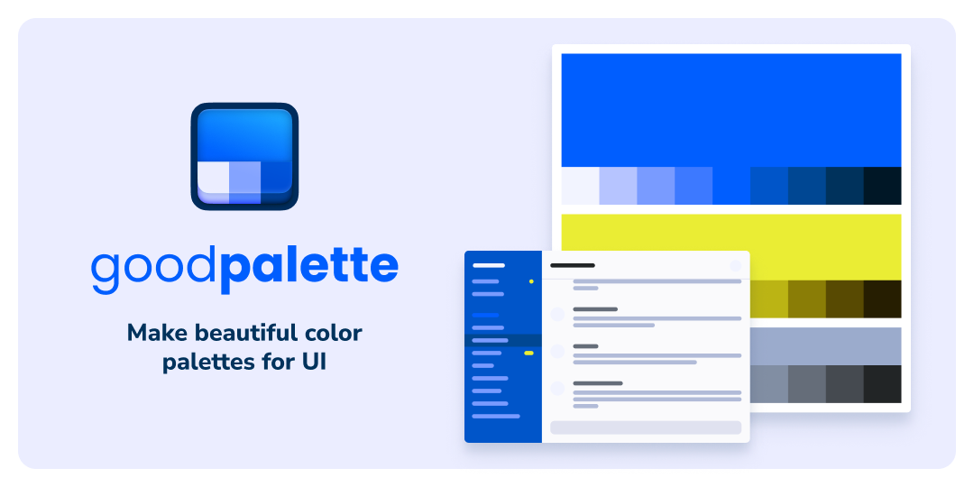

User reviews (0)