
 简体中文
简体中文 English
Website review
This review may include AI-generated content and is not individually verified. Domain, certificate and other facts come from the observed data on this page.
What is tints.dev?
tints.dev is a browser-based palette generator and API for Tailwind CSS. You give it a base hex color, and it produces a full 50–950 color scale you can copy into Tailwind theme variables. The page also exposes an API that returns a palette from a single hex value, aimed at design tools that need to generate scales on the fly.
H3 What you can actually do with it
- Generate a scale from one color. Enter a valid hexadecimal value; by default it is treated as stop 500, but you can set it to any stop from 50 to 950.
- Tweak the spread. Adjust hue shift, saturation shift, and minimum/maximum lightness or luminance to control how colors behave toward white and black.
- Switch modes. Toggle between linear and perceived lightness, and between lightness and luminance, to get different distributions at the extremes.
- Choose output format. The generated theme block can be shown in oklch, hex, or hsl, ready to paste into a CSS file.
- Fetch palettes programmatically. The API returns a palette using only the base hex value, with no HSL tweaks.
H3 Who it suits
Front-end and design-system developers who already use Tailwind and want a quick starting scale rather than hand-picking eleven stops. It is also useful for tool builders who need a single-hex-to-palette endpoint. Teams without Tailwind can still use the output, but the surrounding workflow is clearly Tailwind-oriented.
H3 A practical trade-off
The page itself notes that the principles are inspired by Refactoring UI, and that the same book recommends against automated tools like this one. That is a fair warning: generated scales are a fast starting point, not a substitute for checking contrast, brand fit, and real UI states. If you want a comparison point for hand-tuned scales, Tailwind’s own palette reference is at Tailwind CSS.
H3 Next step
Pick a brand or primary color, set it as stop 500, and generate the scale. Then test the 50, 500, and 950 stops in actual components before committing the values to your theme.
How do I use the Palette API to generate a Tailwind CSS palette from a hex color?
The Palette API on tints.dev turns a single hex color into a Tailwind-ready 50–950 palette. You send the hex value, and it returns the full set of stops already formatted for Tailwind's CSS variables. It is meant for design tools or build steps that need to generate a palette on the fly from one base color, without manually tweaking each stop.
The API currently returns a palette based only on the base hex value. The HSL controls you see in the web UI — hue shift, saturation shift, and lightness distribution — are not available through the API, so treat the API output as the untweaked version.
A minimal workflow
- Pick your base hex color (for example, your brand blue).
- Request the palette from the API using that hex value.
- Copy the returned
@themeblock into your Tailwind CSS file. - Use the generated variables as
--color-blue-50through--color-blue-950in your classes.
The output uses oklch() color values by default, which is what Tailwind CSS v4 expects. The page also shows hex and HSL output modes you can switch between in the UI, so match the format to your setup.
Example result shape
A generated palette looks like a block of custom properties:
@theme {
  --color-blue-50: oklch(0.965 0.015 273.9);
  --color-blue-100: oklch(0.924 0.033 272.8);
  /* ... through --color-blue-950 */
}
Paste that into your CSS file, and Tailwind picks up the blue scale automatically.
When to use the API vs. the UI
| Situation | Better choice |
|---|---|
| Generating palettes inside a design tool or script | API |
| You need hue, saturation, or lightness tweaks | Web UI |
| One-off palette for a personal project | Web UI |
| Reproducible palettes across many projects | API |
A practical next step: generate one palette in the UI first, compare the hex output against the API result for the same base color, and confirm they match before wiring the API into a build pipeline. If they differ, your base stop assumption is likely the cause — the UI treats the input as stop 500 by default, while the API derives the whole scale from the single value.
For background on the palette logic, the site points to the Refactoring UI book by Adam Wathan and Steve Schoger, which inspired the lightness and saturation principles. Notably, that book recommends against automated palette tools, so use this as a fast starting point and adjust the extremes by eye where brand accuracy matters. The tool's own page is at Tailwind CSS 11-color Palette Generator and API.
How can I adjust hue, saturation, and lightness to create a custom Tailwind CSS color palette?
At tints.dev, the palette generator exposes three main controls — Hue Shift, Saturation Shift, and Lightness Distribution / Minimum–Maximum Lightness — plus a base hex value that anchors the whole 50–950 scale. You pick a starting color (by default it fills stop 500, but you can move it to any stop from 50 to 950), then tweak the shifts to spread the remaining stops toward white and black.
Tailwind CSS 11-color Palette Generator and API
What each control does in practice
- Hue Shift: rotates the hue across the scale. The page notes this is most useful when your base color has 100% saturation, where shifting hue up or down makes the palette less flat.
- Saturation Shift: changes how saturated the extremes become. The guidance is that a low-saturation base color becomes more interesting if you increase saturation at the ends of the scale.
- Lightness / Luminance: two related modes. Adjusting Minimum and Maximum Lightness (or Luminance) controls how far the lightest and darkest stops push toward white and black. Switching between Lightness and Luminance produces a different spread at the extremes.
- Output format: you can output in oklch, hex, or hsl and copy a
@themeblock for Tailwind CSS v4, so the palette drops straight into your CSS.
A concrete workflow
- Enter a valid hex value as the initial color — pick the stop it represents (500 is the default).
- If the base is fully saturated, nudge Hue Shift to avoid a one-note ramp.
- If the base is muted, raise Saturation Shift so the light and dark ends don't turn gray.
- Widen Minimum/Maximum Lightness to push stops 50 and 950 toward white and black, then compare Lightness vs Luminance mode to see which spread you prefer.
- Copy the generated
@themevalues and paste them into your CSS file.
Trade-offs to weigh
The page itself points out that the approach is inspired by Refactoring UI, and that the same book recommends against automated tools like this one. That's worth taking seriously: a generator is fast for bootstrapping a consistent ramp, but it won't know your brand, accessibility contrast targets, or how the color behaves against your actual backgrounds. Use it to get a solid starting scale, then hand-check contrast and adjust individual stops.
The Palette API is the other half of the offering: it returns a 50–950 palette from a single hex value, which is handy for design tools that need to generate a scale on the fly. Note the current limitation — the API returns the palette from the base hex only, with no HSL tweak options, so anything you'd normally do with the shift controls has to be done in the UI.
Next step: generate one palette from your brand hex, export the @theme block, and test the 50, 500, and 950 stops against your real UI backgrounds before committing the full scale.
What are the best practices for generating accessible color palettes for Tailwind CSS?
Start from contrast checks, not from the palette generator. A palette is accessible when the text/background pairs you actually ship meet WCAG contrast minimums (4.5:1 for normal text, 3:1 for large text and UI boundaries), and when color is never the only signal for state or meaning. Generators help you build the scale; they don't certify the pairings.
Tailwind CSS 11-color Palette Generator and API is a useful concrete example of the workflow: you set a base hex at a chosen stop (default 500), then tune hue, saturation and lightness distribution across 50–950, and export CSS variables or an @theme block in oklch, hex or hsl. Its own documentation notes the approach is inspired by Refactoring UI, and that the same book advises against automated tools — the tool is positioned as a fast-track for creating palettes, not a replacement for judgment.
A practical routine
- Pick one brand hue and generate the 50–950 scale.
- Decide which stops are for surfaces (usually 50–200), borders (200–300), and text (600–950).
- Test real pairings: 600 text on 50 background, 950 text on 100 background, white on 600, etc.
- Check hover, focus, disabled and dark-mode variants — those are where contrast usually fails.
- Verify with a contrast checker, then re-tune lightness rather than swapping hues.
Why the HSL tweaks matter
The generator exposes hue shift, saturation shift, and minimum/maximum lightness or luminance, with a linear/perceived toggle. Practically:
- Highly saturated base colors can look flat across the scale; a small hue shift keeps light and dark stops from looking muddy.
- Low-saturation base colors often need saturation increased at the extremes so the lightest and darkest stops don't collapse into gray.
- Adjusting min/max lightness spreads the ramp toward white and black, which is what gives you room for accessible text-on-surface pairs.
Where to verify
| Task | What to use |
|---|---|
| Build the 50–950 ramp | tints.dev |
| Check contrast ratios of specific pairs | WebAIM Contrast Checker |
| Confirm the rules themselves | W3C WCAG |
Decision criteria
Choose a base stop that already has enough contrast against your lightest surface, then let the ramp do the rest. If your primary button color can't pass white-on-color at 600, shift the button to 700 rather than darkening the whole palette. If you need programmatic generation, note that tints.dev's API returns a palette from a single hex value without HSL tweaks — so any hue/saturation adjustments you make in the UI won't carry over to API-generated palettes.
Next step: generate a palette, then immediately test the four or five pairings your interface actually uses. If any fail, adjust lightness distribution before touching hue.
How does tints.dev compare to other Tailwind CSS palette generators?
tints.dev is a focused palette generator for Tailwind CSS that produces a full 50–950 scale from a single base color, with an API for programmatic use. Its distinguishing trait is HSL-style fine-tuning—hue shift, saturation shift, and lightness distribution controls—rather than just spitting out a scale from one hex value.
Compare it to other common approaches:
| Tool type | Typical strength | Where tints.dev differs |
|---|---|---|
| tints.dev | HSL tweaks, lightness distribution, API, Tailwind v4 @theme output |
More manual control; API returns only the base palette without HSL tweaks |
| General palette generators (Coolors, Adobe Color) | Broad color exploration, mood boards, multi-color schemes | Not Tailwind-specific; you must map stops to 50–950 yourself |
| Tailwind's own default palette | Battle-tested, consistent across projects | Not customizable from your brand color |
| Hand-rolled HSL/OKLCH scripts | Full control | More setup; no built-in UI or copy-ready CSS variables |
When to pick tints.dev: you have a brand hex and want a Tailwind-shaped scale fast, you want to nudge hue/saturation/lightness to avoid muddy extremes, or you need an API to generate palettes inside a design tool. The page notes the API currently returns a palette from the base hex only, with no HSL tweak options—so if your workflow depends on those tweaks, generate in the UI and copy the output.
Trade-off to weigh: the site itself cites Refactoring UI, which recommends against automated palette tools. tints.dev is positioned as a fast-track starting point, not a replacement for design judgment. Check contrast and perceived lightness in context, especially for text and UI states, rather than trusting the generated scale outright.
Next step: pick your base hex, set it as stop 500, then adjust the minimum/maximum lightness to spread the ends toward white and black. If the base is highly saturated, try a small hue shift; if it is desaturated, raise saturation at the extremes. Copy the resulting @theme block into your CSS. For broader color exploration before committing, Coolors and Adobe Color are useful complements; for Tailwind's built-in reference palette, see Tailwind CSS.
Can I use tints.dev to generate palettes for dark mode or other design systems?
Yes. tints.dev generates a full 50–950 Tailwind palette from a single base hex value, and that range is exactly what you need for dark mode and for feeding other design systems.
For dark mode, the practical workflow is to pick your brand colour as the 500 stop, then use the darker stops (800–950) as surfaces and the lighter stops (50–200) as text or accents in dark themes — or invert that logic if your dark theme uses light text on deep backgrounds. The generator exposes controls that matter here: minimum and maximum lightness/luminance let you spread the extremes toward pure white and black, and you can switch between Lightness and Luminance modes to get a different distribution at those extremes. A palette tuned in Luminance mode often produces more even perceived contrast steps, which helps when you're checking text-on-surface pairs in a dark UI.
For other design systems, the output is not locked to Tailwind. The page shows copy-ready output in oklch, hex and hsl, plus a Tailwind @theme block with CSS custom properties. That means you can:
- Paste the
@themevariables straight into a Tailwind v4 CSS file. - Take the hex or hsl list into Figma variables, a SCSS map, or a tokens JSON file.
- Use the Palette API to fetch a 50–950 palette from a single hex value — useful for design tools or build scripts that need to generate tokens on the fly.
Trade-offs to know before you commit:
| Need | What tints.dev gives you | What to plan for |
|---|---|---|
| Dark-mode surfaces | Dark stops from the same hue family | Manually verify contrast ratios; generated steps aren't accessibility-checked |
| Non-Tailwind systems | hex / hsl / oklch output | You convert to your own token format yourself |
| Automated pipelines | Palette API | The API returns a palette from the base hex only — no HSL tweaks via API |
| Hue-heavy or low-saturation brands | Hue Shift and Saturation Shift controls | Tuning is manual and per-palette |
Note that the page itself cites Refactoring UI (Adam Wathan and Steve Schoger) as inspiration and points out that the book actually recommends against automated palette tools — the stated purpose here is fast-tracking a first draft, not replacing design judgement.
Next step: generate your brand palette once, copy the oklch or hex values, then build your dark-mode set by remapping which stops serve as background, surface and text. If you want a second reference point for how a mature system structures its dark tokens, compare against Material Design 3 or Tailwind CSS's own colour documentation.
 Cloudflare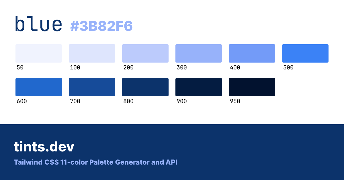
User reviews (0)