
 简体中文
简体中文 English
Website review
This review may include AI-generated content and is not individually verified. Domain, certificate and other facts come from the observed data on this page.
What is Pattern Craft?
Pattern Craft is a free library of ready-to-use CSS background patterns and gradients, published at Pattern Craft. Its own page describes it as a collection of 250+ patterns you can preview and copy with one click, built with modern CSS and Tailwind CSS so the snippets can be pasted directly into a website or app.
What you get
- Pattern categories: Gradients, Geometric, Decorative and Effects, plus a Favourites filter.
- Copy-and-paste snippets: each entry has Preview and Copy actions rather than downloadable asset files.
- Tailwind-oriented output: the site states the patterns are crafted with Tailwind, so expect class-based or utility-friendly code alongside plain CSS.
- Live previews: you see the pattern rendered before copying, and on mobile you tap to reveal the options instead of hovering.
Who it suits
- Front-end developers who need a section background, hero backdrop or card texture without designing one from scratch.
- Tailwind users who want decorative backgrounds that fit an existing utility workflow.
- Designers and hobbyists prototyping a landing page who want to test several looks quickly.
Trade-offs to weigh
- It is a snippet library, not a full design system: you still control contrast, text legibility and dark-mode behaviour yourself.
- Decorative patterns can compete with content. A subtle gradient behind a hero is usually safer than a busy geometric tile behind body text.
- Copying many patterns into one project can produce inconsistent visual language; pick two or three and reuse them.
Practical next step
Open the library, filter to Gradients or Geometric, preview a few options and copy one into a scratch page. Test it behind real text at both desktop and mobile widths, and check that any text sitting on the pattern still passes contrast. If you need supporting UI components to sit on top of these backgrounds, shadcn/ui is a common companion for Tailwind projects.
How do I copy and use a CSS background pattern from Pattern Craft in my project?
Copying a pattern from Pattern Craft is a two-step workflow: preview it, then copy the generated CSS or Tailwind code into your own stylesheet or component. The site is built around one-click copying and live previews, so you can see the effect before you commit to it.
The basic workflow
- Open the Pattern Library and browse by category: All Patterns, Gradients, Geometric, Decorative Effects, or Favourites.
- Hover on desktop (or tap on mobile) over a pattern card to reveal its options.
- Use Preview to see the pattern in action, then Copy to grab the ready-to-use code.
- Paste the code into your project — a stylesheet, a
<style>block, or a component class.
The library advertises 257 patterns and describes them as 100% free, crafted with modern CSS and Tailwind. The exact code format per pattern isn't spelled out on the page, so check whether the snippet you copy is plain CSS (a background-image rule) or a Tailwind utility string before pasting.
Where each format fits
| If your project uses… | Copy the… | Paste it into… |
|---|---|---|
| Plain CSS or SCSS | CSS snippet | A class rule, body, or a section wrapper |
| Tailwind CSS | Tailwind classes | className/class on the element |
| A component framework (React, Vue, etc.) | Either, adapted | A styled component, module, or inline style |
Practical tips
- Apply patterns to a wrapper, not the whole page. A full-viewport pattern competes with text; putting it on a hero section, card, or sidebar keeps content readable.
- Layer it under content. Backgrounds sit behind text, so check contrast after pasting — especially with dark gradients like the "Void" and "Abyss" variants.
- Adjust size and position. Gradient and radial patterns usually respond well to tweaking
background-sizeandbackground-position; grid patterns often need a size that matches your spacing scale. - Consider responsiveness. A pattern that looks good at desktop width may tile oddly on mobile. Test at a narrow viewport and consider hiding or simplifying it there.
A concrete example
Suppose you're building a landing page hero. Pick a subtle radial gradient, copy it, and apply it to the hero's outer <section> rather than body. Keep the headline and call-to-action on a semi-transparent or solid panel above it. That gives you visual interest without sacrificing legibility.
If you want to see how a pattern behaves before editing code, use the site's Preview option first — it's faster than pasting and undoing. For broader background inspiration beyond this library, CSS-Tricks and Tailwind CSS document the underlying techniques.
Can I use Pattern Craft backgrounds with Tailwind CSS?
Yes. Pattern Craft is built around both plain CSS and Tailwind, and every pattern in the library has a one-click copy for ready-to-use code, so you can drop a background into a Tailwind project without rewriting it by hand. The library is organized into categories like Gradients, Geometric, Decorative, and Effects, with a Favourites section for saving the ones you return to.
H3 How this usually works in practice
- Plain CSS route: paste the copied background rule into your stylesheet or a
<style>block, then apply the class to the element you want. - Tailwind route: paste the snippet into your global CSS with
@layeror into a component's style block, then reference it as a class. Arbitrary-value utilities are the other common option when you want the background inline in your markup. - Live preview first: the site's preview lets you see the pattern rendered before you commit, which matters most for gradients and glows where the visual weight is hard to judge from code alone.
H3 Choosing between a pattern and a custom gradient
| Situation | Better fit |
|---|---|
| You need a background in the next five minutes | A ready-made pattern from the library |
| The design has a strict brand palette | Copy the snippet, then swap the color values |
| You want subtle texture behind text | Geometric or Effects categories, kept low-contrast |
| You need a hero section with strong mood | Gradients, especially the radial and glow variants |
H3 Practical trade-offs Copied snippets are a starting point, not a final decision. A pattern that looks striking in isolation can fight your typography once real content sits on top, so check contrast with actual headings and body text rather than placeholder blocks. Radial and glow patterns also tend to be heavier visually at large sizes, which can pull attention away from buttons and calls to action.
If you are comparing options, Tailwind CSS documents how arbitrary values and custom utilities behave, which helps when adapting a copied snippet. shadcn/ui is a reasonable reference point if you are already building components in that style and want backgrounds that sit consistently behind them.
A quick next step: pick one pattern, copy it, and test it behind your longest real paragraph plus your primary button before browsing further. If the text stays readable and the button still reads as the main action, the pattern works for that section.
Are the background patterns on Pattern Craft free for commercial use?
Pattern Craft presents its pattern library as 100% free, and the page describes the collection as "Professional-grade background patterns and gradients" that you can copy and paste into your projects. The site's own framing — "100% Free CSS & Tailwind" and a one-click copy workflow — points to no cost and no gated access for using the snippets.
Two practical cautions matter more than the word "free":
- "Free" is not the same as "licensed for commercial use." The page evidence shows no license text, terms of use, or usage restrictions. Before shipping patterns in client work, a paid product, or marketing material, look for an explicit license or contact the site owner. Absent that, treat commercial use as unconfirmed rather than granted.
- Free-to-use code and free-to-use assets are different. These are CSS snippets — gradients, grids, and geometric backgrounds generated from code. That's generally lower-risk than downloading stock images, but attribution or redistribution terms can still apply.
There's also a voluntary payment element: the page includes "Buy Me Coffee," PayPal, and UPI options with a scannable QR code. That reads as a tip jar supporting the project, not a paywall or a commercial license purchase. Paying a tip does not by itself grant or change usage rights.
A sensible next step
If you're building a personal site, portfolio, or prototype, copy a pattern and move on — the risk is minimal. If you're using it in commercial work, do this first:
- Check the site for a license, terms, or FAQ page.
- If none exists, reach out to the creator and ask directly whether commercial use is permitted and whether attribution is required.
- Keep a note of the answer with your project files.
For comparison, some libraries state their terms plainly up front, so you can decide without asking. Tailwind CSS documents its own licensing, and Hero Patterns is a well-known source of free SVG background patterns where the terms are stated on the page. If licensing certainty matters for your project, sources that spell out commercial-use rights will save you the back-and-forth.
How do I filter and find a specific type of pattern like gradients or geometric designs?
Pattern Craft organizes its library with category tabs directly above the pattern grid. The visible categories are All Patterns, Gradients, Geometric, Decorative, and Effects, plus a Favourites tab. Selecting a tab filters the grid so only that style shows.
For gradients specifically, the library is dominated by radial glow and depth styles — names like Top Gradient Radial, Bottom Violet Radial, Dark Horizon Glow, and Crimson Depth. Geometric patterns lean toward grids (Purple Gradient Grid, Purple Corner Grid, Grid Dual P), so the two categories rarely overlap. That means the fastest filter is deciding first whether you want a soft color wash (Gradients) or a structured line-based texture (Geometric).
H3 Practical workflow
- Open the library and click the category that matches your intent, not a keyword search.
- Hover on desktop or tap on mobile to reveal the Preview and Copy options for each tile.
- Use Preview to see the pattern at realistic size before copying.
- Click Copy to place the ready CSS into your project.
- Star or favourite the ones you may reuse, then return via the Favourites tab instead of scrolling the full grid again.
H3 Choosing between categories
| Category | Best for | Trade-off |
|---|---|---|
| Gradients | Hero sections, cards, dark-mode depth | Can look flat if overused across a whole page |
| Geometric | Grids, technical or editorial layouts | Busier; competes with text and UI elements |
| Decorative | Distinctive section breaks and accents | Harder to repeat consistently |
| Effects | Glows and atmospheric touches | Often subtle, so needs contrast behind it |
If you already know the look you want but not the name, start with All Patterns and scan visually — the naming is descriptive (Top/Bottom, color, style), so a quick pass reveals the pattern family quickly. For a dashboard or app shell, filter to Gradients and pick a dark depth variant so foreground content stays readable. For a marketing page with a structured brand, Geometric grids tend to pair better with strong typography.
If you want more background options beyond this library, Tailwind CSS documents the gradient utilities the snippets are built on, which helps when you need to adjust colors or direction after copying.
What is the best way to preview a pattern before adding it to my website?
Use the live preview and one-click copy flow on Pattern Craft: browse the library, hover on desktop or tap on mobile to reveal options, then hit Preview to see a pattern in action before you Copy the CSS and paste it into your project. That preview-then-copy loop is the fastest way to avoid committing a background you'll immediately replace.
Pattern Craft
A practical preview workflow
- Filter first. The library is organized into All Patterns, Gradients, Geometric, Decorative Effects and Favourites, so narrow to the style family you want before previewing individual options.
- Preview at real size. Check the pattern in a container close to your actual hero, card or section dimensions rather than judging it as a thumbnail.
- Copy and test in context. Paste the snippet into your own markup and view it behind real text, buttons and images — contrast problems usually only appear there.
- Compare two or three candidates side by side. The page lists many close variants, such as Top vs Bottom radial glows or swapped gradient overlays, so pick based on where you want the visual weight.
What to check during preview
- Text contrast. A pattern that looks subtle alone can make body copy hard to read. Test with your real font sizes and colors.
- Direction and focal point. Top and bottom variants shift attention; match the glow or gradient to where your headline or call to action sits.
- Density on mobile. Fine geometric patterns can turn into visual noise on small screens; preview at a narrow viewport too.
- Dark vs light sections. Depth-style patterns suit dark themes, while lighter gradients often work better behind light UI.
Choosing between the options
| Goal | Better fit |
|---|---|
| Subtle depth behind a hero | Gradients or glow variants |
| Texture for cards or panels | Geometric or decorative effects |
| Matching an existing design system | CSS or Tailwind snippets you can adapt |
| Keeping a shortlist | Favourites |
If you use Tailwind, the Tailwind-oriented snippets will fit your existing utility workflow with less rewriting than raw CSS. For a quick decision: preview three candidates, paste each behind your actual content, and keep the one that preserves readability at both desktop and mobile widths.
 Cloudflare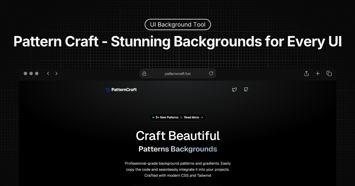

User reviews (0)