
 slimicons.com
No paid content found
slimicons.com
No paid content found
Categories: Icons & Fonts Design & Creativity
Slim is a free & open source icon library. The library consist of icons in a style slimmer than you 🤍.
 Visit website
 Updated: 2026-09-30 07:19
 Language: English (default)
 Access: Normal
 Profile views 0
 Outbound visits 0
Related questions
More questions →What Are Icons and How Do You Choose the Right Ones for an App or Interface?
An icon is a small, simplified graphic that stands in for an action, object, or idea inside a user interface. You choose the right ones by matching style to context, then checking four things before you commit: consistency, scalability, licensing, and platform conventions. This applies whether you are picking a ready-made set for a mobile app or commissioning custom work for a brand.
What an icon is — and what it is not
An icon is functional first. It has to be recognized at a glance, often at 16–24 pixels, and it usually sits next to or inside a control the user can tap or click.
| Element | Purpose | Example |
|---|---|---|
| Icon | Represent an action, object, or state in a UI | A trash can for "delete" |
| Logo | Identify a brand or organization | A company wordmark |
| Illustration | Explain, decorate, or set tone | An onboarding scene |
| Symbol | Carry meaning beyond one product | A checkmark for "done" |
The overlap is real — a logo can be used as an app icon — but the jobs differ. A logo needs to be distinctive; a UI icon needs to be instantly legible, even when it is one of twenty on screen.
Common icon styles and where each works
- Outline (line) icons — thin strokes, open shapes. Good for secondary actions, dense toolbars, and interfaces that need a light, modern feel. They can lose clarity at very small sizes if strokes get too thin.
- Filled (solid) icons — closed shapes with solid mass. Strong at small sizes and for primary navigation, like a bottom tab bar. Mixing filled and outline in the same row usually reads as a state change (selected vs. unselected), so use that deliberately.
- Flat icons — no gradients, shadows, or depth. Fast to render and easy to keep consistent across a large set.
- Skeuomorphic icons — textured, dimensional, imitating real objects. Rare in modern interfaces, but still useful when the metaphor itself carries meaning, such as a leather-bound notebook for notes.
The practical rule: pick one style and stay in it. A screen that mixes flat, skeuomorphic, and outline icons looks assembled rather than designed.
Criteria for choosing an icon set
Consistency
Check stroke width, corner radius, grid size, and visual weight across the whole set. A set where one icon is noticeably heavier than its neighbors will look broken in a toolbar.
Scalability
Ask for the formats and sizes you actually need — commonly SVG for UI, plus PNG exports at 1x, 2x, and 3x for raster use. Vector source matters because you will need to resize, recolor, and adapt icons later.
Licensing
This is where most teams get caught. Read the license for:
- Commercial use in a product you sell
- Modification (recoloring, reshaping)
- Redistribution inside an app bundle or design system
- Attribution requirements
A free set is not automatically free for every use. Check the specific terms rather than assuming.
Platform guidelines
Apple's Human Interface Guidelines and Google's Material Design both publish icon guidance, including recommended sizes and which metaphors are already taken. Following them reduces the chance that users misread your icons. If you are building for one platform, its conventions should usually win over a generic set.
How icons work in UI/UX
Icons speed up recognition and shrink the space a control needs. They work best when paired with a text label, especially for anything unfamiliar — an icon alone is a guess, an icon plus a word is an instruction.
Use icons for:
- Navigation (home, search, profile)
- Common actions (edit, share, delete)
- Status and feedback (success, warning, offline)
Be careful with metaphor. A floppy disk for "save" still works for many users, but a younger audience may not recognize it. When a metaphor is ambiguous, label it.
Steps to source or commission custom icons
- Audit what you need. List every action, object, and state that requires an icon. Group them so related icons share a visual family.
- Define the spec. Decide grid size, stroke width, corner radius, color rules, and export formats before anyone draws anything.
- Choose a path. Use an existing set if your needs are common; commission custom icons if your product has unique concepts, a strong brand system, or a need for a distinctive look.
- Test at real size. View the icons at the smallest size they will appear, on the actual background colors. Problems that are invisible at 200px show up immediately at 20px.
- Document and hand off. Name files predictably, keep the vector source, and record the license. Future you will need it.
For custom work, a studio that has spent decades on icon and interface design — like The Iconfactory, which has crafted icons, apps, and user experiences for clients for over 25 years — is the kind of partner to evaluate against your spec, not instead of it.
Quick decision guide
- Shipping fast, common actions? Use a well-licensed existing set and follow platform guidelines.
- Distinctive brand, unusual concepts? Commission custom icons with a written spec.
- Mixed needs? Start from a base set, then commission only the icons it lacks — but match the style precisely, or the seams will show.
What Are Open-Source UI Element Libraries and How Do They Differ From UI Frameworks?
An open-source UI element library is a collection of individual, ready-made interface pieces—buttons, cards, inputs, toggles, loaders—that you copy into your own project and adapt. A UI framework, by contrast, is a structured system of components, conventions, and often a theming layer that governs how your whole interface is built. The practical difference: an element library gives you a snippet; a framework gives you a way of working. If you need a polished button in ten minutes, reach for the element library. If you're building a 40-screen product with a team, you probably want the framework.
What "open-source UI element library" actually means
The term gets used loosely, so it helps to separate the parts:
- Open-source: the code is publicly available, and the license tells you what you may do with it—copy, modify, redistribute, or use commercially.
- UI element: a single, self-contained piece of interface, usually small enough to read in one sitting. A button with hover states, a pricing card, a search field.
- Library: a browsable, searchable collection of those elements, typically contributed by many different people.
On a site like Uiverse, elements are shared by a community and written in plain CSS or Tailwind. You find one you like, copy the markup and styles, paste them into your project, and adjust colors, spacing, and text to fit. There's no package to install and no build step required—which is exactly the appeal, and also the source of most of the confusion.
Element library vs. UI framework: the core differences
| Dimension | Open-source UI element library | UI framework / design system |
|---|---|---|
| Unit of reuse | A single snippet you copy | A component you import or call |
| Installation | None; paste into your code | Package install, config, sometimes a provider |
| Consistency | Depends on you; each element may look different | Enforced by shared tokens and APIs |
| Theming | Manual edits per element | Central theme/config file |
| Updates | You own the copy; no upstream updates | Version bumps bring fixes and changes |
| Accessibility | Varies per contributor; must be checked | Usually tested and documented |
| Best for | Prototypes, landing pages, small sites, one-off needs | Multi-page apps, teams, long-lived products |
| Learning curve | Low—read the CSS | Higher—learn the API and conventions |
The table isn't a verdict. It's a map of trade-offs. Element libraries win on speed and freedom; frameworks win on consistency and maintenance.
Licensing and attribution: what to check before you paste
This is where people get into trouble, and it's worth slowing down for.
- Find the license. Every element or collection should state one. Common open-source licenses include MIT, Apache-2.0, and BSD. Some projects use copyleft licenses like GPL, which can impose obligations if you redistribute your code.
- Understand what the license permits. MIT and Apache-2.0 are permissive: you can typically use the code in commercial and closed-source projects. Copyleft licenses may require you to release derivative source under the same terms.
- Check attribution requirements. Permissive licenses usually require you to keep the copyright notice and license text somewhere in your project. That's a real obligation, not a formality.
- Look for per-element terms. On community sites, the site's overall terms and the individual contributor's stated wishes may differ. If a contributor asks for credit, honor it.
- When in doubt, ask or avoid. If a snippet has no license at all, you don't have clear permission to reuse it. Treat "no license" as "not open source," even if the code is publicly visible.
This article is general information, not legal advice. For commercial products with real exposure, have someone qualified review the licenses you're relying on.
How to use a community element in your project: a practical workflow
Here's a repeatable process that avoids most of the usual mess.
1. Start from a real need, not a browsing session
Decide what you need first—"a compact primary button with a loading state"—then search. Browsing aimlessly produces a pile of pretty snippets that don't fit together.
2. Copy the smallest version that works
Take the markup and the styles. Strip anything you don't need: demo wrappers, extra animations, decorative layers. Less code means fewer surprises.
3. Convert it to your conventions
If your project uses design tokens or CSS variables, replace hard-coded values:
/* Before: hard-coded */
.button { background: #4f46e5; border-radius: 8px; }

/* After: token-based */
.button { background: var(--color-primary); border-radius: var(--radius-md); }
This one step is what keeps a copied element from looking like a foreign object in your UI.
4. Check accessibility before you ship
Community elements vary widely here. Verify at minimum:
- Keyboard focus is visible and the element is reachable by Tab.
- Color contrast meets WCAG AA (4.5:1 for normal text).
- Interactive elements use semantic HTML (
<button>, not a clickable<div>). - Form inputs have associated labels.
- Motion respects
prefers-reduced-motion.
5. Test in context
Paste it into a real page with real content. Long labels, small screens, and dark mode break more copied elements than anything else.
6. Note where it came from
Keep a short comment or an internal credits file: source, license, date. Future you—and your legal reviewer—will be grateful.
Where element libraries genuinely shine
- Prototypes and demos: you need something clickable today, not a design system.
- Landing pages and marketing sites: a handful of distinctive elements, each custom.
- Filling gaps: your framework lacks one specific component, and you don't want to build it from scratch.
- Learning: reading well-made CSS is one of the fastest ways to improve.
- Small projects: a personal site doesn't need a theming architecture.
Where they fall short
- Consistency at scale: ten elements from ten contributors rarely look like one product.
- Maintenance: you own every copy. When your design changes, you edit each one.
- Accessibility debt: you inherit whatever the contributor did or didn't do.
- No upstream fixes: a bug fixed in the original won't reach your copy.
- Integration friction: different naming conventions, different units, different assumptions about resets.
When to choose which
Choose an element library when the scope is small, the timeline is short, or you need a few distinctive pieces rather than a whole system.
Choose a framework or design system when multiple people build multiple screens over months, when consistency is a product requirement, or when accessibility and theming need to be guaranteed rather than checked.
A hybrid works well for many teams: adopt a framework for the structural components—forms, navigation, layout—and borrow individual elements for the places where you want personality. Just route every borrowed element through the same token and accessibility checks, so it lands as part of your system rather than beside it.
The short version: open-source UI element libraries are a fast, flexible way to get good-looking interface pieces into a project. They are not a substitute for a design system, and the license and accessibility details are the part worth reading carefully.
Website Overview
The available information shows a mix of normal operation and configuration gaps. Depending on how the website is used, these gaps may affect secure access or the consistency of its public presentation.
Domain and Registration
Transfer-protection status is present, helping reduce the risk of unauthorized domain transfers. The domain has about 5 years of registration history; its current configuration provides more context than age alone. The registrar is Cloudflare, Inc., a widely used domain service provider. The domain uses the common .com extension, which is not an independent safety signal.
DNS and Email
Nameservers are provided by Cloudflare, indicating managed DNS hosting. MX records point to the Proton Mail email service. No CNAME was found; the observed records resolve directly to addresses. SPF and DMARC are configured. DKIM status is unknown. TXT records include verification markers for Google. Such markers may also remain after a service stops being used.
TLS and Certificates
The public key uses EC with 256 bits. The server supplied a complete certificate chain. No organization name is present in the certificate; the available fields are consistent with domain validation. The certificate was issued within the Google Trust Services cloud or CDN ecosystem. The certificate's total validity is about 90 days, consistent with a short renewal cycle.
HTTP and Browser Security
The checked browser-security headers were not detected, leaving fewer explicit browser-side safeguards. No X-Powered-By header was found, reducing one common source of backend fingerprinting information. The cf-ray response header indicates a CDN or caching proxy in the delivery path. No obvious internal addresses or debug information were found in the headers. The Server header identifies cloudflare without an exact version.
Technology Stack Analysis
The public page identifies Cloudflare without precise versions, leaving fewer clues for version-specific scanning.
Search and Social Sharing
No homepage canonical URL was detected. If duplicate URLs exist, consolidation may be less explicit. The title has 46 characters, within a common display range. A meta description is present, with 102 characters. The observed directives allow indexing and link following. No Generator meta tag is publicly exposed.
 Hosting and Email
 Cloudflare
 Hosting
 Proton Mail
 Location
 unknown
104.21.85.147
Location
Location unknown
104.21.85.147
 Pages, Search and Sharing
| Meta description | Slim is a free & open source icon library. The library consist of icons in a style slimmer than you 🤍. |
|---|---|
| Canonical URL | Not detected |
| Language | English (default) |
| Twitter Card | Not detected |
Social Sharing Preview
7 fieldsSharing metadata
| og:url | https://slimicons.com |
|---|---|
| og:type | website |
| og:image | https://slimicons.com/meta/social_image.webp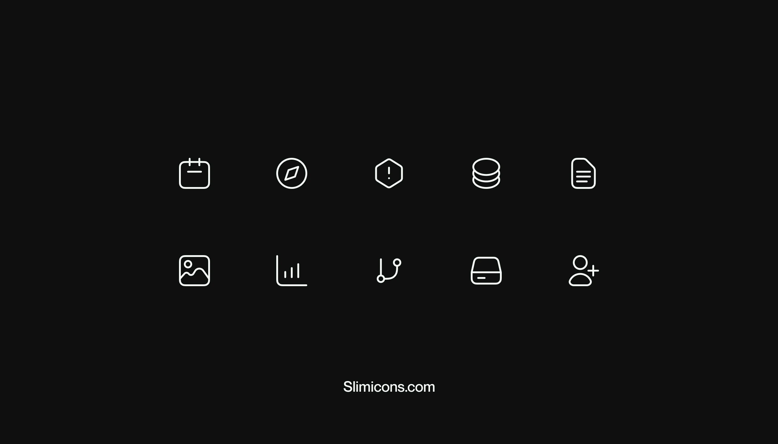 |
| og:title | Slim icons — Free and open source icon library |
| og:locale | en |
| og:site_name | Slim icons |
| og:description | Slim is a free & open source icon library. The library consist of icons in a style slimmer than you 🤍. |
robots.txt (opens in a new tab)
0 rulesNo rules found
No matching rules.
Sitemaps
0No sitemaps found
 Registration details RDAP / WHOIS
| Registrar | Cloudflare, Inc. |
|---|---|
| Registered | 2021-07-20 |
| Expires | 2027-07-20 |
| Domain status | client transfer prohibited |
| Nameservers | matteo.ns.cloudflare.com、virginia.ns.cloudflare.com |
| DNSSEC | unsigned |
 DNS records
| Type | Name | Value | TTL | Priority |
|---|---|---|---|---|
| A | slimicons.com | 104.21.85.147 | 300 | — |
| A | slimicons.com | 172.67.206.173 | 300 | — |
| AAAA | slimicons.com | 2606:4700:3032::6815:5593 | 300 | — |
| AAAA | slimicons.com | 2606:4700:3035::ac43:cead | 300 | — |
| MX | slimicons.com | mail.protonmail.ch | 300 | 10 |
| MX | slimicons.com | mailsec.protonmail.ch | 300 | 20 |
| NS | slimicons.com | matteo.ns.cloudflare.com | 86400 | — |
| NS | slimicons.com | virginia.ns.cloudflare.com | 86400 | — |
| TXT | slimicons.com | google-site-verification=jikIy7-aKX5a3G6HcjuSm0ZUORWTyUnK4zS1gQgJFI0 | 300 | — |
| TXT | slimicons.com | protonmail-verification=b3e46bdabedf98bd895ba741a97963fdb714e47a | 300 | — |
| TXT | slimicons.com | v=spf1 include:_spf.protonmail.ch mx ~all | 300 | — |
| DMARC | _dmarc.slimicons.com | v=DMARC1; p=none | 300 | — |
 TLS and certificates
| Assessment | Normal configuration |
|---|---|
| Supported protocols | TLSv1.2、TLSv1.3 |
| Negotiated protocol | TLSv1.3 |
| Certificate subject | slimicons.com |
| Issuer | Google Trust Services |
| Valid until | 2026-11-23T20:02 · Remaining when checked: 54 days |
| Verification details | Certificate trust: Passed · Hostname match: Passed |
 HTTP response headers
| Header | Value |
|---|---|
| content-type | text/html; charset=utf-8 |
| server | cloudflare |
 Identified technologies
User reviews (0)