Website profiles · Technology insights · Alternatives

websitevice.com

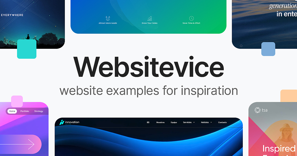
Modern website examples for real-world web design inspiration. Dedicated to makers focused on results not awards

No paid content found
Visit website
Profile views 5 Outbound visits 0 Normal
Website Examples for Design Inspiration on Websitevice Full homepage screenshot

At a glance

Category
Design & Creativity
Language
English
Paid-content signal
No paid content foundObserved
Registered
2023
Hosting
Google Ireland LimitedInferred
HTTPS certificate trusted
PassedObserved
Last updated

Website review

This review may include AI-generated content and is not individually verified. Domain, certificate and other facts come from the observed data on this page.

What is Websitevice?

Websitevice is a gallery of real-world website examples, organized by industry and use case, intended for designers and makers who want practical design inspiration rather than award-show showpieces. Its stated focus is on results over awards, and the examples are grouped into categories such as agency, artist, blog, business, corporate, ecommerce, restaurant, SaaS, and mobile app.

What you'll find there

  • Concrete examples with short descriptions of the design approach, for instance an architecture agency site built around a full-screen image slider, or a design studio using high-contrast sections and bold typography.
  • Category browsing by business type, which is useful when you want references that match a client's sector rather than generic "nice websites" collections.
  • A mix of styles, from light minimal themes to playful dark themes, so you can compare approaches instead of copying a single trend.

Who it suits

  • Freelancers and small studios looking for a starting reference before wireframing a client site.
  • Founders who want to show a developer or designer the kind of look they have in mind.
  • Designers stuck on layout or typography decisions who need quick, sector-relevant examples.

Trade-offs to keep in mind

It is an inspiration index, not a tool: you browse examples and follow links out to the live sites. There is no built-in editor, no templates to download, and no filtering by technical stack. If you need to see how a design behaves across many screens or app states, a UI pattern library is a better fit — for example Mobbin, which the site itself lists among its sponsors.

A practical next step

Pick the category closest to your project, open three examples, and note one specific decision from each — header treatment, color contrast, grid density. Then apply those decisions to your own content rather than reproducing the layout. If your project is a mobile app rather than a website, treat the site's mobile app examples as a starting point only and look for dedicated app-pattern references.

How can I find design inspiration for a specific industry like healthcare or restaurant?

Use the site's industry categories as filters, not as a single gallery. Websitevice lists examples by sector — healthcare, restaurant, hotel, law firm, SaaS and more — so you can narrow the feed to the context you're designing for, then borrow structural ideas rather than copying the surface look.

How to work through it

  1. Pick the closest category (e.g. healthcare, restaurant, corporate, agency).
  2. Open three to five examples and note one decision per site: how the hero is framed, how services or menus are organised, how trust signals (credentials, reviews, locations) appear.
  3. Compare across categories: a restaurant and a hotel solve similar problems — hours, booking, location, imagery — so cross-reading is often more useful than staying in one lane.
  4. Write down the pattern, not the pixels: "full-width photo with a booking bar above the fold" travels well; a specific colour palette usually doesn't.

Matching the example to your actual goal

Your goal Look at What to extract
Build trust fast (clinic, dentist, law firm) Healthcare, Law Firm, Corporate Placement of credentials, staff photos, contact prominence
Drive a booking or visit Restaurant, Hotel, Salon, Spa Menu/hours layout, reservation entry point, map placement
Explain a complex product SaaS, Software, Startup How features are chunked, pricing-page structure, demo calls to action
Sell visual work or a place Portfolio, Real Estate, Travel Image sizing, gallery rhythm, how much text surrounds each image

Useful companions

For interface patterns rather than full pages, Mobbin collects screen-level mobile and web UI references, which helps when you need a component like a booking flow or a filter panel. For editorial and content-led layouts, Awwwards and Land-book cover different ends of the spectrum — the former leans experimental, the latter toward clean landing pages.

A practical starting scenario: you're designing a dental clinic site. Open the healthcare examples, note how each handles the appointment call to action and practitioner bios, then check two restaurant examples purely for how they present opening hours and location without clutter. Combine those two patterns and you have a structure that fits your industry without looking like a template of it.

What are the key design elements in the agency website examples?

The agency examples on Websitevice share a small set of recurring moves: full-bleed imagery, oversized type, and strong contrast between sections. The page describes Fabio Fantolino as built on a full-screen image slider with a bold title, Wagemut as using high-contrast sections and bold typography, Mint & Poppy as a boutique-studio layout, and Duo Design Lab as standing out through bold typography.

What that means in practice

  • Imagery does the selling. A slider or full-width photo lets the work itself be the argument, which suits architecture, interiors and visual studios whose output is photographic.
  • Type carries the personality. When there is little copy, headline size, weight and spacing become the main signal of whether a studio reads as luxurious, playful or technical.
  • Contrast creates rhythm. Alternating light and dark bands makes a long scrolling page feel segmented, so visitors can skim to services, work and contact without reading everything.
  • Restraint keeps it credible. Agency sites are usually short: a statement, selected work, a few client names, contact. The design work is in the pacing, not the volume of content.

Choosing between the approaches

If your priority is… Lean toward Trade-off
Showing visual craft Full-screen image slider Heavy media can slow load on mobile
A strong, memorable identity Bold typography, high contrast Harder to read for long text; needs careful accessibility
A calm, boutique feel Light theme, generous whitespace Can look generic without distinctive type or photography

Next step

Pick two examples that match your discipline, then list which element you are actually copying — the slider, the type scale, or the section rhythm. Copying one element deliberately usually produces a better result than imitating a whole page. For broader patterns beyond agencies, browse the artist and blog sections on Websitevice, since those categories show the same techniques applied to different content.

How do I use Websitevice to improve my own website's design?

Use Websitevice as a browsing-and-comparison tool, not a template shop: you look at real sites grouped by type (agency, artist, blog, business, corporate and more), then adapt the underlying design decisions to your own content. The site's stated focus is "results not awards," so the examples lean toward practical layouts rather than experimental showpieces.

A practical workflow

  1. Pick your category first. The listings are organised by industry and site type, so a bakery owner should start under business or restaurant examples rather than browsing agency work. Relevance beats visual novelty.
  2. Study one example at a time and name what it actually does — full-screen image slider, high-contrast sections, bold typography, article grid, dark theme, video hero. The descriptions on Websitevice call out these devices explicitly, which makes them easy to spot and copy as principles.
  3. Translate, don't clone. If an agency site uses a full-bleed image slider, ask whether your product photos are strong enough to carry it; if a blog uses a three-column home grid, check whether you publish often enough to fill it.
  4. Note the trade-offs. Bold typography and dark themes create impact but demand careful contrast and readable body text. Image-heavy heroes look striking on fast connections and frustrate mobile visitors on slow ones. Minimal white space, as in makeup artist portfolios, puts pressure on photo quality.
  5. Compare two or three examples in your category side by side before deciding. Seeing the same problem solved differently is more useful than copying the first attractive site.

Who benefits most

  • Solo makers and small businesses without a designer, who need a starting direction rather than a blank page.
  • Designers hunting for current patterns across many industries at once.
  • Anyone rebuilding a specific page — a portfolio, a blog index, a services page — who wants several reference points quickly.

Where it stops helping

Inspiration sites show the surface: layout, type, colour, imagery. They don't tell you whether a design converted well, how it performs, or how it was built. Treat every example as a hypothesis to test on your own audience, and keep accessibility and load speed as your own constraints rather than the reference site's.

A useful next step: choose one page of your site, collect three examples from the closest matching category, and write down one concrete change per example — headline size, section order, image treatment — then implement only the change you can justify for your own visitors.

What makes a website example effective for a mobile app?

An effective mobile-app website example works when the page itself feels like the app: one clear action, a visual that shows the interface in use, and a rhythm that survives a small screen. On Websitevice, the "Mobile App" category sits alongside site types such as SaaS, Ecommerce and Portfolio, so the examples are meant to be judged as real-world business pages rather than award entries. The useful signal is not decoration but whether a visitor can tell what the app does, who it is for and what to do next within a few seconds.

What to look for in a strong example

  • A single dominant action. One primary button (download, start free trial, join waitlist) repeated at natural stopping points, not five competing calls to action.
  • Interface proof. Screens, short clips or device mockups that show the actual product, ideally in a real usage moment rather than a floating phone on a gradient.
  • Mobile-first layout. The example should still read well at phone width: short headline, one column, tap targets that are not crowded.
  • Store context. Clear platform cues (iOS, Android, web app) so visitors know whether it applies to them.
  • Social proof tied to the promise. Ratings, user counts or short quotes placed near the download button, not buried in the footer.
  • Fast, light pages. App audiences often arrive from social or ads on mobile connections, so heavy hero video is a trade-off worth noticing.

A quick comparison of common approaches

Approach Best for Trade-off
Single-screen hero with one download button Consumer apps with a simple promise Little room to explain features
Scrolling story with screenshots per feature Apps solving a multi-step problem Longer page, needs tight copy
Video or animated demo in the hero Visual or novel interactions Slower load, harder to skim
Waitlist or early-access page Pre-launch apps No store proof yet, relies on email capture

A concrete scenario

Suppose you are launching a habit-tracking app. A useful example to study is a page that opens with a plain-language headline ("Build one habit at a time"), shows three real app screens in sequence, and keeps a single "Get the app" button visible as you scroll. Compare that with a page that leads with a stylised 3D phone and no readable interface; the first tells a visitor what they get, the second only signals that design mattered.

Next step

Pick two or three examples from the Mobile App group on Websitevice and open each on your phone. Note where your thumb naturally expects a button, how long it takes to understand the product, and whether the screenshots answer your first question. Those three checks will tell you more than any list of visual trends.

Are there examples of websites with dark themes or playful designs?

Yes. Websitevice’s gallery includes both dark-themed sites and more playful, personality-led designs, so it can work as a starting point if you are choosing a direction for a portfolio, blog, music or small-business site.

H3 Dark themes

  • Sierra Ferrell — described as a music artist example that “embraces a playful and decorative dark theme.” That combination is useful for performers, events or creative portfolios where a straight corporate look would feel too stiff.
  • Fernando Mastrangelo — a sculptor example with a “modern light theme,” included here as the opposite reference: if your work photography is already dramatic, a light background can keep the focus on the pieces.
  • The Beautiful Truth — a business blog example with a “supportive light theme,” useful if you want readability first and only occasional dark accents.

H3 Playful designs

  • Laavu Coaching — a business example that “has a lot of character,” which suits coaches, consultants or small studios that want to feel human rather than institutional.
  • Emily Hunter — a makeup artist example using “impactful photos surrounded by negative white space,” a playful-but-clean approach for image-heavy personal brands.
  • Duo Design Lab and Wagemut — agency examples built on bold typography and high-contrast sections, a louder style that can read as playful when paired with informal copy.

H3 How to choose between them Dark themes tend to flatter photography, video and music, and they make colour accents pop. The trade-off is that body text and form fields need more care, and some older screens make dark greys look muddy. Playful, high-contrast designs stand out in a crowded feed, but they date faster and can undermine trust for legal, healthcare or finance audiences.

A practical next step: pick two references that match your content type — one dark, one light or playful — and sketch your homepage hero in both. If your images or video still look strong in the light version, you probably do not need a dark theme to carry the design.

For more real-world examples by category, browse Websitevice. Related inspiration sources include Mobbin for app and web UI patterns.

Related questions

More questions →
Does Aldersgate United Methodist Church Have a Mobile App?

As of the information available on the church's website, Aldersgate United Methodist Church in Wichita, Kansas does not advertise a dedicated mobile app. The site presents itself as the primary online hub for the congregation, with its mission of "Making Disciples of Jesus Christ for the Transformation of the World" front and center. If a mobile app exists, it is not prominently featured on the homepage. The most reliable way to confirm is to contact the church office directly or check the website for any new announcements.

That said, "no app advertised" is not the same as "no app at all." Churches sometimes launch apps quietly, link them only in weekly bulletins, or roll them out through a congregation-wide email. This article explains what a church mobile app usually includes, how to verify whether Aldersgate has one, and how to stay connected in the meantime.

What a Church Mobile App Typically Offers

Most church apps are built around a handful of core functions. If Aldersgate launches or already operates one, you can reasonably expect some combination of the following:

  • Sermons and worship — audio or video of past services, sometimes with notes or discussion questions.
  • Events calendar — worship times, Bible studies, youth group meetings, outreach days, and seasonal services.
  • Giving — online donations via credit card, debit card, or bank transfer, often with recurring gift options.
  • Prayer requests — a form or feed where members can submit and pray for needs.
  • Groups and ministries — sign-ups, rosters, and communication for small groups, choirs, or volunteer teams.
  • Push notifications — reminders for services, weather cancellations, or special announcements.
  • Connection cards — a digital way for first-time visitors to share contact information.

Not every app includes all of these. Some churches use a general-purpose platform that bundles them together; others rely on separate tools for giving and communication.

How to Check Whether Aldersgate Has an App

Because app availability changes and the website may not always reflect the latest tools, verify through more than one channel:

  1. Search the website. Look for a menu item labeled "App," "Mobile," "Connect," or "Media." Check the footer, too, since app links are sometimes placed there.
  2. Search your phone's app store. Try terms like "Aldersgate United Methodist," "Aldersgate Wichita," or "Aldersgate Church." Be careful to match the correct city and denomination, since other churches share the Aldersgate name.
  3. Call or email the church office. This is the fastest way to get a definitive answer. Ask specifically: "Do we have a mobile app, and if so, what is it called and where do I download it?"
  4. Ask an usher or greeter on Sunday. They often know about new tools before they appear online.
  5. Check the weekly bulletin or newsletter. App launches are frequently announced there first.

If you find an app, confirm it is officially affiliated with the church before entering any personal or payment information.

If There Is No App: Other Ways to Stay Connected

A dedicated app is convenient, but it is not the only way to remain plugged into church life. These alternatives cover most of what an app would do:

Need Alternative
Worship times and location Church website homepage
Sermons Website media page, podcast, or social media
Events Website calendar, bulletin, or email newsletter
Giving Online giving link on the website, or giving during service
Prayer requests Email, phone call, or prayer chain
Announcements Email newsletter, social media, or Sunday bulletin

For a first-time visitor, the simplest starting point is the website's contact page: send a message introducing yourself and ask how the church prefers to communicate. For a long-time member, the church office can add you to the email list or connect you with the right ministry leader.

A Practical Checklist for Getting Connected

Use this sequence whether or not an app exists:

  1. Visit the church website and note the worship times and address.
  2. Find the "Contact" or "About" page and save the office phone number and email.
  3. Sign up for the email newsletter if a sign-up form is available.
  4. Follow the church on any social media accounts linked from the site.
  5. Ask the office directly about a mobile app, online giving, and prayer request channels.
  6. If an app is confirmed, download it, create an account, and enable notifications for the updates you want.

A Note on Accuracy

App availability, features, and download links can change at any time, and a website may lag behind those changes. Nothing in this article should be treated as a guarantee that Aldersgate United Methodist Church does or does not currently offer an app. Treat the church office as the authoritative source, and confirm details before relying on any tool for giving or personal information.

If you are a member or visitor hoping for an app, it is also reasonable to ask the church whether one is planned. Congregations often gauge interest before investing in a new platform, and a simple question can move the conversation forward.

What types of website examples can I find on Websitevice?

Websitevice is a curated gallery of real-world website examples organized by industry and site type, intended for design inspiration rather than awards. Based on its homepage, you can browse categories including Agency, Artist, Blog, Business, Corporate, and many more (Accounting, Ecommerce, SaaS, Restaurant, Portfolio, Nonprofit, and others). Each entry pairs a real site with a short note on its design approach, so you can quickly see both the example and why it was included.

How the examples are organized

The site groups examples into category pages, each linked from the homepage with a "»" marker. The visible categories on the page are:

  • Agency examples
  • Artist examples
  • Blog examples
  • Business examples
  • Corporate examples

The page also lists a much longer set of tags covering other niches, including Accounting, Author, Bakery, Coffee Shop, Community, Construction, Consulting, Dentist, Directory, Ecommerce, Education, Event, Fitness, Gaming, Government, Healthcare, Hotel, Informational, Law Firm, Marketplace, Mobile App, Modeling, News, Newsletter, Nonprofit, Personal, Podcast, Portfolio, Product, Real Estate, Restaurant, SaaS, Salon, Services, Software, Spa, Startup, and Travel.

What each example includes

Every listing follows a consistent, minimal format:

  • Site name — the real website being shown.
  • A one-line design description — what makes the design notable.

For example, under Agency examples, Fabio Fantolino is described as an architecture agency site built on a full-screen image slider background with a bold title. Under Artist examples, Sierra Ferrell is noted for a playful, decorative dark theme. Under Blog examples, Everyday UX is highlighted for an article grid and multiple theme switches.

Real sites, not concepts

The examples are drawn from actual, live websites rather than mockups or concept designs. That matters if your goal is to study how real businesses, studios, and creators handle layout, typography, color, and navigation in production.

How to use the gallery

  1. Pick the category closest to your project (e.g., SaaS, Restaurant, Portfolio).
  2. Open a few examples and note the specific design trait called out in the description.
  3. Compare how different sites in the same category solve the same problem — for instance, how several agency sites use bold typography versus full-screen imagery.
  4. Use the notes as a starting vocabulary when briefing a designer or planning your own layout.

If you are looking for inspiration by industry rather than by overall style, the category structure is the fastest entry point; if you want to see a specific technique in context, scan the one-line descriptions for the trait you care about.

What Is Websitevice?

Websitevice is a curated gallery of real-world website examples, organized by industry and site type, intended as design inspiration for makers who care about results rather than awards. If you're a designer, developer, or founder looking for concrete references before starting a project — rather than abstract trend articles — this is what the site offers.

What you'll find on the site

The homepage presents itself as "Real-world web design inspiration for makers focused on results not awards." The core value is a browsable set of live website examples, each with a short editorial note describing the design approach behind it.

Examples are grouped into categories, including:

  • Agency
  • Artist
  • Blog
  • Business
  • Corporate

The broader tag list on the page also covers Accounting, Author, Bakery, Coffee Shop, Community, Construction, Consulting, Dentist, Directory, Ecommerce, Education, Event, Fitness, Gaming, Government, Healthcare, Hotel, Informational, Law Firm, Marketplace, Mobile App, Modeling, News, Newsletter, Nonprofit, Personal, Podcast, Portfolio, Product, Real Estate, Restaurant, SaaS, Salon, Services, Software, Spa, Startup, and Travel.

How the examples are presented

Each entry pairs a named site with a one-line description of its design choices, so you can judge relevance before clicking through. A few from the page:

Category Example Design note
Agency Fabio Fantolino Architecture agency site built on a full-screen image slider background and bold title
Agency Wagemut High-contrast sections and bold typography
Artist Fernando Mastrangelo Sculptor site with a modern light theme and large work photography
Artist Sierra Ferrell Playful, decorative dark theme
Blog Undark Unique header with vertical links and earthy colors
Blog Everyday UX Article grid with multiple theme switches
Business Builders And Backers Green and red color combination
Business SemiQon Dynamic video hero section

This format is useful when you need a starting point for a specific brief — for instance, "a dark-theme portfolio for a musician" or "a light, photography-led site for a sculptor" — and want to see how others solved it.

Sponsors and related tools

The page includes a sponsors section listing design and AI tooling:

  • Mobbin — real-world UI & UX design inspiration with 500k+ screens from 1,200+ mobile & web apps
  • Wonder — generate AI designs, edit them, and work with your code context on the same canvas
  • Repaint — an AI website builder that uses your existing resources to generate a custom website

These are third-party products featured on the site, not part of Websitevice itself.

When it's useful — and when it isn't

Use Websitevice when you want:

  • Quick visual references filtered by industry or site type
  • A sense of current layout and typography choices across niches
  • A starting point for mood boards or client conversations

It's less suited to tasks like:

  • Finding code, templates, or downloadable assets — the page describes examples, not resources
  • Comparing tools or pricing — no pricing information is presented on the page
  • Deep case studies — descriptions are brief, one line per example

Practical way to use it

  1. Pick the category closest to your project (e.g., SaaS, Restaurant, Portfolio).
  2. Scan the one-line notes to shortlist two or three examples whose described approach matches your goal.
  3. Open the live sites to inspect layout, typography, and color in context.
  4. Note recurring patterns in your niche before committing to a direction.

The site's framing — "results not awards" — signals a bias toward practical, working websites over showcase-only design, which makes it a reasonable first stop when you need grounded references rather than aspirational ones.

How to Use Websitevice for Web Design Inspiration

Websitevice is a gallery of real-world website examples organized by industry and site type, and you can use it by browsing a category that matches your project, then studying the layout, color, and typography choices described for each example. It works best when you already know what kind of site you're building — an agency page, a portfolio, a blog, or a business site — and want concrete references rather than award-driven showcases. The site describes itself as "real-world web design inspiration for makers focused on results not awards," so expect practical examples over experimental ones.

What you'll find on Websitevice

The gallery is grouped into browsable categories, each with named examples and a short note on what makes the design distinctive. Based on the site's own listings, the main categories include:

  • Agency examples — e.g., Fabio Fantolino (full-screen image slider background with bold title), Wagemut (high-contrast sections and bold typography), Mint & Poppy (boutique studio), Duo Design Lab (bold typography)
  • Artist examples — e.g., Fernando Mastrangelo (modern light theme, large work photography), Craig David (personal photo slider with vibrant header backgrounds), Emily Hunter (impactful photos with negative white space), Sierra Ferrell (playful, decorative dark theme)
  • Blog examples — e.g., Undark (vertical header links, earthy colors), Everyday UX (article grid, multiple theme switch), The Beautiful Truth (3-column home grid, light theme), Lauren Tan (easy navigation)
  • Business examples — e.g., Builders And Backers (green and red color combo), Laavu Coaching (characterful), Knoll Ventures (tech-inspired), SemiQon (dynamic video hero)
  • Corporate examples — e.g., Westminster Group Solutions

The site also lists many additional tags for filtering or browsing, including Accounting, Bakery, Coffee Shop, Construction, Consulting, Dentist, Ecommerce, Education, Event, Fitness, Gaming, Government, Healthcare, Hotel, Law Firm, Marketplace, Mobile App, Nonprofit, Podcast, Real Estate, Restaurant, SaaS, Salon, Software, Spa, Startup, and Travel.

How to turn an example into usable inspiration

Browsing is the easy part; the value comes from extracting specific, transferable decisions. For each example you like, work through these dimensions:

  1. Layout structure — Is it a full-screen slider, a grid, or high-contrast stacked sections? Note how the header and content blocks are arranged.
  2. Color approach — Look at the described palette (e.g., earthy tones, green-and-red combo, light theme) and how it supports the brand.
  3. Typography — Note whether the design leans on bold type as a focal point or keeps type quiet to let imagery lead.
  4. Imagery role — Some examples use large work photography or vibrant photo sliders; others rely on negative white space.
  5. Theme behavior — A few examples (like Everyday UX) offer theme switching, which tells you the design accounts for user preference.

Write these observations down next to your own project's goals, then decide which two or three traits actually fit your content and audience.

A practical workflow

  • Start with your category. If you're building a SaaS marketing site, go straight to the SaaS or Software tags rather than scrolling the whole gallery.
  • Collect 3–5 references, not 20. Too many references blur into noise; a small set forces you to choose.
  • Match the reference to your content type. A photo-heavy artist layout won't translate to a text-heavy law firm site.
  • Extract rules, not pixels. Instead of copying a specific hero, note the principle — "bold title over full-bleed image" — and apply it to your own assets.
  • Check the description text. Websitevice pairs each example with a one-line design note; that note is often the fastest way to understand the intent behind the design.

Common pitfalls

  • Copying a look that doesn't fit your content. A dark, decorative theme suits a musician but can hurt readability for a documentation-heavy blog.
  • Ignoring the "results not awards" framing. These are working sites, so prioritize clarity and conversion patterns over novelty.
  • Skipping the category filter. Browsing everything makes it harder to find examples relevant to your industry.

What Websitevice is not

Websitevice is a curated example gallery, not a design tool or template marketplace. The page evidence shows no pricing, sign-up, or download features — it presents examples and short descriptions for reference. Treat it as a starting point for direction, then build and test your own design against your actual content and users.

How Is Websitevice Different From Other Design Inspiration Websites?

Websitevice is a website-example gallery that positions itself around real-world web design rather than award-winning work. Its own tagline states it is "dedicated to makers focused on results not awards," and the examples are organized by industry and site type — agency, artist, blog, business, corporate, and more — with a short note on what each design actually does. If you want to see how working sites in a specific category handle layout, typography, and color, that framing is the main difference from award-oriented galleries.

The core distinction: results over awards

Most design inspiration sites are built around recognition. Entries are curated because they won something, were nominated, or represent a high-water mark of visual craft. That produces beautiful work, but it often skews toward portfolio pieces, concept sites, and agency self-promotion rather than sites that had to serve a business goal.

Websitevice inverts that filter. Its stated audience is "makers focused on results not awards," and its examples are drawn from real, operating websites. The value is practical: you see how a working architecture studio, a coaching business, or a science blog actually presents itself, not how a designer would present it in a case study.

What the examples actually show

Each entry pairs a named site with a one-line description of the design mechanism behind it. That is a meaningful difference from galleries that show a thumbnail and a link. From the page evidence, the descriptions read like this:

Category Example What the note describes
Agency Fabio Fantolino Full-screen image slider background with bold title
Agency Wagemut High-contrast sections and bold typography
Artist Fernando Mastrangelo Modern light theme with large work photography
Artist Craig David Personal photo slider with vibrant header backgrounds
Blog Undark Unique header with vertical links and earthy colors
Blog Everyday UX Article grid with multiple theme switch options
Business Builders And Backers Green and red color combination
Business SemiQon Dynamic video hero section
Corporate Westminster Group Solutions Corporate site example (description truncated in source)

The pattern is consistent: the note tells you the technique, not just the vibe. That makes the gallery more useful as a reference when you are trying to solve a specific problem — for instance, "how do I make a blog header feel distinctive without a huge image?" — because you can scan for the mechanism rather than the aesthetic.

Breadth of categories

The site organizes examples across a wide set of types, which matters if you work outside the usual SaaS/portfolio bubble. The listed categories include:

  • Agency, Artist, Author, Blog, Business
  • Coffee Shop, Community, Construction, Consulting, Corporate
  • Dentist, Directory, Ecommerce, Education, Event
  • Fitness, Gaming, Government, Healthcare, Hotel
  • Informational, Law Firm, Marketplace, Mobile App, Modeling
  • News, Newsletter, Nonprofit, Personal, Podcast
  • Portfolio, Product, Real Estate, Restaurant, SaaS
  • Salon, Services, Software, Spa, Startup, Travel

That is a broader industry spread than most inspiration galleries, which tend to concentrate on tech, design, and creative portfolios. If you are building for a dentist, a law firm, or a restaurant, having examples in those exact categories is more directly useful than browsing a feed of startup landing pages.

Where it fits in a design workflow

Websitevice is best used as a reference layer, not a template source. The examples are real sites, so you are looking at production decisions — what a full-screen slider does to load time and mobile behavior, how a three-column blog grid holds up with uneven content, whether a dark decorative theme suits a music artist but not a healthcare provider.

A practical way to use it:

  1. Pick the category closest to your project.
  2. Read the one-line technique note for each example.
  3. Open the ones whose mechanism matches a problem you have.
  4. Note the specific choice (contrast, grid, hero type) and test it against your own content.

What it is not

The page evidence does not indicate pricing, accounts, or gated content, so treat it as a browsable gallery rather than a tool with a free tier. It also does not present itself as a UI pattern library or a screenshot database — the sponsor listings (Mobbin, Wonder, Repaint) point to separate products for those needs. Websitevice's contribution is the curation angle: real sites, labeled by what their design does, sorted by industry.

If your goal is to win an award or study cutting-edge visual experimentation, an award gallery will serve you better. If your goal is to ship a site that works for a specific kind of business, the results-oriented, category-sorted approach here is the reason to use it.

Website Overview

Page metadata, canonical configuration and social previews work together to provide more consistent search and sharing presentation.

Domain and Registration

Transfer-protection status is present, helping reduce the risk of unauthorized domain transfers. The domain has about 3 years of registration history; its current configuration provides more context than age alone. The registrar is Tucows Domains Inc., a widely used domain service provider. The domain uses the common .com extension, which is not an independent safety signal.

DNS and Email

Nameservers are provided by siteground.net, indicating managed DNS hosting. MX records point to the mailspamprotection.com email service. No CNAME was found; the observed records resolve directly to addresses. SPF and DMARC are configured. DKIM status is unknown. TXT records include verification markers for Google. Such markers may also remain after a service stops being used.

TLS and Certificates

The certificate uses an RSA 2048-bit public key, offering broad client compatibility. The server supplied a complete certificate chain. No organization name is present in the certificate; the available fields are consistent with domain validation. The certificate was issued by Let's Encrypt, commonly associated with automated certificate services. The certificate's total validity is about 89 days, consistent with a short renewal cycle.

HTTP and Browser Security

The checked browser-security headers were not detected, leaving fewer explicit browser-side safeguards. No X-Powered-By header was found, reducing one common source of backend fingerprinting information. No obvious internal addresses or debug information were found in the headers. The Server header identifies nginx without an exact version. No explicit CDN or WAF marker was found in the response headers.

Technology Stack Analysis

The public page identifies Google Analytics, nginx without precise versions, leaving fewer clues for version-specific scanning.

Search and Social Sharing

Open Graph is partially configured; og:type is missing. Twitter Card metadata is configured. The title has 54 characters, within a common display range. A meta description is present, with 112 characters. The observed directives allow indexing and link following.

Hosting and Email

DNSsiteground.net
HostingGoogle Ireland Limited
Emailmailspamprotection.com
Approximate IP geolocation (inferred; a CDN or proxy may differ from the origin server) The Netherlands flagGroningen, The Netherlands Inferred 35.214.215.226

Registration details

RDAP / WHOIS

RegistrarTucows Domains Inc.
Registered2023-02-13
Expires2027-02-13
Domain statusclient transfer prohibited、client update prohibited
Nameserversns1.siteground.net、ns2.siteground.net
DNSSECunsigned

DNS records

DNS

TypeNameValueTTLPriority
Awebsitevice.com35.214.215.22686400—
MXwebsitevice.commx10.antispam.mailspamprotection.com8640010
MXwebsitevice.commx20.antispam.mailspamprotection.com8640020
MXwebsitevice.commx30.antispam.mailspamprotection.com8640030
NSwebsitevice.comns1.siteground.net86400—
NSwebsitevice.comns2.siteground.net86400—
TXTwebsitevice.comgoogle-site-verification=SjVKdfMetAlLgWaq3ZPrL2Uhdt68YKQY6mpATrG5ByQ86400—
TXTwebsitevice.comv=spf1 +a +mx include:websitevice.com.spf.auto.dnssmarthost.net ~all86400—
DMARC_dmarc.websitevice.comv=DMARC1; p=none; aspf=r; adkim=r;86400—

TLS and certificates

TLS / SSL

AssessmentNormal configuration
Supported protocolsTLSv1.2、TLSv1.3
Negotiated protocolTLSv1.3
Certificate subject*.websitevice.com
IssuerLet's Encrypt
Valid until2026-12-30T02:21 · Remaining when checked: 85 days
Verification detailsCertificate trust: Passed · Hostname match: Passed

HTTP response headers

HTTP

HeaderValue
content-typetext/html; charset=UTF-8
servernginx

Identified technologies

Google Analyticsnginx

Pages, Search and Sharing

Meta descriptionModern website examples for real-world web design inspiration. Dedicated to makers focused on results not awards
Canonical URLhttps://websitevice.com/
LanguageEnglish (default)
Twitter Cardsummary_large_image
All bots 0 allowed · 0 disallowed
  • IntervalCrawl delay 10 seconds

No sitemaps found

User reviews (0)

  • No reviews yet.