
 简体中文
简体中文 English
Website review
This review may include AI-generated content and is not individually verified. Domain, certificate and other facts come from the observed data on this page.
What is isUpMap?
isUpMap is a real-time status heatmap for more than 80 popular internet services. It shows, at a glance, whether each one is up, degraded, or down right now, rather than making you check a dozen separate status pages. The dashboard is organized by category: AI (OpenAI, Anthropic, xAI, Groq, Perplexity, Hugging Face, ElevenLabs, Cursor), developer and cloud (GitHub, Cloudflare, AWS, Vercel, Netlify, npm, Docker, GitLab, Supabase, Firebase), payments (Stripe, Coinbase, Shopify, Plaid, Square, Klarna), communication (Discord, Slack, Zoom, Twilio, SendGrid, Resend, Intercom), and productivity and media (Notion, Figma, Dropbox, Reddit, Linear, Airtable, Canva, Datadog).
It also lists recent incidents and supports per-service views, so you can go straight to a question like "is GitHub down?" instead of scanning the whole grid. The live dashboard requires JavaScript and is best viewed on desktop.
Who it's for
- Developers and on-call engineers who need a fast first check before digging into a provider's own status page.
- Teams that depend on several vendors at once and want to spot whether an outage is widespread or isolated to one service.
- Anyone troubleshooting a sudden failure — a payment that won't process, a deploy that won't finish, a chat app that won't load.
How to use it
- Open the heatmap and scan for red or amber tiles in the categories you rely on.
- If several services in different categories look degraded, suspect a broader network or cloud issue rather than a single vendor.
- Click through to the specific service for incident history and per-service uptime before you escalate.
- Cross-check the vendor's official status page for authoritative details, since an aggregator's view can lag or interpret status differently.
Trade-offs
The breadth is the main draw: one page instead of many bookmarks. The limits are that it depends on third-party status feeds, needs JavaScript, and is desktop-oriented, so it's less convenient on a phone during an incident. Treat it as a quick triage layer, not a replacement for the provider's own incident communications.
A practical next step: bookmark the directory and, for the two or three services your team depends on most, also save their official status pages — for example GitHub Status for GitHub or OpenAI Status.
How can I check if a specific service like GitHub or OpenAI is down right now?
Open isUpMap and use its heatmap to see whether GitHub, OpenAI or any other listed service is currently up, degraded or down. The dashboard is JavaScript-dependent, so if the live view does not load, enable JavaScript or try a desktop browser — the site itself notes it is best viewed on desktop.
How to check a specific service
- Open the heatmap and scan for the service name (GitHub, OpenAI, Anthropic, AWS, Stripe and others are grouped by category such as AI, Developer & Cloud, Payments and Communication).
- Read the colour or status label: up, degraded or down.
- If you need more than the current moment, look for that service's own page, which the site says includes per-service uptime and incident history.
- Cross-check with the provider's official status page before acting on a red tile, especially for anything customer-facing.
A practical example
Suppose your CI pipeline starts failing and you suspect GitHub. Checking the heatmap first tells you whether the problem is broad (GitHub down for everyone) or local (your network, token or runner). If the tile shows degraded or down, you can pause deploys and point colleagues to the incident history instead of debugging your own code. If it shows up, the fault is more likely on your side.
Decision criteria
| Situation | What to do |
|---|---|
| Heatmap shows down and your provider's status page agrees | Wait, or use a fallback provider |
| Heatmap shows up but your requests fail | Check your network, credentials and local configuration |
| Status is degraded | Expect slow or intermittent responses; avoid non-urgent deploys |
| You need historical context | Use the per-service uptime and incident history rather than the live tile alone |
For a quick answer to "is GitHub down right now?", the heatmap is the fastest first stop; treat it as a signal to investigate, not as a final verdict.
What does it mean if a service shows as degraded instead of down on the heatmap?
A "degraded" status means the service is still reachable and usually still usable, but it is not operating normally. A "down" status means the service is failing to respond or is broadly unavailable. On a heatmap like isUpMap, degraded is the middle state between healthy and down: partial outages, elevated error rates, slow responses, or problems affecting only some regions, features, or users.
In practice, the difference matters for what you do next:
- Degraded: expect slowness, intermittent errors, failed requests, or missing functionality. You can often keep working, but with retries, fallbacks, or reduced expectations.
- Down: assume requests will fail outright. Switch to a backup, pause dependent jobs, or communicate an outage.
A concrete scenario: if isUpMap shows GitHub as degraded while your CI pipeline is failing, the problem may be on GitHub's side rather than in your code. If it shows a payment provider as degraded, you might keep checkout running but watch for failed charges and queue retries instead of assuming every decline is a customer issue.
Treat degraded as a signal to verify, not a verdict. Check the provider's own status page and your own monitoring before escalating, because "degraded" can reflect a narrow issue that does not affect you at all.
Which internet services does isUpMap monitor in categories like AI, developer tools, and payments?
isUpMap is a live status heatmap that tracks whether 80+ popular internet services are up, degraded or down, grouped into categories rather than listed as one flat directory. The page evidence names the following services as monitored:
| Category | Services named on the page |
|---|---|
| AI | OpenAI, Anthropic, xAI, Groq, Perplexity, Hugging Face, ElevenLabs, Cursor |
| Developer & Cloud | GitHub, Cloudflare, AWS, Vercel, Netlify, npm, Docker, GitLab, Supabase, Firebase |
| Payments | Stripe, Coinbase, Shopify, Plaid, Square, Klarna |
| Communication | Discord, Slack, Zoom, Twilio, SendGrid, Resend, Intercom |
| Productivity & Media | Notion, Figma, Dropbox, Reddit, Linear, Airtable, Canva, Datadog |
Who this fits
The mix suits people whose work depends on several vendors at once: an engineering team that ships through GitHub and Vercel while running on AWS; a support or ops team watching Slack, Zoom and Twilio; a finance or e-commerce team relying on Stripe, Shopify or Plaid; and anyone building on AI APIs who wants to know whether a failure is theirs or the provider's.
How to use it
Before you start debugging, check the relevant category to rule out a provider-side outage. If you depend on one service heavily, the page's per-service views (for example, "is GitHub down?") go deeper than the category heatmap, and the incident history helps you tell a one-off blip from a recurring pattern.
Trade-offs to keep in mind
A heatmap is a fast first signal, not a diagnosis: a green tile means the provider reports healthy, not that your specific region, account or API key is fine. The dashboard also relies on JavaScript, and the page notes it is best viewed on desktop, so a phone check may be less useful. For incident detail and post-mortems, the providers' own status pages remain the authoritative source.
How can I customize the isUpMap dashboard to track only the services I care about?
The page describes a Customize section on isUpMap, so the dashboard is built to be filtered down rather than showing all 80+ services at once. The exact interaction isn't spelled out in the page text, but the intent is clear: you choose which services appear in your heatmap instead of scanning the full directory.
Practical approach
- Open the live dashboard (JavaScript must be enabled — the page states the live up/down heatmap, incident history and per-service uptime won't render without it).
- Find the Customize control and select only the services relevant to you, for example:
- A solo developer: GitHub, Vercel, npm, Supabase, Stripe
- An agency running client sites: Cloudflare, AWS, Netlify, SendGrid, Slack
- An AI product team: OpenAI, Anthropic, Hugging Face, ElevenLabs, Cursor
- Pair your custom view with the Recent incidents list so you can tell a genuine outage from a service you simply don't use.
Why a narrow view helps
A full 80-service heatmap is useful for spotting broad internet trouble, but it's noisy when you're trying to answer one question: "is my stack down, or is it me?" Trimming to the services you actually depend on makes a red cell actionable — you know immediately whether it affects your users.
Trade-off to weigh
If you filter too aggressively, you lose the early-warning value of seeing a shared dependency fail (a cloud provider or DNS layer, for instance) before it reaches the services you track directly. A reasonable middle ground is a small core list plus one or two infrastructure providers underneath it.
Next step
If you want a second opinion during an incident, cross-check the provider's own status page — for example GitHub Status or OpenAI Status — alongside your customized isUpMap view, since first-party pages often carry the most specific incident notes.
Does isUpMap provide historical incident data or per-service uptime statistics?
Yes. isUpMap is built around both: it shows a live up/down heatmap for more than 80 popular services, and the page states that enabling JavaScript reveals incident history and per-service uptime alongside that heatmap. There is also a "Recent incidents" section in the page structure, so the site is not limited to a single moment-in-time snapshot.
H3 Practical uses
- Incident history helps you judge whether a problem is a one-off or a recurring pattern — useful when deciding whether to add a fallback provider or adjust your own retry/alerting logic.
- Per-service uptime gives a rough reliability signal for services you depend on, which is handy during vendor comparisons or architecture reviews.
- Live status answers the immediate question ("is GitHub down right now?") before you dig into trends.
H3 What to keep in mind
The page notes the live dashboard requires JavaScript, and it says it is best viewed on desktop. So on a phone or with scripts blocked, you may only see the static service list rather than the heatmap, incident history and uptime figures. The coverage spans AI tools, developer and cloud platforms, payments, communication, and productivity services, so it is broad rather than deep on any one vendor.
H3 Next step
If you are evaluating a specific dependency, open its individual page (for example, the GitHub or OpenAI status page linked from the directory) and compare its incident history against the official status page for that vendor — GitHub Status or OpenAI Status. Treat third-party aggregators as a convenience layer for spotting patterns across many services, and the vendor's own page as the authoritative record for a single service.
 Cloudflare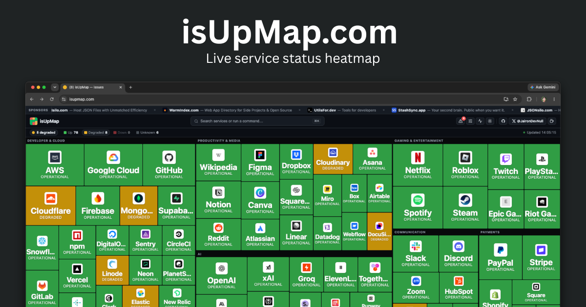

User reviews (0)