
 简体中文
简体中文 English
Website review
This review may include AI-generated content and is not individually verified. Domain, certificate and other facts come from the observed data on this page.
What is Proto.io?
Proto.io is a browser-based prototyping tool for building interactive web, iOS and Android prototypes without writing code. Its drag-and-drop editor is aimed at UX designers, product managers, entrepreneurs and marketers who want to move from a rough wireframe to something that behaves like a real app.
What you can do with it
- Start from ready-made parts. The page_evidence lists 250+ UI components, 1000+ templates and 6000+ assets (icons, stock images, sound effects), so you can assemble screens quickly instead of drawing every element.
- Add realistic behavior. More than 80 events and 40 actions support interactions such as scrolling areas and multi-directional navigation, letting a prototype respond the way users expect.
- Animate transitions. 18 built-in screen transitions (slide, push, pop and others) plus timeline-based animations let you control timing, easing and properties like opacity, color, size and rotation.
- Preview and share. Prototypes can be viewed in a web or mobile browser, through native iOS and Android apps, and shared with others.
Where it fits
A practical example: a product manager wants to test an onboarding flow with five stakeholders before development starts. They build the screens from a template, wire up button taps and a slide transition, then share a preview link for feedback. That is faster than static mockups and avoids involving engineers.
The trade-off is that Proto.io is a prototyping environment, not a production build tool—its value depends on how much interactivity your review process needs. If a simple clickable wireframe is enough, the large component and animation library may be more than you need; if you want to demonstrate motion and state changes convincingly, it is well suited.
A useful next step is to check the free trial and the pricing page at Proto.io to see whether the plan limits match how many prototypes you expect to maintain.
How does Proto.io compare to other prototyping tools like Figma or Adobe XD for building interactive mobile app prototypes?
Proto.io is strongest when the prototype itself needs to feel close to a finished app—real gestures, screen transitions, and micro-animations—rather than when you need one shared file for design and prototyping. Figma and Adobe XD are design-first tools with prototyping built in; Proto.io is a dedicated prototyping tool. That distinction drives most of the practical differences.
Where each approach fits
| Need | Proto.io | Figma | Adobe XD |
|---|---|---|---|
| High-fidelity, animation-heavy mobile prototypes | Core strength: timeline-based animation, 18 screen transitions, 80+ events and 40+ actions per the site | Good for standard flows; advanced motion takes workarounds or plugins | Solid transitions and auto-animate, but development has slowed |
| One file for design, handoff and prototype | Prototype-focused; design work happens elsewhere | Strongest all-in-one option | Design and prototype in one, smaller ecosystem |
| Drag-and-drop without design skills | Explicitly no-code, with 250+ UI components, 1000+ templates and 6000+ assets | Requires comfort with a design canvas | Similar learning curve to Figma |
| Team collaboration on design systems | Not its main role | Best-in-class components and libraries | Adequate |
Concrete scenario
A product manager wants to test an onboarding flow with real users next week—swipe gestures, a bottom sheet that springs open, and a staggered card animation. In Proto.io, those interactions come from built-in events and the timeline editor, and the prototype can be previewed in a mobile browser or the iOS/Android apps, including offline. In Figma, the same flow is faster to draw but the motion detail usually gets simplified or handed to a developer. Conversely, if a designer and engineer need to iterate on the same screens daily, keeping the source of truth in Figma and reserving Proto.io for the polished demo avoids maintaining two design files.
For a broader field, Figma and Adobe cover the design-side tools; Marvel and InVision sit closer to the quick-link prototyping end.
Decision criterion
Choose Proto.io when interaction fidelity and animation are the point of the prototype and the audience will judge it by feel. Choose Figma or XD when the prototype is a byproduct of design work and handoff matters more than motion. A practical next step: rebuild one representative screen from your app in Proto.io's free trial and compare how long the animation took versus your current tool—that time difference, not the feature list, is the real trade-off.
Can I try Proto.io for free before paying, and what does the trial include?
Yes. Proto.io offers a 15-day free trial, and you can start it from the site without providing coding skills or installing anything, since the tool runs entirely in a web browser. The trial is aimed at the same broad audience the product targets: UX designers, product managers, marketers, entrepreneurs, and anyone else who wants to test an idea before committing to a paid plan.
What the trial gives you access to
The trial is not a stripped-down demo; it exposes the core building blocks described on the site:
- Drag-and-drop editor with a visual, no-code interface.
- 250+ UI components across iOS, Android, and Web libraries that mimic native behavior.
- 1000+ templates for web and mobile, including common patterns like sign-in, onboarding, settings, and e-commerce.
- 6000+ digital assets such as static and animated icons, stock images, and sound effects.
- Interactivity tools: over 80 events and 40 actions, plus nested and scrollable areas.
- Animation features: 18 screen transitions, timeline-based transitions with control over timing, easing, and duration, and property-level animation (opacity, color, rotation, scale, filters, shadows).
- Preview and sharing: view prototypes in a web or mobile browser, use the native iOS/Android apps for previewing or offline viewing, and share prototypes with others.
A practical way to use the 15 days
Treat the trial as a scoped evaluation rather than an open-ended exploration. Pick one realistic task—for example, a three-screen mobile onboarding flow with a transition and one micro-interaction—and build it end to end. That tests the editor, the component libraries, and the animation tools under conditions close to real work.
Then check the Proto.io pricing page to compare plan limits (such as number of projects or collaborators) against what your test project required. If your prototype needed features or capacity beyond the trial tier, that gap tells you which plan to consider; if the trial covered everything comfortably, you have a clear baseline for judging whether paying is worthwhile.
How do I preview and share a Proto.io prototype with clients or teammates on their devices?
Proto.io previews in a browser on any device and also has native iOS and Android apps for viewing prototypes, including offline. Sharing uses a share link that you send to clients or teammates, who then open it on their own phone, tablet or desktop. The page describes sharing single or multiple prototypes, and the native apps make on-device review easier than passing a link around in a desktop browser.
A practical review flow
- Build the prototype and test it yourself in the browser, then on the native app on a real phone, since scroll areas, transitions and tap targets behave differently on touch.
- Share a link rather than screen recordings, so reviewers experience the interactions and animations themselves.
- Ask reviewers for feedback tied to specific screens and transitions, not general impressions.
Choosing how to share
- Quick internal check: a share link in a team chat is fastest; teammates can open it on whatever device they have.
- Client presentation: open the prototype on the client's device or your own in the room, so you can explain intent and note reactions live.
- Offline or unreliable connections: the native app's offline viewing is the safer option for a demo away from Wi-Fi.
Watch-outs
Interaction-heavy prototypes can feel different on older phones, so test on the oldest device your audience is likely to use. Also confirm that everyone opening the link has the access they need before a scheduled review, rather than discovering a problem mid-meeting.
For teams comparing tools, Figma and InVision are common alternatives with their own sharing models; the deciding factor is usually whether reviewers need a link-only preview or a full collaborative workspace.
How do I add screen transitions and timeline animations to make my prototype feel real?
In Proto.io, you add both kinds of motion from the same interaction-building workflow: screen transitions connect one screen to the next, while timeline transitions animate layers within a screen. The page describes 18 built-in screen transitions (slide, push, pop and others) and timeline-based state animations where you control timing, easing, duration and individual layer properties.
Screen transitions vs. timeline animations
| Screen transitions | Timeline transitions | |
|---|---|---|
| What moves | The whole screen | Any layer or property on a screen |
| Best for | Navigation flow: onboarding to home, list to detail, modal open/close | Micro-interactions: button feedback, expanding cards, animated state changes |
| Control | Pick a transition and link screens | Adjust timing, easing, duration per layer |
| Risk | Overuse makes flows feel generic | Too many simultaneous animations can slow previews and obscure usability |
A practical sequence
- Build the static screens first with drag-and-drop components and templates, so you have something real to animate.
- Wire navigation with screen transitions; match the direction to the mental model (push forward for drill-down, pop back for return).
- Add timeline animations only where they communicate something: state change, feedback, or emphasis. The page notes you can animate opacity, color, font, rotation, size and scale, and apply effects, filters and shadows.
- Preview on the web and on the iOS or Android native apps, since timing often feels different on a phone than on a desktop browser.
Decision criteria
- If the question is "where does this tap lead?", use a screen transition.
- If the question is "what happens to this element?", use a timeline animation.
- If a stakeholder asks "does it feel native?", test the transition against the platform conventions the page references via its iOS, Android and Web UI libraries.
A concrete scenario: a product manager prototyping an e-commerce checkout. A push transition moves cart to payment; a timeline animation slides the order summary up when a promo code applies. That split keeps navigation predictable and reserves animation for feedback.
For comparison, Figma and InVision also handle prototyping with transitions, though their interaction models differ. Proto.io's emphasis on prebuilt templates and native-like components suits teams that want speed without coding; teams already deep in a design tool may prefer to stay there.
What UI kits, templates, and digital assets come included so I can skip designing from scratch?
Proto.io is built to let you skip blank-canvas design work. Its page evidence lists four reusable starting resources: 250+ UI components, 1000+ templates, 6000+ digital assets, and platform-specific UI libraries for iOS, Android, and Web.
What's included
- UI libraries and components (250+): iOS, Android, and Web kits whose components are designed to look like and behave like their native counterparts. A concrete use: drop in an iOS-style navigation bar or Android tab bar so a clickable prototype feels familiar to testers without redrawing standard controls.
- Templates (1000+): ready-made, customizable screens for Web and mobile, covering common flows such as sign-in, onboarding, settings, and e-commerce. These suit product managers or founders who need a believable flow in an afternoon rather than pixel-perfect visuals.
- Digital assets (6000+): static and animated icons, stock images, and sound effects, so you don't have to source or export assets separately when assembling a prototype.
How to choose what to start from
| Your situation | Best starting point | Trade-off |
|---|---|---|
| Testing a standard flow (login, checkout, onboarding) | A template, then swap in your branding | Fastest, but you inherit someone else's layout logic |
| Prototyping a native-feeling mobile app | Platform UI kit (iOS/Android) | Realistic behavior, less visual originality |
| Early concept or stakeholder demo | Wireframe-level components plus icons | Quick to build, but may look too rough for user testing |
| Polished interactive demo | Template plus timeline transitions and custom assets | More time spent tuning animation timing |
A practical next step: pick one template that matches your core flow, replace its screens with your own content using the platform UI kit, then add screen transitions to connect them. This keeps effort focused on interaction and logic rather than visual construction.
 Amazon Route 53
 Google Workspace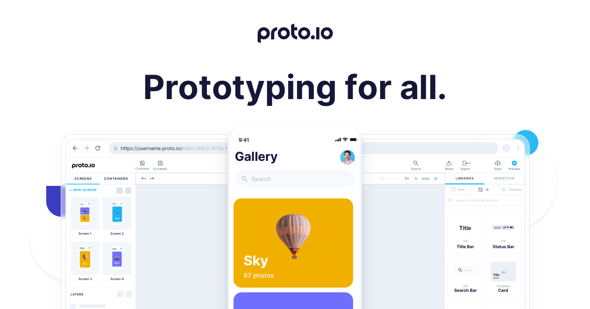
User reviews (0)