Website profiles · Technology insights · Alternatives

toolcraft.sh No paid content found

Categories: Design & Creativity Artificial Intelligence

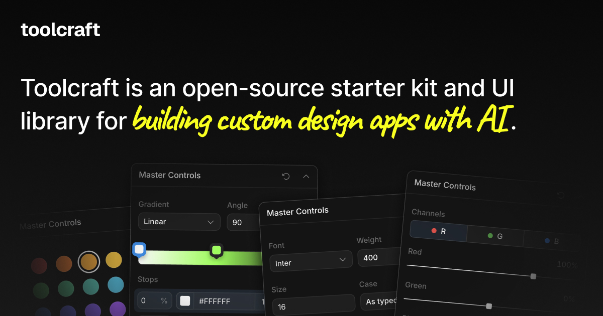
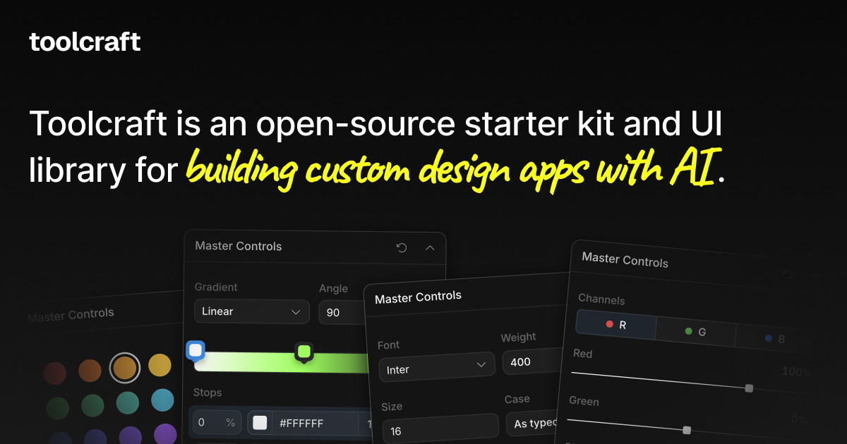
Toolcraft is an open-source starter kit and UI library for building custom design apps with AI.

Visit website

Updated: 2026-09-23 09:14 Language: English (default) Access: Normal

Profile views 1 Outbound visits 0
Toolcraft Full homepage screenshot
Editorial Review

Website Review

What is Toolcraft?

Toolcraft is an open-source starter kit and UI library for building your own small design apps with AI. Rather than a finished design tool, it gives you a foundation of components aimed at creative workflows, so you can assemble focused tools — branded asset generators, style explorers, or utilities that turn repetitive design chores into reusable apps. Its own framing is "design the outcome, not the workspace": you build a narrow tool for one job instead of working inside a general-purpose editor.

H3. Who it's for

  • Designers and design engineers who can work in a code environment and want custom, shareable tools.
  • Teams that repeatedly produce the same kind of asset and would rather automate it once.
  • Anyone exploring procedural graphics, WebGL effects, or interactive web elements who wants a starting point rather than a blank repo.

H3. What you'd actually build The published case studies point to concrete uses: a mini app for exploring a testimonials section layout, a rotating-sphere logo showcase for a bento card, a generator for a brand's signature visual, WebGL dispersion on a carousel edge, an animated showreel element, and an interactive product demo. The common thread is small, single-purpose apps that support a design decision or a recurring production task.

H3. Trade-offs You get openness and control — the code is yours to extend — but you supply the setup, hosting, and maintenance, and AI features depend on whatever model access you wire in yourself. It suits exploratory or bespoke work better than a team needing a polished, no-code editor with support.

As a next step, pick one repetitive task on your team and try rebuilding it as a mini app. If you want a broader view of open-source design tooling, see Penpot.

How do I create a new design app with Toolcraft?

Start by scaffolding the starter kit, then treat the generated project as a normal codebase you customize. Toolcraft is described as an open-source starter kit and UI library for building custom design apps with AI, and the documented entry point is:

npx @pixel-point/toolcraft create

That command creates a new app from the kit. From there, the real work is deciding what narrow design task the app should do, then assembling it from the provided components.

A practical build sequence

  1. Pick one repetitive or exploratory task. Toolcraft's examples are deliberately small: a branded asset generator, a visual-style explorer, a logo sphere for a bento card, a WebGL carousel, an animated showreel footer, an interactive product demo. Choosing one outcome keeps the app shippable.
  2. Scaffold and run it. Use the create command above, install dependencies, and confirm the default app runs before changing anything.
  3. Replace the sample workflow with yours. Keep the shell and component patterns; swap in your own inputs, preview area and export step.
  4. Decide where AI fits. In this kind of tool, AI typically generates or varies the asset while the UI library handles controls and preview. The kit gives you the interface layer; you define the prompts, models and guardrails.
  5. Ship it to the people who will actually use it. A designer, a marketer or a client — not a general audience.

Who this suits

Situation Good fit? Why
A team repeatedly producing the same branded visuals Yes The task becomes a reusable internal tool instead of ad-hoc files
Exploring a visual direction before committing Yes Small procedural apps make variation cheap
You need a full production design suite No It is a starter kit, not a finished product
You have no front-end developer available Risky You still own the code, hosting and maintenance

A concrete example

Suppose a brand needs social images in dozens of variants. Instead of designing each one, you build a small app: text and color inputs on one side, a live preview on the other, and a download button. The UI library supplies the controls and layout; your code supplies the template and rendering. The result is a tool a marketer can use without opening a design file.

If you want to see how far the pattern stretches before writing your own, browse the case studies on Toolcraft — they show the same kit applied to carousels, logo animations and interactive demos, which is the fastest way to judge whether your idea fits.

What types of custom design apps can I build with Toolcraft?

Toolcraft is aimed at small, single-purpose design tools rather than a general-purpose editor. Its own case studies describe mini apps for very specific jobs: exploring a testimonials section layout, placing logos on a rotating sphere for a bento card, designing a brand's signature visual, experimenting with WebGL dispersion around a carousel, and prototyping an interactive product demo or call-to-action section. The pattern is a reusable tool built around one visual problem, often with real-time graphics.

Typical categories

Category What the app does Who it suits
Branded asset generators Produce on-brand graphics from fixed rules and inputs Brand and marketing designers who repeat the same output
Style explorers Test visual directions, colors and procedural graphics quickly Art directors choosing a direction
WebGL / interactive pieces Tune carousels, dispersion effects, animations and demos Design engineers and creative developers
Layout mini apps Iterate on one section, such as testimonials or a CTA Product and web designers working inside a live site
Workflow tools Turn a repetitive design task into a reusable internal app Teams with recurring production work

The trade-off is focus versus breadth. A Toolcraft app is good when the task is narrow, repeated and visual; it is a poor fit if you need a full illustration suite or a general layout tool. The starter kit and UI library are open source, so you can also read and modify the components rather than only using them as shipped.

A concrete scenario: a brand designer who rebuilds the same social card every week could build one generator with locked type styles and color tokens, then hand it to the marketing team.

Next step: list the three design tasks your team repeats most often, pick the one with the clearest rules, and check whether the case studies on Toolcraft resemble it before committing.

Can I use Toolcraft for free in commercial projects?

Yes. Toolcraft is described as an open-source starter kit and UI library, and open-source licensing is what generally allows free use in commercial projects. The page itself does not spell out the license terms, so treat "free for commercial use" as likely but verify the exact license before you ship.

What to check before committing

  • The repository's LICENSE file: MIT and Apache-2.0 are permissive and fine for commercial products; GPL-style licenses may require you to open-source your own code.
  • Attribution requirements: some licenses require keeping copyright notices in your distribution.
  • Any bundled assets (fonts, icons, demo imagery) that may carry separate terms from the code.

Practical scenario

A small studio wants a branded asset generator for a client. Using Toolcraft as the starting point, the team builds the app, keeps the license notice in the repo, and delivers the tool to the client. That is the typical commercial use case the starter kit is aimed at.

Next step

Run the create command shown on the site, then open the generated project's license file before you build anything client-facing. If the license is permissive, you can proceed; if not, decide whether the terms work for your product. For general open-source licensing guidance, see Open Source Initiative.

How does Toolcraft integrate AI into the design workflow?

Toolcraft integrates AI as the engine behind small, purpose-built design apps rather than as a chat assistant bolted onto a general editor. The premise from its own materials is "Design the outcome. Not the workspace." Instead of opening one big canvas and hunting through panels, you assemble a focused tool—say, a generator for a brand's signature visual or a carousel experiment—and let AI drive the generation inside that narrow context.

That distinction matters in practice. A general AI design tool asks you to describe what you want in prose and hope the output is usable. Toolcraft's approach is to give the model a constrained job with a known output format, which tends to produce more repeatable results. The page also frames repetitive design tasks as candidates for becoming reusable tools, which is where AI earns its keep: not one-off hero images, but the twentieth testimonial card or the next variant of a logo arrangement.

H3: What the workflow looks like

  • Start from the starter kit and UI library, then scaffold an app with the project's CLI command shown on the site.
  • Pick a single creative job—a rotating logo sphere, a WebGL dispersion effect on a carousel, an interactive call-to-action section.
  • Wire the AI into that job so it generates or varies the output, while the surrounding UI handles the parameters a designer actually wants to tweak.
  • Reuse the result as a tool for the next brief instead of rebuilding from scratch.

H3: Who gets the most from it

If you are... Toolcraft's AI angle helps when... Watch out for...
A design engineer You want AI generation wrapped in a real interface with controls, not a prompt box You'll need to build and maintain the app shell yourself
A brand or agency team You keep rebuilding the same asset type for different clients Each tool is narrow by design; broad needs mean several tools
A front-end developer You want to prototype WebGL or interactive sections quickly The value is in the components and structure, not the model itself

H3: A concrete scenario

A studio needs a rotating sphere of client logos for a website bento card. Rather than briefing a 3D artist each time a logo changes, they build a small app once: the AI handles layout and variation, the UI exposes rotation speed and logo spacing, and anyone on the team can regenerate the asset. That is the trade-off Toolcraft is selling—upfront build effort in exchange for a reusable, AI-assisted tool.

If you want to judge fit, the fastest test is to take one repetitive task from your own last month of work and ask whether it could become a small app with three or four controls. If yes, the starter kit is worth cloning; if the task changes shape every time, a general tool will serve you better. For broader context on AI-assisted building, GitHub hosts the project's ecosystem, and Vercel is a common place to deploy the resulting apps.

What do the Toolcraft case studies demonstrate?

The Toolcraft case studies demonstrate the range of small, purpose-built design apps you can assemble with the starter kit — each one solving a narrow creative problem rather than trying to be a general-purpose design tool. They are essentially worked examples of the "design the outcome, not the workspace" idea: instead of opening a broad editor, you build (or adapt) a focused app that produces exactly the asset or effect you need.

What the examples cover

  • Brand and visual identity work — custom apps for developing a brand's signature visual, and for exploring a brand's visual direction through procedural graphics.
  • Website section design — mini apps for exploring a testimonials section layout, and for an interactive call-to-action section built directly into a site.
  • Motion and 3D — a rotating-sphere logo showcase for a bento card, WebGL dispersion along a testimonial carousel's edges, and a footer showreel animation.
  • Interactive product demos — an interactive demo built for an AI image-generation company.
  • Reusable generators — branded asset generators that turn repetitive design tasks into tools you run again.

What they collectively show

Three things stand out. First, the apps are mini: scope is deliberately small, which keeps them quick to build and easy to throw away or iterate on. Second, they often target a single deliverable inside a real production context, such as a carousel or footer animation, rather than a standalone mockup. Third, several examples are exploratory — used to test a visual direction before committing to it.

How to read them usefully

Treat the case studies as a menu of patterns, not a feature list. If your work involves repeating the same asset variations, the generator examples are the closest match. If you need to pressure-test a visual style, the procedural and dispersion experiments are more relevant.

Next step: pick the case study closest to a task you already repeat weekly, then use the documented create command to scaffold that single app and adapt it — Toolcraft.

Related questions

More questions →
What is Toolcraft and what is it used for?

Toolcraft is an open-source starter kit and UI library for building custom design apps with AI. You use it when you want to create a focused tool for a specific design task — a branded asset generator, a visual style explorer, or a reusable app that replaces a repetitive design chore — rather than working inside a general-purpose design workspace.

What Toolcraft actually is

Toolcraft describes itself as "an open-source starter kit and UI library for building custom design apps with AI." Two parts matter here:

  • A starter kit — a starting point you scaffold, then extend into your own app.
  • A UI library — components for creative workflows that you assemble into that app.

The framing on the site is "Design the outcome. Not the workspace." That is the core idea: instead of opening a large design tool and configuring it for one narrow job, you build a small app whose only job is that outcome.

What it's used for

Toolcraft is aimed at turning specific, repeatable design tasks into dedicated tools. The published case studies show the range:

Use case What was built
Branded asset generation A custom app to design a brand's signature visual
Style exploration A procedural graphics app for exploring a brand's visual direction
Component design A mini app to explore a testimonials section design
Motion and 3D A mini app for logos on a rotating sphere in a bento card
WebGL effects A mini app to experiment with WebGL dispersion on a testimonial carousel
Interactive demos An interactive product demo for an AI image generation company
In-context design Designing a WebGL image carousel or an interactive call-to-action directly in a company's website

The pattern across all of them: a narrow, well-defined design problem gets its own purpose-built app, often with AI assistance in the loop.

How you start

The site gives a single command to scaffold a project:

npx @pixel-point/toolcraft create

Running this creates a Toolcraft project you then build on. The expected result is a working starting point with the UI library available, which you customize into your specific design app. Beyond the create command, the site does not document further setup steps, so treat the scaffold as the entry point and expect to work from the generated project.

When Toolcraft is the right choice

Toolcraft fits when:

  • You have a recurring design task that would be faster as a dedicated tool than as manual work in a general editor.
  • You want to explore a visual direction — procedural graphics, WebGL effects, motion — through an app built for that exploration.
  • You need a branded generator or an interactive demo that non-designers can operate.
  • You're comfortable working in code and want an open-source base rather than building UI from scratch.

It is less suited to one-off design work, or to situations where you want a finished end-user product rather than a starter kit you extend yourself.

What the site does not specify

The available material does not state pricing, licensing terms beyond "open-source," hosting requirements, or a supported framework list. If any of those determine your decision, check the repository directly before committing.

What Are Open-Source UI Element Libraries and How Do They Differ From UI Frameworks?

An open-source UI element library is a collection of individual, ready-made interface pieces—buttons, cards, inputs, toggles, loaders—that you copy into your own project and adapt. A UI framework, by contrast, is a structured system of components, conventions, and often a theming layer that governs how your whole interface is built. The practical difference: an element library gives you a snippet; a framework gives you a way of working. If you need a polished button in ten minutes, reach for the element library. If you're building a 40-screen product with a team, you probably want the framework.

What "open-source UI element library" actually means

The term gets used loosely, so it helps to separate the parts:

  • Open-source: the code is publicly available, and the license tells you what you may do with it—copy, modify, redistribute, or use commercially.
  • UI element: a single, self-contained piece of interface, usually small enough to read in one sitting. A button with hover states, a pricing card, a search field.
  • Library: a browsable, searchable collection of those elements, typically contributed by many different people.

On a site like Uiverse, elements are shared by a community and written in plain CSS or Tailwind. You find one you like, copy the markup and styles, paste them into your project, and adjust colors, spacing, and text to fit. There's no package to install and no build step required—which is exactly the appeal, and also the source of most of the confusion.

Element library vs. UI framework: the core differences

Dimension Open-source UI element library UI framework / design system
Unit of reuse A single snippet you copy A component you import or call
Installation None; paste into your code Package install, config, sometimes a provider
Consistency Depends on you; each element may look different Enforced by shared tokens and APIs
Theming Manual edits per element Central theme/config file
Updates You own the copy; no upstream updates Version bumps bring fixes and changes
Accessibility Varies per contributor; must be checked Usually tested and documented
Best for Prototypes, landing pages, small sites, one-off needs Multi-page apps, teams, long-lived products
Learning curve Low—read the CSS Higher—learn the API and conventions

The table isn't a verdict. It's a map of trade-offs. Element libraries win on speed and freedom; frameworks win on consistency and maintenance.

Licensing and attribution: what to check before you paste

This is where people get into trouble, and it's worth slowing down for.

  1. Find the license. Every element or collection should state one. Common open-source licenses include MIT, Apache-2.0, and BSD. Some projects use copyleft licenses like GPL, which can impose obligations if you redistribute your code.
  2. Understand what the license permits. MIT and Apache-2.0 are permissive: you can typically use the code in commercial and closed-source projects. Copyleft licenses may require you to release derivative source under the same terms.
  3. Check attribution requirements. Permissive licenses usually require you to keep the copyright notice and license text somewhere in your project. That's a real obligation, not a formality.
  4. Look for per-element terms. On community sites, the site's overall terms and the individual contributor's stated wishes may differ. If a contributor asks for credit, honor it.
  5. When in doubt, ask or avoid. If a snippet has no license at all, you don't have clear permission to reuse it. Treat "no license" as "not open source," even if the code is publicly visible.

This article is general information, not legal advice. For commercial products with real exposure, have someone qualified review the licenses you're relying on.

How to use a community element in your project: a practical workflow

Here's a repeatable process that avoids most of the usual mess.

1. Start from a real need, not a browsing session

Decide what you need first—"a compact primary button with a loading state"—then search. Browsing aimlessly produces a pile of pretty snippets that don't fit together.

2. Copy the smallest version that works

Take the markup and the styles. Strip anything you don't need: demo wrappers, extra animations, decorative layers. Less code means fewer surprises.

3. Convert it to your conventions

If your project uses design tokens or CSS variables, replace hard-coded values:

/* Before: hard-coded */
.button { background: #4f46e5; border-radius: 8px; }

/* After: token-based */
.button { background: var(--color-primary); border-radius: var(--radius-md); }

This one step is what keeps a copied element from looking like a foreign object in your UI.

4. Check accessibility before you ship

Community elements vary widely here. Verify at minimum:

  • Keyboard focus is visible and the element is reachable by Tab.
  • Color contrast meets WCAG AA (4.5:1 for normal text).
  • Interactive elements use semantic HTML (<button>, not a clickable <div>).
  • Form inputs have associated labels.
  • Motion respects prefers-reduced-motion.

5. Test in context

Paste it into a real page with real content. Long labels, small screens, and dark mode break more copied elements than anything else.

6. Note where it came from

Keep a short comment or an internal credits file: source, license, date. Future you—and your legal reviewer—will be grateful.

Where element libraries genuinely shine

  • Prototypes and demos: you need something clickable today, not a design system.
  • Landing pages and marketing sites: a handful of distinctive elements, each custom.
  • Filling gaps: your framework lacks one specific component, and you don't want to build it from scratch.
  • Learning: reading well-made CSS is one of the fastest ways to improve.
  • Small projects: a personal site doesn't need a theming architecture.

Where they fall short

  • Consistency at scale: ten elements from ten contributors rarely look like one product.
  • Maintenance: you own every copy. When your design changes, you edit each one.
  • Accessibility debt: you inherit whatever the contributor did or didn't do.
  • No upstream fixes: a bug fixed in the original won't reach your copy.
  • Integration friction: different naming conventions, different units, different assumptions about resets.

When to choose which

Choose an element library when the scope is small, the timeline is short, or you need a few distinctive pieces rather than a whole system.

Choose a framework or design system when multiple people build multiple screens over months, when consistency is a product requirement, or when accessibility and theming need to be guaranteed rather than checked.

A hybrid works well for many teams: adopt a framework for the structural components—forms, navigation, layout—and borrow individual elements for the places where you want personality. Just route every borrowed element through the same token and accessibility checks, so it lands as part of your system rather than beside it.

The short version: open-source UI element libraries are a fast, flexible way to get good-looking interface pieces into a project. They are not a substitute for a design system, and the license and accessibility details are the part worth reading carefully.

Who is Toolcraft for and what kinds of design apps can you build with it?

Toolcraft is for designers and front-end developers who want to build their own small, purpose-built design apps rather than work inside a general-purpose design tool. It is an open-source starter kit and UI library, and you scaffold a project with npx @pixel-point/toolcraft create. If your goal is a branded asset generator, a tool for exploring a visual style, or a way to turn a repetitive design task into something reusable, Toolcraft is aimed at you. If you just need a standard interface mockup, a conventional design app will likely be faster.

Who it is built for

The two audiences the project speaks to are designers and front-end developers. That pairing matters: Toolcraft assumes you are comfortable working in code, but it is organized around design outcomes rather than around application plumbing.

  • Designers who can work in a codebase get a starting point instead of a blank project. The library covers the pieces a creative tool tends to need, so you spend time on the visual result rather than on rebuilding sliders, canvases, and panels.
  • Front-end developers get a scaffolded app and a component set tuned for creative workflows, which shortens the distance between "we need an internal tool for this" and a working prototype.
  • Teams with a recurring design task — generating on-brand assets, testing a visual direction, producing variations of a component — are the clearest fit, because the whole point is turning that task into a reusable tool.

The framing on the site is "Design the outcome. Not the workspace." That is the practical distinction: Toolcraft is not a place to do design work, it is a way to build the specific tool that produces the outcome you want.

What kinds of design apps you can build

The published case studies are the most concrete guide to scope. They cluster into a few recognizable types:

Type of app Example from the case studies
Brand asset generators Creating a custom app to design a brand's signature visual
Visual style exploration Exploring a brand's visual direction with a procedural graphics app
Component and section design Building a mini app to explore the design of Neon's testimonials section; designing an interactive call to action section directly in an AI company's website
Motion and animation Creating a custom app to design an animation for the showreel in Neon.com's footer
WebGL and graphics experiments Building a mini app to experiment with WebGL dispersion along the edges of a testimonial carousel; designing a WebGL image carousel directly in an AI company's website
Product demos Creating a custom app to design an interactive product demo for an AI image generation company
Small showcase pieces Building a mini app to showcase logos on a rotating sphere for a website bento card

Two patterns run through that list. First, most of these are mini apps — narrow tools that do one thing well, not full applications. Second, several are built directly in the context of a real site or brand, which is where a custom tool beats a generic one: you can tune the tool to the exact section, animation, or asset you are producing.

When Toolcraft is the right choice

Choose it when at least one of these is true:

  • The design task repeats, and you would rather build a tool once than redo the work each time.
  • You need output that is specific to a brand or a single component, and a general design app forces too much manual adjustment.
  • The work involves graphics, motion, or WebGL that you want to explore interactively.
  • You want an open-source base you can modify, rather than a closed product.

Look elsewhere when the task is a one-off layout, when nobody on the team works in code, or when an existing design tool already covers the workflow without friction. Toolcraft's value comes from customization, and customization only pays off when the task is specific enough to be worth tooling.

Getting started

The documented entry point is a single command:

npx @pixel-point/toolcraft create

Running it scaffolds a Toolcraft project you can then adapt into your own app. From there, the case studies are the best reference for what a finished tool looks like in practice — pick the one closest to your goal (an asset generator, a WebGL experiment, an interactive demo) and use it as a model for scope. The site's own summary of the ceiling is "You're only limited by your creativity," which is fair for a starter kit: the constraint is not what the library permits, but how narrowly you can define the tool you actually need.

How do you get started with Toolcraft?

Toolcraft is an open-source starter kit and UI library for building custom design apps with AI. You start by running npx @pixel-point/toolcraft create, then build your app on top of the provided components and starter structure. This path assumes you're comfortable with front-end development — you'll be working in a code project, not a no-code builder.

What you're actually starting with

Toolcraft isn't a finished design tool. It's a foundation for making your own. The site describes it as a starter kit plus a UI library, aimed at things like:

  • Branded asset generators
  • Tools for exploring new visual styles
  • Reusable tools that replace repetitive design tasks

The framing on the site is "Design the outcome. Not the workspace." — the idea being that instead of adapting your process to a general-purpose editor, you build a small app that produces exactly the output you need.

Step 1: Initialize the project

Run the create command from your terminal:

npx @pixel-point/toolcraft create

This scaffolds a project based on the starter kit. The expected result is a working local codebase you can open, run, and modify — with the UI library already available as a dependency.

Common snag: npx needs Node.js installed. If the command fails immediately, check your Node version before anything else.

Step 2: Understand the two layers

It helps to separate what you got into two parts:

Layer What it gives you What you do with it
Starter kit Project structure and setup Run it, then replace the example with your own app
UI library Components for creative workflows Compose them into your tool's interface

The site's heading "Components for every creative workflow" points at the second layer — the library is meant to cover the controls and panels a design app needs, so you're not rebuilding sliders, canvases, and panels from scratch.

Step 3: Pick a small, real target

The fastest way to learn the kit is to copy the shape of one of the published case studies. The site lists several, and they're all deliberately small:

  • A mini app to explore a testimonials section design
  • A mini app showing logos on a rotating sphere for a bento card
  • A custom app for a brand's signature visual
  • A mini app experimenting with WebGL dispersion on a carousel's edges
  • A custom app for a footer showreel animation
  • An interactive product demo for an AI image generation company
  • A procedural graphics app for exploring a brand's visual direction

Each of these is a single-purpose tool, not a general editor. That's the pattern to imitate: pick one repetitive or exploratory task, build the smallest app that does it, and let the library handle the UI.

Step 4: Build and verify

Because this is a code project, "verification" means running it and checking the output against your intent:

  1. Start the dev server from the scaffolded project.
  2. Confirm the starter renders before you change anything — this isolates setup problems from your own code.
  3. Swap in one component from the library and confirm it behaves as expected.
  4. Iterate toward your target app one piece at a time.

If something breaks after step 3 but not before, the problem is in your change, not the scaffold.

What you need before starting

  • Front-end development experience — the site's examples assume you can read and write project code.
  • A Node.js environment for npx and the dev server.
  • A clear, narrow task in mind. Toolcraft rewards specificity; "build me a design tool" is the wrong starting point, "build a generator for our brand's gradient assets" is the right one.

When Toolcraft is the right choice

Choose it if you want to own the tool — a custom app tailored to one workflow, built on open-source components you can modify. Skip it if you want a ready-made editor to use today, or if you don't want to write code. The site's own closing line, "You're only limited by your creativity," is really a statement about scope: the kit gives you the parts, and the app is yours to define.

How Toolcraft Differs From Standard Design Tools and Building From Scratch

Toolcraft is an open-source starter kit and UI library for building custom design apps with AI. It sits between two extremes: a general-purpose design tool like Figma, where you manipulate a fixed workspace by hand, and a fully custom app you architect from zero. You'd choose Toolcraft when you want a branded, interactive, or procedural design tool — a "mini app" your team reuses — without paying the full cost of building the foundation yourself.

The three approaches at a glance

Dimension Standard design tool Building from scratch Toolcraft
Starting point Blank canvas in a fixed workspace Empty repo, every layer your own Open-source starter kit + UI library
What you produce Artboards, frames, static or lightly interactive files A bespoke app, fully your architecture A custom design app assembled from ready components
Reusability Manual redo each time Whatever you build Repetitive design tasks become reusable tools
Customization Limited to plugins and existing features Unlimited, at full cost Open source, so you can modify and extend
Best fit General visual work Unique product with no reusable base Branded generators, style exploration, interactive demos

Where Toolcraft changes the work

The core difference is the unit of work. In a standard design tool you design the outcome by hand, one iteration at a time. Toolcraft's stated premise is "Design the outcome. Not the workspace." — you build the app that produces the outcome, then reuse it.

That shows up in the kinds of things the site documents as case studies:

  • A mini app to explore the design of a testimonials section
  • A mini app to showcase logos on a rotating sphere for a website bento card
  • A custom app to design a brand's signature visual
  • A mini app to experiment with WebGL dispersion along the edges of a testimonial carousel
  • A custom app to design an animation for a showreel footer
  • A custom app to design an interactive product demo for an AI image generation company
  • A procedural graphics app for exploring a brand's visual direction

Notice the pattern: each is narrow, branded, and interactive. These are tasks that are awkward in a general design tool (procedural graphics, WebGL effects, live interactive demos) and expensive to build from scratch (you'd rebuild the same component scaffolding every time).

What "starter kit and UI library" actually saves you

Building a design app from scratch means solving the same problems repeatedly: panels, controls, canvas handling, component state. Toolcraft ships "components for every creative workflow" as a library, plus a starter kit that wires them together. The documented entry point is:

npx @pixel-point/toolcraft create

Running that scaffolds a project rather than an empty directory, so your first effort goes into the app's specific behavior instead of its plumbing. The site frames the ceiling as "You're only limited by your creativity" — but the practical gain is that the boilerplate is already handled.

When each option is the right call

Stay with a standard design tool if your work is exploratory, one-off, or doesn't repeat. If you're not going to run the same task again, building an app for it is overhead.

Build from scratch if your app's architecture is genuinely novel and no starter kit matches it, or if you need full control over every dependency and abstraction.

Use Toolcraft if you repeatedly produce a specific kind of visual output — brand assets, style explorations, interactive sections — and want it packaged as a reusable, brandable tool. The open-source license matters here: you can modify and extend the components rather than working around a vendor's limits.

The trade-off to weigh

Toolcraft is not a replacement for a design tool's freeform canvas, and it is not a blank-slate framework. It's opinionated: you get a component library and a starter structure, which speeds up common creative-app patterns but constrains you to what those components support. If your need fits the documented cases — generators, procedural visuals, WebGL experiments, interactive demos — the kit removes most of the setup cost. If it doesn't, you're better off either staying in a standard tool or building exactly what you need.

Website Overview

Page metadata, canonical configuration and social previews work together to provide more consistent search and sharing presentation.

Domain and Registration

The domain was registered less than a year ago and has limited historical evidence to assess. Transfer-protection status is present, helping reduce the risk of unauthorized domain transfers. The registrar is Cloudflare, Inc, a widely used domain service provider. The domain uses the common .sh extension, which is not an independent safety signal.

DNS and Email

Nameservers are provided by Cloudflare, indicating managed DNS hosting. No CNAME was found; the observed records resolve directly to addresses. No MX record was found. A conventional explicit inbound-mail route is not configured. TXT records include verification markers for Google. Such markers may also remain after a service stops being used. DNSSEC signatures were not detected, so this additional DNS authenticity protection is not confirmed.

TLS and Certificates

The certificate uses an RSA 2048-bit public key, offering broad client compatibility. The server supplied a complete certificate chain. No organization name is present in the certificate; the available fields are consistent with domain validation. The certificate was issued by Let's Encrypt, commonly associated with automated certificate services. The certificate's total validity is about 89 days, consistent with a short renewal cycle.

HTTP and Browser Security

The response lacks these common security headers: CSP, X-Content-Type-Options, Referrer-Policy, Permissions-Policy, clickjacking protection. CORS permits any origin to read this response. This is common for public resources; sensitive responses need narrower handling. No X-Powered-By header was found, reducing one common source of backend fingerprinting information. No obvious internal addresses or debug information were found in the headers. The Server header contains the custom value Vercel.

Technology Stack Analysis

The public page identifies Next.js, Vercel without precise versions, leaving fewer clues for version-specific scanning.

Search and Social Sharing

Twitter Card metadata is configured. The title has 47 characters, within a common display range. A meta description is present, with 95 characters. The observed directives allow indexing and link following. No Generator meta tag is publicly exposed.

Hosting and Email

DNSCloudflare
HostingVercel
EmailUnknown
Location United States flagUnited States 216.150.1.129

User reviews (0)

  • No reviews yet.

Pages, Search and Sharing

Meta descriptionToolcraft is an open-source starter kit and UI library for building custom design apps with AI.
Canonical URLhttps://toolcraft.sh
LanguageEnglish (default)
Twitter Cardsummary_large_image
All bots 1 allowed · 0 disallowed
  • Allow/

Registration details RDAP / WHOIS

RegistrarCloudflare, Inc
Registered2026-07-02
Expires2027-07-02
Domain statusclientTransferProhibited https://icann.org/epp#clientTransferProhibited
Nameserverskristina.ns.cloudflare.com、venkat.ns.cloudflare.com
DNSSECunsigned

DNS records

TypeNameValueTTLPriority
Atoolcraft.sh216.150.1.129300—
Atoolcraft.sh216.150.16.129300—
NStoolcraft.shkristina.ns.cloudflare.com86400—
NStoolcraft.shvenkat.ns.cloudflare.com86400—
TXTtoolcraft.shgoogle-site-verification=aU5x_D0HmGc_B9daeecOMncpYS0mhz04why6yWegIx43600—

TLS and certificates

AssessmentNormal configuration
Supported protocolsTLSv1.2、TLSv1.3
Negotiated protocolTLSv1.3
Certificate subjecttoolcraft.sh
IssuerLet's Encrypt
Valid until2026-12-12T00:56 · Remaining when checked: 79 days
Verification detailsCertificate trust: Passed · Hostname match: Passed

HTTP response headers

HeaderValue
content-typetext/html; charset=utf-8
cache-controlpublic, max-age=0, must-revalidate
serverVercel
strict-transport-securitymax-age=63072000
access-control-allow-origin*

Identified technologies

Next.jsVercel