
 简体中文
简体中文ui.nuxt.com
Nuxt UI is a free, open source Vue component library: 125+ accessible, TypeScript components built on Reka UI and Tailwind CSS, for Nuxt and any Vue app.
At a glance
- Category
- Development
- Language
- English
- Paid-content signal
- No paid content foundObserved
- Registered
- 2003
- Hosting
- VercelInferred
- HTTPS certificate trusted
- PassedObserved
- Last updated
Related questions
More questions →What Are Open-Source UI Element Libraries and How Do They Differ From UI Frameworks?
An open-source UI element library is a collection of individual, ready-made interface pieces—buttons, cards, inputs, toggles, loaders—that you copy into your own project and adapt. A UI framework, by contrast, is a structured system of components, conventions, and often a theming layer that governs how your whole interface is built. The practical difference: an element library gives you a snippet; a framework gives you a way of working. If you need a polished button in ten minutes, reach for the element library. If you're building a 40-screen product with a team, you probably want the framework.
What "open-source UI element library" actually means
The term gets used loosely, so it helps to separate the parts:
- Open-source: the code is publicly available, and the license tells you what you may do with it—copy, modify, redistribute, or use commercially.
- UI element: a single, self-contained piece of interface, usually small enough to read in one sitting. A button with hover states, a pricing card, a search field.
- Library: a browsable, searchable collection of those elements, typically contributed by many different people.
On a site like Uiverse, elements are shared by a community and written in plain CSS or Tailwind. You find one you like, copy the markup and styles, paste them into your project, and adjust colors, spacing, and text to fit. There's no package to install and no build step required—which is exactly the appeal, and also the source of most of the confusion.
Element library vs. UI framework: the core differences
| Dimension | Open-source UI element library | UI framework / design system |
|---|---|---|
| Unit of reuse | A single snippet you copy | A component you import or call |
| Installation | None; paste into your code | Package install, config, sometimes a provider |
| Consistency | Depends on you; each element may look different | Enforced by shared tokens and APIs |
| Theming | Manual edits per element | Central theme/config file |
| Updates | You own the copy; no upstream updates | Version bumps bring fixes and changes |
| Accessibility | Varies per contributor; must be checked | Usually tested and documented |
| Best for | Prototypes, landing pages, small sites, one-off needs | Multi-page apps, teams, long-lived products |
| Learning curve | Low—read the CSS | Higher—learn the API and conventions |
The table isn't a verdict. It's a map of trade-offs. Element libraries win on speed and freedom; frameworks win on consistency and maintenance.
Licensing and attribution: what to check before you paste
This is where people get into trouble, and it's worth slowing down for.
- Find the license. Every element or collection should state one. Common open-source licenses include MIT, Apache-2.0, and BSD. Some projects use copyleft licenses like GPL, which can impose obligations if you redistribute your code.
- Understand what the license permits. MIT and Apache-2.0 are permissive: you can typically use the code in commercial and closed-source projects. Copyleft licenses may require you to release derivative source under the same terms.
- Check attribution requirements. Permissive licenses usually require you to keep the copyright notice and license text somewhere in your project. That's a real obligation, not a formality.
- Look for per-element terms. On community sites, the site's overall terms and the individual contributor's stated wishes may differ. If a contributor asks for credit, honor it.
- When in doubt, ask or avoid. If a snippet has no license at all, you don't have clear permission to reuse it. Treat "no license" as "not open source," even if the code is publicly visible.
This article is general information, not legal advice. For commercial products with real exposure, have someone qualified review the licenses you're relying on.
How to use a community element in your project: a practical workflow
Here's a repeatable process that avoids most of the usual mess.
1. Start from a real need, not a browsing session
Decide what you need first—"a compact primary button with a loading state"—then search. Browsing aimlessly produces a pile of pretty snippets that don't fit together.
2. Copy the smallest version that works
Take the markup and the styles. Strip anything you don't need: demo wrappers, extra animations, decorative layers. Less code means fewer surprises.
3. Convert it to your conventions
If your project uses design tokens or CSS variables, replace hard-coded values:
/* Before: hard-coded */
.button { background: #4f46e5; border-radius: 8px; }

/* After: token-based */
.button { background: var(--color-primary); border-radius: var(--radius-md); }
This one step is what keeps a copied element from looking like a foreign object in your UI.
4. Check accessibility before you ship
Community elements vary widely here. Verify at minimum:
- Keyboard focus is visible and the element is reachable by Tab.
- Color contrast meets WCAG AA (4.5:1 for normal text).
- Interactive elements use semantic HTML (
<button>, not a clickable<div>). - Form inputs have associated labels.
- Motion respects
prefers-reduced-motion.
5. Test in context
Paste it into a real page with real content. Long labels, small screens, and dark mode break more copied elements than anything else.
6. Note where it came from
Keep a short comment or an internal credits file: source, license, date. Future you—and your legal reviewer—will be grateful.
Where element libraries genuinely shine
- Prototypes and demos: you need something clickable today, not a design system.
- Landing pages and marketing sites: a handful of distinctive elements, each custom.
- Filling gaps: your framework lacks one specific component, and you don't want to build it from scratch.
- Learning: reading well-made CSS is one of the fastest ways to improve.
- Small projects: a personal site doesn't need a theming architecture.
Where they fall short
- Consistency at scale: ten elements from ten contributors rarely look like one product.
- Maintenance: you own every copy. When your design changes, you edit each one.
- Accessibility debt: you inherit whatever the contributor did or didn't do.
- No upstream fixes: a bug fixed in the original won't reach your copy.
- Integration friction: different naming conventions, different units, different assumptions about resets.
When to choose which
Choose an element library when the scope is small, the timeline is short, or you need a few distinctive pieces rather than a whole system.
Choose a framework or design system when multiple people build multiple screens over months, when consistency is a product requirement, or when accessibility and theming need to be guaranteed rather than checked.
A hybrid works well for many teams: adopt a framework for the structural components—forms, navigation, layout—and borrow individual elements for the places where you want personality. Just route every borrowed element through the same token and accessibility checks, so it lands as part of your system rather than beside it.
The short version: open-source UI element libraries are a fast, flexible way to get good-looking interface pieces into a project. They are not a substitute for a design system, and the license and accessibility details are the part worth reading carefully.
Can I use Nuxt UI in a plain Vue app without Nuxt?
Yes. Nuxt UI is described as a Vue component library for Nuxt and any Vue app, so a plain Vue project is a supported target. The main condition is that your project already uses Tailwind CSS, since the library's components are built on Reka UI and Tailwind CSS rather than on a Nuxt-only runtime.
What the library actually depends on
The official description lists three foundations:
- Reka UI for accessible component behavior
- Tailwind CSS for styling
- TypeScript for typed components
None of these are Nuxt-specific. Nuxt is one way to consume the library, not a requirement of the components themselves. The site also states that icons, fonts, color mode, i18n, and typography are "already wired in," which is a convenience layer rather than a hard dependency on the Nuxt framework.
What you need before installing
| Requirement | Why it matters |
|---|---|
| A Vue app | The library targets Vue components |
| Tailwind CSS configured | Components are styled with Tailwind; the docs show a main.css that imports tailwindcss and @nuxt/ui |
| A build setup that handles CSS imports | The documented entry point is a CSS file, not a runtime plugin |
The site's own example shows the styling entry point as a CSS file:
@import "tailwindcss";
@import "@nuxt/ui";

@theme {
  --font-sans: 'Public Sans', sans-serif;
}
If your plain Vue project already has a Tailwind pipeline, this is the shape of the file you would adapt. If it does not, set up Tailwind first — that is the real prerequisite, not Nuxt.
What you give up without Nuxt
Nuxt provides module-level integration: auto-imports, configuration through app.config.ts, and framework conventions that reduce setup code. In a plain Vue app you configure and import more explicitly. The components and theme are the same; the ergonomics differ.
The site references app.config.ts alongside main.css, which reflects that configuration convention. In a non-Nuxt app you would handle equivalent configuration through your own build setup rather than assuming Nuxt's module system.
How to decide
Use Nuxt UI in a plain Vue app if:
- You already run Tailwind CSS
- You want the same component set and theme across a Nuxt project and a plain Vue project
- You are comfortable wiring configuration yourself instead of relying on Nuxt modules
Stay with Nuxt if:
- You want auto-imports and module-based configuration with minimal setup
- You are starting fresh and have no reason to avoid Nuxt
Look elsewhere if:
- Your project does not use Tailwind and you do not want to add it
- You need a component library with no CSS framework assumption
Verifying it works
After installing, the practical check is whether a component renders with correct styling and accessible behavior. The site advertises 125+ accessible, TypeScript components, so a single component test — rendering one interactive element and confirming keyboard behavior and Tailwind styles — tells you whether the CSS import and build pipeline are wired correctly.
The most common failure point is the CSS entry: if @import "@nuxt/ui" is missing or Tailwind is not processing the file, components render unstyled even though the JavaScript loads.
What is Nuxt UI?
Nuxt UI is a free, open-source Vue component library that provides 125+ accessible, TypeScript-typed components built on Reka UI and Tailwind CSS. It works in Nuxt and in any Vue application. You'd reach for it when you want production-ready UI primitives that are accessible and typed out of the box, without hand-building a design system or wiring up icons, fonts, color mode, i18n, and typography yourself.
What you get
The library ships components and templates that share one theme across every layout. According to the site, it is "beautiful by default, with icons, fonts, color mode, i18n and typography already wired in." That means the surrounding concerns of a UI layer — theming, dark/light mode, localization, icon sets, and prose styling — are handled as part of the package rather than left to you.
The component set is broad enough to cover common product surfaces. The homepage demos show, among others:
- Forms and inputs — email fields, notification preference toggles, verification code entry
- Data display — recent transactions, revenue totals, progress toward goals
- Navigation and layout — dashboards, inboxes, sidebars, settings
- Overlays and feedback — notifications, bug report dialogs, invite flows
- Date and scheduling — calendar pickers
These are illustrative of the range, not an exhaustive list of the 125+ components.
How it's built
Two foundations matter for how you'd use it:
| Layer | Role |
|---|---|
| Reka UI | Supplies the accessible, unstyled component primitives |
| Tailwind CSS | Supplies the styling system and utility classes |
Because styling runs through Tailwind, customization happens at the CSS level. The site's setup example shows a main.css file importing Tailwind and Nuxt UI, then defining a theme token:
@import "tailwindcss";
@import "@nuxt/ui";

@theme {
  --font-sans: 'Public Sans', sans-serif;
}
There's also an app.config.ts referenced alongside main.css in the getting-started snippet, which is where Nuxt UI's runtime configuration lives.
Who it's for
- Nuxt developers — it's the native target, so integration is direct.
- Vue developers on other setups — the library is explicitly usable in "any Vue app," not just Nuxt.
- Teams that want accessibility and typing without building them — the accessible and TypeScript-typed claims are the core value proposition.
- Anyone starting a new interface — the templates and shared theme reduce the amount of design plumbing needed before you write product code.
If you're evaluating it against other Vue libraries, the distinguishing points to weigh are the Reka UI + Tailwind CSS foundation, the bundled-in concerns (icons, fonts, color mode, i18n, typography), and the Nuxt-first but Vue-compatible scope.
Getting started
The site offers a Get started entry point and a way to Explore 125+ components. The practical path is: install the package, import it in your CSS as shown above, set your theme tokens, then pull in components as you need them. The homepage also notes a current version, v4.11.3, under "What's new," so check the changelog for the latest additions before assuming a component or behavior exists.
One caveat worth flagging: the homepage demos include banking-style mockups ("Connect your bank," "Transfer funds," "Recent transactions"). These are UI examples showing what the components can render — they are not a statement that Nuxt UI connects to financial services. Treat them as design showcases.
What Makes Nuxt UI Different From Other Vue Component Libraries?
Nuxt UI is a free, open-source Vue component library of 125+ accessible, TypeScript-typed components built on Reka UI and Tailwind CSS. It differs from most Vue component libraries in three concrete ways: it ships as a Tailwind-native layer rather than a CSS-in-JS or precompiled stylesheet system, it wires in icons, fonts, color mode, i18n, and typography by default instead of leaving them to you, and it applies one shared theme across both individual components and full page templates. It is aimed at Nuxt projects first, but the site states it works "for Nuxt and any Vue app."
The stack: Reka UI + Tailwind CSS
Most Vue libraries either ship their own styling system or bundle a precompiled CSS file you override with selectors. Nuxt UI takes a different route:
- Reka UI provides the unstyled, accessible component primitives (behavior, keyboard handling, ARIA wiring).
- Tailwind CSS provides the styling layer, so component appearance is expressed in Tailwind utility conventions rather than a separate theming API.
The practical consequence is that your design tokens live where your Tailwind config lives. The homepage shows the setup as a CSS import plus a theme block:
/* main.css */
@import "tailwindcss";
@import "@nuxt/ui";

@theme {
  --font-sans: 'Public Sans', sans-serif;
}
That means changing a font or a design token is a Tailwind-level change, not a fight against a library's internal stylesheet. If your team already standardizes on Tailwind, this removes an entire styling layer you would otherwise maintain in parallel.
What is pre-wired by default
The library's stated position is "beautiful by default," and the specific claim is that icons, fonts, color mode, i18n, and typography are "already wired in." For a typical Vue project, each of those is normally a separate dependency and a separate configuration task:
| Concern | Typical library | Nuxt UI |
|---|---|---|
| Icons | Add an icon package and register it | Included |
| Fonts | Load and configure separately | Included |
| Color mode | Add a dark-mode solution | Included |
| i18n | Add and wire a translation layer | Included |
| Typography | Style prose content yourself | Included |
The trade-off is real: pre-wiring saves setup time but gives you less freedom to swap in a different icon set or i18n library without working around the defaults. If you have strong existing choices in any of these areas, check how much of the default you can replace before committing.
Accessibility and TypeScript as first-class, not add-ons
Two properties are stated directly in the library's own description: components are accessible and typed.
- Accessibility comes from the Reka UI foundation, so behavior and ARIA semantics are handled at the primitive level rather than patched per component.
- TypeScript support means component props and events are typed, which matters most when you are passing configuration through props and want editor autocomplete and compile-time errors.
If accessibility compliance or type safety is a hard requirement on your project, these are the two claims worth verifying against your own use cases rather than taking on faith.
One theme across components and templates
The homepage presents "Components" and "Templates" side by side under the line "Same theme, every layout." This is a meaningful difference from libraries that offer only components: Nuxt UI pairs the component set with page-level templates that share the same theming, so a dashboard, a settings page, and a marketing page can look consistent without you rebuilding the design language for each.
The page evidence shows the range this covers — dashboards with transaction lists and revenue stats, notification preference panels, team invite flows, verification code entry, bug report forms, and savings goal trackers. That breadth is useful if you are assembling an application UI rather than a single widget.
When Nuxt UI is the right pick
Choose it when:
- You are building a Nuxt app, or a Vue app where you are willing to adopt Tailwind CSS.
- You want icons, fonts, color mode, i18n, and typography handled without assembling five separate dependencies.
- Accessibility and TypeScript typing are requirements, not nice-to-haves.
- You want components and full-page templates to share one theme.
Look elsewhere when:
- You need a styling system other than Tailwind and cannot restructure around it.
- You have entrenched, non-negotiable choices for icons or i18n that conflict with the built-in defaults.
- You want a library with no framework opinion at all.
The fastest way to decide is to check whether your project already uses Tailwind. If it does, Nuxt UI adds a component layer without adding a competing styling paradigm. If it does not, adopting Nuxt UI means adopting Tailwind as well — which is the real decision, not the component count.
What components and templates does Nuxt UI provide?
Nuxt UI ships 125+ accessible, TypeScript-typed components built on Reka UI and Tailwind CSS, plus a templates section that shows those components assembled into full page layouts. If you want to know whether it covers the interface elements you need before adopting it, the component count and the template previews on ui.nuxt.com are the two things to check first.
Components: 125+ accessible, typed building blocks
The library describes itself as "accessible, typed components built on Reka UI and Tailwind CSS." That combination matters for two reasons:
- Reka UI foundation — accessibility behavior (focus management, keyboard interaction, ARIA wiring) comes from the underlying primitive layer rather than being hand-rolled per component.
- TypeScript typing — props and slots are typed, so your editor can surface component APIs as you write.
The site presents components and templates as two separate entry points, so you can browse individual components independently of the page-level examples.
What the component set covers
The homepage demos show the library spanning both simple inputs and composed widgets. Examples visible in the page evidence include:
| Category | Examples shown |
|---|---|
| Form inputs | Email field with helper text, amount input, 6-digit verification code entry |
| Selection controls | Notification preference toggles (transaction, security, marketing) |
| Data display | Recent transactions list, total revenue stat, monthly goal progress |
| Navigation / structure | Dashboard, Inbox, Projects, Calendar, Settings sidebar |
| Overlays & feedback | Notifications panel, bug report form, invite dialog |
| Date handling | A full month calendar grid (July 2026) |
| Keyboard affordances | Shortcut hints (Search K, Quick actions J, New file N, Save S, Toggle sidebar B) |
This spread suggests the set is aimed at application UI — dashboards, settings, forms, and data views — rather than only marketing pages.
Templates: the same theme across different layouts
The templates section exists to answer a different question than the component list: not "does this widget exist?" but "what does a whole screen look like when these widgets are combined?"
The page's framing is "Same theme, every layout" — meaning the templates are variations on one visual system rather than unrelated designs. The demo screens on the homepage illustrate the range of layouts covered:
- A banking / finance dashboard — account linking, payout setup, transfer funds form with from/to accounts, estimated arrival, and a $0.00 transaction fee line.
- A transactions and revenue view — recent activity list (Stripe payout, Blue Bottle Coffee, Whole Foods Market, Netflix), total revenue with a percentage change, and a monthly goal at 75%.
- A notifications preferences screen — grouped toggles with descriptions under each option.
- A team invitation flow — add members with Editor/Viewer roles, plus a shareable invite link.
- A bug report form — title, severity selector, component field, reproduction steps, file attachment.
- A savings and investment goals view — retirement and real estate targets with percentage achieved, plus a projected finish date.
- A calendar — a full month grid with event dates.
Because these are built from the same component set, a template is a starting layout rather than a separate dependency.
Setup context you'll see alongside the components
The homepage's getting-started snippet shows the styling entry point:
/* main.css */
@import "tailwindcss";
@import "@nuxt/ui";

@theme {
  --font-sans: 'Public Sans', sans-serif;
}
Alongside app.config.ts as the configuration file. The library states that icons, fonts, color mode, i18n, and typography are "already wired in," which is why the setup is short — those concerns are handled by the library rather than assembled by you.
How to decide whether the coverage fits
- Check the component list against your screen inventory. If your app is mostly forms, tables, dialogs, and navigation, the categories above suggest good coverage. If you need something highly specialized, verify it exists before committing.
- Browse templates by layout type, not by name. Since they share one theme, pick the layout closest to your target screen and adapt it.
- Confirm the Vue/Nuxt fit. The library is described as being for "Nuxt and any Vue app," so a plain Vue project is in scope — but check the installation path for your specific setup rather than assuming the Nuxt instructions transfer unchanged.
The practical takeaway: 125+ components give you the element-level coverage, and the templates show whether the assembled result matches the kind of application you're building.
Website Overview
An established domain and managed infrastructure suggest continuity of operations and may support dependable delivery, although neither guarantees service quality. Page metadata, canonical configuration and social previews work together to provide more consistent search and sharing presentation.
Domain and Registration
Registered in 2003, this domain has about 22 years of history. That suggests continuity, although ownership and purpose may have changed. Transfer-protection status is present, helping reduce the risk of unauthorized domain transfers. The registrar is Cloudflare, Inc., a widely used domain service provider. The domain uses the common .com extension, which is not an independent safety signal.
DNS and Email
Nameservers are provided by Cloudflare, indicating managed DNS hosting. MX records point to the Cloudflare Email Routing email service. SPF and DMARC are configured. DKIM status is unknown. TXT records include verification markers for Google. Such markers may also remain after a service stops being used. DNSSEC signatures were not detected, so this additional DNS authenticity protection is not confirmed.
TLS and Certificates
The certificate uses an RSA 2048-bit public key, offering broad client compatibility. The server supplied a complete certificate chain. No organization name is present in the certificate; the available fields are consistent with domain validation. The certificate was issued by Let's Encrypt, commonly associated with automated certificate services. The certificate's total validity is about 89 days, consistent with a short renewal cycle.
HTTP and Browser Security
The response lacks these common security headers: CSP, X-Content-Type-Options, Referrer-Policy, Permissions-Policy, clickjacking protection. CORS permits any origin to read this response. This is common for public resources; sensitive responses need narrower handling. No X-Powered-By header was found, reducing one common source of backend fingerprinting information. No obvious internal addresses or debug information were found in the headers. The Server header contains the custom value Vercel.
Technology Stack Analysis
The public page identifies Nuxt, Tailwind CSS, Vercel without precise versions, leaving fewer clues for version-specific scanning.
Search and Social Sharing
Twitter Card metadata is configured. JSON-LD includes Organization data, helping describe the organization as an entity. The title has 38 characters, within a common display range. A meta description is present, with 153 characters. The observed directives allow indexing and link following.
Hosting and Email
 Cloudflare
 Vercel
 United States
Inferred
216.150.1.129
United States
Inferred
216.150.1.129
Registration details
| Registrar | Cloudflare, Inc. |
|---|---|
| Registered | 2003-12-04 |
| Expires | 2026-12-04 |
| Domain status | client transfer prohibited |
| Nameservers | jaxson.ns.cloudflare.com、tessa.ns.cloudflare.com |
| DNSSEC | unsigned |
DNS records
| Type | Name | Value | TTL | Priority |
|---|---|---|---|---|
| A | ab2c255aa0cf5804.vercel-dns-016.com | 216.150.1.129 | 300 | — |
| A | ab2c255aa0cf5804.vercel-dns-016.com | 216.150.16.129 | 300 | — |
| MX | nuxt.com | amir.mx.cloudflare.net | 300 | 3 |
| MX | nuxt.com | isaac.mx.cloudflare.net | 300 | 23 |
| MX | nuxt.com | linda.mx.cloudflare.net | 300 | 41 |
| NS | nuxt.com | jaxson.ns.cloudflare.com | 86400 | — |
| NS | nuxt.com | tessa.ns.cloudflare.com | 86400 | — |
| TXT | nuxt.com | google-site-verification=COJg1dK0BGs4S0hvXP7LvCK9nqJcwfgsaQ5v4Up8J7w | 300 | — |
| TXT | nuxt.com | google-site-verification=t-ExgMp4QNprmF0N_CCWbMK39indj3XZ4ZJmddvHXhc | 300 | — |
| TXT | nuxt.com | v=spf1 include:_spf.mx.cloudflare.net ~all | 300 | — |
| CNAME | ui.nuxt.com | ab2c255aa0cf5804.vercel-dns-016.com | 600 | — |
| DMARC | _dmarc.nuxt.com | v=DMARC1; p=none; | 300 | — |
TLS and certificates
HTTP response headers
| Header | Value |
|---|---|
| content-type | text/html; charset=utf-8 |
| cache-control | public, max-age=0, must-revalidate |
| server | Vercel |
| strict-transport-security | max-age=63072000 |
| access-control-allow-origin | * |
Identified technologies
Pages, Search and Sharing
| Meta description | Nuxt UI is a free, open source Vue component library: 125+ accessible, TypeScript components built on Reka UI and Tailwind CSS, for Nuxt and any Vue app. |
|---|---|
| Canonical URL | https://ui.nuxt.com |
| Language | English (default) |
| Twitter Card | summary_large_image |
Social Sharing Preview
12 fields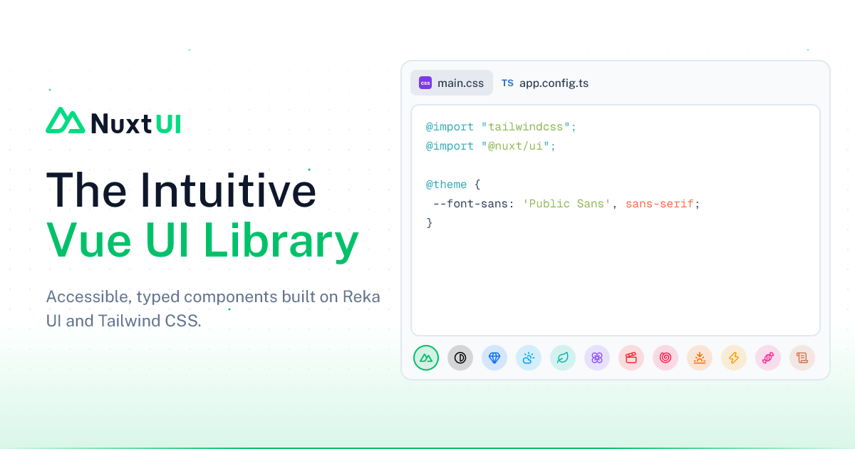

robots.txt (opens in a new tab)
34 rulesAll bots 0 allowed · 8 disallowed
- Disallow
/vercel/ - Disallow
/node_modules/ - Disallow
/docs/src/ - Disallow
/home/ - Disallow
/_nuxt/ - Disallow
/_plausible - Disallow
/dev/ - Disallow
/api/
claudebot 1 allowed · 0 disallowed
- Allow
/
claude-user 1 allowed · 0 disallowed
- Allow
/
claude-searchbot 1 allowed · 0 disallowed
- Allow
/
claude-web 1 allowed · 0 disallowed
- Allow
/
anthropic-ai 1 allowed · 0 disallowed
- Allow
/
gptbot 1 allowed · 0 disallowed
- Allow
/
chatgpt-user 1 allowed · 0 disallowed
- Allow
/
oai-searchbot 1 allowed · 0 disallowed
- Allow
/
google-extended 1 allowed · 0 disallowed
- Allow
/
google-cloudvertexbot 1 allowed · 0 disallowed
- Allow
/
meta-externalagent 1 allowed · 0 disallowed
- Allow
/
meta-externalfetcher 1 allowed · 0 disallowed
- Allow
/
perplexitybot 1 allowed · 0 disallowed
- Allow
/
perplexity-user 1 allowed · 0 disallowed
- Allow
/
mistralai-user 1 allowed · 0 disallowed
- Allow
/
duckassistbot 1 allowed · 0 disallowed
- Allow
/
youbot 1 allowed · 0 disallowed
- Allow
/
deepseekbot 1 allowed · 0 disallowed
- Allow
/
amazonbot 1 allowed · 0 disallowed
- Allow
/
cohere-ai 1 allowed · 0 disallowed
- Allow
/
ai2bot 1 allowed · 0 disallowed
- Allow
/
applebot-extended 1 allowed · 0 disallowed
- Allow
/
bytespider 1 allowed · 0 disallowed
- Allow
/
ccbot 1 allowed · 0 disallowed
- Allow
/
diffbot 1 allowed · 0 disallowed
- Allow
/
firecrawlagent 1 allowed · 0 disallowed
- Allow
/
No matching rules.
Sitemaps
1Recent Updates
- Website images
- Screenshots
- Network details
- Website Technologies
- Pages and Search Information
- HTTP Response Information
- TLS and certificates
- DNS Information
- Domain Registration
- Website profile
- Website Description
- Website Name
- Website profile
- Website Description
- Website Name
User reviews (0)