Website profiles · Technology insights · Alternatives

worldview.earthdata.nasa.gov No paid content found

Categories: Other

Interactive interface for browsing full-resolution, global, daily satellite images. Supports time-critical application areas such as wildfire management, air quality measurements, and weather forecasting. Data is generally available within three hours of observation.

Visit website

Updated: 2026-10-02 07:01 Language: English (default) Access: Normal

Profile views 3 Outbound visits 0
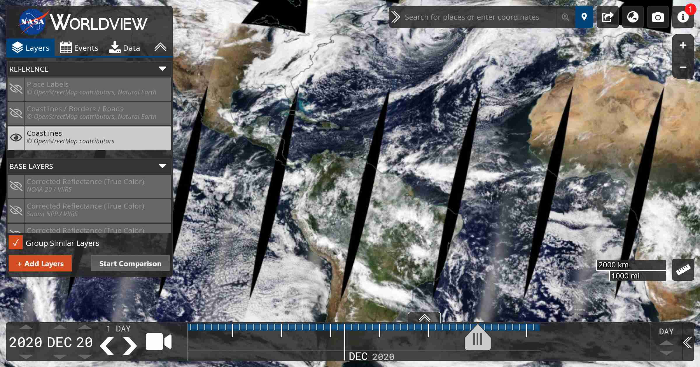
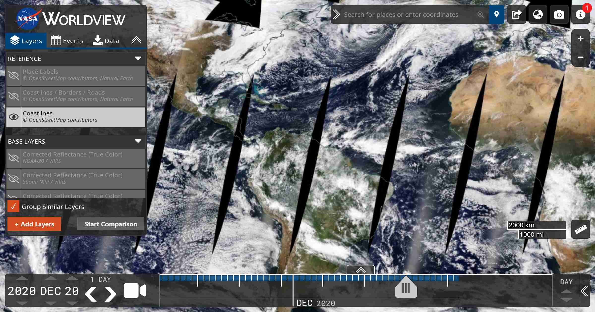
NASA Worldview Full homepage screenshot
Editorial Review

Website Review

What is NASA Worldview?

NASA Worldview is a free, browser-based tool for viewing near-real-time satellite imagery of the entire Earth. It is run by NASA's Earth Science Data and Information System and is aimed at anyone who needs to see what the planet looks like today or over recent weeks — not at people who want to process raw data themselves.

You open it, pick a date, and browse global, full-resolution daily images. The imagery is generally available within about three hours of observation, which is what makes it useful for time-sensitive situations rather than just archival browsing.

What you can actually do with it

  • Watch unfolding events. Wildfire managers, air-quality analysts and weather forecasters use it to see smoke plumes, dust storms, volcanic ash, flooding and storm systems as they develop.
  • Compare dates. Move the timeline back and forth to see how a fire perimeter, snowpack, coastline or algal bloom changed over days or weeks.
  • Layer different views. Combine satellite layers with overlays such as fires and thermal anomalies, and switch between true-color and other band combinations that reveal things the naked eye misses.
  • Check a location quickly. Type in a place name or coordinates and zoom to it without downloading anything.

Who it suits — and who it doesn't

If you are… Worldview works well Consider something else
A journalist or emergency responder needing a quick visual Yes — fast, visual, no setup —
A researcher needing calibrated, downloadable data Useful for a first look A dedicated data portal for analysis-ready files
A student or curious general reader Yes — no account or software needed —
Someone wanting high-resolution commercial or historical imagery Partly Commercial imagery providers

The main trade-off is depth versus speed. Worldview is excellent for orientation and monitoring, but it is a viewing interface, not an analysis environment. If you need to run calculations, you will likely export the imagery or move to the underlying NASA data archives.

A practical next step

Pick a real event you care about — a fire near you, a hurricane, or the snow on a mountain you know — and step through the last two weeks day by day. That single exercise will tell you faster than any description whether the tool fits your workflow.

For complementary views, NASA's Earth Observatory publishes plain-language stories and images at NASA Earth Observatory, and the broader Earthdata portal at NASA Earthdata is where the underlying datasets live.

How can I use NASA Worldview to monitor wildfires in real time?

NASA Worldview lets you monitor wildfires by layering near-real-time satellite imagery on a global map. It is not a fire alert service: it shows you what sensors observed, often within about three hours, and you interpret the smoke, burn scars and heat signatures yourself.

A practical wildfire workflow

  1. Open NASA Worldview and zoom to the region you care about, or search a place name.
  2. Add a fire-related layer from the layer list — look for active fire or thermal anomaly products, plus a true-colour or false-colour imagery layer.
  3. Add a smoke or aerosol layer if you want to see where smoke is travelling, and a wind layer to judge direction.
  4. Use the timeline at the bottom to step through recent days and compare before, during and after an event. The animation feature is useful for showing a fire front moving over several days.
  5. Switch base layers to distinguish cloud from smoke: a false-colour combination makes burn scars and active fire lines stand out where visible imagery is ambiguous.

What it is good at, and what it is not

Strength Limitation
Global, daily coverage with no account needed Not a dispatch or evacuation tool
Fast refresh for time-critical decisions Cloud, smoke and night can hide the ground
Time comparison to track growth and recovery Coarse resolution for small or short-lived fires

The typical user is an analyst, journalist, researcher or emergency-planning staffer who needs a quick independent look at an incident. For official warnings and evacuation orders, go to your local fire authority or civil protection agency instead.

A concrete scenario

Suppose you are tracking a fire near a town. You open Worldview, centre on the area, enable an active-fire layer and a corrected-reflectance imagery layer, then scrub back a week. You can see the ignition point, the direction of spread and the smoke plume. Add a wind layer to check whether the plume is heading toward the town. That gives you a defensible picture of the situation to pair with official updates, without claiming more precision than the data supports.

What satellite data sources and layers are available in NASA Worldview?

NASA Worldview gives you near-real-time, full-resolution satellite imagery as browsable layers, not as a data-analysis tool. You pick a date, zoom to an area, and stack layers to see what the satellites saw. The catalog is organized around imagery products from NASA's Earth observing fleet and partner instruments, covering the whole globe on a daily basis.

Main layer categories you'll find

  • True-color and corrected-reflectance imagery from MODIS (Terra and Aqua) and VIIRS (Suomi NPP and NOAA-20). These are the everyday "what does it look like from space" layers, useful for smoke plumes, dust, floods and snow cover.
  • Active fire and thermal anomalies — fire detections overlaid on imagery, which is why wildfire response teams use it.
  • Aerosol and air quality products such as aerosol optical depth, plus sulfur dioxide and other trace-gas layers for volcanic and industrial emissions.
  • Atmospheric layers including cloud fraction, water vapor and precipitation-related products.
  • Ocean color and sea surface temperature for algal blooms, sediment plumes and marine heat signals.
  • Land and cryosphere layers such as land surface temperature, snow cover and sea ice.
  • Night lights and nighttime imagery, plus specialized products like lightning.

What this means in practice

A useful way to think about it: Worldview is a visualization front end to NASA's Earth observation archive. If you need the underlying science data for statistics or modeling, you download the granules or go to the source archives; Worldview itself is for seeing and comparing.

If your goal is… Worldview works well Consider something else
Spot a wildfire or smoke plume today Yes — daily, updated within hours —
Track a hurricane or flood extent Yes — true-color and infrared Dedicated weather services for forecasts
Measure aerosol concentrations numerically Not really Data archives and analysis tools
Compare the same area across weeks Yes — date slider and animation GIS software for heavy analysis

A concrete scenario

Suppose you're a local air-quality officer and residents report haze. Open Worldview, set the date to today, zoom to your region, and toggle the aerosol optical depth layer over the true-color imagery. If a smoke plume lines up with your haze reports, you have a plausible source and direction; then pull the actual data values from the archive before making any public statement.

Next step

Start with the corrected-reflectance true-color layer for your area and date, then add one thematic layer at a time — fire, aerosol, or temperature — so you can tell which signal comes from which product. For official context on the program, see NASA and NASA Earthdata.

How often is new imagery added to NASA Worldview?

New imagery is generally available in NASA Worldview within about three hours of the satellite observation. That near-real-time cadence is the main reason the tool is used for time-sensitive work such as wildfire tracking, air-quality monitoring and weather forecasting.

NASA Worldview

A few practical qualifications:

  • Not every layer updates at the same speed. Different satellite instruments and products are processed on different schedules, so a layer you add may lag behind the fastest-available imagery.
  • "Daily" means daily global coverage, not a single daily refresh. You can step through dates to compare conditions over time.
  • Latency is a processing estimate, not a guarantee. Data availability can slip during heavy demand or technical issues.

For a concrete scenario: if you're monitoring a fast-moving fire, open the relevant imagery layer, set the date to today, and check whether the most recent overpass is already visible. If it isn't, the three-hour window hasn't closed yet for that product — try again shortly rather than assuming the event is missing.

Can I download or export images and data from NASA Worldview for my own analysis?

Yes. NASA Worldview is built for exactly that kind of use: it lets you browse full-resolution, global, daily satellite imagery and then take the imagery or underlying data out for your own analysis. According to the site's own description, it supports time-critical work such as wildfire management, air quality measurement, and weather forecasting, with data generally available within about three hours of observation — so the export path is meant for operational and research use, not just casual viewing.

H3 What you can typically take away

  • Imagery snapshots — capture the current map view as an image for reports, briefings or quick visual checks.
  • Georeferenced imagery layers — download image layers that retain geographic coordinates so they can be opened in GIS or remote-sensing software.
  • The underlying data — access the source data granules behind a layer, which is what you want for quantitative analysis rather than just looking at a picture.
  • Time-series views — compare dates to track change, useful for fires, floods, smoke plumes or seasonal patterns.

H3 Choosing the right export for your task

Your goal Better export choice
A figure for a slide or article Image snapshot of the map view
Overlay analysis in QGIS/ArcGIS Georeferenced imagery layer
Statistics, indices, modeling Source data granules
Tracking change over days or weeks Multiple dated exports or the time-series tool

H3 A practical example

Suppose you are monitoring a wildfire. You could open the area of interest, add a true-color or false-color imagery layer plus an active-fire or aerosol layer, and export a dated snapshot for a situation report. For anything quantitative — say, estimating burn scar area — you would instead pull the georeferenced layer or the underlying data granule into a GIS and run your own calculations.

H3 Before you rely on it

Check the resolution, projection and licensing of the specific layer you download, since these vary by dataset and sensor. Also note the latency: three hours is fast, but it is not real time, so for immediate decisions treat it as near-real-time context rather than a live feed. If you want a broader view of NASA's Earth observation data, NASA Earthdata is the main catalog and distribution point, and NASA Worldview itself is the browsing and export interface.

How does NASA Worldview compare to other satellite imagery platforms for tracking natural disasters?

NASA Worldview is strongest when you need to see what a satellite saw, fast, without building a data pipeline. It is a browse-and-download interface for full-resolution, global, daily imagery, with new data generally available within about three hours of observation. For disaster tracking, that timeliness matters more than polish: you can check a wildfire perimeter, a dust plume, or flooding extent the same day and pull the underlying imagery for your own analysis.

Its trade-offs are equally clear. Worldview is not a hazard-alerting service, not a GIS analysis tool, and not a source of official evacuation or damage assessments. It shows imagery layers and lets you compare dates; it does not model fire spread or issue warnings.

H3 Where it fits against alternatives

Platform Best for Main trade-off
NASA Worldview Fast, free, full-resolution daily imagery and near-real-time natural hazard browsing No alerting, limited analysis; you interpret what you see
NASA Earthdata Finding and downloading the underlying datasets and products More technical; slower to a first look
Sentinel Hub Custom scripts, band math, and processing chains on Sentinel and other data Requires configuration and often a paid plan
USGS Landsat archives, EarthExplorer downloads, and official hazard programs Interface is archive-oriented, not a quick daily browse

H3 A practical scenario

Suppose a wildfire breaks out and you need a same-day view. Open Worldview, search the location, set the date to today, and add a true-color layer plus a fire or aerosol layer. Compare with the same date last week to judge growth. If you need to quantify burn area, download the granules and move to a GIS tool; if you need an official incident update, go to the responsible agency instead.

H3 Decision criteria

  • Choose Worldview for speed, global daily coverage, and free access to full-resolution imagery.
  • Choose a processing platform when you need band math, time series, or automated alerts.
  • Choose an official agency source when the decision depends on authoritative warnings or damage reports.
  • Use Worldview as a first look, then verify with the dataset or agency behind it.

A useful next step: pick one recent event you care about, view it in Worldview at two dates, and note whether the imagery alone answers your question. If it does not, that gap tells you which specialized platform you actually need.

Related questions

More questions →
What Are Natural Hazards and How Can You Assess Your Risk?

Natural hazards are naturally occurring events—floods, hurricanes, tornadoes, wildfires, earthquakes, and others—that can threaten people and property. A hazard becomes a disaster only when it actually affects a community. To assess your own risk, you look at which hazards are plausible where you live and how severe they could be. Augurisk, a US-focused risk platform, offers a free, instant disaster and societal risk report for a home, city, or neighborhood, scoring risk from Very Low to Very High.

Hazard vs. disaster: the key distinction

A natural hazard is a physical event or condition with the potential to cause harm—a fault line, a floodplain, a hurricane-prone coastline. A natural disaster is what happens when that hazard intersects with people, buildings, and infrastructure and causes real damage or loss.

This matters because you can live near a hazard without ever experiencing a disaster. Risk assessment is about estimating the probability and consequence of that intersection for a specific place.

Common natural hazards in the US

The hazards that matter most depend heavily on where you are. Augurisk's state-by-state coverage highlights different combinations—for example, "Crime & Flood Risk" for most states, "Crime & Wildfire Risk" for states like California, Idaho, and Oregon, and "Crime & Disaster Risk" for others such as Kentucky, Missouri, and Tennessee.

Hazard Typical US regions What drives the risk
Flooding (incl. coastal) River valleys, coasts, low-lying areas Proximity to water, elevation, drainage
Hurricanes Gulf and Atlantic coasts Coastal location, storm surge exposure
Tornadoes Central US ("Tornado Alley") Regional climatology
Hail storms Central and Plains states Storm patterns
Blizzards Northern and mountain states Latitude, elevation
Wildfires West, Southwest, and dry forest regions Vegetation, dryness, terrain
Drought Arid and agricultural regions Climate, water supply
Earthquakes West Coast, fault zones Proximity to faults
Rising sea levels Coastal communities Long-term coastal change

How risk is actually assessed

Risk assessment combines hazard data with exposure and vulnerability. In practice, platforms like Augurisk use proprietary risk models—the site states it includes 12 such models—to translate data into a simple rating.

The output is usually a graded scale. Augurisk uses five levels: Very Low, Low, Moderate, High, and Very High. This lets you compare one location against another at a glance rather than reading raw data.

Steps to check risk for your home, city, or county

  1. Identify your location — a specific address, city, or neighborhood.
  2. Pull a risk report — Augurisk provides an instant, free disaster and societal risk report for a home, city, or neighborhood.
  3. Read the rating — note where your location falls on the Very Low–to–Very High scale.
  4. Check the hazard types — see which specific hazards (flood, wildfire, etc.) drive your score.
  5. Compare — look at nearby counties or states to understand relative risk.

Expected result: a clear risk rating for your location that you can use for decisions about preparedness, insurance, and where to live.

Why this matters for preparedness and insurance

Knowing your hazard profile helps you:

  • Prepare — buy supplies, plan evacuation routes, and reinforce your home for the hazards most likely to affect you.
  • Insure — understand why certain coverage (flood, earthquake) may be required or recommended in your area.
  • Decide — weigh risk when buying, renting, or relocating.

A note on scope

Augurisk covers the United States, including states, territories such as Puerto Rico, Guam, and the US Virgin Islands, and counties. The platform reports reaching 200,000 yearly users. Its reports are framed as instant and free, though the site does not publish pricing details for any additional enterprise services—so treat the free report as the starting point and confirm anything beyond it directly with the provider.

What Does 'Daily' Mean for a News Site Like The Peninsula Qatar?

On The Peninsula Qatar, "daily" describes how often the outlet publishes — it puts out news every day — rather than naming a specific topic, section, or content type. That matters because a daily publication is organized around freshness: stories are tied to a date, sections are refreshed continuously, and the value of the site comes from checking it regularly rather than reading it once. If you want to follow Qatar, Gulf, or world news through this outlet, treat it as a recurring habit with a fixed routine, not a single visit.

"Daily" is a frequency label, not a category

When a news site calls itself a daily, it is making a claim about its publishing rhythm. The Peninsula describes itself as bringing "the latest news from Qatar and around the world," which signals an ongoing cycle of updates rather than a static archive.

So "daily" tells you:

  • How often to expect new material — every day, not weekly or monthly.
  • How to read it — in short, repeated sessions rather than one long read.
  • What kind of source it is — a newspaper-style outlet, not a blog, database, or reference site.

It does not tell you the subject matter. A daily can cover sport, business, entertainment, health, and opinion all at once, which is exactly what this outlet does.

How a daily paper organizes its coverage

A daily newspaper splits its output into sections so readers can navigate a large volume of stories. The Peninsula's stated coverage spans football, cricket, business, entertainment, Bollywood, Hollywood, science, technology, health, fitness, and opinion from columnists — alongside Qatar and world news.

A practical way to picture the structure:

Layer What it covers How often it changes
Local / Qatar News specific to Qatar and Doha Frequently, through the day
Regional / Gulf Gulf-wide developments Daily
World International news Daily, often rolling
Sport Football, cricket, and more Daily, spikes around fixtures
Business Markets, companies, economy Daily on business days
Lifestyle & opinion Entertainment, health, fitness, columnists Daily or near-daily

The point of the section structure is that you do not read everything. You pick the layers you care about and let the rest pass.

Checking whether a daily site is actually fresh

Because "daily" is a promise, it is worth verifying it holds. On a news site, look for:

  • Date and time labels on each story — these tell you when it was published or last updated.
  • Ordering — the newest items should sit at the top of a section or homepage.
  • Update markers — some stories carry a "updated" note when they are revised after first publication.
  • Recurring formats — live blogs, market wraps, or match reports that reappear on a schedule.

If the top stories carry old dates, the "daily" rhythm has slipped for that section, and you should adjust how much you rely on it.

A routine for reading a daily without overload

The failure mode with any daily is trying to read all of it. A workable routine:

  1. Pick two or three sections that match your actual interests — for example, Qatar news plus business.
  2. Check once or twice a day at fixed times, rather than refreshing constantly.
  3. Scan headlines first, then open only the stories that affect a decision, a conversation, or your work.
  4. Use the date labels to skip anything you already saw in a previous session.
  5. Stop when your chosen sections are covered — the rest will still be there tomorrow.

This turns a daily from an endless feed into a bounded task.

Daily edition vs. rolling online updates

These are two different things wearing the same word:

  • A daily edition is the day's collected output — the set of stories published for that date, the way a printed paper is assembled once.
  • Rolling online updates are stories added, revised, or replaced throughout the day, so the "edition" is never truly finished.

The Peninsula operates as an online news source, so expect the rolling model: a story you read in the morning may be updated by the afternoon. That is a feature, not a flaw — but it means you should re-check a developing story rather than assume your first read is final.

What to take away

"Daily" on a site like The Peninsula Qatar is a statement about how often it publishes, and it implies a reading habit: check regularly, follow the sections you need, use date labels to avoid repeats, and treat developing stories as live rather than fixed. Read it as a recurring appointment with the news, not as a one-time reference.

What Recent Agricultural Science Research Actually Shows

Agricultural science research is best understood as a set of evidence types, not a single stream of breakthroughs. A study showing that a cover crop increased soil carbon on one farm is not the same kind of claim as a multi-year trial across dozens of sites, and neither is the same as a computer model projecting yields in 2050. If you want to know what "agriculture research shows," the first useful skill is telling those apart.

Start by identifying the study type

Most agriculture news items fall into one of four categories, and each supports a different strength of conclusion.

Study type What it does What it can support Main limitation
Controlled experiment Compares treatments under managed conditions (lab, greenhouse, small plot) Causal claims within those conditions Conditions may not resemble a working farm
Field trial Tests practices on real farmland, often over seasons Practical, context-specific effects Results tied to soil, climate, and management
Observational study Measures what already exists without assigning treatments Associations and patterns Cannot prove cause and effect
Model or simulation Projects outcomes from assumptions and data Scenarios and ranges Output quality depends entirely on inputs

A headline rarely states which of these it is. The abstract or methods section almost always does.

The main areas agriculture research actually covers

Soil health and fertility

Work here examines organic matter, microbial communities, nutrient cycling, erosion, and how tillage or cover cropping changes them. Findings are often highly site-specific because soil type and climate drive results.

Crop genetics and breeding

Researchers develop varieties with traits such as drought tolerance, disease resistance, or improved nutrient use. Distinguish between results from controlled environments and multi-location field performance, which is what determines whether a variety reaches farmers.

Livestock and animal science

This includes nutrition, genetics, health, emissions, and welfare. Feed trials and herd studies typically report average effects across a population, not guarantees for an individual animal.

Climate resilience and environmental impact

Studies assess how farming systems respond to heat, drought, flooding, and pests, and how agriculture contributes to or mitigates greenhouse gas emissions. Many of these rely on models combined with field data.

Technology and precision agriculture

Sensors, remote sensing, and data-driven management are evaluated for water use, input efficiency, and yield. Adoption research examines whether these tools actually get used and under what conditions.

Why a single study is rarely the final word

One experiment is a data point, not a settled fact. Science moves through replication (other teams getting similar results), meta-analysis (combining many studies), and review. When you read about a finding, ask:

  • Has it been repeated in different locations or years?
  • Is there a systematic review or meta-analysis on the topic?
  • Do the authors describe the result as preliminary?

A result that holds across many independent trials is far more actionable than one striking headline.

Lab and greenhouse results are not farm results

Controlled conditions remove variables—pests, weather swings, soil variability—that real farms cannot remove. A treatment that works in a greenhouse may fail in a field, and a field result from one region may not transfer to another. This is not a flaw in the research; it is a limit on how far you can generalize it. Always check where and under what conditions the work was done.

Practical questions before applying any finding

  1. Sample size: How many plots, animals, or sites were studied?
  2. Location and climate: Does the setting resemble yours?
  3. Time frame: One season or many years? Some soil effects take years to appear.
  4. Control or comparison: What was the finding compared against?
  5. Effect size: How large was the change, and does it matter economically?
  6. Funding and conflicts: Who supported the work, and do the authors disclose interests?
  7. Peer review: Was it published in a peer-reviewed journal, or is it a preprint or press release?

Where to find the primary sources

News coverage is a summary of a summary. To go deeper, look for the original journal article, the university or agency press release it came from, and any linked data. Government agricultural agencies, university extension services, and international research organizations publish applied guidance alongside primary studies. Extension materials are often the most directly usable for on-farm decisions because they translate research into local recommendations.

A reasonable way to read agriculture news

Treat each item as one piece of an evolving picture. Note the study type, the location, the time frame, and whether it has been replicated. Then ask whether the conditions match your own. Research tells you what happened under specific circumstances; deciding what to do with that information depends on your soil, climate, budget, and goals.

What Is NASA GMAO? Global Modeling and Assimilation Data Explained

NASA's Global Modeling and Assimilation Office (GMAO) is the part of NASA's Earth science effort that builds global models of the Earth system and combines them with satellite and other observations through data assimilation. If you need research-grade atmospheric, land surface, ocean, or ozone fields — especially for subseasonal-to-decadal timescales — GMAO is a primary source. If you need a consumer weather forecast or a simple point-and-click local outlook, GMAO is not that; it produces the underlying model and reanalysis data that other services build on.

What GMAO actually does

GMAO's work sits at the intersection of two activities:

  • Global modeling — running numerical models that simulate the atmosphere, land surface, ocean, and chemistry on a global grid over time.
  • Data assimilation — merging those model simulations with real observations (largely satellite) to produce a physically consistent, gridded estimate of the Earth system state.

The assimilation step is what separates a reanalysis or analysis product from a pure forecast: observations constrain the model so the output stays anchored to what actually happened, while the model fills gaps where observations are sparse.

The main product areas

GMAO's stated scope covers several Earth system components. The table below maps each to what it typically means for a user.

Domain What it covers Typical use
Atmospheric Winds, temperature, humidity, pressure fields Weather and climate diagnostics, model evaluation
Land surface Soil moisture, surface fluxes, land-atmosphere exchange Drought, hydrology, agriculture research
Ocean Sea surface and ocean state variables Coupled climate and seasonal prediction work
Ozone Atmospheric ozone fields Atmospheric chemistry and stratospheric studies
Subseasonal to decadal Forecasts and analyses on weeks-to-years timescales Seasonal outlooks, predictability research

If your question is "what did the atmosphere look like over a region last month" or "what does the model project for the coming season," these categories tell you which product family to look in.

How to access GMAO data and documentation

GMAO publishes its research, model descriptions, and data products through its site at gmao.gsfc.nasa.gov. A practical path:

  1. Start with the research/product pages to identify which model or dataset matches your variable and time range.
  2. Read the documentation for that product — resolution, time span, and known biases determine whether it fits your use case.
  3. Download or query the data through the access method the product page specifies.
  4. Validate against your own observations before relying on it, since reanalysis and model fields carry resolution and bias limitations.

The site is documentation- and research-oriented, so expect to read product descriptions rather than find a single unified download button for everything.

When GMAO fits your work — and when it doesn't

Good fit:

  • You need gridded global fields for research, model evaluation, or downstream processing.
  • You work on subseasonal-to-decadal timescales or Earth system components like land, ocean, or ozone.
  • You can handle scientific data formats and read documentation.

Poor fit:

  • You want a ready-made local forecast for planning your day — use a consumer weather service instead.
  • You need a guaranteed, plug-and-play API with no setup.
  • You need commercial support or a service-level guarantee; GMAO is a NASA research operation.

Common limitations to plan for

  • Resolution and bias. Global model and reanalysis fields are gridded estimates, not point measurements. Local accuracy varies.
  • Documentation-dependent use. Correct interpretation requires reading the product notes; using a field without checking its time span or version can lead to wrong conclusions.
  • Research orientation. Access methods and formats assume a technical user.

If your task is research or development that needs global, physically consistent Earth system data, GMAO is worth checking first. If your task is a quick local forecast, look elsewhere.

Website Overview

An established domain and managed infrastructure suggest continuity of operations and may support dependable delivery, although neither guarantees service quality. Several search or sharing settings need attention. Together they may make snippets, preview images or preferred URLs less consistent across platforms.

Domain and Registration

Registered in 1997, this domain has about 29 years of history. That suggests continuity, although ownership and purpose may have changed. Transfer-protection status is present, helping reduce the risk of unauthorized domain transfers. The domain uses .gov, a restricted namespace whose registration normally has eligibility requirements. Registration contact information is publicly available through RDAP.

DNS and Email

The lowest TTL is 60 seconds, supporting rapid record changes at the cost of more frequent lookups. Nameservers are provided by Akamai Edge DNS, indicating managed DNS hosting. DNS and provider evidence indicate traffic passes through the Amazon CloudFront CDN, which may support caching and traffic distribution. MX records point to the Microsoft 365 email service. DNSSEC is enabled, allowing validating resolvers to authenticate signed DNS data.

TLS and Certificates

The certificate uses an RSA 2048-bit public key, offering broad client compatibility. The server supplied a complete certificate chain. No organization name is present in the certificate; the available fields are consistent with domain validation. The certificate was issued within the Amazon cloud or CDN ecosystem. The certificate is valid for about 197 days in total, with 107 days remaining.

HTTP and Browser Security

The response lacks these common security headers: Referrer-Policy, Permissions-Policy. No X-Powered-By header was found, reducing one common source of backend fingerprinting information. The x-cache, via response header indicates a CDN or caching proxy in the delivery path. No obvious internal addresses or debug information were found in the headers. The Server header contains the custom value ServerTokens ProductOnly.

Technology Stack Analysis

The public page identifies Google Tag Manager, Amazon CloudFront without precise versions, leaving fewer clues for version-specific scanning.

Search and Social Sharing

The meta description has 267 characters and may be shortened in search results. No homepage canonical URL was detected. If duplicate URLs exist, consolidation may be less explicit. Twitter Card metadata is configured. The title has 14 characters, within a common display range. The observed directives allow indexing and link following.

Hosting and Email

DNSAkamai Edge DNS
HostingAmazon CloudFront
EmailMicrosoft 365
Location United States flagUnited States 18.67.65.104

User reviews (0)

  • No reviews yet.

Pages, Search and Sharing

Meta descriptionInteractive interface for browsing full-resolution, global, daily satellite images. Supports time-critical application areas such as wildfire management, air quality measurements, and weather forecasting. Data is generally available within three hours of observation.
Canonical URLNot detected
LanguageEnglish (default)
Twitter Cardsummary

Unknown

No sitemaps found

Registration details RDAP / WHOIS

Registrarget.gov
Registered1997-10-02
Expires2027-07-31
Domain statusserver transfer prohibited
Nameserversa1-32.akam.net、a12-64.akam.net、a14-67.akam.net、a5-66.akam.net、a8-66.akam.net、a9-64.akam.net
DNSSECsigned

DNS records

TypeNameValueTTLPriority
Ad21xna9em7jndj.cloudfront.net18.67.65.10460—
Ad21xna9em7jndj.cloudfront.net18.67.65.5360—
Ad21xna9em7jndj.cloudfront.net18.67.65.6060—
Ad21xna9em7jndj.cloudfront.net18.67.65.8660—
MXnasa.govnasa-gov.mail.protection.outlook.com6000
NSnasa.gova1-32.akam.net600—
NSnasa.gova12-64.akam.net600—
NSnasa.gova14-67.akam.net600—
NSnasa.gova5-66.akam.net600—
NSnasa.gova8-66.akam.net600—
NSnasa.gova9-64.akam.net600—
TXTnasa.gov1HqDXPHdt8JOt02qy6FB+l3+Z1zXScqcPxlE/faXjZLS9FRbVhHCUCHQE2bWofZt2TWKPchjjma3Pqli4FULFw==600—
TXTnasa.govHRlHXyx8jXo+9pIaJWFVBPOLVfeI2biAj3VT1woaTFpp05D5/q6AoD5KpUgws539/d2jl8wBJiEr58OEsRVugQ==600—
TXTnasa.govMS=ms93625004600—
TXTnasa.govamazonses:FXFVeQnEO3Wua+aY/H4aOIH3sSwteE+7YpGrwm8kF/s=600—
TXTnasa.govamazonses:PvUL7T41LO87xjr+2nfgxTu11i75NeT9HzY3xYv82Ko=600—
TXTnasa.govapple-domain-verification=qw51K0kGzRHLbN9S600—
TXTnasa.govasv=12d88629ae88f5017642bfc4981f8dd7600—
TXTnasa.govatlassian-domain-verification=oNzRM7G9GIAL/LLP5c7sPOQiAHsHrQ1hKcU7GGZ0ADRZJFhUB/upe935/2RYq/jO600—
TXTnasa.govatlassian-sending-domain-verification=4730ddf4-d24e-4a91-9612-cb14998d0e47600—
TXTnasa.govdocusign=4025560e-93c9-4920-bb13-849c6fc35d58600—
TXTnasa.govgoogle-site-verification=BUxd0xTJY4ZjGohBwKDpNms-yOATz92Y54kgme4eKHs600—
TXTnasa.govgoogle-site-verification=ZKpcXLqaBX3jND8Fybkvr3MaaOpC_6MRjXBYm0XNkJQ600—
TXTnasa.govmj8729pr7k44dx62wwtx5745xr5njzkn600—
TXTnasa.govn39n7frbwnkhcmky2nps779y4ttn61wl600—
TXTnasa.govnmh1f9tgxhmfmjkshg7qh595drdfgnf1600—
TXTnasa.govopenai-domain-verification=dv-CO0ENDLO7EB9V5E4JnmE6pS8600—
TXTnasa.govopenai-domain-verification=dv-Fbq5PVntP9qLelQPUBKniDjr600—
TXTnasa.govpvv8mevb6qrmqvqi8alhmreg42600—
TXTnasa.govsmartsheet-site-validation=gnL11HAQqHlH1tQabmxKf12b5ZCNxJfx600—
TXTnasa.govuechcfoubh169akghg2214p54n600—
TXTnasa.govv=spf1 include:_spf-4a.nasa.gov include:_spf-4b.nasa.gov include:_spf-4c.nasa.gov include:_spf-4d.nasa.gov include:_spf-4g.nasa.gov include:_spf-4m.nasa.gov include:_spf-4x.nasa.gov include:_spf-6a.nasa.gov include:spf.protection.outlook.com -all600—
TXTnasa.govwebexdomainverification.1YPST=f98a61ea-b92e-41f2-87aa-5651b2af43b8600—
CNAMEworldview.earthdata.nasa.govd21xna9em7jndj.cloudfront.net600—
DSnasa.gov59470 8 2 a4d0e150872a3b60e0984c005ebdc7a7fb860ee69d8334db924989ee4175e30e3600—
DMARC_dmarc.nasa.govv=DMARC1; p=reject; fo=1; rua=mailto:[email protected],mailto:[email protected]119—

TLS and certificates

AssessmentNormal configuration
Supported protocolsTLSv1.2、TLSv1.3
Negotiated protocolTLSv1.3
Certificate subjectworldview.earthdata.nasa.gov
IssuerAmazon
Valid until2027-01-17T23:59 · Remaining when checked: 107 days
Verification detailsCertificate trust: Passed · Hostname match: Passed

HTTP response headers

HeaderValue
content-typetext/html
serverServerTokens ProductOnly
strict-transport-securitymax-age=31536000; includeSubDomains; preload
content-security-policyframe-ancestors *.nasa.gov https://nasa-gibs.github.io *.arcgis.com *.refoorest.com *.cuny.edu *.monday.com *.imperativemoocs.com laczko.ch walestra.or.id *.google.com www.gstatic.com *.googleusercontent.com *.earth.gov *.netlify.app earth.gov *.worldbank.org macroscope.earth sisu.ut.ee/velle-toll sisu.ut.ee dev-meteo-alia-e-dintorni.pantheonsite.io arset.unhosting.site californiatoday.com arctictradenations.com app.argos.education opera-cal-val.github.io *.articulate.com bourgoing.com apac.atm.ncu.edu.tw *.akd.odsi.io *.hf.space huggingface.co politiken.dk staging.politiken.dk test101.politiken.dk wri-indonesia.org https://nypost.com odsi.io agent.akd.odsi.io;
x-frame-optionsSAMEORIGIN
x-content-type-optionsnosniff

Identified technologies

Google Tag ManagerAmazon CloudFront