Website profiles · Technology insights · Alternatives

bloouikit.com

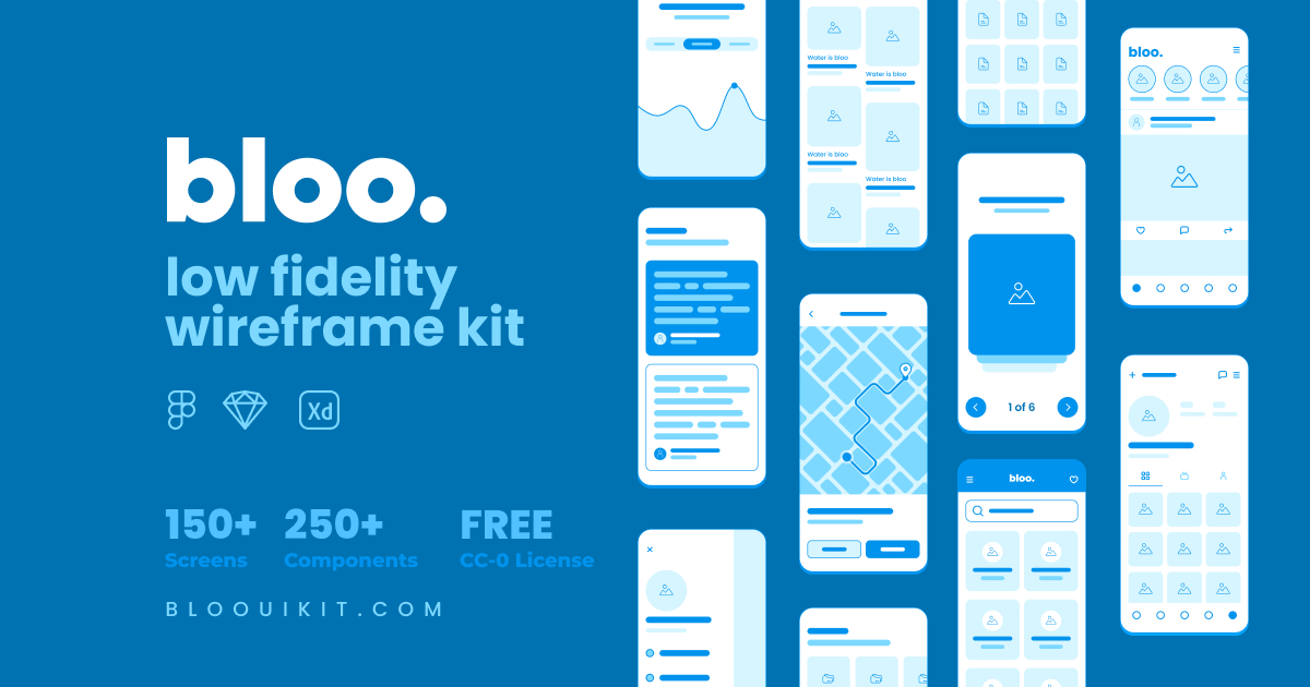
All in one open source wireframe kit for quick design and prototyping your idea. Its library contains more than 250+ components supporting darkmode and 150+ ready to use mobile screens .

No paid content found
Visit website
Profile views 4 Outbound visits 0 Normal
Bloo Low Fidelity Wireframe Kit Full homepage screenshot

At a glance

Category
Design & Creativity
Language
English
Paid-content signal
No paid content foundObserved
Registered
2021
Hosting
FastlyInferred
HTTPS certificate trusted
PassedObserved
Last updated

Website review

This review may include AI-generated content and is not individually verified. Domain, certificate and other facts come from the observed data on this page.

What is Bloo Low Fidelity Wireframe Kit?

Bloo Low Fidelity Wireframe Kit is a free, open-source library of wireframing components and screen templates for quickly sketching and prototyping product ideas. It is distributed as a design file for Figma, Sketch, and Adobe XD, and it's released under a CC0 license, so you can use it for both personal and commercial work without asking permission.

The kit's contents are aimed at speed rather than visual polish:

  • 250+ predefined components for assembling layouts
  • 150+ ready-to-use mobile screen templates
  • 10+ flowchart and arrow examples for mapping flows
  • Dark mode support across the library

Because it's low fidelity, the value is in getting structure, hierarchy, and navigation down before anyone debates colors or type. A typical use: a solo founder or small product team needs to test an onboarding flow this week, so they drag in screen templates, rearrange the steps, and put the result in front of users for feedback. A UX designer at a larger company might use it the same way for early stakeholder reviews, then hand the validated structure to a visual designer.

The main trade-off is exactly what makes it fast. These are deliberately rough, generic screens, so they won't represent your brand or final interaction details, and you'll need to redraw anything you intend to ship. If your team already has a mature design system, a component library like this can add a second, inconsistent vocabulary, so it's best kept to the earliest exploration phase. It also leans mobile: if you're designing a dense desktop dashboard, the screen templates will help less than the individual components.

One practical note from the kit's own framing: the author describes the styles and components as made "for fun" but useful for turning ideas into something testable quickly. Treat that as the intended scope — a fast thinking tool, not a production UI kit.

A good next step is to download the version matching your tool, open the mobile screen templates first, and pick two or three that resemble the flow you have in mind. Sketch your flow by rearranging those before touching the component library; that keeps you in low-fidelity thinking instead of drifting into pixel-level decisions. If you want to compare options before committing, Figma's own community files and Figma are a reasonable place to browse alternative wireframe kits.

How do I download and install Bloo for Figma, Sketch, or Adobe XD?

Bloo is distributed as a single open-source kit you download once, then open in whichever design tool you already use. The page lists download options for Figma, Sketch and Adobe XD, so installation is really just importing the file into that tool.

What you get in the download

  • 250+ predefined wireframe components
  • 150+ ready-to-use mobile screens
  • 10+ flowchart and arrow examples
  • Dark mode support
  • CC0 licence, free for personal and commercial use

Per-tool steps

H3 Figma Download the Figma version, then in Figma open the file from your drafts or use Import file and choose the downloaded .fig file. Because Figma files often arrive as community duplicates, the simplest route is to open the downloaded file once and then duplicate it into your own project. Components arrive as local components, so you can detach, restyle or publish them to a team library.

H3 Sketch Download the Sketch version and double-click the .sketch file, or use Open in Sketch. The components should appear in the document's Symbols/Components panel, from which you can insert them into your own artboards. If you want them in every new document, copy the components into a template document or add them to a shared Sketch library.

H3 Adobe XD Download the XD version and open the .xd file in Adobe XD. XD treats the file as a normal document with components and artboards; to reuse them, copy the components into your working file or save the file as a cloud document and use it as a source for linked assets. Note that Adobe XD is no longer actively developed, so treat this version as a convenience rather than a long-term commitment.

A practical decision rule If you are starting fresh, choose the tool you already pay for or use daily, then download only that version. If you collaborate, Figma is usually the easiest to share and hand off; Sketch suits Mac-based teams with an existing library workflow; XD is mainly for people already inside Adobe's ecosystem.

First 10 minutes Open the file, scan the screen templates to find one close to your idea, duplicate it into a new page, then swap in components from the library. Keep the original download untouched as your master copy so you can re-import later.

The official source is Bloo Low Fidelity Wireframe Kit.

Can I use Bloo wireframes in commercial projects without attribution?

Yes. The Bloo Low Fidelity Wireframe Kit is published under a CC0 license and the page states it is free for commercial and personal use. CC0 is a public-domain-style dedication, so it does not require attribution — you can use the components in client work, paid products or internal tools without crediting the creator.

A few practical points:

  • Attribution is optional, not forbidden. Crediting Vijay Verma (@realvjy) is a courtesy, not an obligation. Many designers still add a line in a portfolio or README.
  • The license covers the kit, not your output. Your wireframes and the product you build from them are yours; CC0 applies to the components and templates themselves.
  • Low fidelity means exactly that. With 250+ components, 150+ mobile screens and 10+ flowchart examples, this is best for early structure and flow testing — not for final UI. Expect to replace it with a visual design system before launch.
  • Redistribution is a separate question. If you plan to repackage the kit itself and sell it as a template library, check the license terms directly rather than assuming commercial use of your own designs covers reselling the assets.

Next step: if you need a higher-fidelity starting point later, compare this with a full UI kit such as Figma community resources, or a design system like Material Design. For pure wireframing, Bloo's CC0 terms are about as permissive as it gets.

How can I customize the dark mode components and mobile screens in Bloo?

Bloo's dark mode is a styling layer over the same component library, so customization means editing the design file's shared styles rather than hunting for separate dark-mode components. The kit ships as Figma, Sketch and Adobe XD files with 250+ components and 150+ mobile screens, and it's released under CC0, so you can restyle and republish without licensing friction.

How customization works

  • Start with color styles, not layers. Open the file's color style or variable definitions and change the dark surfaces, text and border tokens there. Every component and screen using those tokens updates at once.
  • Check which library you downloaded. Figma files typically expose styles and components that propagate across screens; Sketch uses shared text and layer styles plus symbols; Adobe XD uses character and color assets with components. The mechanics differ, but the principle — change the token, not the instance — is the same.
  • Detach only when you must. If a screen needs a genuinely different structure (say, a bottom sheet instead of a full page), detaching that one screen is fine. Detaching the whole library defeats the point of using a kit.
  • Swap screens, keep the grid. The 150+ mobile screens are pre-built layouts. Replacing placeholder blocks with your own content usually works best inside the existing spacing and column structure, so flows stay visually consistent.

A practical scenario

Suppose you're validating a fintech onboarding flow and your brand is a deep navy with a single accent. Duplicate the file, redefine the dark background, surface, text and accent styles, then walk through the 10+ flowchart and arrow examples to map your own steps onto existing screen templates. You get a clickable prototype in an afternoon instead of drawing boxes from scratch.

Decision criteria

  • Use Bloo as-is when you only need to test structure and flow with users.
  • Restyle tokens when you need brand recognition in a stakeholder demo.
  • Rebuild individual screens when your product's interaction pattern doesn't exist in the library.

If you want a second low-fidelity option to compare component depth and file formats, Figma community files and Sketch's own template resources are the official places to look.

What are the flowchart and arrow examples included in Bloo used for?

The flowchart and arrow examples are a small, reusable set of diagramming pieces rather than a screen library. Bloo lists "10+ Flowchart & Arrow Example" among its assets, alongside 250+ components and 150+ mobile screens, so this group is best understood as the connective tissue for mapping how a user moves between those screens.

Typical uses:

  • User flows: boxes for steps or screens, arrows for the path a person takes, including branches for alternate choices.
  • Decision points: showing where a flow splits (logged in vs. not, payment succeeds vs. fails) before you commit to screen layouts.
  • Annotations in reviews: a quick arrow or note block to point at a specific element during a critique instead of writing a paragraph.
  • Onboarding and checkout maps: tracing a linear sequence with a clear start and end, which is where low-fidelity diagrams pay off fastest.
  • Handoff context: attaching a flow sketch to a prototype so a developer sees the intended order, not just the individual screens.

Where it fits in practice

Consider a designer preparing a first stakeholder review for a sign-up flow. With this kit, the sequence is: sketch the entry screen, duplicate a few screen templates for the steps, then drop in flowchart shapes and arrows to show the branch where a user abandons or verifies. The value is that the diagram and the wireframes share one visual language, so nobody mistakes the flow for a finished design.

Trade-offs to weigh

Diagram assets in a wireframe kit are deliberately plain: good for speed and for keeping attention on structure, less suited to polished presentations or complex system architecture. If you need many nested conditions, a dedicated diagramming tool will handle the sprawl better; if you need three screens and the path between them, this is faster.

Next step

Download the kit and open the flowchart/arrow set first. Sketch your current project's main path end to end, then decide whether the built-in shapes cover your branching needs or whether you should keep the wireframes here and diagram elsewhere. Bloo is free for personal and commercial use under a CC0 license, which removes licensing friction for client work. If you want to compare approaches before committing, Figma's own community files and Figma are a reasonable place to see how other teams structure flow templates.

How does Bloo compare to other free wireframe kits for rapid prototyping?

Bloo sits in the "fast and disposable" tier of free wireframe kits: it is built for getting an idea onto a screen quickly, not for producing polished design systems. Its page describes 250+ predefined components, 150+ ready-to-use mobile screens, 10+ flowchart and arrow examples, dark-mode support, and a CC0 license that covers personal and commercial use. It ships for Figma, Sketch and Adobe XD.

H3 What it is good at

  • Speed over fidelity. The library is large and predefined, so you assemble flows from existing blocks instead of drawing boxes yourself.
  • Mobile-first coverage. The 150+ screen templates are the strongest reason to pick it if you are mocking up an app.
  • Flow and logic work. The flowchart and arrow set is unusual for a wireframe kit and helps when you need to show navigation or state changes, not just screens.
  • No licensing friction. CC0 means you can use the output commercially without attribution, which matters if wireframes become client deliverables.

H3 How it differs from common alternatives

  • Compared with general-purpose UI kits such as Figma's community files, Bloo is narrower but more opinionated: you get low-fidelity blocks rather than high-fidelity components, which discourages pixel-tuning too early.
  • Compared with full design systems like Material Design, Bloo is deliberately rough. Use Material when the wireframe needs to communicate real platform behaviour; use Bloo when the goal is agreeing on structure.
  • Compared with paper or whiteboard tools such as Miro, Bloo wins on reusable components and loses on real-time group sketching.
  • Compared with paid kits, the trade-off is depth of maintenance and documentation, not the breadth of the starter library.

H3 A practical scenario You have a stakeholder call tomorrow and a half-formed app idea. In Figma, you open Bloo, drop in a login, home, list and detail screen, wire them with the arrow set, and present a clickable flow. You are not defending visual design, so feedback stays on structure and missing steps.

H3 Decision criteria Choose Bloo if you want volume, mobile screens and a permissive license, and you are comfortable working in Figma, Sketch or Adobe XD. Choose something else if you need documented components, accessibility annotations, or a kit that stays close to a real production library.

Next step: download it, build one five-screen flow for a real idea, and judge whether the component naming and grouping let you move fast without hunting.

Related questions

More questions →
What Is an Open Source Wireframe Kit and How Do You Use One to Prototype an Idea?

An open source wireframe kit is a downloadable library of low-fidelity UI components, screen templates, and flow assets that you can use to turn an idea into a testable prototype quickly. The Bloo Low Fidelity Wireframe Kit, for example, ships 250+ predefined components, 150+ ready-to-use mobile screens, and 10+ flowchart and arrow examples, with files for Figma, Sketch, and Adobe XD. It is released under a CC0 license and is free for commercial and personal use. Choose this kind of kit when you want to validate structure and flow early, not when you need polished visual design.

What an open source wireframe kit actually contains

A wireframe kit is deliberately low fidelity: boxes, placeholders, generic buttons, and simple navigation patterns. That is the point — it keeps attention on layout and flow instead of color and typography.

Using the Bloo kit as a concrete reference, the contents break down as:

Asset type Count What it is for
Predefined components 250+ Buttons, inputs, cards, nav bars, and other building blocks
Screen templates 150+ Ready-made mobile screens you can assemble into a flow
Flowchart & arrow examples 10+ Diagramming pieces for mapping user journeys
Dark mode support Included Testing contrast and layout in both themes

The kit is distributed as source files for Figma, Sketch, and Adobe XD, so you edit components directly in your design tool rather than in a separate app.

How to go from idea to testable prototype

The workflow below applies to any low-fidelity kit; the specifics assume a Figma, Sketch, or Adobe XD file like Bloo's.

  1. Download the file in your tool's format. Pick Figma, Sketch, or Adobe XD to match where you work. Opening a Sketch file in Figma (or vice versa) usually loses component structure, so match the format up front.
  2. Skim the component library before designing. Confirm the kit has the patterns your idea needs — for a marketplace, that means listing cards, filters, and checkout steps. If a pattern is missing, you will be building it yourself.
  3. Assemble the core flow from screen templates. Duplicate the closest existing screens and rearrange them into the sequence a user would actually follow: entry point → main task → confirmation. Expect to modify templates rather than use them untouched.
  4. Replace content with your real structure. Swap placeholder labels for your actual screen names, section headings, and button text. This is where the wireframe starts answering questions instead of just looking like one.
  5. Add flow arrows to show transitions. Use the flowchart and arrow assets to mark what triggers each screen change, so a reviewer can follow the logic without you narrating it.
  6. Test with real people and iterate. Put the prototype in front of users, watch where they hesitate, and revise the wireframe. Because everything is low fidelity, changes are cheap at this stage.

Expected result: a clickable, structurally complete prototype you can hand to testers or stakeholders before any visual design work begins.

Low-fidelity wireframe kit vs. high-fidelity UI kit

These solve different problems, and picking wrong wastes time in both directions.

Dimension Low-fidelity wireframe kit High-fidelity UI kit
Visual detail Placeholders, no branding Styled components, real polish
Best stage Early concept and flow validation Late-stage design and handoff
Speed to first prototype Fast — assemble and go Slower — styling decisions required
Feedback it invites "Is this the right flow?" "Is this the right look?"
Risk if used too early None significant Stakeholders debate colors instead of structure

Use a wireframe kit when the open question is what the product does and in what order. Switch to a high-fidelity kit once the flow is settled and the open question becomes how it looks and feels.

What to check before you download

  • Format compatibility. Confirm the kit offers your design tool's native format. A kit that only ships Sketch files adds friction if your team works in Figma.
  • License terms. Bloo uses a CC0 license and permits commercial and personal use. Licenses vary between kits, so read the terms rather than assuming "open source" means unrestricted.
  • Component and template coverage. Count matters less than fit. 250+ components are useless if the specific patterns your product needs are absent.
  • Maintenance and source. Kits tied to an active maintainer tend to get updates; abandoned ones may break as design tools change their file formats.

Common problems and how to handle them

  • Missing components. If the kit lacks a pattern, build it once and add it to your local library so the rest of the prototype stays consistent.
  • Format mismatch. Converting between Figma, Sketch, and Adobe XD often flattens components into static shapes. Download the correct format instead of converting.
  • License confusion. "Free" and "open source" are not the same as "no conditions." Check whether attribution or redistribution limits apply before using assets in a shipped product.
  • Over-polishing too early. The most common failure is spending hours on visual detail in a wireframe. If you are choosing fonts, you have left the wireframe stage.

The Bloo Low Fidelity Wireframe Kit is a workable starting point if you need a large, free, CC0-licensed library across Figma, Sketch, and Adobe XD. Verify the format and license fit your project, then use it to settle structure and flow before investing in visual design.

What Is a Wireframe and How Do You Use One to Prototype an Idea?

A wireframe is a low-fidelity visual plan of a screen or flow: it shows layout, hierarchy, and interaction placement without committing to colors, typography, or final visual design. You use one early in the design process to turn an idea into something testable before investing in high-fidelity UI work. The fastest way to start is with a component library and screen templates — for example, the Bloo Low Fidelity Wireframe Kit offers 250+ predefined components, 150+ mobile screen templates, and 10+ flowchart and arrow examples, downloadable for Figma, Sketch, and Adobe XD under a CC0 license for personal and commercial use.

Low-fidelity vs. high-fidelity wireframes

The distinction is about how much detail you commit to, and it determines when each is useful.

Dimension Low-fidelity wireframe High-fidelity wireframe
Detail level Boxes, placeholders, grayscale shapes Real content, type, spacing, sometimes color
Purpose Structure, flow, hierarchy, early feedback Refining layout, validating visual decisions
Speed Fast to produce and change Slower; changes cost more
When to use Before visual design, during ideation After structure is agreed, before final UI
Risk Looks unfinished to some stakeholders Invites nitpicking on style too early

Low-fidelity is the right default when the question is "does this flow make sense?" High-fidelity is for when the question is "does this look and feel right?"

When wireframes fit in the design process

Wireframes sit between an idea and visual design. A practical sequence:

  1. Define the goal — what the user should accomplish on this screen or flow.
  2. Sketch the structure — wireframe the key screens and the path between them.
  3. Test the flow — walk through it yourself or with others; find gaps and dead ends.
  4. Iterate cheaply — rearrange boxes and screens while changes are still fast.
  5. Move to visual design — apply type, color, and brand once structure holds.

Skipping straight to high-fidelity usually means redoing visual work every time the structure changes.

How component libraries and screen templates speed things up

Instead of drawing every box from scratch, you assemble screens from predefined parts. A kit like Bloo provides:

  • 250+ predefined components — buttons, inputs, cards, navigation, and similar building blocks.
  • 150+ ready-to-use mobile screens — starting points you can duplicate and rearrange.
  • 10+ flowchart and arrow examples — for mapping flows between screens.
  • Dark mode support — useful when the target product needs it.

This matters because wireframing is repetitive: the same header, list row, or tab bar appears across many screens. Reusing components keeps spacing and structure consistent and lets you focus on the flow rather than redrawing rectangles.

Tools and formats

Wireframe kits commonly ship in the major design tools. Bloo is available for Figma, Sketch, and Adobe XD, so you can work in whichever your team already uses. The kit is described as open source under a CC0 license, free for personal and commercial use. If you prefer not to use a kit, any of these tools can produce wireframes from scratch with basic shapes and text.

Practical steps to turn an idea into a testable wireframe flow

  1. List the screens your idea needs — for example, onboarding, home, detail, and settings.
  2. Pick a starting template from the kit closest to each screen's purpose, and duplicate it.
  3. Replace content with placeholders — keep labels generic so reviewers focus on structure.
  4. Assemble the flow — use the flowchart and arrow examples to connect screens in order.
  5. Check the path — follow it as a new user would; note where you get stuck or where a step is missing.
  6. Share for feedback — ask specifically about flow and hierarchy, not colors or wording.
  7. Iterate, then hand off — once the structure is stable, move to visual design.

Common pitfalls

  • Adding visual polish too early — it invites style feedback before the structure is settled.
  • Wireframing every edge case first — start with the primary path, then expand.
  • Treating the wireframe as final — it's a thinking tool; expect to change it.
  • Inconsistent components — reusing a library avoids mismatched spacing and repeated elements.

If your goal is to validate structure and flow quickly, a low-fidelity wireframe built from a component kit is the efficient path. If your goal is to evaluate visual design, move to high-fidelity once the wireframe holds.

What Is the Bloo Low Fidelity Wireframe Kit and How Do You Use It to Prototype an Idea?

Bloo is an open source, low-fidelity wireframe kit for quickly turning an idea into a testable prototype. It ships with 250+ predefined components, 150+ ready-to-use mobile screen templates, and 10+ flowchart and arrow examples, in Figma, Sketch, and Adobe XD versions. It is free for personal and commercial use under a CC0 license. Use it when you want to validate flow, structure, and interaction before investing in visual design — not when you need a finished, high-fidelity UI or production code.

What's inside the kit

Resource Count What it's for
Predefined components 250+ Buttons, inputs, cards, navigation, and other building blocks
Screen templates 150+ Ready-made mobile screens you can assemble into a flow
Flowchart & arrow examples 10+ Mapping user journeys and connecting screens
Dark mode Supported Reviewing layouts in both light and dark contexts
File formats Figma, Sketch, Adobe XD Pick the tool your team already uses

The kit is described as "all in one" and open source, with a CC0 license that covers both personal and commercial work. The site's own disclaimer notes the styles and components were made "for fun" but are meant to be extremely useful when you want to quickly turn ideas into design and test them.

When Bloo is the right choice

  • You're at the idea stage and need to show a flow to someone this week.
  • You want to test structure and navigation before any visual design decisions.
  • You work in Figma, Sketch, or Adobe XD and want assets that drop straight in.
  • You need something free for commercial use without attribution friction.

When it isn't

  • You need a complete design system with tokens, typography scales, and brand rules — Bloo is a wireframe kit, not a design system.
  • You need working code or a component library for development.
  • You need high-fidelity visuals for a client presentation or marketing asset.

How to prototype an idea with Bloo

  1. Download the file for your tool. Choose the Figma, Sketch, or Adobe XD version from the site. Expected result: the kit opens as an editable file with components and screen templates available.
  2. Pick the screens closest to your flow. Browse the 150+ templates and pull out the ones that resemble your key steps — onboarding, list, detail, form, confirmation. Expected result: a rough set of screens covering your core journey.
  3. Assemble the flow. Place screens in sequence and use the flowchart and arrow examples to show how a user moves between them. Expected result: a connected path from entry point to goal.
  4. Fill gaps with components. Where no template fits, build the screen from the 250+ components. Expected result: every step in the flow has a screen, even if rough.
  5. Check dark mode. Toggle to dark mode to confirm your layout still reads clearly. Expected result: no elements disappear or lose contrast.
  6. Export or share for testing. Send the prototype to the people you want feedback from and watch where they hesitate. Expected result: concrete notes on confusing steps, missing states, or unclear labels.

Common sticking points

  • Treating it as a finished design. Bloo is deliberately low fidelity. If you polish it before testing, you lose the main benefit — fast, cheap iteration.
  • Skipping the flowchart layer. The arrow and flow examples exist because screens alone don't show a journey. Connect them, or testers will judge screens in isolation.
  • Expecting a design system. There's no token set or brand layer here. Plan to build visual design separately once the flow is validated.
  • Forgetting the handoff gap. Nothing in the kit produces code. Budget time for a real UI and development pass after prototyping.

The short version

Bloo gives you a large, free, CC0-licensed set of low-fidelity components and mobile screens across three design tools. Download the version matching your tool, assemble templates into a flow, connect them with the included arrows, and test with real people. Then move on to visual design and development — the kit's job ends where those begin.

What Are Open-Source UI Element Libraries and How Do They Differ From UI Frameworks?

An open-source UI element library is a collection of individual, ready-made interface pieces—buttons, cards, inputs, toggles, loaders—that you copy into your own project and adapt. A UI framework, by contrast, is a structured system of components, conventions, and often a theming layer that governs how your whole interface is built. The practical difference: an element library gives you a snippet; a framework gives you a way of working. If you need a polished button in ten minutes, reach for the element library. If you're building a 40-screen product with a team, you probably want the framework.

What "open-source UI element library" actually means

The term gets used loosely, so it helps to separate the parts:

  • Open-source: the code is publicly available, and the license tells you what you may do with it—copy, modify, redistribute, or use commercially.
  • UI element: a single, self-contained piece of interface, usually small enough to read in one sitting. A button with hover states, a pricing card, a search field.
  • Library: a browsable, searchable collection of those elements, typically contributed by many different people.

On a site like Uiverse, elements are shared by a community and written in plain CSS or Tailwind. You find one you like, copy the markup and styles, paste them into your project, and adjust colors, spacing, and text to fit. There's no package to install and no build step required—which is exactly the appeal, and also the source of most of the confusion.

Element library vs. UI framework: the core differences

Dimension Open-source UI element library UI framework / design system
Unit of reuse A single snippet you copy A component you import or call
Installation None; paste into your code Package install, config, sometimes a provider
Consistency Depends on you; each element may look different Enforced by shared tokens and APIs
Theming Manual edits per element Central theme/config file
Updates You own the copy; no upstream updates Version bumps bring fixes and changes
Accessibility Varies per contributor; must be checked Usually tested and documented
Best for Prototypes, landing pages, small sites, one-off needs Multi-page apps, teams, long-lived products
Learning curve Low—read the CSS Higher—learn the API and conventions

The table isn't a verdict. It's a map of trade-offs. Element libraries win on speed and freedom; frameworks win on consistency and maintenance.

Licensing and attribution: what to check before you paste

This is where people get into trouble, and it's worth slowing down for.

  1. Find the license. Every element or collection should state one. Common open-source licenses include MIT, Apache-2.0, and BSD. Some projects use copyleft licenses like GPL, which can impose obligations if you redistribute your code.
  2. Understand what the license permits. MIT and Apache-2.0 are permissive: you can typically use the code in commercial and closed-source projects. Copyleft licenses may require you to release derivative source under the same terms.
  3. Check attribution requirements. Permissive licenses usually require you to keep the copyright notice and license text somewhere in your project. That's a real obligation, not a formality.
  4. Look for per-element terms. On community sites, the site's overall terms and the individual contributor's stated wishes may differ. If a contributor asks for credit, honor it.
  5. When in doubt, ask or avoid. If a snippet has no license at all, you don't have clear permission to reuse it. Treat "no license" as "not open source," even if the code is publicly visible.

This article is general information, not legal advice. For commercial products with real exposure, have someone qualified review the licenses you're relying on.

How to use a community element in your project: a practical workflow

Here's a repeatable process that avoids most of the usual mess.

1. Start from a real need, not a browsing session

Decide what you need first—"a compact primary button with a loading state"—then search. Browsing aimlessly produces a pile of pretty snippets that don't fit together.

2. Copy the smallest version that works

Take the markup and the styles. Strip anything you don't need: demo wrappers, extra animations, decorative layers. Less code means fewer surprises.

3. Convert it to your conventions

If your project uses design tokens or CSS variables, replace hard-coded values:

/* Before: hard-coded */
.button { background: #4f46e5; border-radius: 8px; }

/* After: token-based */
.button { background: var(--color-primary); border-radius: var(--radius-md); }

This one step is what keeps a copied element from looking like a foreign object in your UI.

4. Check accessibility before you ship

Community elements vary widely here. Verify at minimum:

  • Keyboard focus is visible and the element is reachable by Tab.
  • Color contrast meets WCAG AA (4.5:1 for normal text).
  • Interactive elements use semantic HTML (<button>, not a clickable <div>).
  • Form inputs have associated labels.
  • Motion respects prefers-reduced-motion.

5. Test in context

Paste it into a real page with real content. Long labels, small screens, and dark mode break more copied elements than anything else.

6. Note where it came from

Keep a short comment or an internal credits file: source, license, date. Future you—and your legal reviewer—will be grateful.

Where element libraries genuinely shine

  • Prototypes and demos: you need something clickable today, not a design system.
  • Landing pages and marketing sites: a handful of distinctive elements, each custom.
  • Filling gaps: your framework lacks one specific component, and you don't want to build it from scratch.
  • Learning: reading well-made CSS is one of the fastest ways to improve.
  • Small projects: a personal site doesn't need a theming architecture.

Where they fall short

  • Consistency at scale: ten elements from ten contributors rarely look like one product.
  • Maintenance: you own every copy. When your design changes, you edit each one.
  • Accessibility debt: you inherit whatever the contributor did or didn't do.
  • No upstream fixes: a bug fixed in the original won't reach your copy.
  • Integration friction: different naming conventions, different units, different assumptions about resets.

When to choose which

Choose an element library when the scope is small, the timeline is short, or you need a few distinctive pieces rather than a whole system.

Choose a framework or design system when multiple people build multiple screens over months, when consistency is a product requirement, or when accessibility and theming need to be guaranteed rather than checked.

A hybrid works well for many teams: adopt a framework for the structural components—forms, navigation, layout—and borrow individual elements for the places where you want personality. Just route every borrowed element through the same token and accessibility checks, so it lands as part of your system rather than beside it.

The short version: open-source UI element libraries are a fast, flexible way to get good-looking interface pieces into a project. They are not a substitute for a design system, and the license and accessibility details are the part worth reading carefully.

How Do You Choose a Free UI Kit for Wireframing and Prototyping?

A free UI kit works for wireframing when three things line up: the license allows commercial use, the file format matches your design tool, and the component count is high enough that you don't rebuild basic screens from scratch. Bloo Low Fidelity Wireframe Kit is one example that meets all three — it ships 250+ predefined components, 150+ screen templates, and 10+ flowchart and arrow examples, with downloads for Figma, Sketch, and Adobe XD under a CC0 license. If your goal is fast low-fidelity prototyping rather than polished visual design, this category of kit is the right starting point.

What "free" actually means in a UI kit license

The word "free" covers several different arrangements, and they are not interchangeable:

  • CC0 / public domain — no attribution required, commercial and personal use both allowed. Bloo states its kit is "Free for commercial and personal use under CC0 License."
  • Free with attribution — you can use it, but must credit the creator somewhere in your project or documentation.
  • Free for personal use only — commercial projects require a paid license.
  • Freemium — a free subset, with the full library behind a purchase.

Before downloading any kit, find the license line on the page. If it says CC0, you can drop the components into client work without crediting anyone. If it says "attribution required," plan where that credit will live. Bloo's page explicitly grants both personal and commercial use, so no attribution step is needed.

Matching the kit to your design tool

A kit is only useful if it opens in the software you already use. Bloo provides download options for Figma, Sketch, and Adobe XD, which covers the three most common wireframing environments. Check this before anything else — a beautiful Sketch-only kit is dead weight if your team works in Figma.

Once imported, the practical test is whether components behave the way you expect: can you drag a button, swap its label, and resize it without breaking the layout? Low-fidelity kits usually rely on simple shapes and text layers, so they tend to be more forgiving than high-fidelity kits with nested styles.

Low-fidelity vs. high-fidelity: pick by project stage

These two kit types serve different moments in a project, and mixing them up wastes time.

Low-fidelity / wireframe kit High-fidelity UI kit
Purpose Test structure, flow, and layout Test visual design and brand feel
Detail level Boxes, placeholders, grayscale Real colors, typography, imagery
Speed to first screen Fast — templates are ready to drop in Slower — styling decisions required
Best used when Idea is still changing Direction is settled
Example Bloo (250+ components, 150+ screens) Branded component libraries

Bloo sits firmly in the low-fidelity column. Its 150+ ready-to-use mobile screens and 10+ flowchart/arrow examples are built for moving quickly from an idea to something testable. If you're still deciding what a screen should do, a wireframe kit gets you there faster than a polished UI kit.

A practical workflow for prototyping with a wireframe kit

  1. Download the file for your tool. Choose Figma, Sketch, or Adobe XD from the kit's download options.
  2. Import and browse the template library. Bloo's 150+ screens give you a starting point — find the screen type closest to what you need (onboarding, list, detail, form) rather than building from zero.
  3. Assemble your flow. Duplicate screens, delete what you don't need, and connect them with the flowchart and arrow elements to show navigation.
  4. Swap in your content. Replace placeholder text and boxes with your actual labels and content areas. Because these are low-fidelity components, this step is fast.
  5. Test with real people. The point of low fidelity is that testers react to structure and flow, not colors — so feedback stays focused on whether the idea works.
  6. Check dark mode if your product needs it. Bloo's library supports dark mode, which matters if you're prototyping for an app that ships both themes.

Common sticking points

  • Assuming "free" means unrestricted. Always read the license. CC0 is the most permissive; attribution and personal-use-only licenses are not.
  • Downloading a kit for the wrong tool. Confirm Figma/Sketch/XD support before you commit time to a kit.
  • Using a wireframe kit for final visuals. Low-fidelity kits are deliberately plain. If you need brand-accurate screens, you'll want a high-fidelity kit or your own design system.
  • Rebuilding components that already exist. With 250+ predefined components, the win comes from reusing them — check the library before drawing anything new.

Who this kit suits

Bloo Low Fidelity Wireframe Kit fits teams and solo designers who need to turn an idea into a testable prototype quickly, work in Figma, Sketch, or Adobe XD, and want a CC0 license that clears commercial use without attribution. It's less suited to projects that need polished, brand-ready visuals from the start — for those, look at high-fidelity UI kits instead.

Website Overview

An advisory match combined with missing browser safeguards may increase exposure if the affected component is active. Deployment-specific verification and remediation deserve priority. Identifiable technologies and additional version or configuration signals make the service easier to fingerprint, which may help targeted scanners narrow their checks.

Domain and Registration

Transfer-protection status is present, helping reduce the risk of unauthorized domain transfers. The domain has about 5 years of registration history; its current configuration provides more context than age alone. The domain uses the common .com extension, which is not an independent safety signal.

DNS and Email

Nameservers are provided by bigrock.in, indicating managed DNS hosting. No CNAME was found; the observed records resolve directly to addresses. No MX record was found. A conventional explicit inbound-mail route is not configured. TXT records include verification markers for Google. Such markers may also remain after a service stops being used. DNSSEC signatures were not detected, so this additional DNS authenticity protection is not confirmed.

TLS and Certificates

The certificate uses an RSA 2048-bit public key, offering broad client compatibility. The server supplied a complete certificate chain. No organization name is present in the certificate; the available fields are consistent with domain validation. The certificate was issued by Let's Encrypt, commonly associated with automated certificate services. The certificate's total validity is about 89 days, consistent with a short renewal cycle.

HTTP and Browser Security

The checked browser-security headers were not detected, leaving fewer explicit browser-side safeguards. CORS permits any origin to read this response. This is common for public resources; sensitive responses need narrower handling. No X-Powered-By header was found, reducing one common source of backend fingerprinting information. The x-cache, x-served-by, via response header indicates a CDN or caching proxy in the delivery path. No obvious internal addresses or debug information were found in the headers.

Technology Stack Analysis

The public page identifies Gatsby 2.32.11, Google Analytics, Fastly, with exact versions exposed for 1 technologies. These details can narrow vulnerability checks, although exposure alone is not a vulnerability. The advisory source OSV places Gatsby 2.32.11 in the affected range of GHSA-c6f8-8r25-c4gc. Verify the deployed version and relevant configuration before drawing conclusions about exploitability. Updating affected components should be a priority.

Search and Social Sharing

The meta description has 186 characters and may be shortened in search results. The Generator tag identifies Gatsby 2.32.11, making the publishing system easier to fingerprint. No homepage canonical URL was detected. If duplicate URLs exist, consolidation may be less explicit. Twitter Card metadata is configured. The title has 31 characters, within a common display range.

Hosting and Email

DNSbigrock.in
HostingFastly
EmailUnknown
Approximate IP geolocation (inferred; a CDN or proxy may differ from the origin server) United States flagUnited States Inferred 185.199.108.153

Registration details

RDAP / WHOIS

RegistrarBigRock Solutions Ltd
Registered2021-01-12
Expires2027-01-12
Domain statusclient transfer prohibited
Nameserversdns1.bigrock.in、dns2.bigrock.in、dns3.bigrock.in、dns4.bigrock.in
DNSSECunsigned

DNS records

DNS

TypeNameValueTTLPriority
Abloouikit.com185.199.108.15328800—
Abloouikit.com185.199.109.15328800—
Abloouikit.com185.199.110.15328800—
Abloouikit.com185.199.111.15328800—
NSbloouikit.comdns1.bigrock.in38400—
NSbloouikit.comdns2.bigrock.in38400—
NSbloouikit.comdns3.bigrock.in38400—
NSbloouikit.comdns4.bigrock.in38400—
TXTbloouikit.comgoogle-site-verification=GjM1QStXCzwGwOD9f-L-Z6wvXcFlXse5uX7OHD6Batc28800—

TLS and certificates

TLS / SSL

AssessmentNormal configuration
Supported protocolsTLSv1.2、TLSv1.3
Negotiated protocolTLSv1.3
Certificate subjectbloouikit.com
IssuerLet's Encrypt
Valid until2026-11-17T15:49 · Remaining when checked: 42 days
Verification detailsCertificate trust: Passed · Hostname match: Passed

HTTP response headers

HTTP

HeaderValue
content-typetext/html; charset=utf-8
cache-controlmax-age=600
serverGitHub.com
access-control-allow-origin*

Identified technologies

Gatsby 2.32.11Google AnalyticsFastly

Pages, Search and Sharing

Meta descriptionAll in one open source wireframe kit for quick design and prototyping your idea. Its library contains more than 250+ components supporting darkmode and 150+ ready to use mobile screens .
Canonical URLNot detected
LanguageEnglish (default)
Twitter Cardsummary_large_image
All bots 0 allowed · 0 disallowed

No sitemaps found

User reviews (0)

  • No reviews yet.