
 简体中文
简体中文 English
Website review
This review may include AI-generated content and is not individually verified. Domain, certificate and other facts come from the observed data on this page.
What is shadcn-svelte?
shadcn-svelte is a collection of pre-built Svelte components that you copy into your own project and then edit freely. It is not a conventional installed UI library: the code lands in your codebase, so you own it and can change any part of it. The project describes itself as "the foundation for your design system," with components you can "customize, extend, and build on."
What that means in practice
- Components are built with Tailwind CSS, so styling happens through utility classes in your own files.
- Accessibility is a stated goal, which matters if you are shipping forms, dialogs or menus to a broad audience.
- It fits SvelteKit projects, though the components are Svelte components first and can be used outside a full SvelteKit app.
- The page shows a wide range of realistic UI: buttons, badges, dialogs, grouped controls, dashboards, tables, forms, charts and settings screens.
Who should consider it
| If you are… | shadcn-svelte is a good fit when… | Look elsewhere when… |
|---|---|---|
| A Svelte/SvelteKit developer | You want ready-made, accessible components you can restyle | You want a single dependency that updates itself |
| Building a design system | You need a starting point you can fork and adapt | You need a fully opinionated, locked-down theme |
| Working on a dashboard or admin app | The example layouts match your needs | You need heavy data-grid features out of the box |
| A small team | You value owning the code over library abstraction | Nobody wants to maintain copied component code |
The trade-off to weigh
Copy-paste ownership is the main draw and the main cost. You gain full control and avoid fighting a library's API, but you also take on updates, bug fixes and consistency yourself. If your team prefers automatic upgrades and a stable public API, a traditional component library may suit you better.
Next step
Skim the component list on shadcn-svelte, pick one component you already need — a dialog or a form field is a good test — and copy it into a scratch SvelteKit project. If adapting it to your styling and accessibility expectations feels natural, the approach will scale; if it feels like unnecessary overhead, that is your answer.
How do I install and configure shadcn-svelte in a SvelteKit project?
Install shadcn-svelte by initializing it inside an existing SvelteKit project, then adding components on demand. There is no single package that gives you every component at once; the project's model is "open code," meaning the CLI writes component source files into your repo so you own and edit them.
A typical setup flow:
- Create or open a SvelteKit project with Tailwind CSS already configured.
- Run the shadcn-svelte init command from the project root. This sets up your component path, utility helpers, and styling tokens.
- Add individual components with the CLI (for example, button, dialog, badge). Each lands as a
.sveltefile you can modify. - Import them from your configured component directory and compose pages normally.
Configuration decisions that matter most:
- Component directory: choose a path that matches your imports, and keep it consistent so future CLI adds go to the same place.
- Tailwind setup: your
content/@sourceglobs must include the component directory, or styles will silently drop. - Design tokens: the init step establishes CSS variables for colors and radii. Editing those variables is how you re-theme everything at once, rather than patching each component.
- Aliases: set up path aliases before init if you want clean imports; changing them later means updating generated files.
A practical example: for a dashboard, add button, card, dialog, and table components, then adjust the token file to match your brand colors. Because the source lives in your project, you can change spacing, variants, or markup directly — the trade-off is that upstream improvements are not automatic, so you decide when to re-pull a component.
Where to look:
- shadcn-svelte — installation, component list, and theming docs.
- Svelte — SvelteKit project and routing fundamentals.
- Tailwind CSS — configuration and content detection, which the components depend on.
Next step: run the init command in a throwaway branch first, confirm one component renders with correct styling, then commit before adding the rest.
Can I use shadcn-svelte components with Tailwind CSS?
Yes. shadcn-svelte is built around Tailwind CSS, so Tailwind is not an optional add-on — it is the styling layer the components expect. The components are distributed as source you copy into your project, so their classes are plain Tailwind utilities you can read, edit and extend like any other markup.
H3 What that means in practice
- You style components by editing their Tailwind classes directly, not by overriding a compiled theme through props or CSS variables alone.
- Because the code lives in your repo, you can change spacing, colours, radii and states without fighting a packaged library.
- Tailwind's config (design tokens, custom colours, fonts) flows into the components, which is how you turn them into your own design system rather than a stock look.
- SvelteKit and Tailwind are the natural pairing; the components are framework-native Svelte, so there is no wrapper layer between you and the DOM.
H3 A concrete scenario Suppose you are building a finance dashboard — savings goals, payout thresholds, transfer forms. You copy in the button, dialog, badge and input components, then adjust the badge's Tailwind classes to match your brand's "achieved / pending" colour scale. Later, a designer asks for a denser table; you change padding utilities in the table component itself. Nothing is hidden behind a versioned dependency, which is the main trade-off: you gain full control but also own the maintenance.
H3 Decision criteria
- Choose this approach if you want Tailwind-native control and are comfortable editing component internals.
- Avoid it if you need a fully managed, upgrade-by-version component package where you never touch the markup.
- If you are comparing options, look at Tailwind CSS for the utility layer itself and Svelte for the framework; shadcn-svelte sits on top of both.
Next step: scaffold a SvelteKit project with Tailwind, copy one component, and change a single class to confirm the edit-and-own workflow fits your team.
Are shadcn-svelte components accessible and keyboard-friendly?
Yes. Accessibility is a design goal of shadcn-svelte, not an afterthought: the components are built to be usable with a keyboard and to expose sensible semantics, and because you copy the code into your project, you can inspect and adjust that behaviour directly.
What that means in practice
- Interactive pieces such as dialogs, menus, tabs and popovers are expected to open, close and move focus using standard keys (Tab, Shift+Tab, Enter, Space, Escape, arrow keys). The exact key map depends on the component and the underlying primitive it wraps.
- Focus handling matters most in overlays. When a dialog opens, focus should move into it; when it closes, focus should return to the control that triggered it. That is the behaviour to verify first, because it is where accessibility usually breaks.
- Because the source is yours, you are not locked into a library's defaults. If a component's focus order or labelling does not fit your app, you edit the component rather than filing a feature request.
A quick way to judge it yourself
Take the components you actually plan to use and run this check before committing:
- Unplug the mouse and complete the main task using only the keyboard.
- Tab through the page and confirm the focus ring is always visible and in a logical order.
- Open and close every dialog, menu and popover; check that focus enters and returns correctly.
- Run an automated audit (for example axe) and then confirm the flagged items by hand, since automated tools miss focus-management problems.
- Test with a screen reader on at least one platform.
Where the trade-off sits
Copy-paste components give you control and transparency, but they also transfer responsibility. Once the code is in your repository, updates and fixes are yours to apply, and accessibility regressions can be introduced by your own edits. If you want accessibility handled for you behind an upgrade path, a maintained component package may suit you better; if you want to own the markup and behaviour, this approach fits.
For the component list and the accessibility notes attached to each one, start at shadcn-svelte. If you are weighing alternatives, Svelte covers the framework itself, and Tailwind CSS covers the styling layer these components use.
How do I customize or extend a shadcn-svelte component?
Copy the component's source into your project, then edit that file directly. shadcn-svelte is distributed as open code you paste in rather than an installed package you configure from the outside, so customization happens in your own copy, not through theme props or overrides. The page frames it as a foundation you "customize, extend, and build on."
The practical workflow
- Add a component using the CLI or by copying its source file into your components directory.
- Open the file and change the markup, classes, and props to fit your design.
- If you need new behavior, wrap the component in your own component instead of editing the original — this keeps upgrades manageable.
- Restyle globally by adjusting your design tokens (CSS variables) so every component picks up the change at once.
Two levels of customization
| Approach | What you change | Best when |
|---|---|---|
| Token/theme level | Colors, radius, spacing via CSS variables | You want a consistent look across many components |
| Source level | Markup, variants, props, logic in the component file | One component needs behavior or structure the default doesn't offer |
Example scenario
Suppose your team needs a button with a loading spinner. Rather than adding conditional logic to every usage, copy the button component, add a loading prop that renders a spinner and disables interaction, and export it from your own components folder. Existing buttons stay untouched; only the places that need loading behavior import the new version.
Decision criteria
- Reach for tokens first when the change is visual and should apply everywhere.
- Edit the source when the change is structural or behavioral and specific to one component.
- Wrap, don't fork, when you only need to add a prop or preset — wrapping survives upstream changes better than a heavily modified copy.
Useful next step
Pick one component you already use, add it via the CLI, and change a single class to confirm the edit flows through. That verifies your setup before you commit to deeper changes. For setup details and component source, see shadcn-svelte. If you want to compare the approach with the original React version, the docs at shadcn/ui cover the same copy-and-own philosophy.
Is shadcn-svelte free and open source, and what are the licensing terms?
Yes. shadcn-svelte is free to use and open source. The project describes itself as "Open Source. Open Code." and distributes its components as source code you copy into your own project rather than as an installed dependency.
What "open code" means in practice
Instead of adding a package to package.json and importing from it, you run a CLI or copy component files directly into your codebase. Those files then belong to your project: you can rename props, restyle with Tailwind classes, delete parts you don't need, or wire them to your own state management. There is no upstream component to upgrade in place, so you also take on maintenance of the copied code yourself.
Licensing terms
The site itself does not spell out a license name in the material available here, so treat the specifics as something to confirm at the source. In practice you should check two places:
- The
LICENSEfile in the project repository, which states the actual terms. - The license of any registry item you pull in, since individual components or blocks may carry their own notices.
If you need a definitive answer for legal or procurement purposes, read that file rather than relying on a summary.
Practical trade-offs
| Aspect | Implication |
|---|---|
| Cost | No purchase or subscription indicated |
| Ownership | You own and control the copied files |
| Updates | No automatic upstream fixes; you merge changes manually |
| Flexibility | High — restyle or restructure freely |
| Effort | More setup and upkeep than a versioned component package |
A concrete scenario
Suppose you are building a SvelteKit admin dashboard and need a data table with custom filters. With a conventional library you would pass props into a black-box component. Here you would copy the table and dialog components in, then edit the markup and Tailwind classes directly to match your design tokens. That is faster for unusual layouts, but when the project later fixes an accessibility bug in a component you copied, you have to apply that fix yourself.
Next step
Open the project's repository and read the LICENSE file before shipping, then check whether your organization's policy treats permissively licensed, vendored code differently from installed dependencies. For a wider view of comparable component approaches, see shadcn/ui and Svelte.
 Cloudflare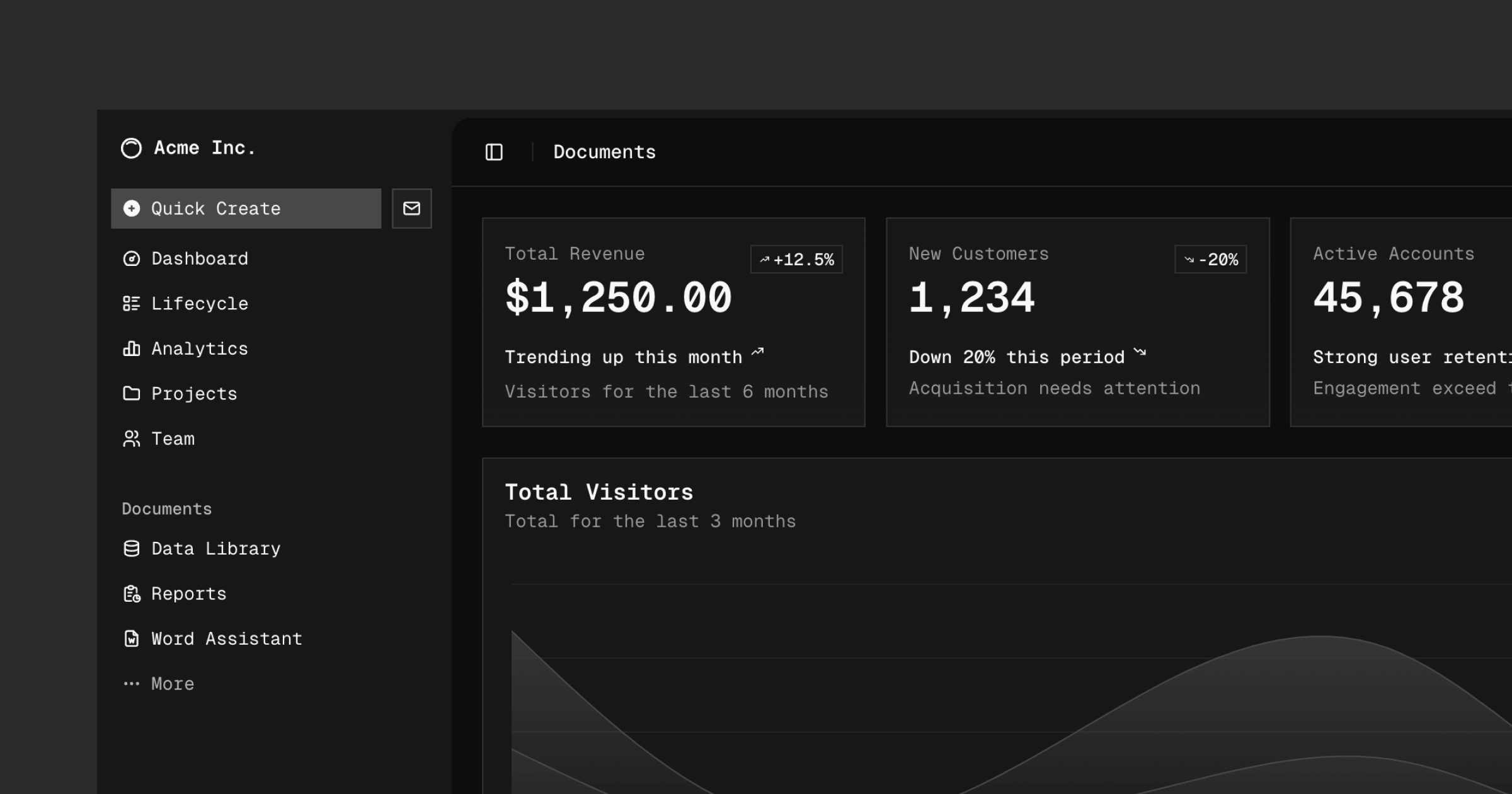

User reviews (0)