
 简体中文
简体中文 English
Website review
This review may include AI-generated content and is not individually verified. Domain, certificate and other facts come from the observed data on this page.
What is Engaging Data?
Engaging Data is a personal workshop and gallery of interactive web projects: data visualizations, calculators, maps and small programming experiments. It is built around curiosity rather than a single subject, so its content ranges across maps, environment, energy, finance, politics and society, health, fun, and math or science. The site describes itself as covering whatever interests the author at the time.
What you'll find there
- Interactive maps and geographic comparisons, such as country-centered maps, population distribution, and elevation of national parks.
- Financial and retirement tools, including an income tax bracket visualizer and early retirement calculators.
- Environment and energy dashboards, such as reservoir and snowpack data or electricity generation.
- Playful math and word projects, including a digits math game and word-guessing games.
Who it suits
It is most useful for teachers, students, and curious general readers who want to explore an idea visually rather than read a report. The author explicitly invites educators to share how they use the tools in a curriculum, which signals that classroom use is a realistic fit. Because the projects are self-contained and interactive, they also work well for a reader who wants a quick, hands-on explanation of a concept.
How to approach it
Start with the featured or popular items if you want the strongest examples, then use the category tabs to narrow down by topic. Treat it as a gallery to browse rather than a reference site with a fixed structure: the value is in trying the visualizations and adjusting their inputs yourself.
If you want a concrete next step, pick one topic you already care about — retirement timing, energy, or population — and open the matching visualization first. That gives you a sense of the site's style before you explore unrelated categories.
How can I use the early retirement calculator to figure out when I can retire?
The short answer: enter your current age, savings, income, spending and expected returns, then adjust the levers until the tool projects a retirement date. The calculator on Engaging Data is designed to answer "when can I retire?" rather than to give a single definitive number, so treat it as a scenario tester.
What to have ready
- Current age and the age you expect to stop working
- Invested savings (not home equity, unless you plan to sell)
- Annual income, savings rate and annual spending
- Expected investment return and inflation, if the tool asks for them
How to use it
- Start with conservative assumptions: lower returns and higher spending than you expect.
- Read the output as a range, not a promise. A projection that says age 58 with your inputs might become 63 with a 1% lower return.
- Change one variable at a time. Raising your savings rate by a few percentage points usually moves the date more than chasing a higher return.
- Run a pessimistic case (poor markets early in retirement) and a comfortable case, and see whether you can live with both.
A practical example
Suppose you are 40, plan to spend $50,000 a year, and have $300,000 saved. Test what happens if you save $15,000 a year instead of $10,000, and what happens if returns are 4% rather than 7%. The gap between those scenarios tells you how much your retirement date depends on things you control versus things you don't.
Decision criterion
If the date only works under optimistic assumptions, you are not ready; if it works under middling ones, you have a plan worth revisiting annually. Pair the calculator with a longevity check such as the site's "Rich, Broke or Dead" tool, and consider a second opinion from Bogleheads or FIRECalc before making irreversible choices.
What do the income tax bracket visualizer and other financial tools show about my taxes and income?
The site is a personal gallery of interactive visualizations and calculators rather than a tax service. Its financial tools, including the Income Tax Bracket Visualizer, are built to make numbers visible and comparable, not to file returns or give individualized advice. Engaging Data
What the financial tools show
- Tax brackets as a picture. The Income Tax Bracket Visualizer is listed as a featured tool on the site. It likely shows how a given income is divided across marginal brackets and how the resulting tax is built up from each slice, rather than presenting a single flat rate.
- Retirement timing trade-offs. The early retirement calculators and the "Rich, Broke or Dead" tool frame the question as a range of outcomes: how long money lasts, how spending and savings choices interact, and what happens across different longevity scenarios.
- Household context. A US household spending by income group visualization puts your income in a broader distribution, which is useful for sanity-checking whether your spending looks typical for your bracket.
- Other money-adjacent views. Electricity generation, emissions and reservoir dashboards show costs, resources and consumption patterns, but they are not personal finance calculators.
A practical example
Suppose you earn $95,000 and are deciding whether to contribute more to a pre-tax retirement account. A bracket visualizer helps you see which marginal rate your next dollar of income faces, and how a contribution shifts income out of that bracket. A retirement calculator then shows how that same choice changes the year your portfolio might run out. Together they answer two different questions: "what does this year's tax bill look like?" and "what does this decision do over decades?"
How to use them well
- Treat them as exploratory models, not official calculations. Tax rules, state taxes, credits and deductions are usually simplified.
- Check what assumptions a tool makes about filing status, dependents, inflation and investment returns before trusting the output.
- Use a bracket visualizer for marginal-rate intuition and a retirement calculator for scenario planning, then verify decisions with a tax professional or official guidance.
A good next step is to open the Income Tax Bracket Visualizer with your own rough income figure, note which bracket your top dollars fall into, and then run the early retirement calculator with two spending levels to see how sensitive the outcome is. If you are an educator, the site's own author invites notes on how these tools are used in teaching.
How do the maps and geographic visualizations compare population, land area, and other data across countries and states?
Engaging Data is best understood as a personal workshop of interactive charts, maps and calculators rather than a single themed atlas. Its geographic pieces mostly take one of two approaches: they either re-draw a familiar map so that area represents something other than land, or they let you click a location and read a number. That makes it useful for building intuition about how population, area and other measures diverge, especially for teaching or for quick curiosity-driven exploration.
What the geographic projects actually do
- Redistributing area to represent population. Splitting the US by Population and States re-sized to match population take the standard US map and change the size of states so that physical area stands for people instead of square miles. The trade-off is immediate: dense small states swell, large empty ones shrink, and you can no longer use the map to judge distance or shape.
- Distortion comparisons at world scale. Mercator country size distortion and Country-Centered Maps tackle the well-known problem that flat projections inflate high-latitude countries. These are comparison tools, not navigational maps.
- Country and globe views. Mapping Countries onto Planets, Assembling the World Country-by-Country and Snake on a Globe move the same question into a 3D or assembled-globe setting, which helps when you want to see relative size without a projection's distortion.
- Point-based geographic data. Global Birth Map, Population by Latitude and Longitude, 3D Elevation of National Parks and the Antipodes map plot or shade locations rather than resize regions, so they answer "where is this concentrated?" rather than "how big is it compared with that?"
How to choose between them
| If you want to show… | Use a resizing or distortion view | Use a point or shading view |
|---|---|---|
| Population versus land area | States re-sized to match population, Splitting the US by Population | Global Birth Map, Population by Latitude and Longitude |
| Projection bias | Mercator country size distortion | Country-Centered Maps |
| Physical geography | 3D Elevation of National Parks | Antipodes map |
The practical rule: resizing maps are persuasive at a glance but destroy geographic accuracy, so they work well in a classroom discussion and poorly as a reference. Point maps keep geography intact but hide totals unless you read the underlying numbers.
A concrete next step
If you are preparing a lesson on why "big country" and "populous country" are different claims, start with Mercator country size distortion to establish that the map already lies, then open States re-sized to match population to show the same trick applied to a familiar map. Ask students to predict which states grow before they click.
For a broader set of interactive geographic tools built around similar questions, the Our World in Data site publishes comparable country-level charts, and the U.S. Census Bureau is the authoritative source for the underlying state population figures you would want to check a resized map against.
What can I learn about energy and environment topics like California reservoirs, electricity generation, and global water distribution?
Engaging Data is a personal gallery of interactive visualizations and calculators, and its environment and energy section is where you can explore exactly these topics: water supply, electricity sources, and where water exists on Earth.
What you can explore
- California reservoirs: A dashboard tracks reservoir levels and snowpack, helping you see how storage changes over time and how it relates to seasonal snowmelt. A separate visualization shows how much water is in California reservoirs.
- Electricity generation: A visualization breaks down California's electricity generation by source, useful for understanding the state's energy mix.
- Global water distribution: A visualization titled "Where is all the water on Earth?" puts Earth's water into perspective, showing how much is ocean, ice, groundwater, and freshwater.
- Solar and daylight: Tools show solar intensity by location and time, and hours of daylight by latitude and season, connecting energy potential to geography.
- Related environmental data: The site also covers global birth maps, US COVID statistics, and other map-based datasets.
How to use it
These are exploratory tools rather than formal reports. If you are a student or educator, start with the reservoir dashboard or the electricity generation chart and adjust the inputs to see how the results change; the site's author explicitly invites educators to share how they use the visualizations in class. For a quick comparison of water versus energy topics, the table below may help.
| Topic | Example visualization | What it shows |
|---|---|---|
| California water | Reservoir dashboard, reservoir totals | Storage levels and snowpack over time |
| Electricity | California electricity generation | Breakdown of generation by source |
| Global water | Where is all the water on Earth? | Relative volumes of water on the planet |
| Solar/daylight | Solar intensity, daylight hours | Energy potential by location and season |
A useful next step: open the reservoir dashboard first, since it changes with real conditions and gives you a concrete sense of how the site presents environmental data. If you want a broader context on water and energy systems, official sources such as the USGS for water data and the U.S. Department of Energy for energy information can complement what you see here.
Which interactive games and math tools, such as Wordle clones and digits math games, are available on the site?
Engaging Data hosts a mix of casual word games, number puzzles and small math/science toys, alongside its larger data-visualization projects. The games are browser-based, quick to start, and generally meant for a few minutes of play rather than deep strategy.
Word and letter games
- WordGuessr — a Wordle-style daily word guessing game.
- ScrabWordle — a word game that blends Scrabble-style play with Wordle mechanics.
- Tridle — described as a "Triple Wordle," i.e. three word puzzles at once, which suits players who find a single daily Wordle too easy.
- Stylish Text Font Generator — not a game, but a text tool for producing decorative fonts; useful for classroom labels or social posts.
Number and math tools
- Digits Math Game — a puzzle built around digits, in the same quick-session spirit as the word games.
- Income Tax Bracket Visualizer — an interactive calculator for seeing how tax brackets apply to income; a practical teaching aid for personal finance or civics lessons.
- Early retirement calculator and Rich, Broke or Dead — retirement modelling tools that combine savings assumptions with longevity probabilities, better for planning discussions than for a two-minute break.
- Hours of Daylight by Latitude/Season — a seasonal/astronomy explorer that pairs well with geography or earth-science lessons.
- How long does it take to count to one million? — a simple scale demonstration for building intuition about large numbers.
A sensible way to choose: use the word games for a daily habit or a five-minute classroom warm-up, and the calculators and daylight tool when you need something students or colleagues can manipulate to see how changing one input shifts the outcome. The site's own author invites educators to share how they use these tools in a curriculum, which suggests they are intended to be adapted rather than used as fixed lessons.
If you want a starting point, try WordGuessr or Tridle first to gauge whether the difficulty suits you, then move to the Income Tax Bracket Visualizer or the early retirement calculator for something with real analytical value. You can browse the full set at Engaging Data.
 IONOS SE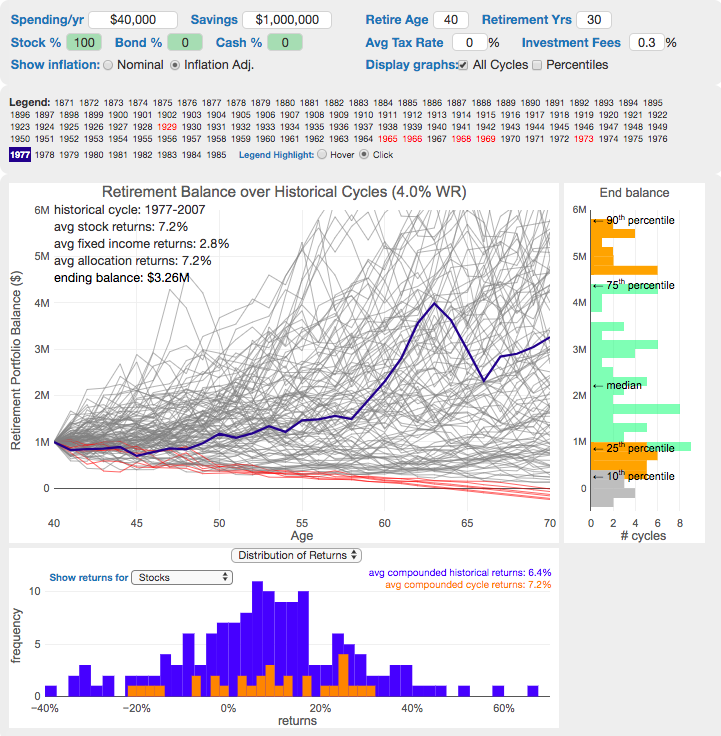
User reviews (0)