Website profiles · Technology insights · Alternatives

pageui.shipixen.com

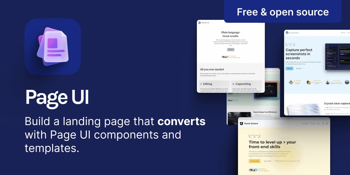
Page UI is a set of landing page components & templates that you can copy & paste into you React/Next.js codebase. Built on top of Shadcn UI and TailwindCSS.

Paid content
Visit website
Profile views 7 Outbound visits 1 Normal
Landing page components & templates that you can copy & paste Full homepage screenshot

At a glance

Category
Development
Language
English
Paid-content signal
Paid contentObserved
Registered
2023
Hosting
VercelInferred
HTTPS certificate trusted
PassedObserved
Last updated

Website review

This review may include AI-generated content and is not individually verified. Domain, certificate and other facts come from the observed data on this page.

What is Page UI?

Page UI is a collection of landing-page components and templates you copy and paste into a React or Next.js codebase. It is built on Shadcn UI and TailwindCSS, and the site describes it as free and open source. Instead of installing a component library and importing from it, you take the section you want and own the code in your own project.

Its focus is conversion-oriented marketing pages rather than general app UI: hero sections, pricing comparisons, carousels, marquees, and similar blocks. The site also offers full templates for common scenarios, such as a B2C AI SaaS landing page, a creator platform, and a minimal product or agency site.

Who it suits

  • React/Next.js developers who already use TailwindCSS and want pre-designed marketing sections.
  • Small teams or solo founders who need a credible landing page quickly without a dedicated designer.
  • People who prefer editing real source code over configuring a visual builder.

Practical trade-offs

  • Copy-paste ownership means you can customize freely, but you also maintain the code yourself; upstream updates won't flow in automatically.
  • It assumes a React + Tailwind + Shadcn UI setup. If your stack is Vue, Svelte, or plain HTML, the components won't drop in.
  • Templates give you a strong starting point, but they are starting points — expect to rewrite copy, swap imagery, and adjust branding.

A sensible next step: pick one template that matches your product type, copy a single section into a test page, and check how it behaves with your fonts, colors, and content before committing to a full page. If you want to see how it compares with similar copy-paste React resources, look at shadcn/ui for the underlying primitives and Tailwind UI for a commercial alternative.

How do I copy and paste a landing page component into my React or Next.js codebase?

Page UI is built for exactly this workflow: you browse its templates and components, then copy a section and paste it into your own React/Next.js project rather than installing it as a dependency. The site describes a "thief mode" that lets you copy any section with a click, and states the components are free and open source.

Basic workflow

  1. Open a template or component in the docs or templates gallery and find the section you want (hero, pricing, feature grid, testimonial, marquee, etc.).
  2. Use the copy action on that section — the site highlights a one-click "thief mode" for copying any section.
  3. Paste the JSX into a component file in your codebase, or directly into a page.
  4. Adjust the content, colors and spacing to match your brand.

What to check before pasting

Because Page UI is built on Shadcn UI and TailwindCSS, pasted sections assume that foundation. Before you paste, confirm:

  • TailwindCSS is configured in your project.
  • Any Shadcn-style primitives the section imports (buttons, cards, accordions) exist in your components/ui folder, or add them.
  • Icon and animation libraries referenced by the snippet are installed.
  • Import paths match your project's aliases (for example @/components/...).

If a section fails to render, an unresolved import is usually the cause — not the markup itself.

Practical example

Suppose you are building a Next.js marketing page for a small SaaS product. You could paste a hero section from a template like Gnomie AI into app/page.tsx, then paste a pricing comparison section from the components library further down the same page. Each section stays as ordinary code you own, so you can delete, reorder or restyle it freely.

Trade-offs to weigh

Approach Best for Cost
Copy-paste sections Custom layouts, one-off marketing pages You maintain the code; no upstream updates
Component library dependency Consistent design system across a large app Less layout freedom, version coupling

Copy-paste suits teams that want to own the code and iterate quickly on a single landing page. If you need many pages kept in sync, a shared internal component set may serve you better.

Next step

Pick one template closest to your product type, copy a single section into a scratch page, and get it rendering before copying more. That isolates setup problems early. You can browse the source and examples at GitHub or start from the docs at Page UI.

Is Page UI free to use, and what are the licensing terms?

Yes. Page UI is described on its own site as free and open source, and its templates and components are stated to be free to use. The site's pitch is that you copy a section or template into your React/Next.js codebase and then own it there — so the practical model is copy-and-keep rather than a hosted subscription.

For licensing specifics, the authoritative source is the project's repository, since open-source terms live in the license file rather than in marketing copy. Check the repository linked from Page UI before shipping anything commercial, and confirm whether the license requires attribution or places limits on redistribution.

What "free" means in practice

  • No cost to browse, copy or adapt components and templates.
  • Built on Shadcn UI and TailwindCSS, so your obligations to those upstream projects also apply.
  • Because you paste code into your own app, there is no runtime dependency on Page UI itself.

H3: Who this suits A solo developer or small team building a SaaS or product marketing page in React who wants a head start on layout and conversion patterns, and is comfortable reviewing a license file. If your organisation blocks code of uncertain provenance, get legal sign-off on the repository license first — that step matters more than the price.

Next step: open the repository from the Page UI site, read the LICENSE file, and note the exact terms before you paste your first section.

What landing page templates does Page UI offer for different types of SaaS products?

Page UI groups its ready-made templates by the kind of product or audience they suit, so you can start from a layout that already matches your positioning rather than restyling a generic page.

Template categories on the site

  • AI SaaS (B2C) — the Gnomie AI template targets a consumer-facing AI product, with carousel examples and product tours built in.
  • Creator platform — the Specta template is aimed at creator tools, using a marquee section and a showcase section, with a playful, video-friendly tone.
  • Minimal product or productized agency — the Minimum Via template relies on text and a restrained color palette for a clean, simple look.

Each template is described as copy-and-paste: you take a section you like and it becomes part of your own codebase, rather than being locked to a hosted builder. The components are built for React and sit on top of TailwindCSS and Shadcn UI, so the practical audience is developers or small teams already working in that stack who want a head start on layout and conversion structure. The trade-off is that you own the code and its maintenance, and you need some familiarity with those tools to adapt sections cleanly.

How to choose

Match the template to your buyer and your proof. A B2C AI app benefits from the carousel and product-tour patterns in Gnomie AI, because showing the product in motion does more work than long copy. A creator platform fits Specta, where a marquee and showcase can display user content and output. If your differentiator is clarity and speed rather than visual richness, Minimum Via's text-led approach avoids competing with your message.

A useful next step: open the template closest to your product, copy one hero and one feature section into a scratch page, and see whether the structure still fits once your own headline and screenshots are in place. If it does, build outward from there; if not, try a second template before writing custom sections. You can browse the full set at Page UI.

How do I customize the theme and styling of Page UI components?

Page UI is built on TailwindCSS and Shadcn UI, so theming works through the same mechanisms those two tools use: Tailwind utility classes on the components themselves, plus design tokens (CSS variables) for colors, radius, and typography. Because you copy components into your own codebase rather than installing a locked package, you edit the source directly — there is no separate theme API to learn.

The site also states that its documentation lets you "switch between themes straight in the docs," which is useful for previewing how a component looks under different token sets before you commit to one.

Practical customization paths

  • Design tokens first. Define your brand colors, border radius, and font families as CSS variables in your global stylesheet. Shadcn-style setups typically map these variables to Tailwind's theme config, so changing a variable cascades through every copied component at once.
  • Utility classes second. For one-off adjustments (spacing, alignment, responsive behavior), edit the Tailwind classes in the copied JSX. This is the intended workflow — the components are yours to modify.
  • Component variants third. Where a component exposes props for variants or sizes, prefer those over hardcoded class overrides so updates stay predictable.
  • Dark mode. Since tokens drive color, a dark theme usually means a second variable set under a dark selector rather than rewriting each component.

A concrete scenario

Suppose you copy the pricing comparison section from Page UI into a Next.js marketing site with a purple brand palette. Rather than hunting through the JSX for every blue class, you change your primary color token once, then adjust only the section's layout classes (grid columns, padding) to fit your page. That keeps the component visually consistent with the rest of your site and makes future token changes free.

Decision criterion

If you need a component to look different in many places, change the token. If it needs to look different in one place, change the class. Reserve direct JSX edits for structural changes, since those are the ones you'll have to redo if you pull a newer version of the component later.

Next step: open a component in the docs, toggle the available themes to see which tokens are in play, then replicate that token structure in your own Tailwind config before copying anything into your project.

Can Page UI components help improve my landing page's conversion rate?

Page UI can help indirectly, by reducing the time and effort it takes to build a polished landing page — but the components themselves do not guarantee a higher conversion rate. The page claims its templates were built by analyzing successful SaaS landing pages, and its components are free and open source, built on Shadcn UI and TailwindCSS for React/Next.js. Treat that as a head start on structure and visual quality, not as a conversion mechanism.

What actually moves conversion is your message, offer, audience fit and traffic quality. Page UI gives you sections to test those things faster: hero, pricing comparison, social proof, carousels, marquees and product tours. If you are a developer or small team shipping a SaaS or B2C product page, the practical gain is speed — you copy a section, own the code, and iterate without a designer or a page builder.

A realistic scenario

Suppose you run a B2C AI app and your current page gets traffic but few signups. With Page UI you could copy a hero and a product-tour section, then run one change per week: clearer headline, then a demo video, then a testimonial row. Because the code lives in your repo, you can ship variants quickly and keep whatever wins.

What to watch

  • Templates reflect patterns common in successful SaaS pages; your market may respond differently, so validate with your own analytics.
  • A good-looking page can still underperform if the offer or audience is wrong.
  • The library leans toward SaaS and product marketing layouts; highly unusual or content-heavy pages may need custom work.

If you want a fast, code-owned starting point for testing landing page ideas, browse the templates and pick the one closest to your product, then change one conversion element at a time. For broader inspiration on proven page patterns, Page UI itself curates examples, and you can compare layout ideas against Tailwind CSS and shadcn/ui, the foundations it builds on.

Related questions

More questions →
How to Use Page UI Components in Your React or Next.js Project

Page UI is a copy-and-paste component library for React and Next.js landing pages, built on Shadcn UI and TailwindCSS. You use it by copying a component or template section from the docs or templates gallery and pasting it directly into your own codebase, where the code becomes yours to modify. This works best if your project already uses TailwindCSS and the Shadcn UI conventions, since Page UI components are built on top of them.

What you need before copying

Page UI is not installed as a package you import from. The workflow is copy-and-paste, so the main prerequisite is a project that can render the pasted code correctly.

  • React or Next.js project — Page UI is made for React and built on TailwindCSS.
  • TailwindCSS configured — the components rely on Tailwind utility classes for styling.
  • Shadcn UI setup — Page UI is built on top of Shadcn UI, so components assume the same primitives and conventions are available in your project.
  • A target location — decide where the pasted section will live, such as a page file or a components folder.

If your project does not yet use Shadcn UI or TailwindCSS, set those up first. Otherwise pasted components may render without their expected styles or dependencies.

Step-by-step: from Page UI to your codebase

1. Open the docs or templates gallery

Go to the Page UI docs or the templates section. The docs contain hundreds of examples you can copy and modify, and templates are organized by use case — for example, Gnomie AI for a B2C AI SaaS app, Specta for a creator platform, and Minimum Via for a minimal product or productized agency.

2. Pick a component or a full section

You can start from a single component or copy an entire template section. The site describes this as "landing pages on easy mode" — copy any section of a template and own it forever in your codebase. There is also a "thief mode" that lets you copy any section with a click.

3. Copy the code

Use the copy action in the docs or template. The docs include props and code samples for each component, so you can see what the component expects before you paste it.

4. Paste into your React/Next.js project

Paste the copied code into the file where you want the section to appear. Because the code is now in your codebase, you can edit it freely — change text, colors, layout, or logic.

5. Verify it renders

Run your project and check the section in the browser. Expected result: the section renders with Tailwind styles and Shadcn UI primitives intact. If it looks unstyled or throws missing-import errors, the usual cause is that TailwindCSS or Shadcn UI is not fully configured in your project.

6. Adjust and ship

Once it renders, modify the copy and layout to match your product. Page UI's stated goal is to help you ship a landing page quickly, so the final step is replacing placeholder content with your own.

Common sticking points

  • Missing Shadcn UI primitives — components built on Shadcn UI may reference primitives your project has not added yet. Add the missing ones rather than rewriting the component.
  • Tailwind not picking up classes — if your Tailwind content paths do not include the folder where you pasted the component, styles may be purged. Check your Tailwind config.
  • Treating it like an npm package — Page UI is copy-and-paste, not an import. There is no install step that brings components in automatically.
  • Theme mismatch — the docs let you switch between themes, so a component may look different in your app than in the docs if your theme tokens differ.

What you get and what to check

Aspect Detail
Integration method Copy and paste into your React/Next.js codebase
Built on Shadcn UI and TailwindCSS
Ownership Copied code belongs to you and can be modified freely
Docs In-depth docs with props and code samples per component
Templates Multiple templates by use case, with new ones added over time
Licensing Described as free and open source

Page UI also mentions an AI tool, Page AI, that builds production-ready websites using Page UI, which you can try if you want a generated starting point instead of copying sections manually.

If your project already runs TailwindCSS and Shadcn UI, the fastest path is: open a template, copy the section you want, paste it into your page, and adjust. If it does not, set up those two first — that is the step most likely to determine whether the pasted components work on the first try.

What landing page templates does Page UI provide?

Page UI currently ships three named landing page templates — Gnomie AI, Specta, and Minimum Via — plus a broader library of copy-and-paste sections you can assemble yourself. All templates and components are free and open source, built for React on top of Shadcn UI and TailwindCSS. If your project is a B2C AI SaaS, a creator platform, or a minimal product/agency site, one of the named templates likely matches your scenario; otherwise you can copy individual sections into your own layout.

The named templates

Template Best for Notable sections
Gnomie AI B2C AI SaaS app Carousel examples, product tours
Specta Creator platform Marquee section, showcase section
Minimum Via Minimalistic product or productized agency Text-driven layout, minimal color palette

Each template is a full landing page you can view, then copy section by section into your codebase.

What you actually get

The value isn't only the three finished templates — it's the section library behind them. Page UI is described as "landing pages on easy mode": you copy any section of a template and own it in your codebase. The site highlights a "thief mode" that lets you copy any section with a click.

Sections demonstrated across the templates include:

  • Carousels — for cycling through product screenshots or examples (Gnomie AI)
  • Product tours — for walking visitors through features (Gnomie AI)
  • Marquee sections — scrolling logo or content strips (Specta)
  • Showcase sections — for displaying work or content (Specta)
  • Text-and-minimal-color layouts — clean, restrained hero and content blocks (Minimum Via)

Because these are components rather than fixed pages, you can mix a marquee from Specta with a product tour from Gnomie AI if that fits your product better than any single template.

How to decide which to start from

  1. Match the audience first. B2C AI SaaS → Gnomie AI. Creator platform → Specta. Minimal product or agency → Minimum Via.
  2. Check the section types you need. If your page depends on a carousel or product tour, Gnomie AI gives you a working reference. If you need scrolling social proof or a portfolio-style showcase, Specta does.
  3. Copy at the section level, not the page level. The intended workflow is to take only the blocks you need and adapt them, rather than adopting a whole template wholesale.
  4. Verify against the docs before committing. Page UI's documentation includes in-depth docs, props, and code samples for each component, plus a theme switcher so you can preview themes directly in the docs.

Things to know before you start

  • Stack requirement: React and Next.js, built on Shadcn UI and TailwindCSS. If your project isn't on this stack, the copy-paste workflow won't drop in cleanly.
  • Licensing: All templates and components are stated as free to use and open source.
  • The library grows: The site says new templates and components are added continuously, so the three named templates aren't a fixed ceiling — check the templates and examples pages for the current list.
  • Docs are the reference point: Since components expose props and theming, the documentation is where you confirm exact behavior rather than guessing from the template preview alone.

If none of the three named templates fits, start from a blank slate and pull individual sections from the examples library — the site frames this as "start by example to innovate" rather than forcing a full-template choice.

Why Use Page UI Instead of Building Landing Pages from Scratch?

Use Page UI when you want a React/Next.js landing page assembled from pre-built, conversion-oriented sections rather than designed from a blank file. It is a set of copy-and-paste landing page components and templates built on Shadcn UI and TailwindCSS, and the site describes it as free and open source. It is not a hosted page builder — you still own and maintain the code in your own repository.

What you skip by not starting from scratch

The site's own framing is that "building & designing landing pages is hard." Page UI's answer is to treat landing pages as "easy mode": you copy any section of a template and, in the site's words, "own it forever in your codebase."

Concretely, that removes three tasks you would otherwise do yourself:

  • Layout and visual design — sections arrive already styled, so you are not choosing spacing, type scale, and color from zero.
  • Conversion structure — the templates are described as built from months of analyzing successful SaaS landing pages, so the section order and content patterns follow proven layouts.
  • Component plumbing — because it sits on Shadcn UI and TailwindCSS, the pieces are ordinary React components you can edit, not a locked visual editor.

Where Page UI fits against the alternatives

Approach What you get Where the cost lands
Build from scratch Full control over every pixel and interaction You design, write, and iterate on every section yourself
General UI library (e.g. Shadcn UI alone) Primitives: buttons, cards, dialogs You still compose and design the landing page
Page UI Ready-made landing page sections and full templates on top of Shadcn UI + TailwindCSS You adapt copy, branding, and content to your product

The practical distinction: a general component library gives you parts, while Page UI gives you assembled pages. If your bottleneck is "I have the primitives but not the page," Page UI targets that gap directly.

What is actually in the library

The site lists both components and full templates, and says new ones are added continuously.

Templates shown on the site include:

  • Gnomie AI — a B2C AI SaaS landing page with carousel examples and product tours.
  • Specta — a creator-platform template with a marquee section and a showcase section.
  • Minimum Via — a minimal template for a minimalistic product or productized agency, using text and restrained color.

Beyond templates, the documentation is positioned as the learning surface: hundreds of copy-and-modify examples, per-component props and code samples, and a theme switcher built into the docs so you can preview themes without leaving the page.

How to decide

Choose Page UI if all of these are true:

  • Your project is React or Next.js.
  • You already use, or are willing to use, TailwindCSS and Shadcn UI.
  • You want a landing page shipped soon and are comfortable editing JSX rather than dragging blocks in a visual editor.
  • You want the code in your own repo, not on a vendor's hosting.

Stay with building from scratch if your landing page depends on a bespoke visual identity or interactions that no template approximates, or if introducing Shadcn UI and TailwindCSS into the stack is a cost you do not want to pay.

Getting started

  1. Open the docs or templates section of the site.
  2. Pick a template or an individual section that matches your page's job.
  3. Copy the section into your React/Next.js codebase.
  4. Replace the placeholder copy, imagery, and links with your product's.
  5. Adjust theme tokens and Tailwind classes so it matches your brand.

The site also mentions a "thief mode" that copies any section with a single click, and a separate Page AI tool that generates production-ready websites using Page UI — useful if you would rather start from a generated page and edit down.

One thing the site does not state: whether any paid tier or account is required. It describes the templates and components as free to use and open source, but treat that as the site's claim about the library itself rather than a statement about every related tool.

Is Page UI Free and Open Source?

Yes. Page UI is described on its own site as free and open source, and the site states that "all templates and components are free to use and open source." You can copy sections into your own codebase and, in the site's words, "own it forever." There is no pricing page or paid tier mentioned anywhere in the available site content, so nothing in the source material suggests a paid plan, trial limit, or license fee.

What "free and open source" covers

Based on the site's own claims, the free/open-source status applies to the whole library, not a sample:

  • All templates — the template gallery (Gnomie AI, Specta, Minimum Via, and others) is presented as free to use.
  • All components — the component docs and examples are described as free to use and open source.
  • Copy-and-own model — you copy a section into your codebase and keep it there permanently, rather than licensing it per project or per seat.

The site's tagline reinforces this: "Skip the setup" and "Free & open source" appear together in the hero area.

What you actually need to run it

Free to use doesn't mean zero dependencies. Page UI is built for React on top of TailwindCSS and Shadcn UI, so your project needs:

Requirement Why
React (or Next.js) codebase Components are made for React
TailwindCSS Styling layer the components are built on
Shadcn UI Base component layer Page UI builds on top of

If your stack already matches this, adopting Page UI adds no new licensing cost — only the setup work of integrating the copied code.

What the source does not say

To avoid over-reading the site:

  • No specific open-source license (MIT, Apache, etc.) is named in the available content. If license terms matter for your use case, check the GitHub repository directly.
  • No pricing page, payment platform, or paid tier is referenced, so there's no evidence of a paid upgrade path.
  • No usage limits, attribution requirements, or commercial-use restrictions are stated in the source material.

Practical takeaway

If you're building a landing page in a React/Next.js + Tailwind + Shadcn project and want to avoid paying for a component library, Page UI is positioned exactly for that: free, open source, copy-paste, and yours to keep. The main thing to verify before shipping commercially is the exact license text on the GitHub repo, since the marketing site doesn't spell it out.

What Is Page UI and What Does It Offer?

Page UI is a free, open-source library of landing page components and templates that you copy and paste directly into a React or Next.js codebase. It is built on top of Shadcn UI and TailwindCSS. It suits developers and small teams who want to assemble a converting landing page quickly without designing sections from scratch — and who are comfortable owning the copied code inside their own project rather than installing a dependency.

What you actually get

The site describes three overlapping resources:

  • Components — individual landing page sections you can drop into an app.
  • Templates — full page layouts assembled from those sections. The site lists examples including Gnomie AI (a B2C AI SaaS page with carousel and product tour sections), Specta (a creator platform page with marquee and showcase sections), and Minimum Via (a minimal text-and-color page for a product or productized agency).
  • Docs and examples — in-depth documentation with props and code samples for each component, plus hundreds of copyable examples. Themes can be switched directly inside the docs.

The stated workflow is "copy and paste any section in your app" and "own it forever in your codebase." The site also mentions a "thief mode" for copying a section with a click.

How it fits into a project

Because Page UI is distributed as copy-and-paste code rather than an npm package, the practical steps look like this:

  1. Open the docs or a template on pageui.shipixen.com.
  2. Copy the section or component you want.
  3. Paste it into your React/Next.js project.
  4. Adjust props, content, and Tailwind classes to match your brand.

The expected result is a working section in your own codebase that you can edit freely. The trade-off is that you maintain the copied code yourself — updates to the library do not flow into your project automatically.

Prerequisites and constraints

  • Stack: React and Next.js, with TailwindCSS and Shadcn UI as the foundation. If your project does not already use Tailwind and Shadcn-style components, expect setup work before pasted sections render correctly.
  • Licensing and cost: The site states that all templates and components are free to use and open source. No paid tier is described in the available material.
  • Distribution model: Copy-and-paste, not a versioned package. Plan for manual updates.

Who it is for

Page UI is a reasonable fit if you:

  • Are building a SaaS, creator, or product landing page in React/Next.js.
  • Want proven section patterns instead of starting from a blank file.
  • Prefer owning the markup over depending on a component library's release cycle.

It is a weaker fit if you need a no-code builder, use a different framework, or want automatic upstream updates.

Where to start

Go to the docs for component-level detail and props, or browse the templates if you want a full page to adapt. The site also links a GitHub repository and mentions a separate "Page AI" tool for generating production-ready websites using Page UI, which you can evaluate separately if you want generation rather than manual copying.

Website Overview

Page metadata, canonical configuration and social previews work together to provide more consistent search and sharing presentation. An active inbound-mail setup with incomplete authentication may leave the domain more open to impersonation. Provider hosting alone does not close that gap.

Domain and Registration

Transfer-protection status is present, helping reduce the risk of unauthorized domain transfers. The domain has about 3 years of registration history; its current configuration provides more context than age alone. The registrar is Cloudflare, Inc., a widely used domain service provider. The domain uses the common .com extension, which is not an independent safety signal.

DNS and Email

The observed email authentication setup is incomplete: DMARC is missing. Nameservers are provided by Cloudflare, indicating managed DNS hosting. MX records point to the Apple iCloud Mail email service. No CNAME was found; the observed records resolve directly to addresses. TXT records include verification markers for Google. Such markers may also remain after a service stops being used.

TLS and Certificates

The public key uses EC with 256 bits. The server supplied a complete certificate chain. No organization name is present in the certificate; the available fields are consistent with domain validation. The certificate was issued within the Google Trust Services cloud or CDN ecosystem. The certificate's total validity is about 90 days, consistent with a short renewal cycle.

HTTP and Browser Security

CORS permits any origin to read this response. This is common for public resources; sensitive responses need narrower handling. No X-Powered-By header was found, reducing one common source of backend fingerprinting information. All six checked browser-security headers are present. Their effectiveness still depends on the policy values and application behavior. The cf-ray response header indicates a CDN or caching proxy in the delivery path. No obvious internal addresses or debug information were found in the headers.

Technology Stack Analysis

The public page identifies Shipixen, Next.js, Tailwind CSS, Cloudflare, Vercel without precise versions, leaving fewer clues for version-specific scanning.

Search and Social Sharing

The Generator tag identifies Shipixen, making the publishing system easier to fingerprint. Twitter Card metadata is configured. The title has 61 characters, within a common display range. A meta description is present, with 157 characters. The observed directives allow indexing and link following.

Hosting and Email

DNSCloudflare
HostingVercel
EmailApple iCloud Mail
Approximate IP geolocation (inferred; a CDN or proxy may differ from the origin server) Location unknown Inferred 104.21.42.65

Registration details

RDAP / WHOIS

RegistrarCloudflare, Inc.
Registered2023-10-02
Expires2029-10-02
Domain statusclient transfer prohibited
Nameserversgreg.ns.cloudflare.com、tegan.ns.cloudflare.com
DNSSECunsigned

DNS records

DNS

TypeNameValueTTLPriority
Apageui.shipixen.com104.21.42.65300—
Apageui.shipixen.com172.67.202.226300—
AAAApageui.shipixen.com2606:4700:3035::6815:2a41300—
AAAApageui.shipixen.com2606:4700:3035::ac43:cae2300—
MXshipixen.commx01.mail.icloud.com360010
MXshipixen.commx02.mail.icloud.com360010
NSshipixen.comgreg.ns.cloudflare.com86400—
NSshipixen.comtegan.ns.cloudflare.com86400—
TXTshipixen.comapple-domain=z1xa5gG0E3QAV8Na3600—
TXTshipixen.comgoogle-site-verification=KQ1HQfLQDvHc5sbkN2Y_OvBs5WKQGSrLGRWpMmTCMtc3600—
TXTshipixen.comv=spf1 include:icloud.com ~all3600—

TLS and certificates

TLS / SSL

AssessmentNormal configuration
Supported protocolsTLSv1.2、TLSv1.3
Negotiated protocolTLSv1.3
Certificate subjectshipixen.com
IssuerGoogle Trust Services
Valid until2026-11-29T15:07 · Remaining when checked: 60 days
Verification detailsCertificate trust: Passed · Hostname match: Passed

HTTP response headers

HTTP

HeaderValue
content-typetext/html; charset=utf-8
cache-controlpublic, max-age=0, must-revalidate
servercloudflare
strict-transport-securitymax-age=31536000; includeSubDomains
content-security-policydefault-src 'self' *.googleapis.com *.gstatic.com; script-src 'self' 'unsafe-eval' 'unsafe-inline' *.vercel-analytics.com *.vercel-scripts.com *.cloudflareinsights.com *.shipixen.com; style-src 'self' 'unsafe-inline' *.googleapis.com *.gstatic.com *.shipixen.com; img-src * blob: data:; media-src *.s3.amazonaws.com *.shipixen.com; connect-src *; font-src 'self' *.googleapis.com *.gstatic.com;
x-frame-optionsDENY
x-content-type-optionsnosniff
referrer-policystrict-origin-when-cross-origin
permissions-policycamera=(), microphone=(), geolocation=()
access-control-allow-origin*

Identified technologies

ShipixenNext.jsTailwind CSSCloudflareVercel

Pages, Search and Sharing

Meta descriptionPage UI is a set of landing page components & templates that you can copy & paste into you React/Next.js codebase. Built on top of Shadcn UI and TailwindCSS.
Canonical URLhttps://pageui.shipixen.com
LanguageEnglish (default)
Twitter Cardsummary_large_image
All bots 1 allowed · 0 disallowed
  • Allow/

User reviews (0)

  • No reviews yet.