
 简体中文
简体中文 English
Website review
This review may include AI-generated content and is not individually verified. Domain, certificate and other facts come from the observed data on this page.
What is Realtime Colors?
Realtime Colors is a free browser tool for previewing a color palette and font pairing on a realistic website layout instead of on isolated swatches. You pick colors in a toolbar and watch them apply to sample page sections as you scroll, so you can judge contrast, hierarchy and overall mood in context. The site describes the workflow in four steps: choose two neutrals for text and background, then a primary color for main calls to action and sections, a secondary for less important buttons and info cards, and an accent for images, highlights, links and boxes. When you are satisfied, you export the result in formats such as CSS, SCSS, PNG or a zip archive.
Who it suits
- Solo designers and developers who want to settle on brand colors before writing styles, rather than editing a stylesheet repeatedly.
- Small teams that need a quick, shared visual reference for a palette discussion.
- Anyone pairing type and color who wants to see how a font choice holds up against a background and accent colors, not just how two hex codes sit side by side.
What it does not do
It is a preview and export tool, not a full design system or brand guideline generator. It will not produce component libraries, accessibility audits beyond the contrast checking described, or documentation for spacing, logos and tone of voice. Treat its output as a starting palette, then validate it in your actual product.
Practical example
Suppose you are building a landing page for a small accounting firm. You set a near-white background and a dark slate text color, choose a deep blue primary for the main signup button, a muted teal secondary for a secondary call to action, and a warm amber accent for links and small highlights. Scrolling through the sample layout shows immediately whether the amber links stay legible on white and whether the teal competes with the blue. If the page feels busy, drop the accent rather than adding a sixth color.
Decision criteria
- Choose Realtime Colors when the main risk is picking colors that look fine in isolation but fail in a real layout.
- Skip it if you need a complete design system, token management or team-level versioning.
- Keep the palette small. The site's own guidance suggests three colors are usually enough and warns against going beyond roughly six across a platform, since consistency gets harder as the count grows.
- Check contrast before committing, especially for text on colored buttons and cards, and confirm the exported CSS or SCSS matches the naming conventions your codebase already uses.
For broader palette inspiration alongside this tool, Coolors is a well-known generator, and Color Hunt offers curated four-color palettes.
How do I test a color palette on a real website layout before committing to it?
Open Realtime Colors and use its live preview to apply candidate colors to a full sample layout, then adjust until every text/background pairing passes contrast. The point is to judge colors in context—buttons, cards, links, headings, body text—rather than as isolated swatches.
A practical workflow
- Start with two neutrals: one for background, one for text. Check body copy, headings, and muted text first.
- Add a primary color for main actions (primary buttons, key sections).
- Add a secondary color for less important buttons and info cards.
- Add an accent for images, highlights, hyperlinks, boxes, and cards.
- Use the built-in contrast checker on each text/background pair before you commit.
- Export the set in the format you need (.zip, .png, CSS, SCSS, QR code) and drop it into your real project for a final pass.
What to look for
- Contrast: Body text and links should stay readable on every background they appear against.
- Hierarchy: Primary actions should stand out more than secondary ones; if they compete, your palette is fighting itself.
- Repetition in context: A color that looks good once may feel heavy when repeated across many cards or sections.
- Neutrals: Most of a page is background and text, so get those right before adding personality.
How many colors?
Realtime Colors' own FAQ suggests three colors are usually enough—background, text, and one accent—and that going beyond six across a platform tends to hurt consistency. Treat that as a sensible default: add a color only when it has a distinct job.
Audience and trade-offs
This suits solo designers, developers, and small teams who want to decide quickly without building a mock page first. The trade-off is that a generic sample layout can't reproduce your actual content density, imagery, or brand context, so treat the preview as a fast filter, not final proof. For deeper palette work and accessibility guidance, compare against Coolors or Contrast Checker.
Next step: pick your two neutrals, set a primary and one accent, run the contrast checker on every pairing, then export and test on a real page with real copy.
How can I export my chosen colors and fonts for use in my design project?
Realtime Colors is built for exactly this: you try colors and fonts on a mock site, then export the result rather than rebuilding it by hand. The export step is the point of the tool, not an afterthought.
What you can export
According to the site, the export options include .zip, .png, CSS, SCSS, and a QR code. In practice that covers three different jobs:
- CSS / SCSS — drop the variables into a stylesheet or a design-token file, then reference them by name across your project.
- .zip — likely a bundle for handing off or archiving the palette; useful when someone else needs the files rather than the values.
- .png — a flat image for mood boards, client decks, or a style guide page.
- QR code — a quick way to open the palette on a phone or share it in a meeting without sending files.
A realistic workflow
Start with your two neutrals (text and background), then primary, secondary, and accent. The site's own guidance is that three colors are often enough — background, text, and one accent — and that going beyond roughly six across a platform makes consistency harder to maintain. Once the preview looks right on the mock site, export CSS or SCSS for the build and a PNG for documentation.
Two practical notes. First, exported hex values are a starting point, not a finished system: you will still want hover, disabled, and border variants, which most token exports do not generate. Second, check contrast before you commit — the site includes a contrast checker, and body text on a tinted background is where palettes usually fail.
Choosing a format
| Format | Best for | Trade-off |
|---|---|---|
| CSS / SCSS | Live projects, token files | Values only; you define the extra states |
| .zip | Handoff, archiving | Needs unzipping and sorting |
| .png | Decks, style guide pages | Not editable or copy-pasteable |
| QR code | Sharing on mobile, in-person review | Viewing only |
If you are working in Figma, Realtime Colors also offers a plugin, so the palette can move into your design file directly instead of being retyped. For a broader set of ready-made palettes to compare against, Coolors is a common reference point, though it is a separate tool with its own export flow.
A sensible next step: export SCSS, paste it into a single _tokens.scss file, and name each value by role (--color-bg, --color-text, --color-accent) rather than by hue. That way, when a color changes later, you edit one line instead of hunting through the project.
What is the difference between primary, secondary, and accent colors in a website palette?
Primary colors carry the brand and the main actions; secondary colors support structure and less important actions; accent colors are reserved for highlights and small moments of emphasis. In Realtime Colors' own four-step workflow, primary is described as being for main CTAs and sections, secondary for less important buttons and info cards, and accent for images, highlights, hyperlinks, boxes and cards. The site also suggests starting with two neutrals for text and background before choosing the primary and secondary.
How the roles differ in practice
| Role | Typical use | How often it appears | What happens if you overuse it |
|---|---|---|---|
| Primary | Main call-to-action buttons, key sections, brand moments | Sparingly, on the most important element per screen | Nothing stands out; every action looks equally urgent |
| Secondary | Supporting buttons, info cards, less critical UI | Moderately, alongside primary | Competes with primary and blurs the action hierarchy |
| Accent | Links, highlights, tags, small graphics, badges | In small doses | Becomes visual noise and loses its emphasis |
| Neutrals (text/background) | Body copy, surfaces, borders | Most of the page | Low contrast or a flat, hard-to-read interface |
The practical test is priority, not hue. Ask which single action on a screen matters most; that one gets the primary color. Anything that supports it but shouldn't compete gets secondary. Anything that needs to be noticed but not clicked as a main action — a link, a badge, a chart series — gets the accent.
Realtime Colors' FAQ gives a useful constraint: around three colors (background, text, one accent) are usually enough, and it advises against more than six across a platform because consistency gets hard to maintain. That matches how most design systems behave — a wide palette is fine as long as each color has a named job rather than being picked per screen.
A concrete scenario: a checkout page where "Place order" is primary, "Continue shopping" is secondary, and the free-shipping banner plus inline help links use the accent. If the accent also colors the "Place order" button, the hierarchy collapses.
Next step: open Realtime Colors, set your two neutrals first, then assign one primary, one secondary and one accent, and watch how the sample site distributes them before you export. If you want a broader reference for building a full system around those roles, Material Design documents a similar primary/secondary/accent hierarchy with guidance on states and contrast.
How does the contrast checker help ensure my color choices are accessible?
Realtime Colors uses a live website mockup as its contrast-testing surface, so you can judge text against the colors it will actually sit on rather than against isolated swatches. The point is to catch low-contrast pairings while you are still choosing, not after a developer has already built the page.
What the contrast checker changes in practice
- It tests combinations, not single colors. A palette can look balanced while a muted accent color fails badly as button text or a hyperlink. The checker evaluates the pairing of your text color with the background or component behind it.
- It reflects real layout pressure. Because the preview distributes your colors across headings, body copy, buttons, cards and links, you see where a color that reads fine on white becomes unreadable on your primary fill.
- It supports the standard accessibility thresholds. Contrast is normally judged against WCAG ratios: 4.5:1 for normal body text, 3:1 for large text (roughly 18pt, or 14pt bold) and for meaningful UI boundaries such as input borders and focus rings. Use those numbers as your pass/fail line.
- It pushes you toward palette discipline. The site's own guidance suggests starting with two neutrals for text and background, then adding primary, secondary and accent roles. Fewer, more deliberate roles are easier to keep accessible than six colors doing similar jobs.
A concrete workflow
- Set your background and text neutrals first and confirm body copy clears 4.5:1.
- Add the primary color and check it in both directions: white text on the primary fill, and primary-colored text on the background.
- Test the accent where it is most fragile — hyperlinks inside paragraphs, small labels on cards, and any text sitting on an image or gradient.
- If a pairing fails, darken or lighten the offending role rather than abandoning the palette; usually one step in lightness fixes it without changing the brand feel.
- Export once the pairings pass, so the values you hand to a developer are already validated.
Where to be careful
Contrast ratios describe a color pair, not a whole design. Two further checks are worth doing outside the tool: never rely on color alone to convey state (add an icon, underline or label for errors and links), and verify focus indicators against adjacent colors so keyboard users can see where they are. If you want a second opinion on specific values, WebAIM's contrast checker at WebAIM is a long-standing reference, and the WCAG guidance itself is published by W3C.
As a decision rule: if a pairing is borderline at 4.5:1, treat it as failing for small text — antialiasing, thin fonts and low-quality screens will eat the margin. Aim for comfortable headroom, then export.
Is there a Figma plugin for Realtime Colors, and how do I use it?
Yes. Realtime Colors has an official Figma plugin, and the site notes over 19,000 plugin users. The plugin brings the same core idea as the web tool — trying colors and fonts on a realistic layout — into your Figma file, so you can test a palette against actual UI frames instead of a flat swatch grid.
How to use it, in practice
- In Figma, open the community/plugins search and look for Realtime Colors, then run it.
- Pick your base colors first: a background and a text color. These two set your contrast floor, so choose them before anything decorative.
- Add a primary color for main calls to action and large sections, then a secondary for quieter buttons and info cards, and an accent for links, highlights and small details.
- Check the contrast between text and background as you go — the site includes a contrast checker, and this is the step people skip most often.
- Export when you're happy. The web tool lists .zip, .png, CSS, SCSS and QR code among its export formats, which is handy for handing tokens to a developer.
A realistic scenario
Say you're a solo designer building a marketing site. You have a brand blue but no idea whether it works as a button color on a light gray background. Rather than mocking up three full pages, you run the plugin, drop in the blue as primary, a muted version as secondary, and see immediately whether the buttons read as clickable or just blend in. That's a ten-minute decision instead of an afternoon of rebuilding.
Trade-offs worth knowing
The plugin is best for exploration and quick validation, not as a full design-system source of truth. It won't replace a token pipeline or a documented style guide, and the exported CSS/SCSS still needs to be wired into your codebase properly. If you need deeper palette generation or accessibility auditing across a whole product, pair it with a dedicated contrast tool.
For teams already working in Figma, the deciding factor is simple: if you regularly argue about colors in comments, a live preview inside the file ends those arguments faster than any mood board. For a broader look at the web tool itself, see Realtime Colors.
 Namecheap
 Vercel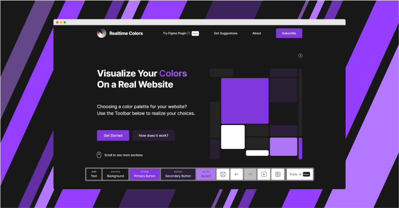
User reviews (0)