Website profiles · Technology insights · Alternatives

mockmagic.com

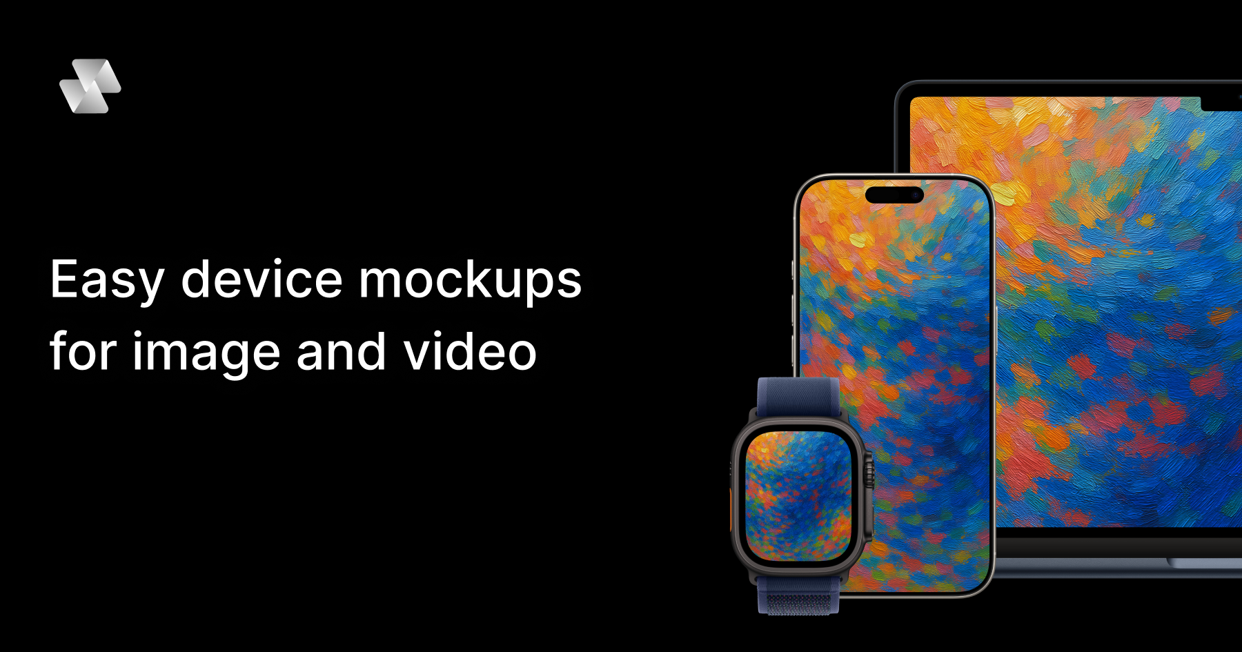
Create stunning video and image device mockups for your apps, websites, and digital products. Choose from 54+ device variants like iPhone, iPad, MacBook, and Android. Free plan available with unlimited static mockups.

Paid content
Visit website
Profile views 6 Outbound visits 0 Normal
Mock Magic Full homepage screenshot

At a glance

Category
Design & Creativity
Language
English
Paid-content signal
Paid contentObserved
Registered
2020
Hosting
VercelInferred
HTTPS certificate trusted
PassedObserved
Last updated

Website review

This review may include AI-generated content and is not individually verified. Domain, certificate and other facts come from the observed data on this page.

What is Mock Magic?

Mock Magic is a browser-based device mockup generator. You upload a screenshot, image or screen recording, place it inside a device frame such as an iPhone, iPad, MacBook, Android phone, desktop monitor or smartwatch, and export a finished mockup. It is aimed at app developers, designers and marketers who need presentable product visuals for landing pages, store listings, portfolios, pitch decks and social posts without opening a full design suite.

What it actually does

  • Device frames: a library of 54+ variants across phones, tablets, laptops, monitors and wearables, with the library described as regularly updated.
  • Image and video: static image mockups are free and unlimited; video mockups are a Pro feature. Video input supports MP4 and WebM, and image input supports PNG, JPG and SVG.
  • Backgrounds: optional solid colors or gradients, plus custom colors via a color picker and your own uploaded background images, which are saved to your account for reuse.
  • Templates: single-device layouts, different orientations and multi-device compositions. Some templates are free; advanced layouts sit behind Pro.
  • Output: downloads are described as high resolution.

Who gets the most out of it

A solo app developer shipping an iOS build is the clearest fit: capture screens, drop them into an iPhone frame, add a gradient, export for the App Store and landing page in one sitting, at no cost. A marketing team producing a launch video will hit the Pro boundary, because moving content in a device frame is the paid tier. Teams that need precise perspective control, custom device models or pixel-level shadow work will still prefer a general design tool; Mock Magic trades that control for speed.

Image vs. video at a glance

Free Pro
Static image mockups Unlimited Included
Video mockups (MP4, WebM) Not available Available
Templates Selection of standard layouts Premium layouts and advanced features

A practical next step

Start by testing one real asset rather than browsing the whole library: upload a single app screenshot, pick the device frame that matches your target hardware, and export. If the result is good enough for your store listing or homepage, the free tier covers most ongoing image work. Only move to Pro when you specifically need screen recordings inside a frame, which is where the paid plan earns its place. If you want to compare the broader category first, Mockuuups Studio and Shots cover similar ground with different template libraries.

How can I create a video mockup for my app demo?

Upload an MP4 or WebM screen recording to Mock Magic, choose a device frame such as an iPhone, iPad, MacBook, or Android phone, then export the finished mockup. Video mockups are the paid feature here; static image mockups are free and unlimited. You can set a solid or gradient background, or upload your own background image, and the editor saves custom backgrounds to your account for reuse.

A practical workflow

  1. Record the demo at the aspect ratio of the target device — a phone-shaped recording for a phone frame, a widescreen recording for a laptop frame.
  2. Keep the recording short and loop-friendly. A 15–30 second clip that starts and ends on a similar screen looks seamless when it repeats on a landing page or in a pitch deck.
  3. Upload the clip, pick a template (single device, multi-device, or a specific orientation), and place the frame.
  4. Set the background last. A gradient or a brand-color solid keeps attention on the screen; a photo background works better for lifestyle-style marketing than for product documentation.
  5. Export at the highest resolution available and check the file before publishing — text in a demo can turn to mush if the recording itself is low quality.

When this approach fits

Video-in-device mockups are strongest for app store previews, landing-page hero sections, social posts, and client presentations where you want to show motion without recording a physical phone. They are less useful when the viewer needs to read fine interface text or interact with the demo; a live prototype or a plain screen recording serves that better.

If you need a different look or a wider device library, these are worth comparing:

  • Mock Magic — image and video mockups with 54+ device variants.
  • Rotato — 3D-style device renders aimed at motion and video work.
  • Screely — quick browser-frame and device-frame images for screenshots.
  • Shots — styled screenshot and mockup compositions for marketing images.

A simple decision rule: if the output is motion, check video support and export resolution first; if it is a still image, a free image mockup tool is usually enough.

What devices and templates are available for different screen sizes?

Mock Magic covers the common screen sizes you would expect for app and web presentation: iPhones, Android phones, iPads, MacBooks, desktop monitors, and smartwatches, with 54+ device variants listed and a library the site says is updated over time. That range lets you match a mockup to the actual form factor of your product instead of forcing a phone frame onto a tablet layout.

Device and template notes

  • Phones and tablets: iPhone, Android, and iPad frames suit mobile app screens, onboarding flows, and responsive website previews. The same design can be shown at multiple sizes if you need a consistent campaign across phone and tablet.
  • Laptops and desktops: MacBook and desktop monitor frames are the natural fit for SaaS dashboards, landing pages, and web apps where the browser viewport matters.
  • Wearables: Smartwatch frames are useful for glanceable UI, notifications, or fitness features, though the small canvas means less detail is visible.
  • Templates: The site describes single-device layouts, multi-device compositions, and different orientations. Some templates are free; premium templates with advanced layouts are Pro-only.
  • Compositions: Backgrounds are optional, with solid colors, gradients, custom color picking, and your own background images. Custom backgrounds are saved to your account for reuse.

Choosing by screen size

Your product Best-fit frame Practical consideration
Mobile app or mobile web iPhone, Android phone Shows touch UI at realistic scale; avoid desktop frames that misrepresent the layout
Tablet app or responsive site iPad Good for split-view and larger touch layouts
Web app, dashboard, SaaS MacBook, desktop monitor Matches browser proportions and wider content
Watch app or notification Smartwatch Best for simple, high-contrast screens

Practical next step

Decide the primary context where people will use your product, then pick the frame that matches it and add a second size only if the design genuinely adapts. For a quick test, upload one representative screen and compare a single-device template against a multi-device composition; the multi-device layout usually works better on a landing page hero, while a single frame keeps attention on one screen.

Image mockups are free and unlimited, while video mockups are a Pro feature. If you need motion—such as a scrolling feed or an animated transition—plan for the paid tier. Mock Magic

What's the difference between the free plan and Pro for mockup creation?

The free plan covers unlimited static image mockups; video mockups are a Pro feature. That one split decides most use cases.

What changes between the plans

Capability Free Pro
Image mockups (PNG, JPG, SVG uploads) Unlimited Included
Video mockups (MP4, WebM uploads) Not available Available
Device library (iPhone, iPad, MacBook, Android, monitors, smartwatches) Available Available
Backgrounds (solid, gradient, custom colors, uploaded images) Available Available
Templates Free selection Full library, including premium layouts

Both tiers export at high resolution, and custom backgrounds you save are tied to your account for reuse.

Who each plan suits

  • Static images only — screenshots for app store listings, landing pages, portfolio pieces, documentation. The free plan is enough, and the unlimited image allowance means you can iterate without counting exports.
  • Motion content — screen recordings for product demos, social posts, feature walkthroughs, or ads. You need Pro, because video upload and rendering sit behind it.
  • Complex compositions — multi-device scenes and advanced layout templates are the other Pro draw. If your mockups are usually one device on a plain background, the free template set likely covers you.

A practical test

Take one real asset you need to publish — say, a 15-second onboarding recording or a store screenshot — and run it through the editor before deciding. If it is a still image and a free template fits, stay free. If the asset moves, or the layout you want is locked, that is your signal to upgrade. Video is the harder constraint to work around, since no amount of template juggling turns a static mockup into a moving one.

For quick comparisons of how other mockup tools split their tiers, Mockuuups Studio and Shots are worth a look, though their free/paid boundaries differ from Mock Magic's.

Can I upload my own background images and save custom colors?

Yes. Mock Magic's editor accepts custom background colors through a color picker and lets you upload your own background images. Custom backgrounds are saved to your account so you can reuse them in later mockups instead of rebuilding the same look each time.

What this means in practice

  • Color picker: Match a brand color, a client palette, or a specific hex value rather than choosing only from preset swatches.
  • Uploaded images: Use a photo, texture, or branded graphic as the backdrop behind the device frame.
  • Saved backgrounds: Once stored, these become part of your reusable setup, which matters most when producing a consistent series of screenshots or feature images.

A realistic workflow

If you publish app store screenshots or a product landing page, you might set one background per product line: a gradient for the free tier, a photo backdrop for premium features. Because the background is saved, each new screenshot only needs the device frame and export step, keeping the whole set visually consistent.

Trade-offs to weigh

  • Consistency vs. variety: Saved backgrounds speed up repeat work but can tempt you into reusing one look until every mockup feels identical.
  • Custom images vs. gradients: Uploaded photos give context and atmosphere but can compete with the UI on screen; solid or gradient backgrounds keep attention on the interface.
  • Free vs. Pro: Static image mockups are free without a stated cap, while video mockups require a paid plan. Background customization is described as available in the editor generally, so if video is part of your plan, check the pricing page for what the Pro tier includes.

Next step

Open the editor, create one background you would use repeatedly, and save it before building a batch of mockups. If you mainly need static images, the free plan covers that; if you need moving screen recordings, review the Mock Magic pricing page first. For broader device-frame options, Mockuuups Studio and Shots are established alternatives worth comparing.

How do I export mockups in high resolution for presentations?

Use Mock Magic's built-in export rather than screenshotting the preview: upload your screenshot or screen recording, pick a device frame and optional background, then export, since the page states all mockups can be downloaded in high resolution. For presentations, the practical decision is image versus video—static image mockups are free and unlimited, while video mockups (MP4 or WebM uploads) require the Pro plan, per the site's FAQ.

A workflow that holds up on a projector

  1. Build the mockup at the largest size you can, then export. A mockup that looks crisp on a laptop can soften when a projector scales it.
  2. Prefer PNG for UI screenshots and SVG-sourced artwork; the supported image formats are PNG, JPG and SVG.
  3. Choose a solid or gradient background that contrasts with your slide theme, or upload your own background image—custom backgrounds are saved to your account for reuse.
  4. Keep one device per slide for a single talking point, and reserve multi-device template layouts for overview or comparison slides.
  5. If you need motion (a scrolling feed, an animation), export video instead—but plan for the Pro subscription and check that the room's player handles MP4 or WebM.

Image or video?

Need Better choice Trade-off
Slides, handouts, PDFs Static image mockup Free and unlimited, but no motion
Live demo feel, app walkthroughs Video mockup Requires Pro; file size and playback risk in some rooms

Next step

Before building a full deck, export one test mockup at your intended size, drop it into a blank slide, and view it at presentation scale or on the actual projector. If edges or small text look soft, increase the source screenshot resolution and re-export rather than scaling the mockup up in the slide software.

For additional device frames or a second opinion on framing, official options include Mock Magic itself, and you can compare presentation-oriented mockup tools such as Shots or Screely if you want simpler static-only exports.

Related questions

More questions →
How Do You Create an iPhone Mockup from a Screenshot or Screen Recording?

Upload your screenshot or screen recording to a device mockup generator, pick an iPhone frame, choose a layout and background, then export. On Mock Magic, image mockups are free and unlimited, while video mockups require a paid plan. The workflow below covers both, plus the format and troubleshooting details that decide whether your export looks sharp or slightly off.

Image vs. video mockup: which one do you need?

Image mockup Video mockup
Best for App Store screenshots, portfolio pages, landing pages, docs App previews, feature demos, social clips, product pages
Input formats PNG, JPG, SVG MP4, WebM
Output High-resolution still High-resolution video
Cost on Mock Magic Free, unlimited Pro (paid)

If your content is static, a still mockup is faster and easier to place in layouts. If you need to show motion — a scroll, an animation, a tap flow — you need the video path, and that means a paid subscription.

Step-by-step: build the mockup

  1. Prepare your source file. For a screenshot, export it at the native resolution of the phone you're framing (or close to it) rather than a downscaled copy. For a recording, export MP4 or WebM.
  2. Upload it. Drop the screenshot or screen recording into the editor. The tool places your content inside the device screen area.
  3. Pick the iPhone frame. Mock Magic offers 54+ device variants across iPhone, Android, iPad, MacBook, desktop monitors, and smartwatches, and the library is updated with new devices. Choose the iPhone model that matches your screenshot's aspect ratio.
  4. Choose a layout template. Templates cover different orientations, single-device layouts, and multi-device compositions. Some templates are free; premium templates with advanced layouts are Pro-only.
  5. Set the background (optional). Use a solid color from the color picker, a gradient, or upload your own background image. Custom backgrounds are saved to your account so you can reuse them in later mockups.
  6. Export. Download in high resolution. Image exports are free; video export requires Pro.

The whole sequence is upload → frame → layout → background → export, and the site describes it as taking seconds.

Backgrounds: when they help and when they hurt

Backgrounds are optional. A solid color or gradient keeps the focus on the screen content and works well for App Store screenshots where consistency across a set matters. A custom background image can place the phone in a context — a desk, a brand-colored scene — but a busy image competes with the UI you're trying to show.

Practical rule: if the screenshot is dense (a dashboard, a feed), use a flat or subtle gradient. If the screenshot is sparse (a splash screen, a single button), a richer background adds visual weight.

Common problems and what to check

Screenshot proportions don't match the frame. A screenshot from one phone model stretched into a different model's frame will look distorted. Match the frame to the source aspect ratio, or crop the screenshot to the frame's ratio before uploading.

Export looks blurry. This usually traces back to the input, not the export. Upload the highest-resolution screenshot you have; a low-res source stays low-res no matter how it's framed.

Video won't upload. Confirm the file is MP4 or WebM. Other containers aren't listed as supported. Also confirm your plan includes video — video mockups are a Pro feature, so a free account will not export them even if the upload succeeds.

Custom background isn't available later. Custom backgrounds are saved to your account, so make sure you're signed in when you set them, otherwise they won't carry over to your next mockup.

Quick decision guide

  • Free, still images only, unlimited → use Mock Magic's free plan for screenshots.
  • Need motion → budget for Pro, and record in MP4 or WebM.
  • Need multiple devices in one image → check whether the multi-device template you want is free or premium before committing to a layout.
  • Need a consistent set for a store listing → build one background, save it, and reuse it across every screenshot.
How to Compress Images for the Web Without Losing Visible Quality

You can cut most images to a fraction of their original file size without any visible quality loss by doing three things in the right order: resize the image to the dimensions it will actually display at, pick the right format for the content, then apply compression at a quality level that survives a side-by-side check. The single biggest mistake is skipping step one — an oversized image compressed at maximum quality is still far heavier than a correctly sized one.

Why file size and quality are a trade-off, not a fixed setting

Every compressed image is a negotiation between three variables: how many pixels you keep, how precisely each pixel is described, and how much the format is allowed to guess.

  • Dimensions decide how many pixels exist at all. Halving width and height removes 75% of the pixel data before any compression happens.
  • Quality level decides how aggressively the encoder discards detail it thinks you won't notice.
  • Format decides the kind of discarding allowed — some formats throw away color precision, others only remove redundancy.

Because these interact, "quality 80" means something different on a 4000px photo than on a 600px thumbnail. Tune dimensions first, then quality.

Pick the format before you touch the quality slider

Format Best for Compression type Transparency Notes
JPEG Photographs, gradients, complex scenes Lossy No Smallest for photos; artifacts appear around sharp edges and text
PNG Logos, icons, screenshots, flat color, anything needing transparency Lossless (or lossy via quantization) Yes Often 5–10× larger than JPEG for photos; excellent for flat graphics
WEBP Almost everything, as a modern default Both lossy and lossless Yes Typically 25–35% smaller than JPEG at comparable quality; broad browser support
SVG Logos, icons, diagrams, charts Vector (resolution-independent) Yes Stays crisp at any size; not suitable for photos
GIF Short simple animations only Lossless, 256 colors Yes (1-bit) Superseded by WEBP/MP4 for animation in nearly all cases

Practical rule: photos → JPEG or lossy WEBP; flat graphics and transparency → PNG or lossless WEBP; anything vector → SVG.

The four levers, in the order you should pull them

1. Resize to display size (biggest win, zero quality cost)

If your layout renders an image at 800px wide, serving a 2400px original wastes roughly 89% of the pixels. Resize to the largest size it will ever be displayed at, and add a 2× version only if you need retina sharpness.

2. Choose the format

Match the format to the content type using the table above. Converting a photographic PNG to JPEG or WEBP alone can shrink it by 80% or more.

3. Set the quality level

For JPEG and lossy WEBP, most photographs hold up well between quality 70 and 85. Below ~60, banding appears in skies and blur around text. Above ~90, file size climbs steeply for gains nobody can see.

4. Strip metadata

EXIF data, camera info, and embedded thumbnails can add tens of kilobytes. Remove them unless you specifically need copyright or orientation data — and note that stripping orientation can rotate an image, so verify after export.

When lossy compression is fine, and when it isn't

Lossy is acceptable when:

  • The image is a photograph or has natural texture.
  • It's decorative or below the fold.
  • Slight softening won't be noticed at final display size.

Use lossless or vector instead when:

  • The image contains text, UI elements, or thin lines (lossy creates ringing artifacts).
  • It's a logo, icon, or diagram — SVG or PNG keeps edges clean.
  • It will be edited again later; repeated lossy saves compound degradation.
  • It's a screenshot of code or a chart where color accuracy matters.

Compressing vs. resizing: don't confuse them

Compressing reduces the bytes needed to describe the same pixels. Resizing reduces the number of pixels. They're independent, and resizing usually delivers the larger saving. A 3000×2000 photo at quality 95 might be 2 MB; the same photo resized to 1200×800 at quality 80 might be 180 KB. Doing only the quality reduction gets you maybe 40% off; doing both gets you over 90%.

A repeatable workflow

  1. Determine the maximum display width in your layout (inspect the element or check your CSS).
  2. Export at that width (plus a 2× variant if needed).
  3. Convert to the right format — WEBP as a modern default, JPEG as a fallback, PNG/SVG for graphics.
  4. Apply quality 75–85 for lossy formats and compare against the original.
  5. Strip metadata and re-check orientation.
  6. Verify before publishing (see below).
  7. Serve the right file with srcset so small screens don't download the large variant.

How to verify quality before you publish

  • View at 100% at final display size, not zoomed in — artifacts you can't see at real size don't matter.
  • Toggle between original and compressed in a viewer or an online compressor's before/after preview.
  • Check the worst-case areas: skies, smooth gradients, sharp edges, and any text.
  • Compare file sizes and ask whether the extra kilobytes buy visible improvement. If not, go smaller.
  • Test on a mid-range phone, where banding and blur are often more obvious than on a desktop monitor.

Common mistakes

  • Compressing a full-resolution image and calling it optimized.
  • Using PNG for photographs.
  • Setting quality to 100 "to be safe" — it inflates size with no visible benefit.
  • Re-saving a JPEG repeatedly, stacking artifacts each time.
  • Forgetting that GIF animations are usually better as WEBP or video.
  • Ignoring metadata, which can silently add weight.

Quick reference

Goal Do this
Photo on a webpage Resize to display width → WEBP (fallback JPEG) → quality 75–85
Logo or icon SVG; fall back to PNG if vector isn't possible
Screenshot with text PNG or lossless WEBP
Transparent photo cutout Lossy WEBP or PNG
Short animation WEBP or MP4, not GIF

The order matters more than any single setting: resize, then choose format, then tune quality, then strip metadata, then verify at real display size. Follow that sequence and you'll routinely land at 10–20% of the original file size with no quality your visitors can detect.

What Are Website Mockups and How Do You Create One?

A website mockup is a realistic visual of a web page placed inside a browser window or device frame, used to show how the design looks in context rather than as a flat screenshot. You create one by uploading a screenshot of your page, choosing a frame (browser, laptop, phone, or tablet), optionally adding a background, and exporting at high resolution. Tools like Mock Magic handle this in a few steps: upload your screenshot, pick a device frame, and export in seconds — image mockups are free, while video mockups require a paid plan.

Website mockups vs. wireframes, prototypes, and app mockups

These terms get used interchangeably, but they describe different stages and outputs:

Term What it shows Fidelity Typical use
Wireframe Layout and structure only Low Early planning, agreeing on content blocks
Prototype Clickable flow between screens Medium–high Testing navigation and interactions
Website mockup A finished page shown in a browser or device frame High (visual) Presentations, portfolios, marketing
App mockup A mobile app screen in a phone frame High (visual) App Store listings, feature announcements
Device mockup Any screen content inside a hardware frame High (visual) General product and UI presentation

The key distinction: a wireframe or prototype is about structure and behavior, while a website mockup is about presentation. You're not testing whether the layout works — you're showing what it looks like on a real screen. Website mockups and app mockups overlap heavily; the difference is mainly the frame (browser or laptop vs. phone) and the aspect ratio of the content you're placing.

When to use a website mockup

  • Portfolio pieces — showing a live-looking site in a laptop or browser frame reads as more finished than a bare screenshot.
  • Client presentations — a framed mockup communicates "this is how it will appear to users" more clearly than a raw image.
  • Landing page previews — useful for social posts, ads, or email headers where a flat screenshot looks unfinished.
  • Marketing visuals — product pages, case studies, and feature announcements often need the site shown in context.

If your goal is to explain how a page works, a prototype serves you better. If the goal is to show how it looks, a mockup is the right format.

Static image vs. video mockup

Both are supported by tools like Mock Magic, and the choice depends on what you're demonstrating:

  • Static image mockup — best for finished designs, portfolio shots, and any situation where the page doesn't change. Fast to produce and easy to reuse. On Mock Magic, image mockups are free and unlimited.
  • Video mockup — best when motion matters: scrolling, animations, hover states, or a screen recording walkthrough. Mock Magic supports MP4 and WebM uploads for video mockups, but this is a Pro feature.

A practical rule: if a still frame tells the whole story, use an image. If the design's value is in how it moves or responds, use video.

How to create a website mockup

The general workflow is the same across tools. Using Mock Magic as the example:

  1. Capture your page. Take a full-page or viewport screenshot of the website at the resolution you want to present. Clean up browser chrome, scrollbars, or personal data first.
  2. Upload the screenshot. Mock Magic accepts PNG, JPG, and SVG for images. For video mockups, MP4 and WebM.
  3. Pick a frame. Choose a browser window, laptop, desktop monitor, phone, or tablet. Mock Magic offers 54+ device variants including iPhone, iPad, MacBook, and Android devices, plus layout templates for single-device and multi-device compositions.
  4. Set the background (optional). Use a solid color, a gradient, or upload your own background image. Custom backgrounds are saved to your account for reuse.
  5. Export. Download in high resolution. Image exports are free; video exports require a Pro subscription.

Expected result: a high-resolution image or video of your page inside a realistic frame, ready to drop into a presentation, portfolio, or marketing asset.

Common snags:

  • Screenshot resolution too low for the frame — the page looks blurry inside a crisp device. Capture at a higher resolution than you think you need.
  • Aspect ratio mismatch — a desktop screenshot in a phone frame will crop or letterbox awkwardly. Match the frame to the content.
  • Cluttered backgrounds — a busy background competes with the design. Solid or subtle gradients usually read better.
  • Wrong frame for the audience — showing a desktop site in a phone frame can confuse viewers about what you actually built.

Choosing a tool

If you only need static image mockups, a free tier covers most needs — Mock Magic offers unlimited free image mockups and a library of templates, with some templates reserved for Pro. If you need video mockups, animated content, or premium multi-device layouts, expect to move to a paid plan. Check the tool's pricing page for current tiers, since feature limits and template access change over time.

How Do You Make a MacBook Mockup from a Screenshot?

Drop your screenshot into a MacBook frame, size the canvas for where it will be published, then export at up to 4× or copy it straight to your clipboard. On Device Shots this runs entirely in the browser with no sign-up, and you can start either from a MacBook template or from a blank canvas up to 6000 px. The steps below follow that order: pick the canvas, add the MacBook frame, place the screenshot, style it, export.

Step 1: Pick a canvas size that matches where the image will live

The canvas decides the aspect ratio, and the aspect ratio decides whether your MacBook mockup gets cropped later. Start from a template when one matches your destination, or set a custom canvas if you need something else.

Destination Template shown on the site Size
Dribbble shot MacBook dark studio / Laptop 1600 × 1200 / 3200 × 2400
Website hero Safari with tabs / Three iPhones 1920 × 1080
LinkedIn banner XPS laptop 1584 × 396
Presentation slide iMac slide 1920 × 1080
Notion cover Edge window dark 1500 × 600
Open Graph link preview Arc window 1200 × 630

A MacBook screen is wide, so a wide canvas (16:10 or 16:9) leaves less empty space around the device than a square or portrait one. If your target is a portrait format like a Pinterest pin, expect to scale the MacBook down and use the extra room for a headline.

Step 2: Add the MacBook frame

Choose a device frame, then drop, paste, or upload your screenshot into it. The site lists 76 phones, tablets, laptops, and watches, so pick the laptop frame that matches the machine you want to show. If you would rather show a web page than a laptop body, the browser window option gives you 9 vector window styles in light or dark, each with an address bar you can type into — useful when the point is the site itself rather than the hardware.

Two practical notes:

  • A MacBook frame implies a desktop layout. A screenshot taken on a phone will look stretched inside it, so use a desktop-width capture when possible.
  • Browser frames stay sharp at any size because they are vector, which matters if you export large.

Step 3: Place the screenshot inside the screen

Drop, paste, or upload the image, then adjust position and scale until it sits inside the screen area without clipping the edges of your UI or distorting the aspect ratio.

  • Match the aspect ratio first. If your screenshot is 16:9 and the laptop screen area is 16:10, you will either crop a little or leave a thin band — decide which edge can lose a few pixels.
  • Keep the top of the screenshot aligned with the top of the screen. Cropping from the bottom usually reads as intentional; cropping the header does not.
  • Avoid non-uniform scaling. Stretching to fill is the most common reason a mockup looks fake.

Step 4: Style the background, shadow, and text

Background, text, shadows, and icons are all adjustable. For a portfolio or Dribbble shot, a dark studio background with a soft shadow reads as a product shot. For a landing page hero, a light background with a headline above or beside the laptop usually fits the surrounding page better. Add a headline only if the image will be seen without supporting copy — a social post or a thumbnail — and keep it short enough to read at the size it will actually appear.

Step 5: Export at the right resolution

Export at up to 4×, or copy straight to the clipboard. The 4× option matters when the mockup will be displayed larger than its canvas size, such as a retina hero image or a presentation on a big screen. Copying to the clipboard is the faster path when you are pasting into a design tool or a chat.

Check two things before you finish:

  • Export size versus canvas size. A 1600 × 1200 canvas at 4× gives you 6400 × 4800, which is more than most destinations need. Match the export multiplier to the final display size rather than always using the maximum.
  • Background transparency. If the background is transparent and the destination expects a solid color, the mockup may render on white or black unexpectedly. Set a background color when in doubt.

Common problems and what causes them

The screenshot looks blurry. Usually the source capture is lower resolution than the space it fills. Re-capture at a higher resolution, or reduce how much of the canvas the laptop occupies.

The image is stretched or squashed. The screenshot's aspect ratio does not match the screen area and it was scaled to fill. Scale uniformly and crop instead.

The export is the wrong size. The canvas was set for one platform but exported for another. Re-check the template size against the destination's requirements before exporting.

The background came out transparent or the wrong color. No background was set. Add one if the destination does not handle transparency.

The laptop looks too small or too large in the frame. This is a canvas choice, not a device choice. A wide canvas with a laptop that fills most of the width reads better than a square canvas with a small laptop floating in the middle.

When this approach fits

This workflow suits anyone who needs a MacBook mockup from an existing screenshot for a portfolio, landing page, or social post, and who wants to stay in the browser without installing anything or creating an account. It is less suited to work that needs custom 3D perspective, reflections, or a specific physical MacBook model rendered from an angle — the frames here are flat, front-facing device and browser shells.

What Are App Mockups and How Do You Make One?

An app mockup is your app's interface placed inside a realistic device frame—a phone, tablet, laptop, or watch—so it looks like the software is actually running on that hardware. You make one by uploading a screenshot or screen recording to a mockup tool, picking a device frame and background, then exporting the result as an image or video. This is different from a UI design file (which is the editable source) and from a live prototype (which is clickable). A mockup is the presentation layer: a static or moving picture meant to be looked at, not interacted with.

App mockup vs. screenshot vs. UI design vs. prototype

These four get used interchangeably, but they solve different problems.

Format What it is Editable? Interactive? Best for
Raw screenshot Direct capture of your screen No No Bug reports, quick internal sharing
App mockup Screenshot or recording inside a device frame with a background Only frame/background No App Store listings, portfolios, landing pages, social posts
UI design file The source design (Figma, Sketch, etc.) Yes, fully No Design iteration, handoff to developers
Prototype Clickable flow built from screens Yes Yes Usability testing, stakeholder demos

The practical rule: use a mockup when the goal is to make your app look credible and finished in front of an audience. Use a design file when the goal is to change the design. Use a prototype when someone needs to click through it.

Where app mockups actually get used

  • App Store and Google Play listings — framed screenshots read as more professional than bare captures and let you add context (backgrounds, multiple devices).
  • Portfolios and case studies — a device frame signals "this shipped" rather than "this is a sketch."
  • Landing pages and marketing sites — hero images of the app on a phone convert better than a flat screenshot.
  • Social media — a phone frame gives vertical content a natural focal point.
  • Video mockups — a screen recording inside a device frame, useful for feature demos and ads.

How to make one

The workflow is the same across most tools. Using Mock Magic as the concrete example:

  1. Prepare your source. Export a clean screenshot (PNG, JPG, or SVG) or a screen recording (MP4 or WebM). Crop out status bars or personal data you don't want shown.
  2. Upload it to the mockup editor.
  3. Pick a device frame. Mock Magic offers 54+ device variants including iPhone, Android phones, iPad, MacBook, desktop monitors, and smartwatches. Match the frame to where your app actually runs—showing a phone app in a laptop frame undermines the point.
  4. Choose a layout template. Options include single-device layouts, different orientations, and multi-device compositions. Some templates are free; advanced layouts are Pro-only.
  5. Set a background. Solid colors and gradients are built in, and you can use a custom color picker or upload your own background image. Custom backgrounds save to your account for reuse.
  6. Export. Images export free and in high resolution. Video mockups require a paid plan.

Expected result: a high-resolution image (or video) of your interface inside a device, ready to drop into a store listing or page.

Common snags: low-resolution source screenshots look soft once scaled into a frame—start from a full-resolution capture. Recordings in unsupported codecs won't upload, so stick to MP4 or WebM. And if your design has a light UI, a light background can wash it out; a gradient or darker background usually separates the device better.

What to check before choosing a tool

  • Device coverage — does it include the specific models your audience recognizes? A current iPhone frame matters more than a generic phone outline.
  • Video support — image-only tools are common; video mockups are often the paid tier. Mock Magic follows this pattern: unlimited free static mockups, video on Pro.
  • Background control — built-in gradients are fine, but custom colors and uploaded background images give you brand consistency.
  • Export resolution — "high resolution" should mean enough pixels for a retina display or a store listing's required dimensions.
  • Free tier limits — check whether the free plan caps exports, watermarks them, or restricts templates. Mock Magic's free plan is unlimited for images, with premium templates and video behind Pro.
  • Template library — single-device layouts are table stakes; multi-device compositions save real time when you need a landing-page hero.

If you only need static images and a handful of devices, a free tier is usually enough. If you're producing demo videos or need advanced multi-device layouts, budget for the paid plan.

Website Overview

Several search or sharing settings need attention. Together they may make snippets, preview images or preferred URLs less consistent across platforms. An active inbound-mail setup with incomplete authentication may leave the domain more open to impersonation. Provider hosting alone does not close that gap.

Domain and Registration

Transfer-protection status is present, helping reduce the risk of unauthorized domain transfers. The domain has about 5 years of registration history; its current configuration provides more context than age alone. The domain uses the common .com extension, which is not an independent safety signal.

DNS and Email

The observed email authentication setup is incomplete: DMARC is missing. Nameservers are provided by Cloudflare, indicating managed DNS hosting. MX records point to the Cloudflare Email Routing email service. TXT records include verification markers for Google. Such markers may also remain after a service stops being used. DNSSEC signatures were not detected, so this additional DNS authenticity protection is not confirmed.

TLS and Certificates

The certificate uses an RSA 2048-bit public key, offering broad client compatibility. The server supplied a complete certificate chain. No organization name is present in the certificate; the available fields are consistent with domain validation. The certificate was issued by Let's Encrypt, commonly associated with automated certificate services. The certificate's total validity is about 89 days, consistent with a short renewal cycle.

HTTP and Browser Security

The response lacks these common security headers: CSP, X-Content-Type-Options, Referrer-Policy, Permissions-Policy, clickjacking protection. No X-Powered-By header was found, reducing one common source of backend fingerprinting information. No obvious internal addresses or debug information were found in the headers. The Server header contains the custom value Vercel. No explicit CDN or WAF marker was found in the response headers.

Technology Stack Analysis

The public page identifies Vercel without precise versions, leaving fewer clues for version-specific scanning.

Search and Social Sharing

The meta description has 217 characters and may be shortened in search results. Open Graph is partially configured; og:description is missing. Twitter Card metadata is configured. JSON-LD includes Organization data, helping describe the organization as an entity. The title has 57 characters, within a common display range.

Hosting and Email

DNSCloudflare
HostingVercel
EmailCloudflare Email Routing
Approximate IP geolocation (inferred; a CDN or proxy may differ from the origin server) United States flagUnited States Inferred 216.198.79.65

Registration details

RDAP / WHOIS

RegistrarHosting Concepts B.V. d/b/a Registrar.eu
Registered2020-10-29
Expires2026-10-29
Domain statusclient transfer prohibited
Nameserversbuck.ns.cloudflare.com、kara.ns.cloudflare.com
DNSSECunsigned

DNS records

DNS

TypeNameValueTTLPriority
Ae3adb24517f9ff77.vercel-dns-017.com216.198.79.65300—
Ae3adb24517f9ff77.vercel-dns-017.com64.29.17.65300—
MXmockmagic.comroute1.mx.cloudflare.net3005
MXmockmagic.comroute2.mx.cloudflare.net30012
MXmockmagic.comroute3.mx.cloudflare.net30062
NSmockmagic.combuck.ns.cloudflare.com86400—
NSmockmagic.comkara.ns.cloudflare.com86400—
TXTmockmagic.comgoogle-site-verification=Hpcl8rKWbJHEHcWwEJWwNE0iU52dJ_xDIF0bf9ac3NQ300—
TXTmockmagic.commailcoach-verification=be471975-26bd-4b75-a576-a0450183b790300—
TXTmockmagic.comv=spf1 include:_spf.mx.cloudflare.net ~all300—
CNAMEwww.mockmagic.come3adb24517f9ff77.vercel-dns-017.com300—

TLS and certificates

TLS / SSL

AssessmentNormal configuration
Supported protocolsTLSv1.2、TLSv1.3
Negotiated protocolTLSv1.3
Certificate subjectwww.mockmagic.com
IssuerLet's Encrypt
Valid until2026-11-07T17:56 · Remaining when checked: 31 days
Verification detailsCertificate trust: Passed · Hostname match: Passed

HTTP response headers

HTTP

HeaderValue
content-typetext/html
cache-controlpublic, max-age=0, must-revalidate
serverVercel
strict-transport-securitymax-age=63072000

Identified technologies

Vercel

Pages, Search and Sharing

Meta descriptionCreate stunning video and image device mockups for your apps, websites, and digital products. Choose from 54+ device variants like iPhone, iPad, MacBook, and Android. Free plan available with unlimited static mockups.
Canonical URLhttps://www.mockmagic.com/
LanguageEnglish (default)
Twitter Cardsummary_large_image
All bots 5 allowed · 3 disallowed
  • Allow/
  • Allow/about
  • Allow/pricing
  • Allow/blog
  • Allow/updates
  • Disallow/admin/
  • Disallow/api/
  • Disallow/.well-known/

User reviews (0)

  • No reviews yet.