
 简体中文
简体中文 English
Website review
This review may include AI-generated content and is not individually verified. Domain, certificate and other facts come from the observed data on this page.
What is Accessible Palette?
Accessible Palette is a browser-based tool for building color systems that stay perceptually consistent in lightness and meet WCAG contrast targets. Instead of picking colors by eye in HSL, you define starting colors in the CIELAB and LCh color models, and the tool generates a numbered scale (50–900) where each step carries a specific lightness value and its corresponding WCAG 2 and WCAG 3 contrast ratios.
What it actually does
The page shows a working example: each swatch is labeled with its L, C and H values plus a hex code, and each step in the ramp is paired with contrast figures. For instance, a step at L 47.6 reports WCAG 2 contrast of 4.8 and WCAG 3 of 73, while a step at L 57.8 reports 3.4 and 61. Because lightness moves in even, predictable increments, you can tell at a glance which steps are safe for body text, which work for large headings or icons, and which belong in backgrounds and borders.
You can set multiple starting colors, adjust the hue range to shift a whole ramp, and add colors as you go.
Who it is for
- Design system builders who need a repeatable palette rather than one-off swatches.
- Designers and developers who must document contrast decisions for accessibility reviews.
- Teams replacing hand-tuned HSL ramps that produce uneven perceived brightness.
Why the color model matters
The page makes its argument directly with the heading "Stop using HSL for color systems!" HSL lightness is a mathematical value, not a perceptual one, so two HSL colors with identical lightness can look very different in brightness. CIELAB and LCh approximate human perception, which is why a scale built there keeps its steps visually even — and why contrast ratios fall into a more useful pattern across the ramp.
A practical next step
Decide your text and background pairs first. Pick the step you intend for body text, check that its WCAG 2 ratio clears 4.5:1, then work outward to hover, border and disabled states. If you want to compare how other tools handle the same problem, Contrast Ratio checks individual color pairs, and WebAIM publishes the underlying contrast guidance.
How can I use Accessible Palette to create a color system with consistent lightness and WCAG contrast?
Use Accessible Palette to build a ramp where every step has a deliberate lightness value, then read the WCAG contrast numbers next to each step to decide which steps can sit together for text and backgrounds.
How the workflow fits together
- Set a starting color using L, C and H (CIELAB/LCh) rather than HSL. The page explicitly warns against HSL for color systems because equal HSL lightness steps don't produce equal perceived lightness.
- Add more starting colors to create parallel ramps (the page shows red/pink, yellow, green and blue examples).
- Use the "Shift color range Hue" control to move a whole ramp's hue while keeping the same lightness structure.
- Read the two contrast columns for each step. The page shows WCAG 2 values alongside a second set of numbers (labelled WCAG 3 in the page evidence) so you can see how a step performs under both.
Reading the numbers
The page's example ramps run from a very light step (around L 98) down to a dark step (around L 23.5), with contrast rising as lightness drops. In that example the light steps sit near 1:1 against white, mid steps land around 3.4, and the darkest steps reach roughly 11.7. The practical takeaway: pick your step by the contrast requirement, not by how the color "looks" on screen.
| Task | Rough contrast target | Which end of the ramp |
|---|---|---|
| Body text on white | 4.5:1 or higher | Darker steps |
| Large text or UI borders | 3:1 or higher | Mid-to-dark steps |
| Subtle backgrounds, dividers | Low contrast is fine | Lightest steps |
A concrete scenario
Suppose you're building a design system for a dashboard. You define a green ramp with 10 steps. You use step 700 for primary text on white because it clears 4.5:1, step 300 for a chart fill that only needs to be distinguishable from white, and step 100 for a card background. Because all steps share the same hue and a controlled lightness progression, the UI looks intentional rather than like ten unrelated greens.
Decision criteria
- If you need guaranteed text contrast, choose steps whose WCAG 2 value is at or above your target (4.5:1 for normal text, 3:1 for large text).
- If you need a ramp that survives hue changes, keep the L values fixed and only shift H.
- If a step's contrast is borderline, move one step darker rather than tweaking the hex by hand — that preserves the system's consistency.
Next step
Open the tool, add one starting color, note the L value of each generated step, and mark which steps hit 3:1 and 4.5:1. Those two thresholds become your documented "text" and "UI" tokens. For background reading on why perceptual color spaces matter here, see W3C guidance on contrast, and for a broader palette-building reference you can compare with Coolors.
Why should I stop using HSL for color systems, and how does CIELAB/LCh solve that problem?
HSL is easy to type but bad at predicting how colors actually look. In HSL, a "50% lightness" yellow and a "50% lightness" blue can have wildly different perceived brightness—so a scale generated in HSL often looks uneven, and its contrast ratios jump around unpredictably.
Accessible Palette's page makes this argument directly with a heading: "Stop using HSL for color systems!" and then demonstrates the alternative.
What HSL gets wrong
- Lightness isn't perceptual. HSL's L is a mathematical coordinate, not a measure of how bright the color appears to the eye. Yellow at L=50% looks much lighter than blue at L=50%.
- Contrast is unpredictable. Because perceived brightness varies by hue, a set of HSL stops at even intervals won't produce even WCAG contrast steps.
- Hue drifts. Changing lightness in HSL can shift the apparent hue and saturation, so a "red" ramp may look orange in the middle and muddy at the dark end.
How CIELAB and LCh fix it
CIELAB is designed so that equal numeric steps correspond roughly to equal perceived differences. LCh is the same space expressed as Lightness, Chroma, Hue—a cylindrical form that maps neatly onto how designers think about color ramps.
- Lightness (L) becomes a genuine perceptual scale, so a 10-step ramp from light to dark feels evenly spaced.
- Chroma (C) controls vividness independently of lightness, so you can keep saturation consistent across a ramp.
- Hue (H) stays stable as you move up and down the scale, avoiding the drift HSL introduces.
The practical payoff
The page shows its own ramps—red, yellow, green, blue—with each stop labeled by both CIELAB values and WCAG 2 / WCAG 3 contrast figures. In the red ramp, the stops run from L: 98.2 down to L: 23.55, with WCAG 2 contrast climbing from 1 to 11.7 and WCAG 3 from 0 to 96. Because L is perceptual, that progression is smooth and the contrast numbers rise in a consistent pattern rather than lurching.
That's the core benefit: you can pick a target contrast level and land on a stop that reliably hits it, instead of guessing and testing.
A concrete scenario
Say you're building a design system and need a red that works as body text on white (WCAG 2 contrast ≥ 4.5). In an HSL ramp you'd generate stops, then check each one manually and probably nudge several. In an LCh ramp, the stop at L: 47.6 already sits at WCAG 2 contrast 4.8–4.9—you can read the number off the scale and move on.
Next step
Open the tool, set a starting color, and compare its LCh ramp against an HSL ramp of the same hue. Watch how the contrast column behaves: even steps in LCh, erratic steps in HSL. If you want a broader reference on perceptual color spaces, Wikipedia covers CIELAB's history and limitations, including where it still isn't perfectly uniform.
How do I shift the hue of an entire color range while keeping lightness and contrast ratios intact?
You can do this in Accessible Palette by keeping the L (lightness) column fixed and changing only H (hue), since its color system is built on CIELAB/LCh rather than HSL. The page's own heading "Shift color range Hue" points to exactly this workflow, and its sample swatches confirm the pattern: every step in a range shares the same L value, so contrast ratios stay stable while hue rotates.
The practical method
- Pick your starting color and note its L, C and H values.
- For each step in the range, hold L constant and change H to the target hue.
- Adjust C (chroma) separately if the new hue looks dull or oversaturated — chroma affects vividness, not lightness.
- Re-read the WCAG 2 and WCAG 3 values shown next to each swatch to confirm nothing crossed a threshold you care about.
In the example data, the red range runs from L 98.2 down to L 23.55, and the yellow, green and blue ranges repeat those identical L values. That is why the WCAG 2 column reads 1, 1.1, 1.4, 1.8, 2.4, 3.4, 4.8/4.9, 6.3, 8.5, 11.7 across all four hues. Hue rotation alone does not move those numbers.
Where it gets less clean
Chroma is the catch. At the same L, some hues simply cannot reach the same saturation — yellow holds high C at light steps, blue drops off sharply (the blue range falls from C 33.8 to around 41 at mid steps while red sits near 56–59). If you force identical C across hues, you get clipping or muddy results. Decide which matters more:
| Priority | What to hold constant | Trade-off |
|---|---|---|
| Predictable contrast | L only | Some hues look weaker or flatter |
| Visual consistency | L and C | Possible out-of-gamut colors |
| Brand fidelity | H and C | Contrast ratios shift between steps |
A concrete scenario
A design team has a ten-step red scale and needs a matching green scale for a status system. They keep the L values, rotate hue to roughly 140, then nudge C down at the light end where green clips. The 600 step stays near 4.8:1 for body text on white, so their text tokens keep working. A designer using WebAIM's contrast checker can verify the final hex values independently.
Next step
Load your existing palette into Accessible Palette, note the L values of your current range, then generate the new hue at those same L values. Compare the WCAG columns side by side before committing — if a step lands just under 4.5:1, move one step darker rather than tweaking the hue.
What do the WCAG 2 and WCAG 3 numbers next to each color stop mean, and which ones meet AA or AAA?
The two numbers next to each color stop are contrast ratios, not color values. They tell you how that stop would perform if its color were used as text or as a background against a reference color (typically white or black, depending on the tool's setup).
- WCAG 2 is the contrast ratio under the older WCAG 2.x formula, which uses relative luminance. Ratios run from 1:1 (no contrast) up to 21:1 (black on white).
- WCAG 3 is the contrast value under the newer APCA-based approach. It uses a different scale (roughly 0–106 in the example data) and accounts for how light or dark text actually appears, so it doesn't map directly onto the 1–21 ratio.
In the example palette, the stops line up so that the same lightness level produces a similar contrast relationship across hues. For instance, stop 500 shows WCAG 2 around 3.4 and WCAG 3 around 61, while stop 900 shows WCAG 2 around 11.7 and WCAG 3 around 96.
Which stops meet AA or AAA
For normal-size text under WCAG 2.x:
- AA (4.5:1) is met from roughly stop 600 upward (600 shows about 4.8–4.9, 700 about 6.3, 800 about 8.5, 900 about 11.7).
- AAA (7:1) is met from roughly stop 800 upward (800 about 8.5, 900 about 11.7). Stop 700 at about 6.3 falls short of AAA for normal text.
- AA for large text (3:1) is met from about stop 500 upward.
For the WCAG 3 column, there is no simple "AA/AAA" label because WCAG 3 is still a draft with its own scoring model. As a practical rule, higher numbers mean better legibility, and the values rise steadily as the stops get darker.
A useful next step: pick the text size you actually need. If you're setting body copy, start at stop 600 or darker for AA and 800 or darker for AAA. If you're setting large headings or non-text UI, stop 500 may be enough. Then check the specific foreground/background pair you'll ship, because a stop's ratio depends on what it sits against.
Can I start from an existing brand color and generate a full accessible palette from it?
Yes. Accessible Palette is built around exactly that workflow: you enter a starting color and it builds an 11-step scale (50–900) where lightness changes in even steps and each step shows its WCAG contrast value.
H3 How the starting-color workflow works The page opens with "Set starting colors," where you define a color using L, C and H values in the CIELAB/LCh model rather than HSL. From that seed, the tool generates a ramp from a very light tint (around L 98) down to a very dark shade (around L 23.5). Each step carries its own contrast figure — for example, in the red ramp shown on the page, step 600 reports roughly 4.8–4.9 for WCAG 2 and 73 for WCAG 3, while step 900 reaches 11.7 and 96.
H3 Why that matters for an existing brand color If your brand color sits at a specific lightness, you can anchor it near the step that matches and let the rest of the scale fill in around it. Because lightness is controlled separately from hue and chroma, the hue stays recognisably "your" color across the whole ramp instead of drifting as HSL tends to do. The page makes this argument directly with its section "Stop using HSL for color systems!"
H3 Practical things to watch
- Your brand color may not land exactly on a generated step; you may need to nudge its L, C or H slightly, which can mean a small shift from the original brand spec.
- Contrast values are listed per step, so you still have to decide which step is safe for body text versus large text versus UI borders.
- Highly saturated brand colors often need chroma reduced at the light and dark ends to stay usable.
H3 A quick decision test Take your brand hex, convert it to LCh, and see which generated step is closest in lightness. If the nearby steps keep a hue you'd accept in a UI, this approach will work for you. If the brand color is very vivid, expect to trade some saturation for a ramp that stays legible at both ends.
For a second opinion on how the resulting steps behave in real interfaces, compare against a general contrast checker such as WebAIM.
 NS1
NS1 Netlify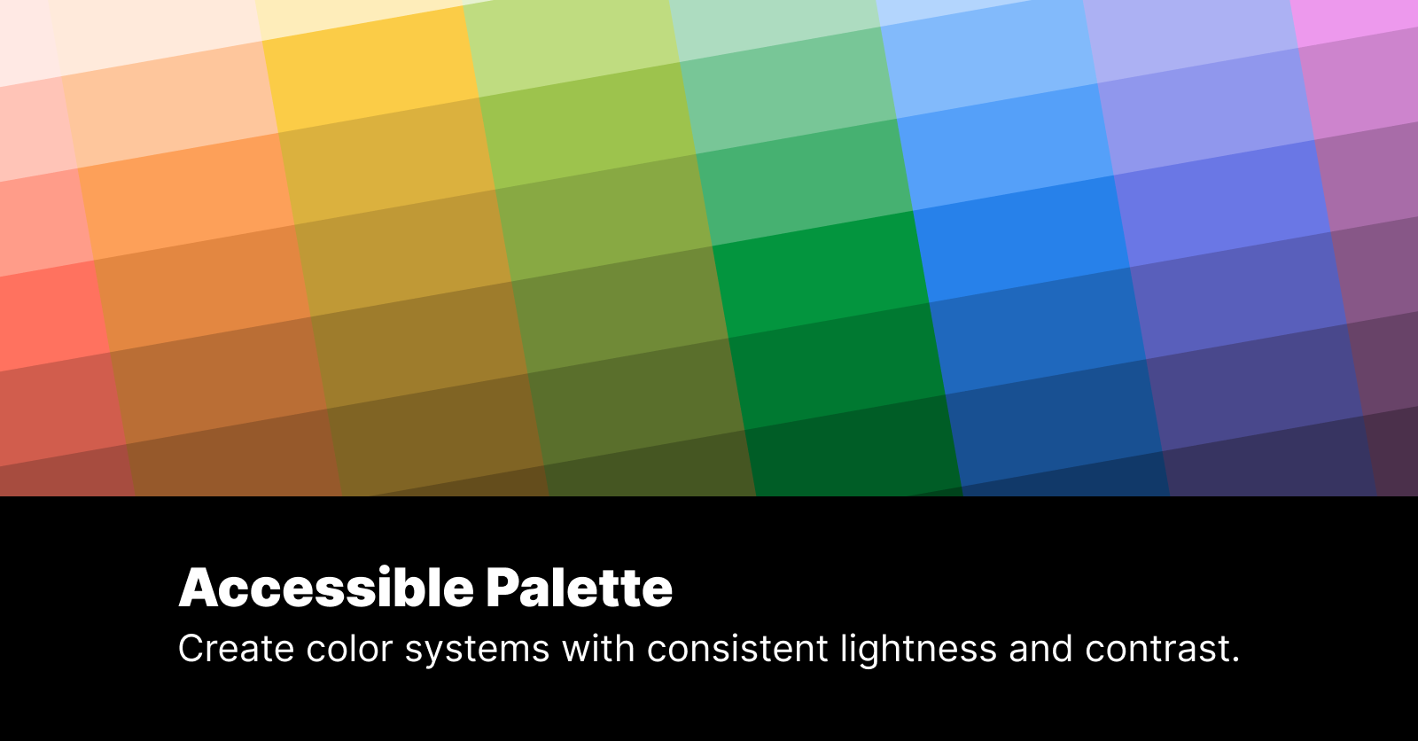
User reviews (0)