
 简体中文
简体中文 English
Website review
This review may include AI-generated content and is not individually verified. Domain, certificate and other facts come from the observed data on this page.
What is BEATA GEYER?
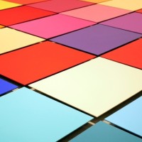
BEATA GEYER is the website of an artist whose practice centres on site-specific installation, often built around colour. The work shown there is made for particular exhibitions and spaces rather than as standalone objects: pieces are documented alongside the venue, dates, curator and participating artists.
What the work involves
- Site-specific installation — works such as METROPOLIS (2022) and FALL (2021) were created for named exhibitions and locations, meaning the space shapes the piece.
- Colour as subject matter — LOVED (2020–21) is described as exploring colour, fashion and design, with attention to colour forecasting and palette development.
- Exhibition context — the site records group shows, curators and co-hosts, so it functions partly as an exhibition history as well as a portfolio.
Who it is for
Curators, gallerists, writers and students of contemporary installation and colour theory are the most likely audience, along with anyone researching how colour forecasting moves between fashion, interiors and consumer goods. If you want process notes or a full biography, the visible evidence is thinner; the emphasis falls on individual projects and their settings.
A practical next step: pick one project, note its venue and dates, then read the accompanying text to see how the artist connects that specific space to the broader argument about colour and consumption.
What exhibitions has Beata Geyer participated in?
Beata Geyer's site documents participation in group exhibitions rather than a full career retrospective, so it gives a useful but partial record.
Exhibitions named on the site
- MATERIAL GIRRRL, China Cultural Centre, Sydney, 31 March – 27 May 2022. Her contribution was METROPOLIS, a new site-specific installation. Curated by Nicholas Tsoutas, with artists including Dandizi Chen, Euphemia Bostock, Peihua Chen, Maria Fernanda Cardoso, Qiyao Chen, Elizabeth Day, Yang Liu, Yi Pang, Rox De Luca and Wenmin Tong. Co-hosted by the Chinese Consulate-General in Sydney, with ART NOVA 100 and Beijing Mingtai Culture & Art Co., Ltd as partners.
- BLUE TOO, part of WAY OUT, Kandos, 27 February – 11 April 2021. She showed FALL, a site-specific installation.
- FABRIK, Penrith Regional Gallery, Sydney, 21 November 2020 – 28 February 2021. She showed LOVED (2020), a site-specific installation, photographed by Silversalt.
What the pattern suggests
Geyer works primarily through site-specific installation, and the listed shows are group exhibitions in artist-run, regional and cultural-institute contexts rather than commercial solo presentations. LOVED is described as exploring colour, fashion and design, especially colour forecasting and palette development — a useful clue to the conceptual thread running through her installation work.
If you want to see the work in person
Check the site's exhibition entries for venue names, then look up those venues' current programmes directly: the China Cultural Centre in Sydney and Penrith Regional Gallery both maintain their own listings, and Penrith Regional Gallery is the more likely of the two to hold archival exhibition records.
How does Beata Geyer use color forecasting in her installations?
Beata Geyer's own project descriptions treat colour forecasting as both subject matter and method. In the LOVED installation at Penrith Regional Gallery, she explicitly framed colour as a driver of consumption — quoting the Colour Marketing Group's line that "colour sells and right colour sells better" — and built the work around the mechanics of forecasting: palettes released by forecasting bodies, the roughly two-year lead time between prediction and purchase, and the way new colour cycles make fundamentally similar products feel novel. Her stated interest is the intersection of colour, fashion and design, so the installation reads as a forecast in its own right rather than a comment on one from outside. She also notes that post-pandemic forecasts lean toward uncertainty, which is why the palettes she describes range from psychedelic neon and energetic reds to muted neutrals and monochromes.
In her site-specific work, colour is tuned to a particular room and occasion rather than issued as a general palette. METROPOLIS (2022) was made for the MATERIAL GIRRRL exhibition at the China Cultural Centre in Sydney, and FALL (2021) for the BLUE TOO exhibition at WAY OUT in Kandos — both settings where the surrounding architecture and light, not a trend book, set the terms. That is the practical trade-off of her approach: a forecast has to travel and be adopted widely, while a site-specific installation only has to work once, in one place.
If you want to see how this plays out, look at installation photographs alongside the exhibition texts and compare the palette she chose with the forecast colours circulating in the year each work was made. For broader context on how trends are packaged and sold, the major forecasting organisations she names are worth checking directly, such as Pantone.
What is the significance of site-specific installations in Beata Geyer's work?
Site-specific installations are central to Beata Geyer's practice: they are made for a particular room, exhibition and moment, so the meaning shifts with the architecture, light and audience rather than travelling as a fixed object.
How this shows up in the work
- METROPOLIS (2022) was created for the MATERIAL GIRRRL exhibition at the China Cultural Centre in Sydney, a group show curated by Nicholas Tsoutas with artists from Australia and China. The installation responds to that venue and that exhibition context.
- FALL (2021) was a site-specific installation in the BLUE TOO exhibition at WAY OUT in Kandos, a regional setting quite different from a city gallery.
- LOVED (2020), shown in the FABRIK exhibition at Penrith Regional Gallery, is described as a site-specific installation and connects colour, fashion and design through colour forecasting and palette development.
Why it matters
For Geyer, site-specificity is a method rather than a format. A work like LOVED carries an argument about how colour palettes are forecast and how they drive consumption; installed in a given gallery, that argument is staged in relation to real walls, sightlines and visitor movement. In a group exhibition such as MATERIAL GIRRRL, the installation also has to hold its own alongside other artists' works, which makes placement and scale part of the content.
What this means for a viewer
If you are deciding whether to seek out her work, the practical point is that photographs only tell part of the story. The experience depends on being in the space. A useful next step is to check a venue's current exhibition programme before visiting, since a site-specific piece is unlikely to reappear in the same form elsewhere. For broader context on installation art and site-specific practice, Tate is a reliable starting point.
How can I subscribe to updates about Beata Geyer's art?
The site presents Beata Geyer's installation work and exhibition news, and its pricing signals mention "subscribe" and "subscription," which suggests there is an updates channel. The page evidence itself doesn't spell out the exact signup steps, so treat the following as practical guidance rather than a confirmed feature list.
Where to look on the site
- Check the footer or a "Subscribe" or "Newsletter" link, which is where artist sites usually place email signup.
- Look for a "Contact" page: many artists add visitors to exhibition announcement lists on request.
What a subscription would realistically give you
For an artist working in site-specific installation, updates tend to be exhibition dates and locations rather than studio news. The page evidence shows entries such as METROPOLIS at the China Cultural Centre in Sydney and LOVED at Penrith Regional Gallery, so a mailing list would most usefully alert you when similar shows open or close.
If there's no signup form
Follow the venues instead. Exhibitions are announced by the galleries and cultural centres hosting them, and those institutions usually run their own newsletters. This is often more reliable than an artist's own list, because it covers opening hours and events too.
A quick decision guide
- Want only Beata Geyer's own news? Use the site's subscribe option if present.
- Want to actually visit shows? Follow the hosting galleries, since they publish dates, times and access details.
- Want a low-effort option? Check the site periodically around the exhibition seasons shown in the page evidence, roughly late February through May.
As a next step, open BEATA GEYER and scan the page footer and menu for a subscribe or contact link before assuming no list exists.
What themes does Beata Geyer explore in her artworks?
Beata Geyer's work centres on colour, site and systems — how colour behaves in space, and how it shapes what we notice, desire and buy.
Recurring themes
Site-specific installation. Her projects are made for a particular room or building rather than as objects that travel. METROPOLIS (2022) was created for the MATERIAL GIRRRL exhibition at the China Cultural Centre in Sydney, and FALL (2021) for the BLUE TOO exhibition at WAY OUT Kandos. If you are commissioning or curating, this matters: the work is designed around light, architecture and sightlines, so it cannot simply be rehung elsewhere without losing its logic.
Colour as a social and commercial force. LOVED (2020, at Penrith Regional Gallery) is described as a colour forecast — a personal journey through past, present and future palettes. It looks at how colour forecasting works, tracing the practice back to the 18th century and its role in fashion and textiles, where predictions are made roughly two years ahead of what consumers will buy. The underlying observation is that many products are functionally similar, so colour becomes the deciding difference — and the engine that keeps consumption cycling.
The mood of a moment. The page notes that post-pandemic forecasts reflect uncertainty about the future, offering everything from psychedelic neons, energetic reds, oranges, strong blues and cooling greens through to muted bohemian neutrals and monochromes. Geyer treats that spread of options as evidence of a culture hedging its bets, not as a settled consensus.
Fashion's spillover into other design fields. The work follows how fashion houses set trends that then move into interiors and furniture, with designers both leading and following.
How to use this
If you are writing, teaching or curating around colour, treat LOVED as the entry point for the forecasting-and-consumption argument and the site-specific installations as the entry point for colour-in-space. A useful question to bring to either: is colour being used to sell something, or to make you look more carefully at where you are standing? Her work tends to ask both at once.
For background on the institutions and forecasting bodies referenced, see Pantone and Penrith Regional Gallery.
User reviews (0)