
 简体中文
简体中文 English
Website review
This review may include AI-generated content and is not individually verified. Domain, certificate and other facts come from the observed data on this page.
What is Daan Lemaire Abstract Schilderij?
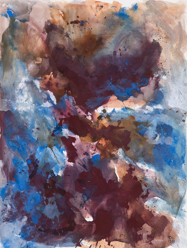
Daan Lemaire Abstract Schilderij is the personal art website of Dutch artist Daan Lemaire, presenting his abstract watercolor and gouache paintings on paper alongside related fused-glass work. The site is essentially an online gallery: it shows images of recently made gouaches on paper and explains the artist's direction in his own words.
What the artist says about the work
Lemaire describes starting series of loose abstract watercolors on paper from 2000. He notes a strong connection between these watercolors and his fused-glass art. For about ten years he used the term "lyrical abstraction" for his painting on paper and glass fusing; after 2007 the work became more expressive and "basic," with the lyrical element fading and stronger colors applied with a rough brush.
Who it is for
- Art viewers and collectors who want to see abstract work on paper without visiting a gallery.
- People interested in the relationship between watercolor painting and fused glass.
- Anyone researching lyrical abstraction and its shift toward more expressive, color-driven abstraction.
A practical next step
If a particular series or period interests you, use the site's images to compare an early, more lyrical watercolor with a post-2007 rougher, brighter piece. That side-by-side comparison is the clearest way to see the change the artist describes. For a broader context on abstract art, see Tate.
How does Daan Lemaire's watercolor technique differ from traditional watercolor painting?
Daan Lemaire describes his own work as moving away from "lyrical abstraction" toward something more expressive and "basic" after 2007, with strong colours applied using a rough brush. That self-description is the clearest signal of how his approach departs from traditional watercolour practice.
Where the difference lies
Traditional watercolour painting usually treats the medium as something to be controlled: washes are layered deliberately, edges are managed, and transparency is used to build light and form. The paper stays visible on purpose, and the painter often works toward a finished, resolved image.
Lemaire's stated direction is almost the opposite in emphasis. He works in series of loose abstract watercolours on paper, started around 2000, and his later work leans on expressive, rough brushwork and strong colour rather than lyrical, controlled effects. In other words, the medium is still watercolour and gouache on paper, but the intent is gestural and abstract rather than representational or finely managed.
A useful way to think about it
| Aspect | Traditional watercolour | Lemaire's described approach |
|---|---|---|
| Goal | Resolved, often representational image | Abstract, expressive mark-making |
| Brushwork | Controlled, blended, layered | Rough, direct, "basic" |
| Colour | Often restrained, transparent build-up | Strong colour used emphatically |
| Structure | Single finished painting | Series of loose works on paper |
One more thing worth noting
Lemaire himself points to a connection between these watercolours and his fused glass art. That cross-medium link is unusual for a watercolourist and suggests he is thinking about colour, surface and material behaviour rather than about watercolour tradition as such.
Next step
If you want to judge the difference for yourself rather than take the description on trust, look at several works from different periods side by side. Compare an earlier piece from the lyrical abstraction years with a post-2007 one, and ask whether the brush marks look planned or improvised. That single comparison will tell you more than any written characterisation. You can see the works at Daan Lemaire Abstract Schilderij.
What is the relationship between Daan Lemaire's watercolor paintings and his fused glass art?
Daan Lemaire describes a direct, mutually informing relationship between his watercolors on paper and his fused glass work: he states there is "much connection" between the two, and invites viewers to judge the similarity for themselves. Both practices sit on the abstract side of modern art, and both passed through the same stylistic shift — roughly a decade of "lyrical abstraction" followed, after 2007, by a more expressive, "basic" approach with strong colours and a rough brush.
In practical terms, you can read that connection in three ways:
- Shared visual language. Loose, flowing shapes and layered colour that behave similarly whether pigment soaks into paper or glass fuses in the kiln.
- Shared chronology. The watercolor series began around 2000; the move toward stronger colour and rougher mark-making after 2007 appears to apply to both media, so works from the same period are the most meaningful comparisons.
- Different material logic. Watercolor is absorbent, fast and unforgiving; fused glass is built in layers and fixed by heat. Similar compositions can therefore feel softer on paper and more sharply edged in glass.
A useful next step: open Daan Lemaire Abstract Schilderij and place a watercolor and a glass piece from the same year side by side. If you are considering a purchase or commission, ask which medium came first in a given series — that tells you whether the glass is translating a painting or the painting is responding to a glass piece, which affects how "original" each version feels.
How has Daan Lemaire's artistic style evolved from lyrical abstraction to a more expressive and basic approach?
Daan Lemaire describes his own trajectory on Daan Lemaire Abstract Schilderij: for about ten years, "lyrical abstraction" was the term he used for his watercolors on paper and his fused-glass work. After 2007, he says, the work became more expressive and "basic," and the lyrical label gradually stopped fitting. The clearest concrete shift he names is colour and brushwork: he increasingly uses strong colours applied with a rough brush.
That is a move away from the gentler, more allusive qualities usually associated with lyrical abstraction and toward directness — bolder hue, visible gesture, less reliance on delicacy or suggestion to carry the image.
What this means in practice
- Before 2007 (lyrical phase): watercolor on paper, made in series of loose abstract works, with a stated connection to his fused-glass art. The emphasis is on flow, nuance and lyrical suggestion.
- After 2007 (expressive/basic phase): stronger colour, rough brushwork, and a pared-back approach. The "lyrical" description fades because the paintings rely less on refinement and more on immediate, physical mark-making.
A useful way to read the change
| Aspect | Lyrical abstraction (to ~2007) | Expressive, "basic" (after 2007) |
|---|---|---|
| Colour | Softer, more nuanced | Strong, saturated |
| Brushwork | Loose, flowing | Rough, gestural |
| Effect | Allusive, lyrical | Direct, immediate |
| Link to glass | Close connection | Connection persists, but painting leads |
A practical next step
If you want to see the evolution for yourself rather than take the description on trust, look at the site's images in sequence and ask two questions of each piece: how saturated is the colour, and how visible is the brush? Works with restrained colour and smooth transitions sit closer to the lyrical period; works with strong colour and obvious, rough strokes sit in the later "basic" mode. Because he also works in fused glass, it is worth comparing a watercolor with a glass piece from the same period — he believes the connection is visible, and checking that claim is the most interesting way to test how much the glass work changed alongside the painting.
What materials and tools does Daan Lemaire use to create his abstract gouaches on paper?
Daan Lemaire describes his work on paper as abstract watercolors and gouaches, made with strong colours and a rough brush. The site's own wording points to watercolour/gouache paint, paper, and brushes as the core materials, with the brushwork becoming more expressive and "basic" after 2007.
H3 Practical reading of the materials
- Paint: watercolour and gouache, used for loose abstract series on paper since 2000.
- Support: paper, as stated in the page's subtitle and excerpt.
- Tool: a rough brush, which he names directly when describing his shift to stronger colour and more expressive mark-making.
- Related practice: fused glass, which he says has much connection to the watercolours — useful context if you are trying to understand his colour choices, but not a material used in the gouaches themselves.
H3 What this means if you are viewing or buying the work
If you are comparing his works, expect the paper pieces to read as fluid and colour-led rather than tightly drawn. The "rough brush" comment is a good signal that edges and textures may be visible and deliberate, not flaws. If you are a collector, ask the artist or seller how the works are mounted, framed and protected from light, since watercolour and gouache on paper are typically more light-sensitive than oil or acrylic.
H3 Next step
Look at the images on Daan Lemaire Abstract Schilderij and compare an early lyrical abstraction with a post-2007 piece. The change in brushwork and colour intensity will tell you more about his materials in practice than any list can.
Where can I view or purchase Daan Lemaire's abstract watercolor paintings?
The only place to view Daan Lemaire's abstract watercolors and gouaches on paper is his own site: Daan Lemaire Abstract Schilderij. It presents images of recent gouaches on paper, alongside his fused-glass work, which he describes as closely related to the watercolors.
What you'll find there
- A gallery-style overview of loose abstract watercolors on paper, made in series since 2000.
- Context on his style shift: he says his work was best described as "lyrical abstraction" for about ten years, then became more expressive and "basic" after 2007, with stronger colours and a rougher brush.
- A link between media: the same visual language runs through his watercolors and his fused-glass art, so viewing both together helps you read the paintings.
If you want to buy
The site is written as a personal presentation of his art rather than a shop page. It shows images and an artist's statement but no visible checkout, price list or payment option. In practice, that means enquiries go through the artist directly: look for a contact route on the site, mention the specific work or series you're interested in, and ask about availability, size, medium, framing and shipping.
A useful next step: note two or three pieces you respond to, then write a short message asking whether they are still available and what the price and delivery would be. If you're comparing his watercolors with the glass pieces, ask which medium suits the space you have in mind — paper works need framing and protection from light, while the glass pieces are a different commitment in weight and display.
 Amazon Route 53
 Dublin, Leinster, Ireland
User reviews (0)