
 简体中文
简体中文 English
Website review
This review may include AI-generated content and is not individually verified. Domain, certificate and other facts come from the observed data on this page.
What is icons.download?
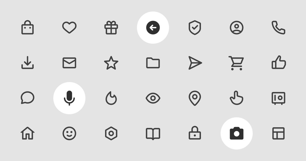
icons.download is a free icon library offering 275 vector icons in 16 style variations. The styles span common visual weights and shapes: bold, regular, thin, solid, outline, rounded, and sharp. Icons are provided as SVGs, which means they scale cleanly to any size and can be recolored or edited in design tools and code. The stated license allows personal and commercial use with no attribution required, which removes the usual licensing friction for client work, side projects, and internal tools.
Who it suits
- Developers who need a small, consistent set for buttons, navigation, and empty states without adding a large dependency.
- Designers who want matching icons across multiple weights — for example, thin icons for a minimal marketing page and solid icons for a dense dashboard.
- Anyone producing commercial work who wants to avoid attribution requirements or per-seat licensing.
Trade-offs to weigh
| Consideration | What it means for you |
|---|---|
| 275 icons | Enough for common UI needs, but likely too small for a product needing thousands of niche symbols |
| 16 styles | Strong visual consistency across weights, but you are limited to one creator's drawing style |
| SVG format | Flexible and editable, but you handle sizing, alignment, and accessibility labels yourself |
| No attribution | Simple compliance, though you may still want to credit the creator voluntarily |
A practical next step
Before committing, pick three or four icons you would actually use — say a search magnifier, a settings gear, a user avatar, and a trash can — and download them in the two styles you are considering. Place them next to your existing UI text and buttons at real size. If the stroke weight and corner radius feel consistent with your typography, the set will work; if they clash, the limited style range is the constraint you will hit.
For broader coverage when a project outgrows this set, established alternatives include Heroicons, Lucide, and Tabler Icons.
What styles of icons does icons.download offer?
icons.download offers 275 SVG icons in 16 styles, spanning weight and shape variants: bold, regular, thin, solid, outline, rounded and sharp.
H3 Practical read
- Weight variants (bold, regular, thin) let you match icon stroke to your typography — thin for airy editorial layouts, bold for buttons and dashboards.
- Shape variants (rounded vs. sharp) are the quickest way to shift tone: rounded feels friendly and consumer-facing, sharp feels technical or enterprise.
- Fill vs. stroke (solid vs. outline) matters most for state changes — solid icons often read better as active/selected states, outline for inactive ones.
H3 Choosing between them
| Need | Better fit | Trade-off |
|---|---|---|
| Dense UI, small sizes | Solid or bold | Less detail visible at 16px |
| Large hero or feature icons | Thin or outline | Can look weak on busy backgrounds |
| Playful product UI | Rounded | Clashes with strict grid-based brands |
| Data, dev tools, finance | Sharp | Feels cold in lifestyle contexts |
A concrete scenario: building a settings page, use outline icons at rest and swap to solid on the selected tab — the style pair does the state work without adding color.
Next step: pick one weight and one shape variant, then apply them consistently across a single screen before committing to the full set. Mixing styles within one interface is the most common way icon sets start to look inconsistent.
Can I use icons.download icons in a commercial project without attribution?
Yes. According to the site's own description, the 275 SVG icons are free for both personal and commercial use, and no attribution is required. So you can drop them into a client project, a product UI, or marketing material without adding a credit line or a link back.
A few practical points worth keeping in mind:
- Keep a record anyway. Even when attribution isn't required, saving the source URL and the date you downloaded the set makes it easy to answer later questions about where an asset came from — useful during a client handover or a legal review.
- Check the individual file, not just the homepage. Licenses can differ per asset on some icon sites, so if you're using a large batch, confirm the terms on the page you actually downloaded from.
- Mind trademark and brand rules. A permissive icon license doesn't cover logos or brand marks you might place alongside the icons, and it doesn't let you imply endorsement by the icon author.
If you need alternatives for comparison, Tabler Icons and Heroicons are both well-known free sets with their own license terms — worth reading if your project has strict attribution or redistribution requirements.
Next step: before shipping, note the license text and download date for the specific icons you used, and confirm your project's own policy on third-party assets. That takes a minute and prevents friction later.
How do I download and use the icons from icons.download?
Go to icons.download, browse or search the icon set, and pick the style variant you need. Icons are offered as SVG files across 16 styles (bold, regular, thin, solid, outline, rounded, sharp and others), so the main decision is which style matches your interface before you download. SVG works well because you can resize without quality loss and recolor it with CSS or by editing the file.
H3 Practical steps
- Find the icon by browsing the library or searching by keyword.
- Choose the style variant — for example, outline for light UI chrome, solid for emphasis or small sizes.
- Download the SVG.
- Drop it into your project: inline it in HTML if you want to control color with CSS, or reference it as an
<img>or background asset if the color is fixed. - Keep the filename meaningful so you can find it later.
H3 A concrete scenario If you're building a dashboard, you might use thin or regular outline icons in the sidebar for a light feel, and solid icons for active states or alerts. Downloading a consistent style set once avoids mixing visual weights later, which is the most common reason icon sets look messy.
H3 Trade-offs to weigh
- SVG vs. raster: SVG scales and recolors cleanly; raster formats don't. If you only need a fixed-size PNG for a slide deck, SVG is still fine but you'll convert it.
- Inline vs. referenced: Inlining gives styling control but adds markup; referencing keeps HTML clean but limits CSS recoloring.
- Style consistency vs. variety: 16 styles is useful for matching a design system, but mixing too many in one product weakens visual hierarchy.
H3 Licensing The site states the icons are free for personal and commercial use with no attribution required. That's convenient, but keep a record of where you downloaded assets from so you can confirm terms if a project's requirements change.
A useful next step: download one icon in two or three styles, place them side by side in your actual layout, and pick the style that reads best at your real sizes before downloading the full set.
Are the icons on icons.download available in SVG format?
Yes. icons.download provides its icon set as SVG files, and the site states that the 275 icons are free to use in personal and commercial projects without attribution.
For most web and product work, SVG is the format you want: it scales cleanly, stays sharp on high-density screens, and can be recolored or resized with CSS rather than re-exported. A practical example: if you are building a dashboard, you can drop an SVG into a button and change its fill or stroke to match your theme, which is harder with PNG or icon-font approaches.
The main trade-off is stylistic rather than technical. The library offers 16 styles — including bold, regular, thin, solid, outline, rounded and sharp — so the real decision is whether you want a consistent family across your interface or a mix. If you need a coherent visual language, pick one or two styles and stay with them; mixing thin outline icons with bold solid ones in the same toolbar tends to look inconsistent.
A useful next step: download a small test batch in the styles you are considering, place them at both small (16–20px) and large (48px+) sizes in a real layout, and check legibility. Thin and outline styles often lose detail at small sizes, while solid styles hold up better in dense UI.
Who created the icons on icons.download?
The icons on icons.download were created by Vitaly Belousov, credited on the site as the designer behind the 275-icon set icons.download.
For practical purposes, the more useful detail is the licensing: the set is described as free for personal and commercial use with no attribution required. That means you can drop an icon into a client project, a slide deck or a product UI without adding a credit line or chasing a separate commercial license.
If you want to verify the creator or confirm the terms before publishing, open the site and look for the designer credit and license note near the collection description.
 Namecheap, Inc.
 Amsterdam, North Holland, The Netherlands

User reviews (0)