Website profiles · Technology insights · Alternatives

klipfolio.com

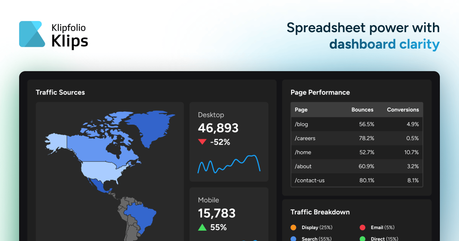
Klips is a complete dashboard solution that automates data retrieval and offers limitless dashboard presentation and distribution options, all with the power and familiarity of spreadsheets.

Paid content
Visit website
Profile views 0 Outbound visits 0 Normal
Klipfolio Full homepage screenshot

At a glance

Category
Data & Analytics
Language
English
Paid-content signal
Paid contentObserved
Registered
2001
Hosting
CloudflareInferred
HTTPS certificate trusted
PassedObserved
Last updated

Website review

This review may include AI-generated content and is not individually verified. Domain, certificate and other facts come from the observed data on this page.

What is Klipfolio used for?

Klipfolio is a dashboard and reporting tool for turning scattered business data into live, shareable KPI dashboards. Its pitch is aimed at people who already work comfortably in spreadsheets but have outgrown using Excel or Google Sheets as the backbone of reporting. Rather than replacing spreadsheet logic, it pulls data in automatically and presents it in dashboards built for monitoring and distribution.

What people actually use it for

  • KPI and performance dashboards: assembling metrics from CRM, advertising and social sources into one view, refreshed automatically instead of manually copied.
  • Client and stakeholder reporting: scheduled email reports, role-based access and embedding or exporting dashboards, which suits agencies producing recurring reports for clients.
  • Team monitoring: the published customer comments describe daily-use KPI reports that track progress against business goals and near-real-time revenue monitoring.
  • Mixed data environments: connecting to 200+ services, plus SQL and REST query connectors, with or without a data warehouse.

Who it fits, and the trade-off

It suits analysts, marketers and agency teams who want dashboard control without developer involvement and who value spreadsheet familiarity. The trade-off is scope: this is a presentation and data-retrieval layer, not a full BI or data-warehousing platform, so teams needing deep modelling or governance may pair it with other tools. If you are weighing options, compare it with purpose-built BI platforms on connector coverage and sharing controls before committing.

A practical next step: list the five metrics your team checks weekly, note where each lives, and confirm those sources are among the supported connectors.

How does Klipfolio connect to spreadsheets like Excel and Google Sheets?

Klipfolio connects to Excel and Google Sheets by pulling live data from them rather than requiring you to copy and paste or re-upload files. On its page, Klipfolio describes this as pulling live data straight from Excel or Sheets so you stop "chasing yesterday's numbers," and it presents spreadsheet familiarity as the foundation of its dashboard approach. In practice, this means a spreadsheet can act as a data source behind a dashboard, with the dashboard refreshing from the sheet instead of from a static export.

What the connection covers

  • Live spreadsheet data: Excel and Google Sheets are treated as connected sources, alongside 200+ other services such as CRM, Google Ads and social platforms.
  • No warehouse required: Klipfolio states its dashboards work with or without a data warehouse, which matters if your spreadsheet is currently your only data store.
  • Deeper connectors when needed: SQL and REST query connectors are available for sources beyond spreadsheets.
  • Distribution after connection: live dashboards, scheduled email reports, role-based access, and export or embed options.

Where spreadsheets fit, and where they don't

Klipfolio's own framing is that spreadsheets are excellent for formulas, filters and pivot tables but poor as the backbone of reporting. A finance analyst maintaining a monthly budget in Google Sheets, for example, can keep editing that sheet while a Klipfolio dashboard reads from it and presents the KPIs to leadership. The trade-off is that the spreadsheet's structure still matters: a messy or inconsistently formatted sheet will produce a messy dashboard, so the connection solves the refresh problem, not the data-quality problem.

A practical next step

Before connecting, decide which spreadsheet tabs are genuinely source data and which are manual calculations you could move into the dashboard. Then check Klipfolio's connector documentation for the specific Excel or Google Sheets setup steps, since authentication and refresh behaviour differ between the two. If your reporting is mostly a single spreadsheet viewed by a few people, the connection may add little; if you are combining spreadsheet figures with CRM or advertising data for a recurring audience, it is the more useful case.

Can I build KPI dashboards for clients and share them with role-based access?

Yes. Klipfolio's Klips product is positioned for exactly this: building dashboards that pull from live data sources and distributing them with role-based access control. The page evidence lists "control access with roles" as part of its sharing options, alongside presenting live dashboards, scheduling inbox reports, and exporting or embedding them.

What fits a client-facing KPI workflow

  • Data gathering: Connect directly to 200+ services (CRM, Google Ads, socials) or pull live data from Excel or Google Sheets, so client dashboards update without manual chasing.
  • Dashboard building: Thirty chart types, extensive styling options and custom layouts, described as requiring no developers.
  • Distribution: Live presentation, scheduled email reports, role-based access, and export or embed. Embedding is often the practical route for client portals.
  • Data infrastructure flexibility: Works with or without a data warehouse, and supports SQL and REST query connectors for less common sources.

Practical trade-offs

Role-based access is useful when a client's team includes people who should see revenue but not campaign-level detail, or when one agency account serves several client organisations. Confirm how roles map to individual dashboards and whether embed links can be scoped per client before you commit. A concrete check: set up one client with two roles (viewer and editor), share a single dashboard, and verify each role sees only what you intend.

The quoted customer, Andrew W., a director at IT MOOTI, says he builds dashboards for clients across industries and rates it highly for daily-use KPI reports. That reflects his agency experience, not a guarantee for your setup; test multi-client separation yourself.

Next step

Start with one client and one KPI set. Connect two sources, build the dashboard, then test sharing with a viewer role and an embed link before rolling out to the rest of your client base. For pricing and plan limits on client accounts, see Klipfolio.

How does Klipfolio compare to using spreadsheets for reporting, and when should I switch?

Klipfolio positions itself as a dashboard layer that keeps spreadsheet-style data work but replaces spreadsheets as the delivery mechanism for reporting. Per its page, Klips pulls live data from Excel or Google Sheets and connects to 200+ services, then builds and shares dashboards without developers. The pitch is aimed at people already fluent in formulas and pivot tables who have outgrown using a workbook as the reporting backbone.

Where the two approaches differ

Dimension Spreadsheet reporting Klipfolio Klips (per page evidence)
Data refresh Manual exports and copy-paste; "chasing yesterday's numbers" Automated retrieval from sheets and 200+ services
Presentation Charts that "barely pass as insightful" Thirty chart types, styling options, custom layouts
Distribution File sharing and version control by hand Live dashboards, scheduled email reports, role-based access, export or embed
Technical skill Familiar to most analysts No developers required; SQL and REST connectors available for advanced sources
Infrastructure None beyond the sheet Works with or without a data warehouse

When switching makes sense

Switch when the reporting process itself is the bottleneck: multiple data sources, recurring manual refreshes, several audiences needing different views, or errors creeping in from duplicated sheets. Those are exactly the pain points the page names. Staying with spreadsheets is reasonable for one-off analysis, small datasets, or a single reader who just needs a file.

A practical test

Count how many times per week someone rebuilds or re-exports the same report. If that number is more than once and more than one person depends on the output, a dashboard tool earns its keep. A reader running a weekly client KPI pack, for example, would gain more from scheduled delivery and access roles than from another template. For broader context on dashboard tools, Klipfolio publishes its own comparison material, and Microsoft and Google document the spreadsheet side through Excel and Sheets.

Do I need a data warehouse to use Klipfolio, or can I connect SQL and REST sources directly?

No, a data warehouse is not required. Klipfolio's page states that its Klips dashboards work "with or without a data warehouse," and it offers query connectors for SQL, REST and similar sources so you can pull data from almost anywhere. It also connects directly to 200+ services (CRM, Google Ads, socials) and can pull live data from Excel or Google Sheets.

What this means in practice

  • Direct connections: For a small team tracking ad spend, pipeline and revenue, you can point Klips at Google Ads, your CRM and a spreadsheet, then build and share dashboards without standing up a warehouse.
  • SQL and REST: If your data lives in a database or behind an API, the query connectors let you retrieve it directly, so a warehouse is optional rather than a prerequisite.
  • When a warehouse still helps: If you have many sources, heavy transformation needs or strict governance, a warehouse can centralize and clean data before it reaches dashboards. Klipfolio supports that setup too, so the choice is about your scale and data complexity, not a product limitation.

A useful next step: list your sources and note whether each is a SaaS app, spreadsheet, SQL database or REST API. If most are SaaS or spreadsheets, start with direct connections; if you have several databases needing joins and cleansing, plan for a warehouse layer. For official details, see Klipfolio.

What does Klipfolio cost, and how does pricing work for agencies?

Klipfolio publishes its pricing on its own pricing page, and it also lists a separate agency pricing path, so cost depends on which plan you pick and whether you buy as an agency. The page evidence confirms three pricing entry points — general pricing, a Klips product/agency pricing view, and a partner pricing page — but it does not include actual dollar figures, tiers, or what each tier includes, so specific numbers should be read from Klipfolio's current pricing pages rather than assumed here.

How pricing appears to be structured

  • Standard plans: A general pricing page covers the usual subscription options.
  • Agency plans: A distinct agency pricing option exists, aimed at buyers who build dashboards for clients rather than only for internal use. This matches the testimonial from a director who builds client dashboards across industries.
  • Partner pricing: A separate partner pricing page suggests reseller or partnership arrangements with their own terms.
Buyer type Pricing path Typical need
Single team or company General pricing Internal KPI dashboards, scheduled reports
Agency or consultant Agency pricing Multiple client dashboards, access control, sharing/embedding
Reseller or partner Partner pricing Ongoing commercial relationship with Klipfolio

Practical guidance

If you are an agency, compare the agency plan against stacking several standard subscriptions: the deciding factors are how many client accounts you need, whether role-based access and embedding are required per client, and whether you need to hand dashboards over or host them yourself. Ask Klipfolio directly about per-client limits, user seats, and whether agency pricing scales by client count or by data connections — those are the terms that usually change the total cost most.

As a next step, open the pricing page, note the tiers that fit your client count, then request a quote for the agency option so you can compare it against the standard plan on equal terms.

Related questions

More questions →
How Klipfolio Turns Spreadsheet Data into Dashboards

Klipfolio (branded as Klips on its site) turns spreadsheet data into dashboards through a three-step workflow: Connect, Build, and Share. You connect a source such as Excel, Google Sheets, a CRM, Google Ads, or one of 200+ supported services; build a dashboard using chart types and layouts without developers; then share it as a live dashboard, scheduled report, or embedded view. This suits teams that already work in spreadsheets but need reporting that updates automatically instead of being rebuilt by hand.

Step 1: Connect your data sources

Klipfolio pulls live data from Excel or Google Sheets, so you stop chasing yesterday's numbers. It also connects directly to 200+ services, including CRMs, Google Ads, and social platforms, and the site states that connected data stays reliable.

If your data lives somewhere less standard, Klipfolio supports SQL, REST, and other query connectors to reach almost any source. You can also keep or skip a data warehouse — the site says Klips works with or without one.

What to expect: the connection is the input; the automated data retrieval is the action; the result is a live data feed that no longer needs manual copy-paste updates.

Step 2: Build the dashboard

The build step is where spreadsheet familiarity helps but spreadsheet limits disappear. According to the site, you get:

  • 30 chart types
  • Thousands of styling combinations
  • Infinite custom layouts
  • No developers required

The pitch is direct: spreadsheets aren't made for dashboards, but the formula, filter, and pivot-table skills you already have carry over. The difference is that Klips automates the "grunt work" of gathering data and presenting it, rather than making you assemble charts by hand each cycle.

Step 3: Share and distribute

Klipfolio offers several distribution paths, which you can mix depending on your audience:

Method Best for
Live dashboards Teams or clients who check metrics regularly
Scheduled inbox reports Stakeholders who prefer email updates
Role-based access control Limiting what different viewers can see
Export or embed Putting dashboards into other tools or sites

Who this workflow fits

The site reports over 25,000 customers using Klips for dashboards. Customer comments describe two common uses: agencies building KPI reports for clients across industries, and teams uploading daily business data to monitor metrics like revenue in real time.

If your reporting currently means exporting spreadsheets, rebuilding charts, and emailing files on a schedule, this three-step model replaces that loop with a connected, automated one. If you only need a one-off chart from a static file, the connection and sharing layers add little.

Pricing is listed on Klipfolio's pricing page, including a separate agency pricing path; check those pages for current plan details before deciding.

What Does It Mean to Work With Data? A Beginner's Guide to Data Visualization and Statistics

Working with data means turning raw records into understanding. In practice, that breaks into five repeatable activities: collecting data, cleaning it, exploring it, visualizing it, and interpreting what the results do and do not support. Data visualization and statistics are two halves of the same job — statistics tells you whether a pattern is real and how uncertain it is, while visualization shows you the shape of the pattern and communicates it to others. You do not need a math or programming background to start; you need a question, a small dataset, and a tool simple enough that you spend your time thinking about the data rather than the software.

The Five Core Activities of Data Work

Most data projects, from a personal budget spreadsheet to a public health dashboard, move through the same stages.

1. Collecting

You gather observations: survey responses, website logs, sensor readings, government tables, or a hand-built spreadsheet. The key decision here is what counts as one row (a person? a day? a transaction?) and what each column measures. Getting this "unit of observation" wrong causes problems that no amount of later analysis can fix.

2. Cleaning

Real data arrives messy. Cleaning means handling missing values, fixing inconsistent categories ("USA," "U.S.," "United States"), correcting types (a date stored as text), and removing duplicates. Beginners are often surprised that this is the most time-consuming step. It usually is.

3. Exploring

Before making charts for others, you look for yourself. What is the range of each variable? Are there outliers? How are two variables related? Simple summaries — counts, averages, minimums, maximums — and quick scatterplots answer most early questions.

4. Visualizing

You encode values as position, length, color, or size so that patterns become visible. A good chart answers one question clearly. A bad chart hides the answer behind decoration or distorts it through a misleading axis.

5. Interpreting

You decide what the pattern means, how confident you should be, and what alternative explanations exist. This is where statistics and careful reasoning matter most.

Visualization vs. Statistics: How They Complement Each Other

These are not competing approaches. They answer different questions about the same data.

Question Better served by
Is there a relationship between two variables? Visualization (scatterplot)
How strong is it, and could it be chance? Statistics (correlation, regression, confidence intervals)
Are there clusters, gaps, or outliers? Visualization
How much uncertainty is in this estimate? Statistics
How do I explain this to a non-expert? Visualization
Did this change actually happen, or is it noise? Statistics

A practical rule: visualize to discover, model to confirm, visualize again to communicate. A scatterplot might reveal that one region behaves completely differently from the rest; a statistical model then tests whether that difference holds up; a final chart shows the finding to an audience.

Beginner-Friendly Tools and Formats

You can start with tools you already have.

  • Spreadsheets (Excel, Google Sheets): Best for datasets under a few thousand rows. Built-in chart types cover bar, line, scatter, and pie. Learn to sort, filter, and use pivot tables.
  • Chart types to master first: bar charts for comparisons, line charts for change over time, scatterplots for relationships, and histograms for distributions. These four cover most everyday questions.
  • Simple code options: If you want to go further, R (with ggplot2) and Python (with matplotlib or plotly) are common. Both have large free learning communities. Start with one, not both.
  • Design principles that matter more than the tool: label your axes, start bar charts at zero, avoid 3D effects, use color to encode meaning rather than decoration, and put the most important comparison in the most prominent position.

A Realistic Starting Path

If you have no data background, this sequence works:

  1. Pick a question you actually care about. "How has my city's rent changed over ten years?" beats a generic tutorial dataset.
  2. Find a small, public dataset. Government open-data portals and statistical agencies publish free tables.
  3. Load it into a spreadsheet and clean it. Fix types, remove duplicates, note missing values.
  4. Make three charts. One bar, one line, one scatter. Write one sentence under each describing what you see.
  5. Ask what could be misleading. Is the sample representative? Is the time range fair? Could a third factor explain the pattern?
  6. Repeat with a slightly harder question. Add a second variable, or try a simple statistical summary like a correlation or a group comparison.

Expect the first project to take longer than you think, mostly in cleaning. That is normal, not a sign you are doing it wrong.

What Data Can and Cannot Answer

Data can describe what happened, compare groups, estimate relationships, and quantify uncertainty. It cannot, on its own, establish causation without a proper study design, tell you what you should value, or compensate for a biased sample. A dataset collected from volunteers will not represent the general population no matter how sophisticated the analysis. Treat every result as "what this data suggests under these conditions," not as a final verdict.

Where to Go Next

FlowingData (flowingdata.com) focuses on data visualization and statistics for people who want practical, well-designed charts rather than academic theory. It is a reasonable place to browse examples, see how real datasets are turned into clear graphics, and pick up habits you can apply in your own work. Pair it with one spreadsheet tutorial and one public dataset, and you have everything you need for a first project.

The short version: working with data is a craft of asking clear questions, cleaning messy inputs, looking before you model, and communicating honestly. Start small, start visual, and let the statistics grow as your questions get harder.

Where to Get Started with Klipfolio and View Pricing

Start on the Klipfolio homepage (klipfolio.com) and use the Get Started link to begin with Klips, or go straight to klipfolio.com/pricing to review plan information. If you are an agency or partner, Klipfolio lists separate pricing paths at klipfolio.com/pricing?product=klips&type=agency and klipfolio.com/partners/pricing. The homepage also links to detail pages for the three core steps — Connect, Build, and Share — so you can read about each before signing up.

Getting started: the three-step path

Klipfolio frames onboarding around three steps, each with a "Learn more" link from the homepage:

  1. Connect — Connect directly to 200+ services, including CRM tools, Google Ads, and social platforms. You can also pull live data from Excel or Google Sheets, or use SQL, REST, and other query connectors to reach almost any source. A data warehouse is optional: Klips works with or without one.
  2. Build — Assemble dashboards using thirty chart types, thousands of styling combinations, and custom layouts. Klipfolio states no developers are required.
  3. Share — Present live dashboards, schedule reports to inboxes, control access with roles, and export or embed dashboards elsewhere.

Expected result: after connecting a source and building a dashboard, you have a live view that refreshes from your data rather than a static spreadsheet export.

Common sticking point: the homepage does not publish step-by-step setup instructions or menu locations. Use the "Learn more" links on each step for the actual walkthrough, and check whether your data source appears among the 200+ supported services before committing.

Viewing pricing

The homepage has a View Pricing button and a Pricing link in the navigation, both leading to klipfolio.com/pricing. Two additional pricing pages exist for specific audiences:

Audience Pricing page
General klipfolio.com/pricing
Agency klipfolio.com/pricing?product=klips&type=agency
Partner klipfolio.com/partners/pricing

The available site material does not list plan names, prices, or whether a free tier or login is required, so confirm those details on the pricing pages themselves before deciding.

What Klipfolio is, in one line

Klipfolio describes Klips as a complete dashboard solution that automates data retrieval and offers flexible dashboard presentation and distribution, built on the familiarity of spreadsheets. The company reports over 25,000 customers using Klips for dashboards.

Is it worth a closer look?

Klipfolio's own positioning is aimed at spreadsheet power users: people comfortable with formulas, filters, and pivot tables who have outgrown using Excel or Sheets as the backbone of reporting. If your data is scattered across tools and you want automated, shareable dashboards without developer involvement, the Connect → Build → Share path maps directly to that need. If you mainly need static reports or have very few data sources, the value of a dedicated dashboard tool is less obvious — review the pricing page first to weigh cost against that gap.

Why Klipfolio Says Spreadsheets Aren't Made for Dashboards

Klipfolio's argument is narrow rather than absolute: spreadsheets are excellent for analysis, but poor as the backbone of a recurring reporting process. Its product, Klips, is positioned as a dashboard layer that pulls live data from Excel, Google Sheets, and 200+ other services, then automates the refresh, presentation, and distribution that spreadsheets handle badly. The claim applies to teams producing dashboards that are updated and shared repeatedly; if you only need a one-off analysis, a spreadsheet remains the simpler tool.

The three problems Klipfolio names

Klipfolio's homepage makes a specific critique of spreadsheet-based reporting, and each point maps to a different failure mode:

  • Scattered data. When metrics live across a CRM, ad platforms, and social tools, someone has to collect them manually. The data is only as current as the last copy-paste.
  • Error risk. Manual collection and formula chains create opportunities for mistakes that are hard to trace once a report is shared.
  • Weak charts. Spreadsheet charts are described as barely passing as "insightful" — functional for quick looks, less effective for dashboards meant to drive decisions.

The underlying point is about role, not capability. Klipfolio explicitly says it loves Excel and Google Sheets; the objection is to using them as the backbone of reporting, which it calls "unnecessary heavy lifting."

What Klips does instead

Klipfolio frames the transition in three steps, each replacing a manual spreadsheet task:

Step What Klips does Spreadsheet equivalent it replaces
Connect Direct connections to 200+ services (CRM, Google Ads, socials); live pulls from Excel and Sheets; SQL and REST query connectors Manual exports and copy-paste
Build About 30 chart types, thousands of styling combinations, custom layouts, no developer required Native spreadsheet charts and formatting workarounds
Share Live dashboards, scheduled email reports, role-based access control, export or embed Emailed files and shared drives with version confusion

Two details matter for evaluation. First, Klips works with or without a data warehouse, so you don't need to rebuild your data infrastructure before adopting it. Second, the SQL and REST connectors mean the "200+ services" list isn't a hard ceiling — anything reachable by query can feed a dashboard.

Where the spreadsheet familiarity still counts

Klipfolio's pitch keeps spreadsheet skills relevant rather than discarding them. The tagline — "spreadsheet power with dashboard clarity" — signals that formulas and data logic you already know remain useful; what changes is where the data lives and how the output is delivered. For a team of spreadsheet power users, that lowers the switching cost: the mental model carries over, and the manual refresh work disappears.

Klipfolio cites over 25,000 customers using Klips, and its testimonials come from people building client-facing KPI reports — the recurring, shared-reporting scenario where the spreadsheet critique bites hardest. One reviewer, a director at an IT consultancy, describes building dashboards for clients across industries; another, a CPO, cites daily uploads for real-time revenue monitoring. Both are cases where freshness and distribution matter more than ad-hoc analysis.

How to decide

Use the critique as a test against your own workflow:

  • Stay with spreadsheets if reports are one-off, consumed by one or two people, and rebuilt from scratch each time. The overhead of a dashboard tool isn't repaid.
  • Consider Klips if you refresh the same report on a schedule, pull from multiple tools, or share dashboards with clients or teams where stale numbers or version mix-ups cause real problems.
  • Check fit before committing on two points the homepage doesn't settle: which of your specific data sources are among the 200+ connectors, and what the pricing page says for your team size and use case (agency pricing is listed separately). Both are linked from the site and worth reviewing against your stack.

The short answer to the headline question: Klipfolio isn't arguing spreadsheets can't display data — it's arguing they can't reliably keep a dashboard current and consistent once reporting becomes a recurring, shared job.

What to Check Before Choosing Klipfolio for Your Dashboards

Klipfolio (the product it now calls Klips) is worth shortlisting if you want live dashboards built on data you already keep in spreadsheets and cloud tools, without hiring developers. Before committing, verify four things: that your data sources are covered by its 200+ connectors or by SQL/REST query connectors, whether you have a data warehouse (it works either way), how you need to distribute dashboards (scheduling, roles, embedding, exports), and which pricing track applies to you — standard, agency, or partner.

1. Data sources: connectors first, SQL/REST as the fallback

Klipfolio states it connects directly to 200+ services, naming CRM tools, Google Ads, and social platforms as examples, and it pulls live data straight from Excel and Google Sheets. For anything outside that list, it offers query connectors including SQL and REST, which the site describes as a way to "get data from almost anywhere."

What to check on your side:

  • List your sources. Separate the ones likely covered by standard connectors (major ad platforms, CRMs, spreadsheets) from internal databases or niche SaaS tools.
  • Confirm the specific integration, not just the category. The site gives examples, not a full list; ask for or look up the connector for each tool you rely on.
  • Plan the SQL/REST path for the rest. This works, but it means someone on your team must write and maintain queries — a different skill than building charts.

If most of your data lives in a handful of mainstream cloud tools, the connector route is straightforward. If it lives in a custom internal system, budget for the query-connector work.

2. Data warehouse: optional, not required

The site is explicit that Klips "works great with or without a data warehouse." That matters in two directions:

  • No warehouse yet: you can connect sources directly and start building, which suits small teams that haven't built data infrastructure.
  • Warehouse in place: Klipfolio can sit on top of it rather than duplicating ingestion, so your existing modeling work isn't wasted.

The decision point is governance. Direct connections are faster to set up but spread logic across many integrations; routing through a warehouse centralizes definitions. Klipfolio supports both, so pick based on how much consistency your reporting needs, not on a tool limitation.

3. Presentation and distribution: match the feature list to your audience

The site describes three steps — Connect, Build, Share — and the Share step is where most buying decisions actually get made. According to the page, you can:

  • Present live dashboards
  • Schedule reports to inboxes
  • Control access with roles
  • Export or embed dashboards anywhere

On the build side, it cites thirty chart types, thousands of styling combinations, and custom layouts with "zero developers required."

Check these against your real workflow:

Your need What to verify
Client-facing reporting Whether embedding and role-based access fit how you share with external parties
Recurring executive updates How scheduled email reports are configured and formatted
Mixed internal/external audiences Whether roles let you separate what each group sees
Portability What export formats are available for offline or archival use

If your main requirement is a live link your team checks daily, the basics are covered. If you run a client reporting business, embedding and access control deserve a hands-on trial before you commit.

4. Pricing: three entry points, so pick the right one

The site links to pricing in three places: the main pricing page, a pricing page filtered for the Klips product and an agency type, and a separate partners pricing page. That structure suggests distinct tracks for standard users, agencies managing multiple clients, and partners.

Before choosing:

  • Identify your model. Are you reporting for one organization, or for multiple clients? Agencies should look at the agency-filtered pricing rather than assume standard rates apply.
  • Check the partner track if you resell or embed reporting in your own offering.
  • Confirm what each tier includes — seats, dashboards, and connector access are the usual variables, but the page evidence here doesn't specify them, so review the pricing pages directly.

A quick pre-purchase checklist

  1. Map every data source to a named connector or to SQL/REST.
  2. Decide whether data flows directly or through a warehouse.
  3. List your distribution requirements: live views, scheduled emails, roles, embeds, exports.
  4. Trial the build experience against one real dashboard you need this month.
  5. Compare standard, agency, and partner pricing for your situation.

Klipfolio's own positioning is that spreadsheets are fine as a data source but poor as a dashboard backbone. If your current process is exactly that — spreadsheet formulas feeding charts that lag behind reality — the fit is strong, provided your sources are connectable and your sharing needs match the features above.

Website Overview

An advisory match combined with missing browser safeguards may increase exposure if the affected component is active. Deployment-specific verification and remediation deserve priority. Identifiable technologies and additional version or configuration signals make the service easier to fingerprint, which may help targeted scanners narrow their checks.

Domain and Registration

Registered in 2001, this domain has about 25 years of history. That suggests continuity, although ownership and purpose may have changed. Transfer-protection status is present, helping reduce the risk of unauthorized domain transfers. The domain uses the common .com extension, which is not an independent safety signal.

DNS and Email

Nameservers are provided by Cloudflare, indicating managed DNS hosting. MX records point to the Google Workspace email service. CAA records restrict which certificate authorities are authorized to issue certificates. No CNAME was found; the observed records resolve directly to addresses. SPF and DMARC are configured. DKIM status is unknown.

TLS and Certificates

The public key uses EC with 256 bits. The server supplied a complete certificate chain. No organization name is present in the certificate; the available fields are consistent with domain validation. The certificate was issued within the Google Trust Services cloud or CDN ecosystem. The certificate's total validity is about 90 days, consistent with a short renewal cycle.

HTTP and Browser Security

The response lacks these common security headers: HSTS, CSP, X-Content-Type-Options, Permissions-Policy, clickjacking protection. No X-Powered-By header was found, reducing one common source of backend fingerprinting information. The cf-ray response header indicates a CDN or caching proxy in the delivery path. No obvious internal addresses or debug information were found in the headers. The Server header identifies cloudflare without an exact version.

Technology Stack Analysis

The public page identifies Astro 7.2.0, Google Tag Manager, Cloudflare, with exact versions exposed for 1 technologies. These details can narrow vulnerability checks, although exposure alone is not a vulnerability. The advisory source OSV places Astro 7.2.0 in the affected range of GHSA-26w7-cxv4-gfx2, GHSA-376h-93r7-7g6f. Verify the deployed version and relevant configuration before drawing conclusions about exploitability. Updating affected components should be a priority.

Search and Social Sharing

The meta description has 190 characters and may be shortened in search results. The Generator tag identifies Astro v7.2.0, making the publishing system easier to fingerprint. Twitter Card metadata is configured. JSON-LD includes Organization data, helping describe the organization as an entity. The title has 52 characters, within a common display range.

Hosting and Email

DNSCloudflare
HostingCloudflare
EmailGoogle Workspace
Approximate IP geolocation (inferred; a CDN or proxy may differ from the origin server) Location unknown Inferred 104.26.10.191

Registration details

RDAP / WHOIS

RegistrarNetwork Solutions, LLC
Registered2001-08-14
Expires2030-08-14
Domain statusclient transfer prohibited
Nameserverselle.ns.cloudflare.com、mitch.ns.cloudflare.com
DNSSECunsigned

DNS records

DNS

TypeNameValueTTLPriority
Awww.klipfolio.com104.26.10.191300—
Awww.klipfolio.com104.26.11.191300—
Awww.klipfolio.com172.67.75.252300—
AAAAwww.klipfolio.com2606:4700:20::681a:abf300—
AAAAwww.klipfolio.com2606:4700:20::681a:bbf300—
AAAAwww.klipfolio.com2606:4700:20::ac43:4bfc300—
MXklipfolio.comaspmx.l.google.com3001
MXklipfolio.comalt1.aspmx.l.google.com3005
MXklipfolio.comalt2.aspmx.l.google.com3005
NSklipfolio.comelle.ns.cloudflare.com86400—
NSklipfolio.commitch.ns.cloudflare.com86400—
TXTklipfolio.com1password-site-verification=NM4FGPNN5FER7PBZMLYBN7BSIQ300—
TXTklipfolio.comDomain 1: TS-GL1PkEK0iFnLkJF5yOg6300—
TXTklipfolio.comamazonses:PbnxI9iLrj4Ku7dDTNAGDgMyuBGEzaqyZ1m2ddHUNaw=300—
TXTklipfolio.comgoogle-site-verification=osKc9kkFY6Rd_yT62cKvRHCSasawmr93SRZF3n4_FI0300—
TXTklipfolio.comgoogle-site-verification=pA9E66e8iFZ5gU40UDtmAyWddd24zJh3AvZgizeFvfY300—
TXTklipfolio.comhubspot-developer-verification=OTlkMzdmMWUtNTZkYy00N2QwLWFmMDEtYTRmZjA1ZGFhM2E4300—
TXTklipfolio.comhubspot-developer-verification=YWFmM2UxNTctZWI0Yi00NTVlLTkwNTYtOGM2ZjAwYjdkZTQ2300—
TXTklipfolio.comstripe-verification=f6b8d64779d3d07d48c798a8c42f9c0dc1b4f210e51ed4440275cc88e3cfcd81300—
TXTklipfolio.comv=spf1 mx a:zgateway.zuora.com include:mail.zendesk.com include:amazonses.com include:7477725.spf02.hubspotemail.net include:_spf.google.com ip4:23.21.109.197 ip4:23.21.109.212 ip4:147.160.167.0/26 ~all300—
CAAklipfolio.com0 issue "amazon.com"300—
CAAklipfolio.com0 issue "amazonaws.com"300—
CAAklipfolio.com0 issue "amazontrust.com"300—
CAAklipfolio.com0 issue "awstrust.com"300—
CAAklipfolio.com0 issue "comodoca.com"300—
CAAklipfolio.com0 issue "digicert.com; cansignhttpexchanges=yes"300—
CAAklipfolio.com0 issue "letsencrypt.org"300—
CAAklipfolio.com0 issue "pki.goog; cansignhttpexchanges=yes"300—
CAAklipfolio.com0 issue "ssl.com"300—
CAAklipfolio.com0 issuewild "amazon.com"300—
CAAklipfolio.com0 issuewild "amazonaws.com"300—
CAAklipfolio.com0 issuewild "amazontrust.com"300—
CAAklipfolio.com0 issuewild "awstrust.com"300—
CAAklipfolio.com0 issuewild "comodoca.com"300—
CAAklipfolio.com0 issuewild "digicert.com; cansignhttpexchanges=yes"300—
CAAklipfolio.com0 issuewild "letsencrypt.org"300—
CAAklipfolio.com0 issuewild "pki.goog; cansignhttpexchanges=yes"300—
CAAklipfolio.com0 issuewild "ssl.com"300—
DMARC_dmarc.klipfolio.comv=DMARC1; p=quarantine; pct=100; rua=mailto:[email protected]; aspf=r;300—

TLS and certificates

TLS / SSL

AssessmentNormal configuration
Supported protocolsTLSv1.2、TLSv1.3
Negotiated protocolTLSv1.3
Certificate subjectklipfolio.com
IssuerGoogle Trust Services
Valid until2027-01-03T02:23 · Remaining when checked: 76 days
Verification detailsCertificate trust: Passed · Hostname match: Passed

HTTP response headers

HTTP

HeaderValue
content-typetext/html
cache-controlpublic, max-age=0, must-revalidate
servercloudflare
referrer-policyno-referrer-when-downgrade
set-cookieRedacted

Identified technologies

Astro 7.2.0Google Tag ManagerCloudflare

Pages, Search and Sharing

Meta descriptionKlips is a complete dashboard solution that automates data retrieval and offers limitless dashboard presentation and distribution options, all with the power and familiarity of spreadsheets.
Canonical URLhttps://www.klipfolio.com/
LanguageEnglish (default)
Twitter Cardsummary_large_image
All bots 1 allowed · 3 disallowed
  • Allow/
  • Disallow/dev/
  • Disallow/preview/
  • Disallow/api/
gptbot 1 allowed · 3 disallowed
  • Allow/
  • Disallow/dev/
  • Disallow/preview/
  • Disallow/api/
chatgpt-user 1 allowed · 3 disallowed
  • Allow/
  • Disallow/dev/
  • Disallow/preview/
  • Disallow/api/
oai-searchbot 1 allowed · 3 disallowed
  • Allow/
  • Disallow/dev/
  • Disallow/preview/
  • Disallow/api/
claudebot 1 allowed · 3 disallowed
  • Allow/
  • Disallow/dev/
  • Disallow/preview/
  • Disallow/api/
claude-user 1 allowed · 3 disallowed
  • Allow/
  • Disallow/dev/
  • Disallow/preview/
  • Disallow/api/
claude-searchbot 1 allowed · 3 disallowed
  • Allow/
  • Disallow/dev/
  • Disallow/preview/
  • Disallow/api/
anthropic-ai 1 allowed · 3 disallowed
  • Allow/
  • Disallow/dev/
  • Disallow/preview/
  • Disallow/api/
google-extended 1 allowed · 3 disallowed
  • Allow/
  • Disallow/dev/
  • Disallow/preview/
  • Disallow/api/
applebot-extended 1 allowed · 3 disallowed
  • Allow/
  • Disallow/dev/
  • Disallow/preview/
  • Disallow/api/
perplexitybot 1 allowed · 3 disallowed
  • Allow/
  • Disallow/dev/
  • Disallow/preview/
  • Disallow/api/
perplexity-user 1 allowed · 3 disallowed
  • Allow/
  • Disallow/dev/
  • Disallow/preview/
  • Disallow/api/
amazonbot 1 allowed · 3 disallowed
  • Allow/
  • Disallow/dev/
  • Disallow/preview/
  • Disallow/api/
bytespider 1 allowed · 3 disallowed
  • Allow/
  • Disallow/dev/
  • Disallow/preview/
  • Disallow/api/
ccbot 1 allowed · 3 disallowed
  • Allow/
  • Disallow/dev/
  • Disallow/preview/
  • Disallow/api/
cohere-ai 1 allowed · 3 disallowed
  • Allow/
  • Disallow/dev/
  • Disallow/preview/
  • Disallow/api/
duckassistbot 1 allowed · 3 disallowed
  • Allow/
  • Disallow/dev/
  • Disallow/preview/
  • Disallow/api/
meta-externalagent 1 allowed · 3 disallowed
  • Allow/
  • Disallow/dev/
  • Disallow/preview/
  • Disallow/api/
mistralai-user 1 allowed · 3 disallowed
  • Allow/
  • Disallow/dev/
  • Disallow/preview/
  • Disallow/api/
youbot 1 allowed · 3 disallowed
  • Allow/
  • Disallow/dev/
  • Disallow/preview/
  • Disallow/api/

User reviews (0)

  • No reviews yet.