
 简体中文
简体中文 English
Website review
This review may include AI-generated content and is not individually verified. Domain, certificate and other facts come from the observed data on this page.
What is Landing Pages Explained?
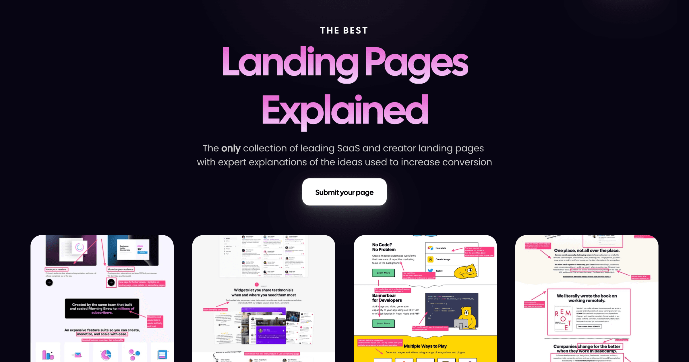
Landing Pages Explained is a curated gallery of real SaaS and creator landing pages, with each example accompanied by an expert breakdown of the conversion ideas behind it. The site is organized around categories such as SaaS, Creators, Newsletters, Courses, and Info products, and it also invites visitors to request a demo, submit their own page, or sponsor the collection.
What you'll find there
- Annotated examples of live landing pages, including Pallyy, ShipFast, Supademo, Gummysearch, Breakcold, and PDF Pals.
- Explanations attributed to Olly Meakings, founder of RMLP, focused on the choices that drive conversion.
- A browsable library by page type rather than by company size or industry.
Who it's for
Marketers, founders, and designers who want to study proven patterns before writing or redesigning a page. It suits people who prefer seeing a real page with commentary over reading abstract copywriting theory.
How to use it
Pick one example close to your own product type, read the explanation, then note which specific element you could test on your own page. A practical next step is to compare two examples in the same category and identify what they share, since repeated patterns across different products are usually the strongest signals.
For broader landing-page references, you can also look at Landingfolio or SaaS Landing Page as complementary galleries.
How can I use Landing Pages Explained to improve my SaaS landing page conversion rate?
Use Landing Pages Explained as a swipe file with commentary, not as a template library. You browse real SaaS and creator pages, then read an explanation of the specific choices intended to lift conversion. The explanations are attributed to Olly Meakings, founder of RMLP, so treat them as one practitioner's teardown rather than a controlled test result.
A practical workflow
- Pick pages closest to your situation, not the most famous ones. Match on audience and buying motion: self-serve trial, demo request, newsletter signup or info product.
- Read the explanation first, then look at the page. Ask which element is doing the persuasive work: the headline promise, the single call to action, the customer-centric framing, or the social proof.
- Write down the underlying idea in one sentence, stripped of the original's wording and visuals.
- Apply it to your page as a hypothesis: "If we lead with the customer's outcome instead of our feature list, more visitors will start a trial."
- Test one change at a time against your current page, and judge by your own conversion data, not by how polished the example looks.
What the examples suggest
The page names several teardowns that hint at different levers. Pallyy is described as simple and customer-centric; Gummysearch as "incredibly simple"; Breakcold as built on social proof; Supademo as a "demo" page; ShipFast as simply "awesome." That spread is useful because it shows conversion can come from simplicity, from proof, or from letting the product demonstrate itself.
| If your problem is... | Look at examples like... | The idea to test |
|---|---|---|
| Too many messages, unclear offer | Pallyy, Gummysearch | Cut to one promise and one action |
| Visitors don't believe you | Breakcold | Put credible proof near the decision point |
| Product is hard to grasp in text | Supademo | Let a demo or visual carry the explanation |
Where it helps most
This suits founders and marketers who already have traffic and a live page, and who want a steady supply of concrete ideas rather than abstract CRO theory. It is less useful if you need statistically rigorous experiment design, industry-specific compliance guidance, or help with traffic acquisition. The explanations tell you what a page is trying to do; they cannot tell you whether it will work for your audience.
Next step
Choose one page from your own category, read its explanation, and draft a single alternative headline plus one call to action. Run it for a full business cycle before changing anything else, so the result is readable.
What specific lessons can I learn from the Pallyy landing page breakdown?
The Pallyy breakdown is a case study in customer-centric simplicity: the page leads with the user's outcome rather than the product's feature list, and the explanation credits Olly Meakings (founder of RMLP) for walking through those choices. The practical takeaway is that a short page can outperform a dense one when every section answers a question a hesitant visitor is already asking.
What to look for in the breakdown
- Audience-first framing. Notice how the copy speaks to the social-media manager's daily grind — planning, scheduling, client approvals — instead of describing the tool's architecture.
- One job per section. Each block moves the reader closer to signup: promise, proof, product glimpse, objection handling, call to action.
- Visual economy. Fewer elements mean less cognitive load; the eye lands on the primary action without competing buttons.
- Proof placement. Testimonials and usage signals sit near the decision point, not buried in a separate page.
How to apply it to your own page
- Write your headline as the customer's desired end state, then test whether a stranger understands it in five seconds.
- Cut any section that doesn't either build belief or remove a reason to hesitate.
- Put your strongest proof immediately before the main call to action.
- Compare your draft against a second example with a different structure — ShipFast's page, also covered on the same site, takes a more energetic, builder-focused tone, which is useful for seeing how tone shifts with audience.
If you work on a SaaS or creator product, treat the collection as a swipe file: pick one page per week, note the single idea it executes well, and A/B test that idea on your own page rather than copying the whole layout. Landing Pages Explained
How do I submit my own landing page for expert analysis on Landing Pages Explained?
Use the Submit your page option in the site navigation. That is the route Landing Pages Explained provides for sending in a landing page so it can be considered for an expert breakdown.
The site is built around a curated collection: SaaS and creator landing pages are featured with explanations of the conversion ideas behind them, and the explanations are attributed to named contributors such as Olly Meakings. Because of that format, submission is best treated as a pitch for editorial consideration, not as a guaranteed listing or a paid placement.
Before you submit
- Pick one page, not a whole site. A single landing page gives the reviewer a clear conversion goal to analyse.
- Make sure the page is publicly viewable without a login, paywall or broken form.
- Be ready to explain the audience and the action you want visitors to take, such as booking a demo, joining a waitlist or buying a product.
- If the page has a distinctive angle — strong social proof, a unusually simple layout, a demo-led structure — say so briefly. That matches the kinds of examples the site highlights.
A practical example
If you run a small SaaS tool, submit the page that asks visitors to start a free trial. In your note, mention that the page targets operations managers and that the main conversion is trial signup. A reviewer can then assess the headline, proof and call to action against that specific goal, which is far more useful than a general “please review my website” request.
How to decide whether it is worth submitting
| Your situation | Submit? |
|---|---|
| You have one page with a clear conversion goal | Yes — this fits the site’s format |
| You want a general website audit | Probably not — the focus is landing pages |
| You need guaranteed publication or fast turnaround | Check the site’s own terms first; submission does not imply acceptance |
| You are early-stage and the page is still changing daily | Wait until the page is stable enough to be reviewed as a finished example |
Your next step: open the site, find Submit your page, and prepare a short note covering the page URL, its target audience and its main conversion goal. If you also want to study what tends to get featured, browse the existing SaaS and creator examples on Landing Pages Explained before you send yours in.
What makes the ShipFast landing page effective according to the expert explanation?
According to the site's explanation, the ShipFast page is presented as a strong example of a focused SaaS landing page. The specific lessons highlighted include:
- A clear, specific promise. The page leads with a direct statement of what the product does, so a visitor understands the offer within seconds.
- Product-led visuals. Screenshots and UI previews show the actual product rather than abstract illustrations, which reduces uncertainty for technical buyers.
- Benefit-oriented copy. Features are framed around outcomes (shipping faster, less setup) instead of listing capabilities in isolation.
- Social proof near the decision point. Testimonials and user counts sit close to the call to action, where they can tip a hesitant visitor.
- A single, repeated call to action. One primary action is emphasized throughout, avoiding competing links that dilute conversion.
Practical takeaway: if you are building a page for a developer tool or boilerplate product, copy the structure — one promise, real screenshots, proof beside the button — before copying the styling. The explanation is attributed to Olly Meakings, founder of RMLP, so treat the framing as one practitioner's read rather than a controlled test result.
For more breakdowns in this style, see Landing Pages Explained.
Is Landing Pages Explained suitable for creators and info product sellers, or only SaaS companies?
It covers both. Landing Pages Explained is organized around two primary categories — SaaS and Creators — and its page includes a "Creators" filter alongside "SaaS," "Newsletters," "Request a Demo," "Courses," and "Info products." That structure signals the collection is meant to be browsed by more than just software teams.
Who gets the most value
- SaaS marketers and founders: The strongest fit, since many of the featured pages are SaaS products (Pallyy, ShipFast, Supademo, Breakcold, PDF Pals). If your conversion problem is a free trial, demo request, or self-serve signup, the examples map closely to your situation.
- Creators and info product sellers: Also served, but the catalogue appears thinner than the SaaS side. The "Creators," "Courses," "Newsletters," and "Info products" categories exist, so you can find relevant teardowns — just expect fewer of them.
What actually transfers between the two
The underlying lessons — a single clear promise, customer-centric copy, obvious next action, restrained page length — apply to a course sales page or newsletter signup just as they do to a SaaS trial page. What differs is the conversion goal.
| Your goal | Closest examples on the site | What to study |
|---|---|---|
| Free trial or product signup | SaaS pages (Pallyy, ShipFast) | How the offer and CTA are framed above the fold |
| Demo or sales call | Supademo, "Request a Demo" category | How a demo is positioned as the primary action |
| Course or info product sale | Creators, Courses, Info products | How a single outcome is promised without clutter |
| Newsletter growth | Newsletters | How a low-commitment signup is presented |
A practical way to use it
Pick the example whose conversion goal matches yours, not just the industry. If you sell a course, a well-explained SaaS trial page still teaches you more about clarity and CTA placement than a creator page with a different goal. Start with the category closest to your offer, read the explanation, then list the specific elements you could copy this week.
If you want to go deeper on landing page craft more broadly, Landing Pages Explained is the collection in question, and Copy Hackers and CXL are established resources for conversion copy and testing.
 Amsterdam, North Holland, The Netherlands

User reviews (0)