
 Visit website
 Updated: 2026-10-02 08:37
 Language: English (default)
 Access: Normal
 Profile views 4
  Outbound visits 0
 Website Review
What is LayoutIt!?
LayoutIt! is a collection of browser-based frontend generators and editors. Instead of handing you a finished app, it produces code you can copy or download and then continue editing in your own project.
Its tools fall into two rough groups:
- Layout and design code: Bootstrap Builder (drag-and-drop Bootstrap components into a layout, then download the HTML), CSS Grid Generator (define rows, columns and named areas, then get the CSS), and a Tokens Generator for design tokens.
- Experimental visual tools: VoxCSS, a CSS voxel engine that renders HTML cuboids by stacking grid layers and applying transforms, plus a CSS Voxel Editor and CSS Terrain Generator. VoxCSS supports colors, textures, transforms, interactions, culling, shapes and projections, and works with Vue, React, Svelte or plain JavaScript.
Who it suits: developers who want a quick starting point for a grid or Bootstrap page rather than a full visual site builder, and people curious about unusual CSS techniques. If you need a hosted CMS or a design-to-production pipeline, this is not that.
A practical first step: open the CSS Grid Generator, sketch the page structure you actually need, and copy the generated CSS into your stylesheet. If the output matches your mental model, the Bootstrap Builder is worth trying next; if you only wanted the grid, you can stop there.
For the voxel side, LayoutIt! links out to the open-source library, so you can inspect the code before committing to it.
How do I use the Bootstrap Builder to create a responsive layout without writing code?
Use LayoutIt!'s Bootstrap Builder as a drag-and-drop canvas: you assemble a page from Bootstrap components visually, then download the generated HTML and continue in your own editor. The page describes it as letting you "drag-and-drop the same Bootstrap components to your own design," with the output being HTML you download and build on. So it removes the initial markup-writing step, not coding altogether.
A practical workflow
- Sketch the page structure first (header, hero, content columns, footer) so you aren't rearranging blocks endlessly.
- Drag Bootstrap components onto the canvas and nest them to match that structure.
- Adjust column widths and stacking behavior so the grid collapses sensibly on narrow screens.
- Preview at several widths before downloading.
- Download the HTML, then add your content, styles, and any backend integration.
Where it helps and where it doesn't
| Task | Builder handles it | You still do it |
|---|---|---|
| Page scaffolding and component placement | Yes | — |
| Responsive column behavior | Yes, via Bootstrap's grid | Verifying real content and edge cases |
| Custom branding and visual design | Partly | Most styling work |
| Dynamic data, forms, back end | No | All of it |
The main trade-off is speed versus control: you get a working Bootstrap skeleton quickly, but the result follows Bootstrap conventions, so heavily custom designs may need substantial editing afterward. Since the tool targets Bootstrap specifically, check the Bootstrap documentation for how breakpoints and the grid system behave — Bootstrap.
Concrete scenario: a developer needs a landing page skeleton for a client demo by tomorrow. They drag out a navbar, a three-column feature row, and a footer, preview the collapse at tablet and phone widths, download the HTML, then paste in real copy and brand colors. That's a realistic fit; building a highly bespoke marketing site this way is not.
Decision criterion: if your layout maps cleanly onto Bootstrap's grid and components, the builder saves real time. If your design departs sharply from Bootstrap's defaults, expect to rewrite much of the output.
What are the steps to generate a CSS Grid layout and export the code for my project?
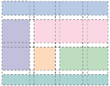
Use LayoutIt!'s CSS Grid Generator as a visual scratchpad: you define the grid, paint the areas, then copy the generated CSS and HTML into your project.
Steps
- Open the CSS Grid Generator on LayoutIt!.
- Set the grid dimensions: choose the number of columns and rows you need.
- Define named areas by dragging across cells and giving each area a name (for example
header,sidebar,content,footer). - Adjust gaps, column/row sizing, and any area placement until the preview matches your intended layout.
- If you need legacy support, toggle the IE 10/11 option — the tool adds the older grid syntax alongside the modern code.
- Export the result: copy the generated CSS and the matching HTML structure into your own files.
What you get and how to use it
The output is a starting point, not a finished design. The CSS defines the grid container and grid-template-areas; the HTML gives you placeholder elements with matching class or area names. In practice you would:
- Paste the CSS into your stylesheet, then rename classes to fit your conventions.
- Replace the placeholder markup with your real components (nav, article, aside) while keeping the same grid-area assignments.
- Treat the generated breakpoints as a baseline and add your own media queries for tablet and mobile.
Audience and trade-offs
This suits developers who know CSS Grid but want to skip the mental arithmetic of counting lines and naming areas, and designers who want to hand off a concrete structure. The trade-off: the tool optimizes for a single, explicit layout, so complex responsive behavior, subgrid, or dynamically generated grids still need hand-written CSS. Also decide early whether you want the IE fallback — it adds verbose code you may not need in 2024-era projects.
Next step
Build the desktop layout first, export it, then create a second version with fewer columns for narrow screens and merge the two by hand. If you also want to prototype the surrounding UI quickly, the Bootstrap Builder on the same site follows a similar drag-and-drop, export-the-HTML workflow.
How can I create a 3D voxel scene with VoxCSS for my website?
VoxCSS, one of the tools on LayoutIt!, is a CSS voxel engine for the DOM: instead of WebGL, it stacks grid layers and applies transforms so that ordinary HTML elements render as colored cuboids. In practice you describe a 3D grid of voxels, and the library turns each one into a positioned HTML box with color, texture, and smooth transform transitions.
What you get from the engine's own description
- HTML cuboids with colors, textures, and smooth transforms
- Support for interactions, culling, shapes, areas, and projections
- Works with Vue, React, Svelte, or plain JavaScript
- Distributed as an open-source library (the page links to GitHub)
A realistic build path
- Start with a small grid — something like 8×8×8 — and a single flat layer of blocks, so you can confirm the DOM structure and transforms render as expected before adding depth.
- Define your voxel data as a simple structure (coordinates plus a color or texture key). Keep it in a plain array or map first; you can move it into a framework component later.
- Add one interaction, such as a click that removes a voxel or a hover that highlights it, and test that it stays responsive. Because each voxel is a DOM node, the cost scales with the number of blocks, so culling matters more than raw rendering speed.
- Only then introduce projections or shaped areas if your scene needs an isometric or forced perspective look.
Choosing between VoxCSS and a WebGL approach
| Situation | VoxCSS fits well | A WebGL engine fits better |
|---|---|---|
| Scene size | Small to moderate voxel grids | Large or continuously generated worlds |
| Styling | You want CSS colors, textures, and transitions | You want shaders and lighting models |
| Integration | You want voxels inside existing HTML/CSS layout | You want a separate canvas or full 3D app |
| Accessibility and DOM | Voxels can be real elements | Canvas content is opaque to the DOM |
If your goal is a decorative or interactive voxel widget embedded in a normal page — a logo, a small terrain, a clickable block puzzle — VoxCSS keeps you in HTML and CSS rather than introducing a rendering stack. If you need thousands of animated blocks, expect DOM node count to become the limiting factor.
Next step
Sketch your scene as a grid on paper first (width × depth × height, and which cells are filled), then build that single layer in the editor and expand. For a framework project, wrap the voxel data in your component state and let the library handle the DOM output, so you can swap scenes without rewriting markup.
What are design tokens and how does the Tokens Generator help me maintain a consistent UI?
Design tokens are named values for the small decisions that repeat across an interface: colors, spacing steps, font sizes, radii, shadows, and similar properties. Instead of hard-coding #1a73e8 or 16px in dozens of rules, you define a token once, give it a meaningful name, and reference that name everywhere. When the value changes, every component that uses the token updates with it.
The Tokens Generator on LayoutIt! is a browser-based tool for defining those values and getting the corresponding code. According to the site, you define your values and the generator produces the code, with an option to include support for IE 10 and 11 in one click. That last option is a compatibility convenience rather than a modern best practice — useful only if you actually still support those browsers; otherwise skip it to keep your output clean.
Where tokens pay off
- Theming. Swapping a light and dark theme becomes a matter of changing token values rather than hunting through stylesheets.
- Handoff. A shared vocabulary ("space-300", "brand-primary") lets designers and developers discuss the same values.
- Consistency at scale. New pages inherit the same spacing and color rhythm without a designer reviewing every screen.
- Refactoring. Renaming or adjusting a value is a single edit, not a find-and-replace across the codebase.
A practical scenario
Suppose you are building a marketing site with a design system. You define a spacing scale, three brand colors, two font families, and a couple of shadow levels. You generate the token code, paste it into your project, and reference tokens in your components. Six months later the brand color shifts. You change one token value; every button, link, and accent updates. Without tokens, that change would mean auditing every stylesheet.
How to decide whether to use it
Use the Tokens Generator if you want a quick way to produce a token block and you are comfortable copying code into your own project. It is a generator, not a hosted design system, so you remain responsible for how tokens are organized, named, and consumed in your framework. If your team already maintains tokens in a dedicated system or a design tool that exports them, adding a second source of truth can cause drift — pick one and stick with it.
Next step: list the properties you repeat most often (colors, spacing, type sizes), define a small set of tokens for them, and generate the code. Start with fewer than twenty tokens; a bloated token set is harder to maintain than the hard-coded values it replaced.
Which frontend frameworks like Vue, React, or Svelte can I use with LayoutIt! tools?
LayoutIt! is framework-agnostic by design. Its tools output HTML, CSS and JavaScript you can paste into any project, so the choice of Vue, React or Svelte does not affect whether the generators work.
The one tool with an explicit framework statement is VoxCSS, the CSS voxel engine: the site says it "Works with Vue, React, Svelte, or plain JavaScript." That makes sense because VoxCSS renders HTML cuboids in the DOM by stacking grid layers with transforms — it is DOM and CSS output, not a framework-specific component library, so any framework that can render markup can host it.
For the other generators, the site describes plain output rather than framework bindings:
- Bootstrap Builder — drag-and-drop Bootstrap components, then download the HTML and "start coding the design into it." The result is ordinary Bootstrap markup, which you can drop into a Vue, React or Svelte template and adapt.
- CSS Grid Generator — define a grid, select areas, get CSS code (with an optional IE 10/11 support toggle). CSS is not framework-bound.
- Tokens Generator — produces CSS custom properties/tokens you can consume from any framework's stylesheet.
- CSS Terrain Generator and SVG Tools — asset and style output, likewise framework-neutral.
A practical decision rule: pick LayoutIt! for the markup and CSS layer, then add framework logic yourself. If you are in React, convert class attributes to className and wire events through props; in Vue or Svelte, the downloaded HTML usually pastes in with minimal edits. VoxCSS is the exception where the site confirms framework compatibility directly, so it is the safest starting point if you want something that already fits your stack.
Next step: open the generator you need, export the HTML/CSS, and test it in a blank component in your framework before integrating it into a larger page.
 Hosting and Email
 Amazon Route 53
 Hosting
 Netlify
 Google Workspace
 Location
 United States
 Pages, Search and Sharing
 Registration details

 Identified technologies
User reviews (0)