
 简体中文
简体中文 English
Website review
This review may include AI-generated content and is not individually verified. Domain, certificate and other facts come from the observed data on this page.
What is amCharts Live used for?
amCharts Live is a browser-based chart and map maker for turning data into an interactive visual without writing code. You choose a template, paste or upload data (CSV is supported), style it visually, then export an image, embed it, or publish it as a link.
Its main uses:
- Quick dashboards and reports: Build line, area, column, bar, pie, donut, scatter, bubble, candlestick, and OHLC charts from spreadsheet data.
- Maps and geography: Plot world, US, or UK data as choropleth, bubble, connection, flow, or pin maps, plus globe views.
- Relationships and flows: Show connections, processes, or money movement with Sankey, chord, arc, and directed chord diagrams.
- Hierarchies and part-to-whole: Use treemaps, sunbursts, packed circles, and tree diagrams for nested data.
- Specialty visuals: Radar, polar, gauges, box plots, timelines, Venn diagrams, and word clouds, including shaped and angled versions.
It suits people who need a presentable interactive chart fast: analysts, journalists, marketers, teachers, and operations teams. The trade-off is that a visual editor is quicker for one-off or small-batch charts but less suited to fully automated, large-scale reporting pipelines than a code library.
A practical next step: open a template closest to your chart type, paste a small CSV sample, and check whether the export or embed fits where you plan to publish it. That tells you quickly whether the tool matches your workflow.
How do I create a chart by pasting my data without coding?
Use the amCharts live editor as a paste-and-style workspace: pick a chart template, paste your data into the table, adjust labels and colors visually, then export an image or publish an embeddable link. The page describes this as a no-code workflow, and its template list covers common business charts (line, column, pie, funnel, maps, Sankey, treemap) plus novelty formats like word clouds and timelines.
Practical steps
- Choose the chart type that matches your data shape: one category column plus one value column for bars or pie; a date column plus one or more value columns for line and area charts.
- Paste from a spreadsheet with headers in the first row. Delimiters such as commas or tabs are usually detected, and the page notes CSV handling.
- Fix column types if a number is read as text — that is the most common cause of an empty or distorted chart.
- Style through the on-screen controls: axis titles, number formats, legend position, colors, dark mode.
- Export. Options mentioned on the page include PNG, an embed, or a published link.
Choosing between output formats
| Goal | Better output | Trade-off |
|---|---|---|
| Slide deck or report | PNG | Static; no hover details |
| Website or blog | Embed or published link | Requires the page to stay online |
| Live data updates | Embed with a data source | More setup than a paste |
Example scenario A marketing analyst pastes a CSV of monthly signups and channel into a column chart, switches to a stacked column to show channel mix, turns on dark mode for a newsletter, and exports a PNG. For an internal dashboard, the same data would be better as a published link so the chart can be updated without re-exporting.
Decision criterion If your audience needs to hover, filter or zoom, publish an interactive version. If the chart is going into a PDF or slide, export an image and check that labels stay legible at the final size.
For chart-type guidance and documentation beyond the maker itself, see amCharts.
What export and sharing options are available for my charts?
You can export a chart as a PNG image, embed it on another site, or publish it as a shareable link — the page describes these as the main ways to get a finished chart out of the maker, with no coding required.
Export and sharing at a glance
| Option | Best for | Trade-off |
|---|---|---|
| PNG export | Slides, reports, printed handouts, social posts | A static snapshot; no hover tooltips or live data updates |
| Embed | Adding a live chart to your own page or blog | Requires editing your site's HTML; the chart stays tied to its source |
| Publish / share link | Sending a chart to a colleague or client for quick review | Anyone with the link can view it; less control than an embed |
Which one to pick
- Choose PNG when the chart is going into a document or presentation where interactivity is pointless.
- Choose embed when readers should hover, zoom or filter on your site.
- Choose a share link for fast feedback before you commit the chart to a page.
One user note in the page material — "The export keeps my formatting" — reflects that reviewer's experience with PNG output, suggesting styles you set visually survive the export. Treat that as their observation rather than a guarantee; always check a test export of your own chart, especially custom fonts, before relying on it in a client deliverable.
The maker also notes "Sharing is one link," which matches the publish option above.
If you need a live chart inside a CMS that blocks embeds, the PNG route is the safer fallback. For a quick comparison, see how a dedicated charting library handles export at amCharts or a spreadsheet-based alternative at Datawrapper.
Next step: build one small chart from a pasted CSV, then run both a PNG export and a share link to see which fits your destination before investing time in styling.
Which chart or map type should I choose for my dataset?
Start with the shape of your data and the job the chart has to do. The chart maker groups its templates into families, so pick the family first, then the specific type.
- Change over time → Line & Area: Line, Spline, Step Line, Area, Stacked Area, 100% Stacked Area, Range Area, Bump.
- Compare categories → Column & Bar: Column, Stacked Column, 100% Stacked Column, Clustered Column, Horizontal Bar, Waterfall, Lollipop, Pareto, Bullet.
- Relationship between two numbers → XY & Scatter: Scatter Plot, Bubble Chart.
- Parts of a whole → Pie & Donut: Pie, Donut, Nested Pie, Semi-circle Pie.
- Stages or narrowing → Funnel & Pyramid: Funnel, Pyramid, Pictorial.
- Place → Maps: World, US, Choropleth, Bubble, Connection, Flow, Pin, Globe, US States, UK Counties.
- Nested or ranked structure → Hierarchy: Treemap, Sunburst, Packed Circles, Partition, Tree Diagram.
- Movement between things → Flow: Sankey, Chord, Arc, Directed Chord.
- Profiles and cycles → Radar & Polar, Timeline, Word Cloud.
H3 Quick decision table
| Your question | Choose | Watch out for |
|---|---|---|
| How did it change? | Line or Area | Too many lines; use small multiples or a scrollbar |
| Which is biggest? | Bar or Column | Long labels; switch to horizontal bars |
| Does A relate to B? | Scatter or Bubble | Overplotting; size must mean something |
| What's the mix? | Pie or Donut | More than ~5 slices; use a bar instead |
| Where? | Choropleth or Pin Map | Big areas can dominate small dense ones |
| How does it flow? | Sankey | Complex diagrams need labels and colour discipline |
H3 A concrete scenario
You have monthly sales for six regions. A line chart with one line per region answers "trend," but six lines get busy. A 100% stacked area shows share of total instead. If the real question is "which region sold most last quarter," a sorted horizontal bar chart wins.
Next step: paste your data and try two templates from the same family — for example Line vs. Stacked Area — then compare which one a colleague understands in five seconds. Use the export or embed options once the choice is settled.
For a deeper template library and documentation, see amCharts.
Can I customize colors, labels, and dark mode visually?
Yes. The editor is built around visual styling rather than code: you pick a template, paste data, then adjust appearance in the interface before exporting PNG, embedding, or publishing. The page lists a Dark mode option alongside the other styling features, so dark presentation is a first-class choice rather than a separate theme you have to build.
What you can adjust
- Colors — chart palettes and series colors, including dark-mode-friendly output. The gallery shows color-heavy types such as Sankey, chord, treemap, and word clouds, where palette choice drives readability.
- Labels — axis and data labels are part of the visual editing flow. Dense chart types like Pareto, bullet, and dumbbell charts need careful label placement, so expect to spend time there.
- Dark mode — available as a setting. This matters if the chart will sit on a dark dashboard or slide deck; a light chart dropped into a dark page looks pasted-on.
Where the trade-off sits
Visual editing is fastest for one-off charts and presentations. It becomes limiting when you need the same styling repeated across dozens of charts, or when a chart must update automatically from a live database. In those cases you would move to a charting library or a BI tool where styles are defined once and inherited.
Practical next step
Open a template closest to your chart type, paste a small sample of your real data, and test two things before committing: whether your longest category labels still fit, and whether your colors stay distinguishable in dark mode. If both survive, the rest is quick.
For a broader comparison of charting approaches, see Observable for code-driven visuals and Flourish for story-focused animated charts.
Is there a free plan, and what are the pricing limits?
Yes. live.amcharts.com is built around a free online chart and map maker: the page presents itself as a "Free interactive chart & map maker" and describes the workflow as picking a template, pasting data, styling visually, and then exporting PNG, embedding, or publishing. A Pricing link exists on the site, so paid tiers are likely part of the picture, but the page evidence here does not spell out what the free plan includes or where its limits sit.
What the free plan appears to cover
From the available page evidence, the free experience includes:
- Access to a large template library: line and area, column and bar, scatter and bubble, pie and donut, funnel and pyramid, maps, hierarchy, flow, radar and polar, candlestick and OHLC, timelines, and word clouds.
- No-code editing: paste data, style visually, then export.
- Export options named on the page: PNG, embed, or publish.
Where the limits usually are
The page does not state concrete caps, so treat the following as general advice for evaluating any free chart maker rather than confirmed features of this product:
- Export format and resolution: free tiers often restrict high-resolution or vector exports.
- Watermarking or branding: free output may carry a maker's mark.
- Number of charts or projects: some tools limit saved or published charts.
- Private vs public sharing: free publishing may be public by default.
- Embedding: custom domains, white-labeling, or removing attribution often require payment.
- Data size: row limits can apply to pasted CSV data.
How to decide
If your need is a one-off chart for a report or slide, the free route is likely enough — paste data, style it, export a PNG. If you need many embedded charts, private dashboards, or unbranded output, check the Pricing page directly before committing, because the free plan's ceiling is exactly where paid tiers begin.
For a quick test, open the maker, load one real dataset, and try the exact export you need. The moment you hit a wall — a watermark, a row cap, or a locked export — you will know whether the free plan fits your workflow.
For comparison, other established options include Plotly and Datawrapper, both of which also publish their own plan limits on their official sites.
 Cloudflare
 Google Workspace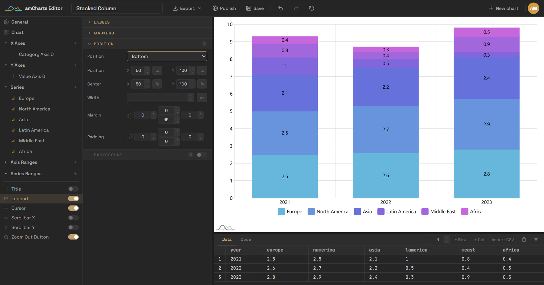

User reviews (0)