
 简体中文
简体中文 English
Website review
This review may include AI-generated content and is not individually verified. Domain, certificate and other facts come from the observed data on this page.
What is Monaspace?
Monaspace is a superfamily of fonts designed specifically for displaying code. Rather than a single typeface, it bundles five related fonts that share compatible metrics, so they can be mixed within the same file without breaking alignment. The page presents it as a way to add structure and hierarchy to code beyond what syntax highlighting alone provides.
The five fonts each carry a different texture:
- Neon — neo-grotesque sans
- Argon — humanist sans
- Xenon — slab serif
- Radon — handwriting
- Krypton — mechanical sans
Because they are designed to be mixed, you could set, say, docstrings in one face, comments in another, and regular code in a third, all on the same grid. The page also mentions three variable axes (weight, width, slant), a font playground, ligatures, and a "texture healing" feature, plus a "What if?" section that imagines giving AI-suggested code its own typographical voice.
Who it is for: developers who spend long hours reading code and want more visual cues than color alone, and anyone building code-focused interfaces or editors that need typographic hierarchy.
A practical next step: open the font playground on Monaspace and try mixing two of the five fonts in a sample file. Pick one face for comments and docstrings and another for executable code, then judge whether the added distinction helps you scan the file faster or just adds noise. The trade-off is real: more typographic variety can clarify structure, but it can also slow reading if the faces contrast too strongly or clash with your editor's theme.
How do I install Monaspace fonts in my code editor?
Monaspace is installed like any other font: you add it to your operating system, then select it inside your editor. The font itself is not editor-specific, so the same files work in VS Code, JetBrains IDEs, Vim/Neovim, Sublime Text, or a terminal.
Install the font files first
- Download the release from Monaspace.
- Unzip it and install the font files for your OS:
- Windows: select the
.ttf/.otffiles, right-click, then Install (or Install for all users). - macOS: double-click each file and choose Install Font, or add them in Font Book.
- Linux: copy them to
~/.local/share/fonts/(or/usr/share/fonts/) and runfc-cache -f -v.
- Windows: select the
- Restart your editor so it picks up the new fonts.
Set it in your editor
- VS Code: open Settings, search for
fontFamily, and set it to the exact name, e.g."Monaspace Neon", monospace. Add"editor.fontLigatures": trueif you want the coding ligatures. - JetBrains IDEs: Settings → Editor → Font → choose the Monaspace family from the list.
- Neovim/Vim: set
guifont=Monaspace_Neon:h14(the exact name depends on the variant and spacing). - Terminal apps: set the font in the terminal profile, not the editor, if you want the same look in shell sessions.
Use the exact family name as it appears in your font list. If it does not show up, the install step or the editor restart is usually the cause.
Choosing among the five fonts
Monaspace is a superfamily, so you pick a variant rather than one fixed face:
| Variant | Style | Good for |
|---|---|---|
| Neon | Neo-grotesque sans | Neutral, familiar code look |
| Argon | Humanist sans | Slightly warmer, readable prose in comments |
| Xenon | Slab serif | Strong distinction between similar characters |
| Radon | Handwriting | Annotations and informal notes |
| Krypton | Mechanical sans | A more technical, engineered feel |
The practical appeal is mixing: you can set your main code in one variant and use another for comments, docstrings, or AI-suggested ghost text, which the site presents as a way to give different parts of a file distinct typographic voices. That is a workflow choice, not a requirement — start with a single variant and only add mixing if you find yourself wanting more visual hierarchy.
A useful next step: install Neon and Krypton side by side, then set fontFamily to Neon and try Krypton for italic or comment text in your theme. Compare a dense file you already know well; if the two variants read as clearly different without slowing you down, the mixing is earning its place.
Can I use Monaspace for free in commercial projects?
Yes. Monaspace is distributed as a freely downloadable font superfamily, and its license permits commercial use. You can install it in your editor, embed it in a product UI, or ship it in a design system without paying a licensing fee.
The practical points to check:
- License terms. Monaspace is released under the SIL Open Font License, which allows commercial use, modification, and redistribution, including bundling with software. The main restrictions are that you cannot sell the fonts by themselves, and modified versions must not use the reserved font name.
- What "free" covers. The download from Monaspace includes the font files and the variable versions. Five families (Neon, Argon, Xenon, Radon, Krypton) share three variable axes, so you can tune weight, width, and slant without buying separate cuts.
- Where cost can still appear. If you embed fonts in a commercial product, review your own distribution method and any third-party platform rules. The font license is not the bottleneck; packaging, hosting, or a design tool's font-upload limits may be.
A concrete scenario: a small studio building a developer tool wants a code font that supports texture healing and ligatures, plus a handwritten face for inline comments. They can ship Monaspace in the app bundle under the OFL, keep the license file alongside the assets, and avoid per-seat font costs. The trade-off is that the OFL requires you to carry the license text and to rename any modified version — so if you customize glyphs, plan for that.
Next step: download the release, read the included license file, and confirm it matches the OFL before you embed it. If your legal team needs a short answer, "SIL Open Font License, commercial use permitted, no attribution required in the UI" is the summary to give them.
How does texture healing improve code readability?
Texture healing is Monaspace's approach to a long-standing annoyance of monospaced type: because every glyph must fit the same fixed-width cell, letters like m, w and i sit awkwardly inside their boxes, leaving uneven gaps and crowding. Monaspace's page describes it as a feature you toggle on alongside ligatures in the font playground, where the same snippet is rendered with and without it so you can compare spacing directly.
The practical effect is that a line of code looks more evenly spaced without giving up the grid that makes columns align. That matters most where you scan vertically rather than read word by word:
- Dense identifiers and long camelCase names, where cramped letters make tokens blur together
- Diff views and side-by-side comparisons, where small spacing differences shift your eye
- Narrow terminals or small font sizes, where the imbalance is most visible
What to weigh before switching. Texture healing is a rendering feature, so it depends on your editor and terminal supporting the font's OpenType features. If your setup ignores them, you get standard monospaced spacing and no benefit. Some developers also find that any variation in glyph width, however subtle, breaks the rhythm they rely on for character counting.
A concrete test. Open a file with a mix of l, i, m and w — a minified config or a line of dense logic — and toggle the feature in the Monaspace playground, then compare it in your own editor at your usual size. If your eye stops snagging on gaps, keep it on; if the line feels less predictable, leave it off.
What are the five Monaspace font styles and when should I use each?
Monaspace is a superfamily of five fonts designed to be mixed within a single code file, so the choice is less "pick one" and more "assign a role to each."
The five styles
| Font | Style | Natural role in code |
|---|---|---|
| Neon | Neo-grotesque sans | Everyday body text: identifiers, keywords, general source |
| Argon | Humanist sans | Warmer, more readable prose-like text; long comments |
| Xenon | Slab serif | Headings, section banners, docstrings that should feel weighty |
| Radon | Handwriting | Tentative ideas, scratch notes, TODO-style annotations |
| Krypton | Mechanical sans | Machine-generated or suggested text, such as AI completions |
How to decide
- If you only want one font for everything, Neon is the neutral default; it reads as a conventional coding face.
- If you want hierarchy without extra colors, set comments in Argon and docstrings or headers in Xenon.
- If you want to distinguish human intent from machine output, use Radon for your own rough notes and Krypton for generated suggestions, so you can tell after the fact which lines came from a tool.
- If you mix several, the point is contrast in texture, not decoration: each face should carry one consistent meaning across your project.
The practical trade-off is cognitive load. A two-font scheme (body plus one accent) is easy to absorb; five fonts in one file can become noise unless each has a rule you actually follow. The site's own examples frame this as layering meaning onto code beyond syntax colors, and its "Mix & Match" idea depends on the fonts sharing metrics so they align on the same grid.
Next step: open the font playground at Monaspace, paste in a real file from your project, and try one accent font at a time — for example, Xenon for docstrings — before committing to a full palette.
How can I mix Monaspace fonts to create custom typographic emphasis in code?
Monaspace is built for exactly this: its five fonts share compatible metrics, so you can swap one for another within the same line and the monospaced grid still lines up. That is the core trick — emphasis comes from changing the typeface, not just weight or color.
The five faces, and what each tends to signal:
- Neon — neo-grotesque sans; the neutral default for ordinary code.
- Argon — humanist sans; slightly softer, good for prose-like content such as comments or docstrings.
- Xenon — slab serif; reads as sturdy and formal, useful for declarations or API signatures.
- Radon — handwriting; suits tentative ideas, notes, or to-dos.
- Krypton — mechanical sans; distinct and technical, a natural fit for machine-generated text.
Practical pairings
The site's own "What if?" examples suggest the intent: handwritten Radon for speculative comments, an authoritative face for docstrings, and a separate voice for AI-suggested code so you can tell at a glance what you wrote versus what was generated. You can apply the same logic to your own codebase:
| Content | Suggested face | Why |
|---|---|---|
| Normal code | Neon | Unobtrusive, stays out of the way |
| Comments and docstrings | Argon | Reads as prose, not instructions |
| Type definitions, interfaces | Xenon | Visual weight without bold |
| TODOs, uncertain logic | Radon | Signals "not final" |
| Generated or AI-suggested code | Krypton | Instantly distinguishable |
How to try it
Start in the font playground on Monaspace and use the Mix & Match controls to shuffle combinations before committing. Pick two faces at most for regular use — the value comes from a consistent, learnable mapping, and a third or fourth voice quickly turns into visual noise.
 NS1
NS1 Fastly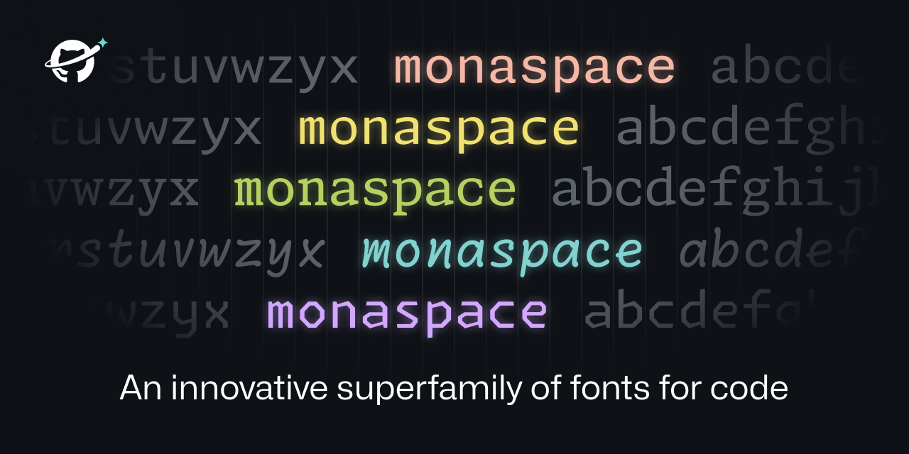

User reviews (0)