Website profiles · Technology insights · Alternatives

palitra.app

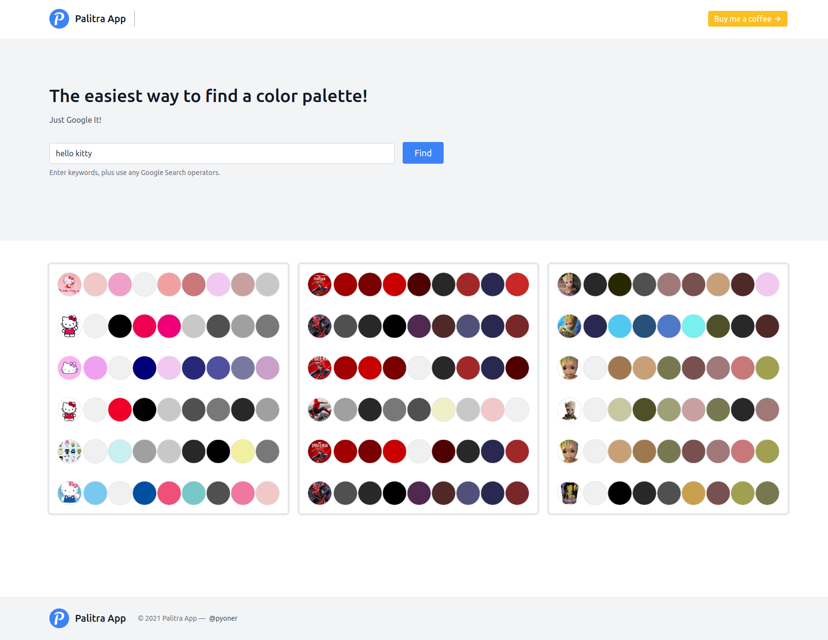
Free color palette finder allows you easy find a color palette. Just enter keywords and get your color palette! Try it now!

No paid content found
Visit website
Profile views 8 Outbound visits 1 Normal
Palitra App Full homepage screenshot

At a glance

Category
Design & Creativity
Language
English
Paid-content signal
No paid content foundObserved
Registered
2021
Hosting
VercelInferred
HTTPS certificate trusted
PassedObserved
Last updated

Website review

This review may include AI-generated content and is not individually verified. Domain, certificate and other facts come from the observed data on this page.

What is Palitra App?

Palitra App is a free web tool for finding color palettes by keyword. You type in a word or phrase describing the mood, subject or style you want, and it returns a matching palette you can use in a design.

Who it suits

  • Designers, illustrators and marketers who need a quick starting point for a color scheme.
  • People without formal color theory training who want something usable without building a palette from scratch.
  • Anyone who thinks in words ("sunset", "forest", "retro") rather than in hex codes.

What it does and doesn't do

  • It works from keywords, so the quality of your result depends on how descriptive your input is. "Muted autumn forest" will likely serve you better than "green".
  • It is a finder, not a full design suite. Expect palette discovery rather than advanced editing, brand asset management or team collaboration.
  • As a free tool, treat it as an idea generator. Always check contrast ratios and accessibility before shipping a palette into a real product.

How it compares

Tool type Best for Trade-off
Keyword palette finder (Palitra App) Fast, mood-based starting points Less control over exact values
Manual color pickers Precise hex/HSL tuning Slower, requires color knowledge
Full design platforms End-to-end workflows and collaboration Heavier, often paid

For a broader library of ready-made schemes, Coolors and Color Hunt are well-known alternatives worth trying alongside it.

Next step: open Palitra App, enter a specific three- to five-word phrase describing your project's mood, then test the returned colors against your background and text to confirm they hold up in real use.

How do I find a color palette by entering keywords?

Enter a keyword that describes the mood, subject, or style you want, and Palitra App returns a matching color palette. That is the core workflow: type words, get colors. It is aimed at people who need a quick starting point rather than a full design system.

What to type

  • Mood or atmosphere: "calm", "energetic", "vintage"
  • Subject or scene: "ocean", "autumn forest", "desert sunset"
  • Style or era: "art deco", "minimal", "retro 70s"

How to get better results

  • Combine a mood with a subject: "calm ocean" narrows the range more than either word alone.
  • Try synonyms when a result misses: "serene" instead of "calm", "dusk" instead of "sunset".
  • Keep it to two or three words; long phrases tend to pull the palette in several directions.
  • Treat the first palette as a draft. Run a few variations and pick the one closest to your intent.

A practical next step

Once you have a palette you like, note the individual hex values and check them against your actual use. A palette that looks good as swatches can fail as text on a background, so verify contrast for anything readable, and test the colors on the surface they will live on — screen, print, or fabric — since the same hex can read differently across media.

If you need a palette tied to an existing brand or image rather than a keyword, this keyword-first approach may not fit; in that case, extract colors from the source material and use the keyword tool only to explore adjacent directions.

What types of projects can I use Palitra App for?

Palitra App is a keyword-driven color palette finder, so it fits any project where you can describe the mood or subject in words and want a matching set of colors. You type keywords, it returns a palette — that's the core loop.

Where it works well

  • Web and app UI: Describe the product or feeling ("calm finance dashboard", "playful kids app") and use the result as a starting point for backgrounds, accents and states.
  • Branding and logo exploration: Early-stage mood boards and client pitches benefit from quick palette options you can react to.
  • Illustration and digital art: Character, scene or environment palettes when you already know the subject but not the colors.
  • Print and packaging concepts: Posters, cards and packaging mockups where you need a coherent set rather than single swatches.
  • Interior and craft planning: Room schemes, textiles or hobby projects where you want a palette that matches a described atmosphere.
  • Slides and social graphics: Fast palette choices for decks, thumbnails and templates.

Where it fits less naturally

If your requirement is precise — an exact brand hex, a WCAG contrast ratio, or a palette derived from a photo — a keyword finder is the wrong first tool. Use it for ideation, then verify contrast and exact values in a design tool or accessibility checker.

A practical workflow

  1. Write three to five keywords covering subject, mood and audience.
  2. Generate several palettes and shortlist two.
  3. Assign roles: one dominant, one secondary, one accent.
  4. Test the accent against your background for readability before committing.

Decision rule: if you can describe the project in adjectives, Palitra App is a reasonable starting point; if you can only describe it as a hex code or a reference image, start elsewhere. For broader palette inspiration alongside it, Coolors and Color Hunt are established options.

Can I export or copy a palette from Palitra App into my design tools?

Palitra App is built around generating palettes from keywords, so the practical question is how you get those colors out of the browser and into Figma, Photoshop, Illustrator or code. The site itself gives very little detail on export options — the page evidence is essentially just a loading state — so treat any specific export claim as something to verify on the live app rather than assume.

What to check on the app

  • Copy-to-clipboard controls: Look for clickable swatches or copy icons next to each color. If a click copies a hex value, that is the fastest route into any design tool.
  • Bulk export: See whether there is a "download" or "export" button offering formats like CSS, JSON, ASE or SVG. Bulk export is the difference between a one-off palette and a reusable asset.
  • Format coverage: Hex is universal. RGB or HSL values matter if you are pasting into a tool that expects them, and CSS variables or JSON matter if you are handing colors to a developer.
  • Account requirements: Some tools gate export behind sign-in. That is a workflow consideration, not a dealbreaker, but worth knowing before you build a habit around it.

Practical workflow if export is limited

If the app only shows colors visually, you can still move quickly:

  1. Click or select each swatch and copy the hex code.
  2. Paste into your design tool's color picker or a shared style/token file.
  3. In Figma, save them as color styles; in code, define them as CSS custom properties so the whole set updates from one place.

For a designer exploring brand directions, copying five hex values by hand takes under a minute and is usually fine. For a team maintaining a design system, you want a bulk export or a documented token file — manual copying invites drift between design and production.

Alternatives worth knowing

If Palitra App's export turns out to be thin, comparable palette tools often provide explicit export formats:

  • Coolors — widely used for palette generation with export options for several formats.
  • Color Hunt — curated palettes, handy for quick inspiration and copying hex codes.
  • Adobe Color — integrates with Adobe apps and can save palettes to your library.

Decision criterion

Choose Palitra App for fast keyword-driven exploration, and check its export controls before committing it to a repeatable workflow. If you need one-click handoff to Figma, CSS or a token pipeline, confirm that capability first or plan to copy hex values manually.

How do I choose the right color palette for a website or brand?

The fastest way to choose a palette is to decide what job color must do before you pick any hues. A brand palette has to work across a logo, packaging, social posts and signage; a website palette has to work on screens at small sizes, in buttons, links and error states. They overlap, but the constraints differ.

Start with the constraint, not the color

  1. Define the message. Warm and energetic, calm and clinical, premium and restrained—each implies a different saturation and contrast range.
  2. Set the base neutrals first. Most of a real interface is background, text and borders. Pick one near-white, one mid grey and one near-black that you can live with, then add color.
  3. Choose one dominant hue, one supporting hue and one accent. More than three competing hues usually reads as noise.
  4. Test at the sizes you will actually ship. A hue that looks rich on a large hero image can turn muddy in a 14px link or a 16px favicon.

Brand versus website palettes

Consideration Brand palette Website palette
Primary use Recognition across many media Interaction and readability on screens
Typical size 2–4 core colors plus neutrals 1 primary, 1 accent, 2–4 neutrals, plus semantic colors
Key test Does it survive in one color and at tiny scale? Do text, buttons and states pass contrast checks?
Common failure Too many hues, no clear lead Accent color used for everything

A practical reader scenario

Suppose you run a small accounting practice. A deep blue primary reads as trustworthy, a warm sand neutral keeps it from feeling cold, and a single amber accent marks calls to action. On the site, blue carries headers and primary buttons, sand carries section backgrounds, amber is reserved for "Book a consultation." If amber also colored links, icons and alerts, none of them would stand out.

Tools and next steps

Keyword-driven palette generators are useful for breaking out of your default choices. Palitra App is described as a free palette finder where you enter keywords and receive a palette, which suits early exploration rather than final accessibility decisions. For contrast checking and accessible color systems, WebAIM publishes widely used contrast guidance. For ready-made, documented palettes, Material Design and Coolors are common references.

Then do the unglamorous part: place your candidates in a real mockup—navigation, body text, a form with an error message, a disabled button—and check contrast ratios and how they look on a phone outdoors. Keep the palette you can still defend after that test.

Is Palitra App free to use, and are there any limitations?

Palitra App presents itself as a free color palette finder: you enter keywords and it returns a palette. The page evidence available here shows no pricing tiers, subscription signals, or payment platforms, which is consistent with a free tool rather than a paid product with a trial.

What "free" likely means in practice

For a keyword-driven palette generator, free usually means the core action — typing a theme like "autumn farmers market" or "calm medical office" and getting colors back — costs nothing. The trade-offs tend to be functional rather than financial:

  • No saved account or history, so palettes you like need to be copied out immediately.
  • Limited export options, such as on-screen colors or simple copy rather than design-tool files.
  • Keyword-dependent results, meaning vague inputs produce generic palettes.
  • No guarantee of uniqueness, since other users may generate similar combinations.

What to do next

Test it against one real task before relying on it. Pick a project you already have — a slide deck, a logo concept, a room repaint — and run three keyword variations. If the palettes are usable and you can move the hex values into your design tool without friction, it fits your workflow. If you need brand-locked colors, accessibility contrast checks, or saved libraries, treat it as an idea starter and pair it with a contrast checker.

A quick decision rule

Use it when you need fast inspiration from a mood or theme. Look elsewhere when you need precise color management, team sharing, or documented accessibility compliance. For broader palette browsing alongside a generator, Coolors and Color Hunt cover similar ground with different browsing styles.

Related questions

More questions →
How do I find a color palette on Palitra App?

Open palitra.app, type descriptive keywords into the input field, and submit them. Palitra App generates a color palette from those keywords and returns the colors for you to review and use. This works for anyone who needs a starting palette — a designer, a developer, or someone picking colors for a personal project — and it requires no color theory knowledge, since the keywords do the describing.

Step by step

  1. Open the site. Go to palitra.app in your browser. The page loads a keyword input field.
  2. Type descriptive keywords. Enter words that describe the mood, subject, or setting you want the palette to evoke — for example sunset beach, forest morning, or retro arcade. The more specific the words, the more directed the result.
  3. Submit the keywords. Confirm the entry to send it. Palitra App then generates a palette based on what you typed.
  4. Review the returned colors. Look at the palette that comes back and judge whether it fits your project. If it doesn't, adjust your keywords and submit again.

The input is your keywords; the action is submitting them; the expected result is a generated palette you can evaluate.

What makes keywords work

The keyword is the only lever you control, so treat it as a description rather than a label.

  • Describe a scene or mood, not a single color. misty mountain lake gives the generator more to work with than blue.
  • Combine a subject with an atmosphere. vintage bakery, neon night city, calm ocean each point toward a different set of colors.
  • Iterate. If the first palette misses, change one or two words rather than starting over — small shifts often move the result in a useful direction.

Checking the result

Before you commit a palette to a project, ask:

  • Do the colors sit together without one fighting the others?
  • Is there enough contrast between the lightest and darkest tones to use them for text and background?
  • Does the palette match the feeling you described in your keywords?

If the answer to any of these is no, revise the keywords and generate again. Palitra App is a finder, so the loop of describe → generate → review is the normal way to use it.

Common snags

  • Vague keywords give vague palettes. If you type something broad, expect a generic result; add a scene or mood word.
  • Expecting exact hex codes for a brand. The tool generates a palette from keywords, so treat the output as a direction to refine, not a guaranteed brand match.
  • One attempt only. The first palette is a starting point; the value comes from trying a few keyword variations.

When to use it

Reach for Palitra App when you need a palette quickly and can describe what you want in words — a landing page, a poster concept, a UI theme, or a mood board. If you already have fixed brand colors or need precise, hand-tuned values, use it as inspiration and adjust the returned colors yourself.

Who Is Palitra App Useful For?

Palitra App is useful for anyone who needs a color palette but doesn't want to build one from scratch. It fits designers seeking quick inspiration, non-designers who know the mood or topic they want but not the colors, and anyone who prefers describing a palette in words over picking individual swatches. Because it runs in the browser and is described as a free color palette finder, it also suits people who want a lightweight tool without installing software.

The core idea: keywords in, palette out

The site describes itself as "the easiest way to find a color palette" and a "free color palette finder." The stated workflow is simple: you enter keywords, and the tool returns a color palette. That single mechanic is what defines who benefits most.

If your problem is "I know the feeling I want, but not the hex codes," this approach matches your problem. If your problem is "I need precise control over every color value," a keyword-driven generator is a weaker fit than a manual color picker.

Who gets the most value

Designers looking for quick inspiration

When you need a starting point rather than a final answer, keyword search is faster than browsing swatch libraries. You get a palette to react to, then adjust it in your own design tool.

People who need a palette but don't know which colors to pick

This is the clearest use case. If you can describe the subject or mood — a season, an industry, a feeling — but can't translate that into colors, keyword input removes the hardest step.

Users who prefer keyword search over manual picking

Manual color picking assumes you already have a direction. Keyword search assumes you have a description. If your thinking starts in words, this matches how you work.

Anyone who wants a browser-based tool

No installation is implied by the product description. If you want to open a tab, get a palette, and move on, that fits.

Where it fits less well

Your need Does Palitra App fit?
Quick palette from a description Yes — this is the stated purpose
Exact control over each color value Weak fit — keyword output is a starting point, not precision editing
Accessibility contrast checking Not indicated by the available information
Exporting to specific design formats Not indicated by the available information
Offline use Not indicated — it is a browser-based tool

The site's own description covers finding a palette, not verifying or exporting one. Treat it as a generator, and plan to do contrast checks and format conversion in whatever tool you already use.

How to decide in one step

Ask yourself which sentence sounds more like you:

  • "I want a palette that feels like this idea." → Palitra App is aimed at you.
  • "I already know the exact colors I want." → You don't need a palette finder.

If the first sentence fits, the next step is simply to try it with a few keywords and see whether the results are close enough to be useful as a starting point.

What Is Palitra App?

Palitra App is a free browser-based color palette finder. You type in keywords, and it returns a color palette based on them. Because it runs in the browser, there is nothing to install — you open the site, enter your keywords, and get a palette. It suits quick palette discovery when you want a starting point rather than a full design tool.

How it works

The workflow is deliberately short:

  1. Input — you enter keywords describing the mood, subject, or theme you have in mind.
  2. Action — the app matches those keywords to a palette.
  3. Result — you get a color palette you can use or refine.

That is the whole loop. The site describes itself as "the easiest way to find a color palette," and the design reflects that: keyword in, palette out.

What it is good for

  • Getting unstuck fast. If you know the feeling you want ("sunset," "forest," "retro") but not the hex codes, keywords are a low-effort way in.
  • Early exploration. Generating a palette before you commit to a direction is cheaper than building one color by color.
  • No setup. Since it runs in the browser, you can use it on any machine without installing software.

What to keep in mind

  • Keywords drive the output. The palette is only as useful as the words you give it, so vague terms tend to produce vague results. Try concrete, sensory words instead.
  • It is a finder, not a full editor. The site positions itself around finding palettes, so treat it as a source of starting points rather than a complete color-management suite.
  • Pricing beyond "free" is not documented here. The site describes itself as a free color palette finder; no paid tiers, accounts, or payment details are stated in the available material, so don't assume features beyond what is described.

When to use it

Use Palitra App when you want a palette quickly from a description and don't want to install anything. If you need precise color control, brand-locked values, or export formats for a specific toolchain, verify those capabilities on the site itself before relying on it.

How Keywords Affect the Color Palettes Generated by Palitra App

Keywords are the only input that shapes your result on Palitra App. You type a word or phrase, and the tool generates a palette intended to match it — it does not pull from a fixed list of preset palettes. So the words you choose are effectively your design brief: they carry the mood, theme, or subject you want the colors to express, and the palette is built around that meaning. The practical consequence is that vague keywords tend to produce generic palettes, while specific, descriptive keywords tend to produce palettes that feel closer to what you had in mind.

What the keywords actually control

Palitra App describes itself as a free color palette finder: you enter keywords and get a color palette back. That single input is doing all the work, so it helps to think about what a keyword can communicate:

  • Mood or atmosphere — calm, energetic, nostalgic, clinical, playful.
  • Theme or setting — autumn forest, deep sea, desert dusk, neon city.
  • Subject or object — coffee, lavender, terracotta, denim.
  • Style or era — retro 70s, art deco, minimal Scandinavian.

Each of these steers the generated colors in a different direction, because the keyword is the signal the tool interprets.

Why specificity changes the result

A broad keyword leaves a lot of room for interpretation, so the palette can land anywhere within a wide range. A narrow keyword constrains that range.

Keyword type Example What you tend to get
Broad "blue" A palette somewhere in the blue family, but with no particular character
Themed "ocean at night" Darker, cooler tones with more contrast
Specific "muted coastal fog at sunrise" Softer, lower-saturation warm-cool mix

The pattern: the more of your intent you put into the words, the more of that intent can show up in the colors. This is the main lever you have.

How to get a more relevant palette

  1. Start with the subject or mood, not a single color name. "Vintage bakery" gives the tool more to work with than "brown."
  2. Add one or two qualifiers — a time of day, a season, a texture, a temperature. "Warm autumn market" is more directed than "autumn."
  3. Generate, then adjust the words rather than the palette. If the result is too bright, add "muted" or "dusk." If it's too flat, add "vivid" or "high contrast."
  4. Compare two versions of the same idea. Run "forest" and "misty pine forest at dawn" side by side to see how much the extra words shift the outcome.

Common sticking points

  • Expecting an exact color. The tool generates a palette from your keywords; it is not a search box for one specific hex value. Treat the output as a starting direction.
  • Reusing the same generic word. If every result looks similar, the keyword is probably too broad, not the tool.
  • Overloading one phrase. A long run-on description can dilute the signal. Two or three strong, concrete words usually work better than a paragraph.
  • Assuming a fixed catalog. Because results are generated rather than selected from a preset list, the same keyword is not guaranteed to behave like a menu item — the words are the input, and the palette is the response.

Who this matters for

Anyone using Palitra App for a design, brand, illustration, or interior project benefits from treating keywords as a brief rather than a label. If you already know the exact colors you want, a palette generator is the wrong tool; if you know the feeling you want and need colors to match it, precise keywords are how you get there.

Website Overview

The available information shows a mix of normal operation and configuration gaps. Depending on how the website is used, these gaps may affect secure access or the consistency of its public presentation.

Domain and Registration

Transfer-protection status is present, helping reduce the risk of unauthorized domain transfers. The domain has about 5 years of registration history; its current configuration provides more context than age alone. The registrar is Porkbun LLC, a widely used domain service provider. The domain uses the common .app extension, which is not an independent safety signal.

DNS and Email

Nameservers are provided by porkbun.com, indicating managed DNS hosting. No CNAME was found; the observed records resolve directly to addresses. No MX record was found. A conventional explicit inbound-mail route is not configured. DNSSEC signatures were not detected, so this additional DNS authenticity protection is not confirmed. The lowest observed DNS TTL is 600 seconds.

TLS and Certificates

The certificate uses an RSA 2048-bit public key, offering broad client compatibility. The server supplied a complete certificate chain. No organization name is present in the certificate; the available fields are consistent with domain validation. The certificate was issued by Let's Encrypt, commonly associated with automated certificate services. The certificate's total validity is about 89 days, consistent with a short renewal cycle.

HTTP and Browser Security

The response lacks these common security headers: CSP, X-Content-Type-Options, Referrer-Policy, Permissions-Policy, clickjacking protection. No X-Powered-By header was found, reducing one common source of backend fingerprinting information. No obvious internal addresses or debug information were found in the headers. The Server header contains the custom value Vercel. No explicit CDN or WAF marker was found in the response headers.

Technology Stack Analysis

The public page identifies SvelteKit, Google Analytics, Vercel without precise versions, leaving fewer clues for version-specific scanning.

Search and Social Sharing

No homepage canonical URL was detected. If duplicate URLs exist, consolidation may be less explicit. Twitter Card metadata is configured. The title has 53 characters, within a common display range. A meta description is present, with 123 characters. The observed directives allow indexing and link following.

Hosting and Email

DNSporkbun.com
HostingVercel
EmailUnknown
Approximate IP geolocation (inferred; a CDN or proxy may differ from the origin server) United States flagWalnut, California, United States Inferred 76.76.21.21

Registration details

RDAP / WHOIS

RegistrarPorkbun LLC
Registered2021-09-29
Expires2027-09-29
Domain statusclient delete prohibited、client transfer prohibited
Nameserverscuritiba.ns.porkbun.com、fortaleza.ns.porkbun.com、maceio.ns.porkbun.com、salvador.ns.porkbun.com
DNSSECunsigned

DNS records

DNS

TypeNameValueTTLPriority
Apalitra.app76.76.21.21600—
NSpalitra.appcuritiba.ns.porkbun.com86400—
NSpalitra.appfortaleza.ns.porkbun.com86400—
NSpalitra.appmaceio.ns.porkbun.com86400—
NSpalitra.appsalvador.ns.porkbun.com86400—

TLS and certificates

TLS / SSL

AssessmentNormal configuration
Supported protocolsTLSv1.2、TLSv1.3
Negotiated protocolTLSv1.3
Certificate subjectpalitra.app
IssuerLet's Encrypt
Valid until2026-11-26T00:23 · Remaining when checked: 52 days
Verification detailsCertificate trust: Passed · Hostname match: Passed

HTTP response headers

HTTP

HeaderValue
content-typetext/html
cache-controlpublic, max-age=0, must-revalidate
serverVercel
strict-transport-securitymax-age=63072000

Identified technologies

SvelteKitGoogle AnalyticsVercel

Pages, Search and Sharing

Meta descriptionFree color palette finder allows you easy find a color palette. Just enter keywords and get your color palette! Try it now!
Canonical URLNot detected
LanguageEnglish (default)
Twitter Cardsummary_large_image
All bots 0 allowed · 0 disallowed

No sitemaps found

User reviews (0)

  • No reviews yet.