
 windytoolbox.com
 Paid content
Categories: Development
Discover a curated collection of Tailwind CSS starter templates, UI components, generators, and tools (Formerly Tailwind Toolbox)
 Visit website
 Updated: 2026-10-05 02:34
 Language: English (default)
 Access: Normal
 Profile views 0
 Outbound visits 0
Related questions
More questions →What Are UI Components and How Do You Choose and Use Them?
UI components are reusable pieces of interface code—a button, an input, a card, a hero section—that you drop into an app instead of rebuilding from scratch each time. You choose them by matching the component's scope (primitive vs. composed block) and source model (headless library, styled kit, copy-paste registry, or prompt-based generator) to your project's needs, then check accessibility, theming, dependencies, and license before adopting. This guide covers the categories, the trade-offs between sourcing options, and how to integrate one into a React + Tailwind project.
Primitives vs. composed blocks
The single most useful distinction when picking components is scope:
- Primitives are single-purpose controls: buttons, inputs, checkboxes, tooltips, dropdowns. They handle one interaction and expose props for state and styling.
- Composed blocks assemble primitives into a larger section: a hero, a pricing table, a sign-in form, an AI chat panel. They solve a layout and content problem, not just an interaction.
A library that's excellent at primitives may not offer blocks, and a block you copy from a gallery may depend on a specific primitive library underneath. Knowing which layer you're shopping at prevents the common mistake of adopting a whole design system just to get one pricing section.
Common categories to expect
Most component sources organize around roughly the same buckets:
| Category | Examples | Typical scope |
|---|---|---|
| Form controls | Buttons, inputs, selects, toggles | Primitive |
| Navigation | Navbars, sidebars, tabs, breadcrumbs | Primitive to composed |
| Cards & grids | Product cards, galleries, 3D grids | Composed |
| Marketing blocks | Animated heroes, shaders, gradients, footers | Composed |
| AI & chat widgets | Chat panels, prompt inputs, streaming message lists | Composed |
| Auth & widgets | Sign-in forms, account menus | Composed |
21st, for instance, describes its catalog as 12,000+ React components, templates, and shadcn themes, split into roughly 2,000+ marketing blocks and 2,100+ UI components, with categories like animated heroes, shaders, cards & grids, navigation, and AI chats. That split mirrors the primitive/block distinction above.
Comparing sourcing options
The four common ways to get components differ mainly in how much styling and ownership you get:
| Source model | What you get | Best when | Trade-off |
|---|---|---|---|
| Headless libraries | Behavior and accessibility, no styles | You have a design system and want full control | You write all the CSS |
| Styled kits | Pre-styled components with a theme API | You want speed and a consistent look | Customizing beyond the theme can fight the library |
| Copy-paste registries | Source code you paste into your repo | You want to own and edit the code | You maintain it; updates aren't automatic |
| Prompt-based generators | A prompt that produces the component in your tool | You want the component adapted to your existing theme | Output quality depends on the model and your prompt |
21st sits in the copy-paste and prompt-based space: every component ships as a prompt you can paste into a tool like Claude Code, Codex, or Lovable, and the result lands as source in your repo—React + Tailwind following shadcn/ui conventions. The site reports 25,431 installs in a week for one component and 3,819,076 builders using the library, which is a signal of activity rather than a quality guarantee.
If you already run shadcn/ui, a registry that follows the same conventions will slot in with less friction than a styled kit with its own theming layer.
Evaluating a component before you adopt it
Run through these checks before committing:
- Accessibility — Does it use semantic elements and manage focus, keyboard navigation, and ARIA states? A visually correct dropdown that traps focus is a liability.
- Theming — Does it read from your design tokens (CSS variables, Tailwind config) or hard-code colors and spacing? Hard-coded values mean manual edits on every theme change.
- Dependencies — What peer dependencies does it pull in? A single button that requires a large animation library may not be worth it.
- License — Confirm the license permits your use, especially for commercial or redistributed products.
- Maintenance — For copy-paste and prompt-based sources, you own the code after adoption, so check whether the source is actively updated.
Integrating a component into React + Tailwind
The general flow, using a prompt-based source as the example:
- Copy the prompt for the component you want.
- Paste it into your tool—a terminal agent, a chat tool, or your editor's AI. The tool generates the component file, typically under something like
components/ui/. - Verify the file landed in your repo and review the diff before accepting it.
- Adapt it to your tokens—swap hard-coded colors and spacing for your CSS variables or Tailwind theme values.
- Render it in a page and check it against your existing layout.
The expected result is a working component file in your project that you can edit like any other source file, since it's plain React + Tailwind rather than an opaque package.
Troubleshooting common issues
- Style conflicts — If the component's classes clash with your global styles, scope them or convert hard-coded values to your tokens. Tailwind's utility model usually makes this a matter of editing class names.
- Missing peer dependencies — Generated or copied components often assume a helper like
cn(a class-merge utility) or a primitive library. If imports fail, install the missing package or replace the import. - SSR / hydration mismatches — Components that read
window, use random values, or animate on mount can mismatch between server and client render. Guard browser-only code behind an effect or a mounted check. - Theme drift — If a component looks right in isolation but wrong in your app, it's usually reading different tokens. Trace its color and spacing values back to your theme.
Making the call
Pick primitives from a headless or styled library when you need consistent behavior across many controls. Pick composed blocks from a copy-paste or prompt-based registry when you need a specific section fast and are willing to own the code. In both cases, evaluate accessibility, theming, dependencies, and license before adopting—and treat usage numbers as a signal of activity, not a substitute for reviewing the source you're about to ship.
What Is Web Development and What Does It Actually Involve?
Web development is the work of building and maintaining websites and web applications — turning a design into functioning pages and features that run in a browser. It covers everything from writing HTML, CSS, and JavaScript on the front end to configuring servers, databases, and content management systems on the back end. If you're deciding whether to learn it, hire for it, or scope a project, the key distinction is this: design decides how a site looks and feels, development makes it work.
Web development vs. web design
The two roles overlap, but they answer different questions.
| Web design | Web development | |
|---|---|---|
| Core question | How should this look and feel? | How does this actually work? |
| Typical outputs | Layouts, wireframes, style guides, UI/UX flows | Working pages, templates, integrations, deployed site |
| Main tools | Design software, prototyping tools | Code editors, version control, frameworks, CMS platforms |
| Success looks like | Clear, usable, on-brand experience | Fast, stable, accessible, maintainable build |
A designer might hand off a responsive layout; a developer turns it into HTML and CSS that renders correctly across browsers and devices. On small projects one person may do both. On larger ones they're separate roles with a handoff in between.
The front end and the back end
Web development is usually split into two halves.
Front end (client side) — everything the user sees and interacts with in the browser:
- HTML structures content
- CSS controls layout, color, and responsive behavior
- JavaScript adds interactivity, from form validation to full single-page interfaces
Back end (server side) — everything that happens on the server:
- A server-side language (for example PHP, Python, Ruby, or Node.js) handles logic and requests
- A database stores content, users, and other data
- Server configuration and APIs connect the two
A contact form is a simple example: the front end collects and validates the input, then the back end receives it, stores or emails it, and returns a response. When people say "full-stack," they mean someone comfortable on both sides.
Common types of web development work
Not all projects are the same shape, and that affects who you hire.
- Static sites — fixed pages, often hand-coded or generated. Fast and cheap to host; best for simple, rarely changing content.
- CMS builds — sites built on platforms like WordPress or Drupal so non-technical staff can edit content. Bean Creative lists both WordPress and Drupal among its platforms, which is typical for agencies serving education, non-profit, and association clients that need ongoing content control.
- Web applications — interactive tools with logins, data, and business logic, closer to software than a brochure site.
- Mobile and cross-platform work — responsive design, plus native iOS or Android apps when a project needs them. Bean Creative's scope includes app development alongside web, which reflects how often the two are now planned together.
A typical project workflow
Most builds follow a similar arc, whether in-house or with an agency:
- Planning and discovery — define goals, audience, content, and technical constraints.
- Design — wireframes and visual design, including responsive breakpoints.
- Development — build templates and components, integrate the CMS or back end, connect any third-party services.
- Testing — check across browsers and devices, verify accessibility, fix bugs, and test forms and integrations.
- Deployment — launch on a hosting environment, then monitor and maintain.
The handoff between design and development is where projects most often stall. Agreeing early on how designs translate to real components — and who owns responsive behavior — prevents most of that friction.
Skills and roles on a team
A project may need some or all of these:
- Front-end developer — HTML, CSS, JavaScript, responsive and accessible markup
- Back-end developer — server languages, databases, APIs, security
- Full-stack developer — both, useful on smaller teams
- CMS specialist — platform setup, theming, and editor experience
- Designer / UI-UX — layout, interaction, and visual systems
- Project manager or producer — scope, timeline, and client communication
For a small marketing site, one capable developer may be enough. For a web application with accounts and data, expect at least a front-end and back-end specialist, plus design.
When you need a developer vs. a designer
- You need a designer when the problem is how something looks, reads, or flows — a new brand, a confusing navigation, a redesign.
- You need a developer when the problem is how something functions — a broken form, a slow site, a CMS that won't do what you need, an integration with another system.
- You need both when you're building something new or substantially changing an existing site.
A useful test: if the fix is a picture or a layout, it's design. If the fix is behavior, data, or infrastructure, it's development.
Common pitfalls
- Treating design and development as the same job. They need different skills, and assuming one person covers both can lead to a polished mockup that never ships well.
- Skipping responsive planning. Mobile behavior should be decided in design, not patched in code later.
- Underestimating maintenance. Sites need updates, security patches, and content changes long after launch.
- Choosing a platform before defining requirements. Picking WordPress or Drupal first, then discovering it doesn't fit, is expensive to undo.
If you're learning: start with HTML, CSS, and JavaScript, build a few small projects end to end, then add a back-end language and a CMS. If you're hiring: match the role to the problem, and confirm the team covers both the front end and whatever runs behind it.
What Is a Design System and How Do Color Palettes Fit In?
A design system is the shared set of decisions, rules, and building blocks a team uses to design and build a product consistently. Color palettes fit into it as one of its most reused foundations: a palette becomes part of the system when its colors are named, stored as tokens, and given rules for where and how they may be used. If you only have a color swatch file that designers pick from by eye, you have a style reference, not a system.
The core parts of a design system
Most design systems are built from three layers that depend on each other:
- Tokens — named values for the smallest decisions: color, spacing, type size, radius, shadow, duration. A token is the single source of truth for a value, so changing it updates everything that references it.
- Components — reusable interface pieces (buttons, inputs, cards, navigation) assembled from tokens rather than hard-coded values.
- Guidelines — the written rules for when to use what: which color signals an error, how much contrast text needs, when a component variant is appropriate.
Color sits mostly in the token layer, but it reaches into both of the others. A button component consumes color tokens, and the guidelines decide which token a given state should use.
How a color palette becomes part of the system
A palette stops being decoration and starts being infrastructure when you do three things to it.
1. Name colors by role, not by appearance
blue-500 describes what a color looks like. color-action-primary describes what it does. Role-based names survive redesigns: if the brand blue shifts, color-action-primary still points at the right decision, while blue-500 becomes a lie. Keep a raw scale underneath (blue-100 … blue-900) and map roles onto it.
2. Separate primitives from semantic tokens
A two-tier structure keeps the system flexible:
| Tier | Example | Purpose |
|---|---|---|
| Primitive | blue-600 |
The raw value; never used directly in components |
| Semantic | color-text-link, color-surface-raised, color-feedback-danger |
The meaning; this is what components reference |
When dark mode or a new brand theme arrives, you remap semantic tokens to different primitives and every component follows without being touched.
3. Define states and contexts, not just base colors
Interactive elements need more than one color. A complete palette entry usually covers default, hover, active, focus, and disabled, plus how the color behaves on light and dark surfaces. Writing these down is what turns a palette into a rule set a team can follow.
Why accessibility belongs in the palette, not after it
Contrast is a property of color pairs, so it has to be decided at the palette level — retrofitting it later means re-auditing every component. Two practical consequences:
- Pair text and background tokens explicitly. Instead of leaving contrast to whoever builds the screen, define approved combinations (for example, which text tokens are allowed on
color-surface-raised). - Check contrast in a perceptually uniform space. Working in a space like HSLuv lets you adjust lightness while keeping perceived hue and saturation stable, which makes it far easier to hit a contrast target without the color shifting character. This is the approach behind HSLuv-based palette builders such as colorca, which is aimed at designing accessible color palettes for digital products in HSLuv color space.
The payoff is consistency: if every team pulls from the same accessible pairs, contrast stops being a per-screen gamble.
Design system vs. style guide
These get conflated, but they answer different questions.
| Style guide | Design system | |
|---|---|---|
| Contains | Visual rules: colors, type, spacing, tone | Tokens, components, guidelines, and often code |
| Format | Usually documentation | Documentation plus reusable, implemented assets |
| Enforces | How things should look | How things are actually built and kept in sync |
| Changes when | A designer updates the doc | A token or component changes and propagates |
A style guide can be a part of a design system, but on its own it doesn't give engineers anything to import. The test is simple: can a developer build a new screen using only system assets, without asking a designer for a hex value? If yes, you have a system.
A practical starting sequence
- Build a primitive color scale in a perceptually uniform space so lightness steps are even.
- Check candidate text/background pairs for contrast before committing them.
- Assign semantic roles (surface, text, border, action, feedback) on top of the scale.
- Document which roles may be combined, and which states each interactive role needs.
- Ship the tokens in a form both design and code can consume, so the palette has one source of truth.
Get the palette and its tokens right first — components and guidelines are much easier to keep consistent once color is no longer a per-screen decision.
Website Overview
The available information shows a mix of normal operation and configuration gaps. Depending on how the website is used, these gaps may affect secure access or the consistency of its public presentation.
Domain and Registration
Transfer-protection status is present, helping reduce the risk of unauthorized domain transfers. The domain has about 1 years of registration history; its current configuration provides more context than age alone. The domain uses the common .com extension, which is not an independent safety signal.
DNS and Email
The lowest TTL is 60 seconds, supporting rapid record changes at the cost of more frequent lookups. Nameservers are provided by dns-parking.com, indicating managed DNS hosting. No CNAME was found; the observed records resolve directly to addresses. No MX record was found. A conventional explicit inbound-mail route is not configured. TXT records include verification markers for Google. Such markers may also remain after a service stops being used.
TLS and Certificates
The public key uses EC with 256 bits. The server supplied a complete certificate chain. No organization name is present in the certificate; the available fields are consistent with domain validation. The certificate was issued by Let's Encrypt, commonly associated with automated certificate services. The certificate's total validity is about 89 days, consistent with a short renewal cycle.
HTTP and Browser Security
X-Powered-By exposes backend information: PHP/8.2.33. The response lacks these common security headers: HSTS, X-Content-Type-Options, Referrer-Policy, Permissions-Policy, clickjacking protection. No obvious internal addresses or debug information were found in the headers. The Server header contains the custom value hcdn. No explicit CDN or WAF marker was found in the response headers.
Technology Stack Analysis
The public page identifies Alpine.js, Tailwind CSS, PHP without precise versions, leaving fewer clues for version-specific scanning.
Search and Social Sharing
No homepage canonical URL was detected. If duplicate URLs exist, consolidation may be less explicit. Twitter Card metadata is configured. The title has 50 characters, within a common display range. A meta description is present, with 129 characters. The observed directives allow indexing and link following.
 Hosting and Email
 Hosting
 Hostinger International Limited
 Location
 Asheville, North Carolina, United States
 Pages, Search and Sharing
| Meta description | Discover a curated collection of Tailwind CSS starter templates, UI components, generators, and tools (Formerly Tailwind Toolbox) |
|---|---|
| Canonical URL | Not detected |
| Language | English (default) |
| Twitter Card | summary_large_image |
Social Sharing Preview
12 fields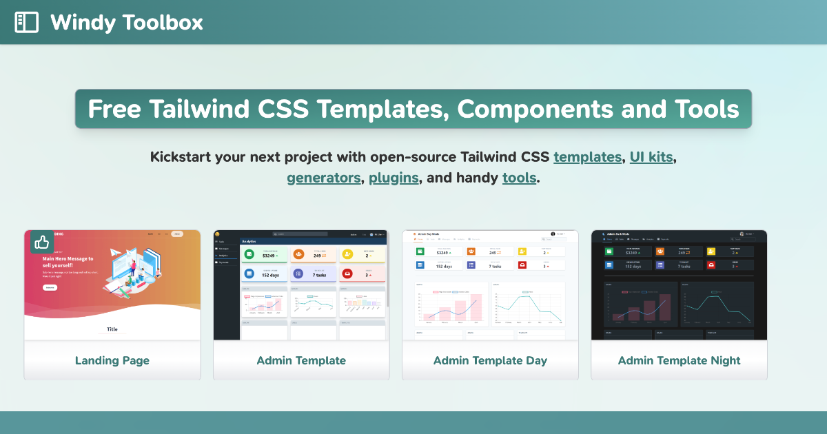

Sharing metadata
| og:url | http://windytoolbox.com/ |
|---|---|
| og:type | website |
| og:image | https://windytoolbox.com/social.png |
| og:title | Windy Toolbox - Tailwind CSS Templates & Resources |
| og:image:alt | Windy Toolbox |
| og:site_name | Windy Toolbox |
| og:description | Discover a curated collection of Tailwind CSS starter templates, UI components, generators, and tools (Formerly Tailwind Toolbox) |
| twitter:card | summary_large_image |
| twitter:image | https://windytoolbox.com/social.png |
| twitter:title | Windy Toolbox - Tailwind CSS Templates & Resources |
| twitter:creator | @amritnagi |
| twitter:description | Discover a curated collection of Tailwind CSS starter templates, UI components, generators, and tools (Formerly Tailwind Toolbox) |
robots.txt (opens in a new tab)
0 rulesAll bots 0 allowed · 0 disallowed

 All bots
No matching rules.
Sitemaps
1 Registration details RDAP / WHOIS
| Registrar | HOSTINGER operations, UAB |
|---|---|
| Registered | 2024-11-03 |
| Expires | 2026-11-03 |
| Domain status | client transfer prohibited |
| Nameservers | ns1.dns-parking.com、ns2.dns-parking.com |
| DNSSEC | unsigned |
 DNS records
| Type | Name | Value | TTL | Priority |
|---|---|---|---|---|
| A | windytoolbox.com | 191.101.104.149 | 60 | — |
| A | windytoolbox.com | 212.1.212.99 | 60 | — |
| AAAA | windytoolbox.com | 2a02:4780:1d:c5f9:bd3e:15aa:d76d:2554 | 60 | — |
| AAAA | windytoolbox.com | 2a02:4780:1e:f19f:90b6:71b1:3e04:c786 | 60 | — |
| NS | windytoolbox.com | ns1.dns-parking.com | 86400 | — |
| NS | windytoolbox.com | ns2.dns-parking.com | 86400 | — |
| TXT | windytoolbox.com | google-site-verification=paqIYQiEuGxrIGGE16TsOTJyQrfi9l8qHRQUdNB0RhQ | 14400 | — |
 TLS and certificates
| Assessment | Normal configuration |
|---|---|
| Supported protocols | TLSv1.2、TLSv1.3 |
| Negotiated protocol | TLSv1.3 |
| Certificate subject | windytoolbox.com |
| Issuer | Let's Encrypt |
| Valid until | 2026-11-28T23:33 · Remaining when checked: 54 days |
| Verification details | Certificate trust: Passed · Hostname match: Passed |
 HTTP response headers
| Header | Value |
|---|---|
| content-type | text/html; charset=UTF-8 |
| server | hcdn |
| content-security-policy | upgrade-insecure-requests |
 Identified technologies
User reviews (0)