Website profiles · Technology insights · Alternatives

colorca.org No paid content found

Categories: Design & Creativity

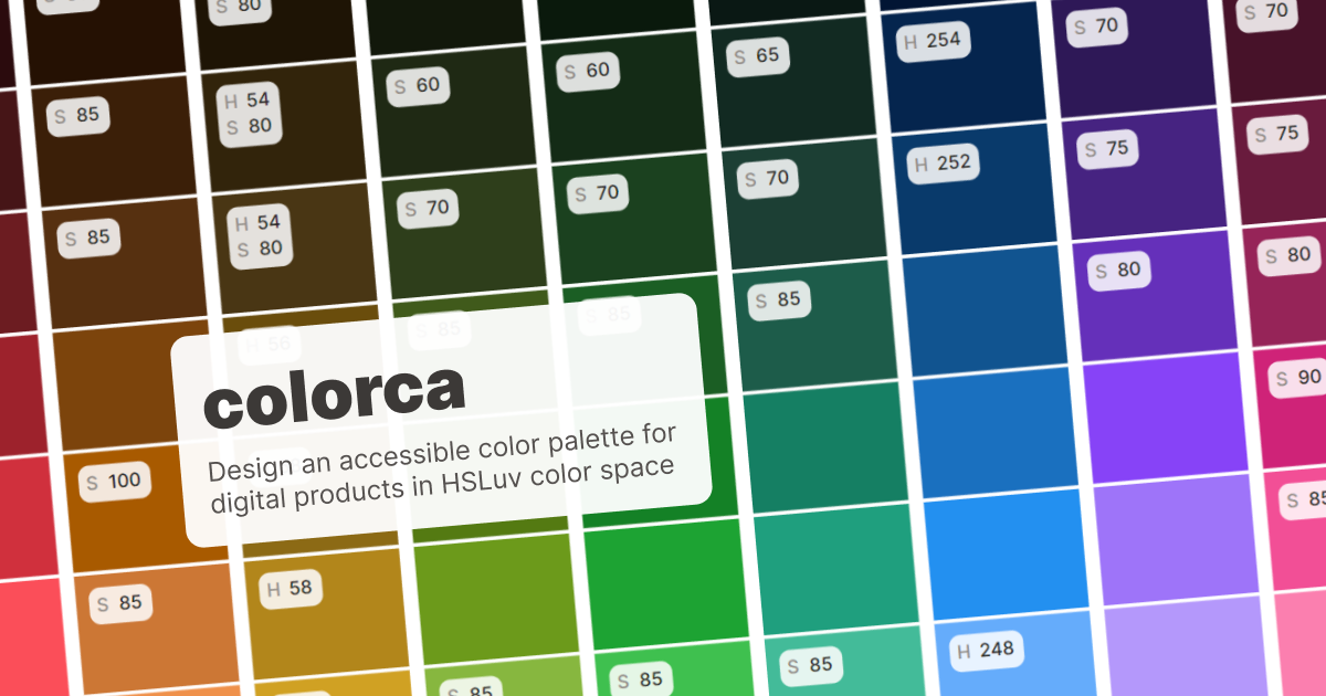
Design an accessible color palette for digital products in HSLuv color space

Visit website

Updated: 2026-10-01 16:31 Language: English (default) Access: Normal

Profile views 3 Outbound visits 0
colorca Full homepage screenshot
Editorial Review

Website Review

What is colorca?

Colorca is a browser-based tool for building accessible color palettes for digital products, working in the HSLuv color space. HSLuv is a perceptually uniform alternative to HSL: equal changes in lightness look like equal changes to the eye, which makes it easier to reason about contrast and keep a palette visually balanced across hues.

colorca is aimed at product designers, design-system maintainers, and front-end developers who need a set of colors that stays legible in real interfaces — buttons, text, charts, status states — rather than a purely decorative swatch collection.

What it's for

  • Building a palette from scratch where lightness steps are consistent, so you can define a scale (light to dark) that behaves predictably.
  • Checking accessibility while you choose colors, instead of picking colors first and fixing contrast later.
  • Keeping a design system coherent when new colors are added by someone other than the original designer.

How it differs from typical color pickers

Approach Strength Trade-off
HSL/HSV pickers Familiar, fast, widely supported Lightness is not perceptually even; two hues at the same L value can look very different in brightness
HSLuv-based tools like Colorca Even perceived lightness, easier contrast control Less familiar model; you still need to verify final values in your target platform

A practical scenario: you're defining semantic tokens — success, warning, danger — and want each to have a 100–900 scale. In HSLuv you can hold lightness constant across the three hues and vary saturation, so the scales read as siblings. Then you check each token against your background colors for text and icon contrast.

Next step

Open colorca, pick your brand hue, and generate a lightness ramp before adding secondary hues. Test the resulting values against your actual UI backgrounds (including dark mode) rather than trusting the palette in isolation — perceived contrast shifts with surrounding colors and with font weight.

How does colorca help designers create accessible color palettes?

colorca helps designers build accessible color palettes by working in the HSLuv color space, which is designed to keep perceived lightness consistent across different hues. That matters for accessibility because contrast and readability depend heavily on how light or dark a color actually appears to the human eye, not just on its raw RGB values. By giving designers a perceptual color model, colorca makes it easier to choose shades that hold up for text, icons and UI surfaces across a digital product.

What that means in practice

A designer building a design system might start with a brand hue, then generate a scale of tints and shades. In a perceptual space like HSLuv, equal steps in lightness tend to look like equal steps, so a "600" shade in blue and a "600" shade in green will feel similarly dark. That consistency helps when the same component—say, a button or an alert—needs to work with multiple accent colors without one variant becoming unreadable.

Typical workflow

  • Pick a base hue for the palette.
  • Adjust lightness to create a range of usable tones.
  • Check that foreground and background combinations remain legible.
  • Export or document the palette for use in design tools and code.

Who benefits most

Product designers, design-system maintainers and front-end developers who need a shared, reproducible set of colors. Teams that already care about contrast and want fewer ad-hoc color decisions will get the most value. Designers working purely in RGB or HSL may find the perceptual approach a useful correction, though it does add a small conceptual step.

Practical next step

If you are starting a palette, define your lightest and darkest usable tones first, then fill the middle. Test your most important text-on-background pairs before polishing the rest, since those combinations drive most accessibility outcomes.

What is HSLuv color space and why does colorca use it?

HSLuv is a color space designed to keep the perceptual lightness and saturation of colors stable as hue changes. Traditional HSL looks simple, but it is not perceptually uniform: a yellow at 50% lightness can appear far brighter than a blue at the same HSL lightness, and saturated yellows and blues can behave very differently when you adjust them. HSLuv maps the familiar HSL-style controls onto a perceptually uniform foundation (CIELUV), so the numbers you set behave more like what your eye expects.

For a palette tool like colorca, that matters because palette work is mostly about relationships: consistent steps between shades, predictable contrast, and colors that still feel balanced when you swap hues. HSLuv makes those relationships easier to reason about, which is useful when you are generating accessible palettes for digital products.

Why a palette tool would choose HSLuv

  • Predictable lightness: If you keep the L value fixed and change hue, colors stay closer to the same perceived brightness. That helps when building a scale where every step should feel equally spaced.
  • More intuitive saturation: Saturation behaves more consistently across hues, so a “muted” setting does not suddenly look neon just because you moved from blue to yellow.
  • Better starting point for contrast work: Accessible color decisions depend on relative luminance and contrast ratios. HSLuv does not replace a contrast checker, but it gives you a more reliable base for adjusting lightness without surprising shifts.
  • Design-system friendly: Tokens for hover, active, disabled and border states are easier to keep coherent when hue changes do not wreck the lightness balance.

A concrete scenario

Imagine you are defining a primary blue and need a lighter hover state, a darker pressed state, and a low-emphasis border. In plain HSL, raising lightness can make some hues look washed out or oddly bright. In HSLuv, you adjust L in steps and the family tends to stay visually related. You would still verify text contrast against the actual background, because HSLuv lightness is not the same as WCAG contrast ratio.

Trade-offs to know

HSLuv is not a native CSS color space in most workflows, so you usually convert to hex, RGB or another supported format before shipping. It also does not guarantee WCAG compliance by itself, and it is less familiar to designers trained on HSL or HSB. If your team already works comfortably in OKLCH, that may be a more modern alternative; HSLuv remains a practical, well-established choice when you want HSL-like controls with better perceptual behavior.

Next step

If you are evaluating colorca, test it on a real component: pick a brand hue, build five lightness steps, and check whether the steps look evenly spaced and whether your text/background pairs pass contrast. That tells you more than comparing color-space theory in the abstract.

How can I integrate colorca palettes into my design system?

Treat colorca as a palette source, not as the design system itself. Export or copy the colors it produces, then define them as tokens in your own system so components reference names like surface, text-muted or action-primary rather than raw hex values.

A practical workflow

  1. Build or refine the palette in HSLuv space, checking contrast as you go.
  2. Export the values and paste them into a single token file (for example tokens/color.json or a _colors.scss partial).
  3. Map each raw color to a semantic role, keeping the raw scale separate from the role layer.
  4. Generate platform outputs (CSS custom properties, Swift, Kotlin, Figma styles) from that one source.
  5. Re-run contrast checks after any change, especially for text on tinted surfaces.

Two-layer token structure

Layer Example name Purpose
Primitive blue-500 The raw value from the palette
Semantic action-primary What the UI actually uses

Components should only consume the semantic layer. That way, if the palette shifts, you update one file and every product follows.

Watch the trade-offs

  • HSLuv keeps perceived lightness consistent across hues, which helps when you need a red and a green that feel equally strong. It does not guarantee WCAG contrast on its own — you still verify pairs.
  • A palette built for one brand or product may not stretch to a second theme. Decide early whether you need light and dark variants, and generate both from the same primitives.
  • Naming matters more than tooling. A team that agrees on danger, warning and success semantics will integrate faster than one arguing about hex codes.

Concrete scenario: you maintain a component library used by three product teams. Put the palette values in a package, publish it, and let each team import the semantic tokens. When accessibility review flags a low-contrast button, you adjust one primitive and every consumer updates on the next release.

Next step: pick five to ten semantic roles your product actually needs, map the palette to them, and document the contrast ratio for each text-on-background pairing. That mapping is the integration; the palette is just the input.

What accessibility standards does colorca support for digital product design?

Colorca is built around the HSLuv color space, which is designed to keep perceived lightness consistent across hues. That matters for accessibility because contrast problems often come from colors that look balanced to the designer but differ sharply in perceived brightness to users.

What the page supports

  • Accessible palette design for digital products.
  • Work in HSLuv rather than only RGB or HSL.
  • A focus on color systems that can be used in design systems and product interfaces.

The page evidence does not list a specific conformance level, such as WCAG 2.1 AA or AAA, nor does it name a contrast-checking tool or automated audit feature. If you need formal compliance, treat colorca as a palette-building aid and verify the output against the standard your project requires.

How to use it in practice

A designer building a product theme might use HSLuv to create a set of brand hues that feel evenly weighted, then test each foreground/background pair for text contrast. A design-system maintainer might generate semantic tokens such as success, warning and error, then check them in both light and dark modes.

Decision criterion

Choose colorca when you want perceptually uniform color selection as a starting point. Choose a dedicated contrast checker when you need to prove compliance against a specific accessibility standard. The two tasks are complementary, not interchangeable.

For a concrete next step, export or note your palette values, then run the key text/background combinations through an accessibility contrast checker before shipping them into a component library.

Can colorca generate color palettes for branding or UI projects?

Yes. colorca is built for creating color palettes for digital products, and its focus on accessible palettes in the HSLuv color space makes it especially relevant to UI work and design systems. The accessibility angle matters because a palette that looks good in isolation can still fail contrast checks once it becomes text, buttons, or form states.

Where it fits best

  • UI and product design: Generating a palette that stays usable across backgrounds, surfaces, and interactive states.
  • Design systems: Establishing a consistent set of colors that other designers and developers can reuse.
  • Accessibility-conscious work: Working in HSLuv, which is designed to keep perceived lightness more predictable than older color models.

Where branding is a different story

Branding often needs more than a harmonious, accessible palette: a distinctive signature color, cultural associations, print behavior, and how the palette feels across packaging or campaigns. colorca can help you explore and validate color relationships, but it won't replace the strategic side of brand color selection.

A practical next step

If you're starting a UI project, define your functional roles first — primary action, background, surface, text, border, success, warning, error — then use the tool to test combinations against those roles. For branding, treat the output as a starting point and check it against your audience, competitors, and any print or environmental use.

A useful decision criterion: if your main constraint is contrast and consistency across a digital interface, this is a good fit. If your main constraint is differentiation and emotional resonance across many media, use it as one input among several.

Related questions

More questions →
How to Design an Accessible Color Palette in HSLuv for Digital Products

HSLuv lets you build a palette where "same lightness" actually looks like the same lightness, which makes it far easier to hit WCAG contrast targets than with HSL or RGB. Use it when you need a systematic palette for a design system — a set of shades and tints that stay perceptually even, plus semantic tokens you can test in both light and dark themes. The workflow below assumes you can pick a base hue and have a way to generate and check colors (a color tool or a small script); the contrast checks themselves are the standard WCAG ratios, not something HSLuv changes.

Why HSLuv instead of HSL or RGB

HSL is not perceptually uniform. In HSL, hsl(60, 100%, 50%) (yellow) and hsl(240, 100%, 50%) (blue) share the same lightness value but look wildly different in brightness. That means a "50% lightness" scale built in HSL produces shades that don't read as evenly spaced, and contrast against text becomes unpredictable.

HSLuv fixes this by defining lightness (L) to match human perception, while keeping the familiar hue/saturation model. Its key properties for palette work:

  • L is perceptually consistent — two colors with the same L look equally light/dark, regardless of hue.
  • Hue stays stable — you can shift saturation or lightness without the hue drifting.
  • Gamut-aware — HSLuv maps to sRGB, so colors you define are displayable (unlike raw CIELUV/LCH, which can fall outside sRGB).

The trade-off: HSLuv's saturation is not the same as HSL's, and very high saturation at extreme lightness may clip. For UI palettes this is rarely a problem.

Step 1: Choose a base hue

Pick one hue (0–360) as your brand/primary anchor. In HSLuv, hue is the same angle convention as HSL, so you can reason about it the same way:

Hue range Family
0–30 red / orange
30–90 yellow / yellow-green
90–180 green / teal
180–270 cyan / blue
270–330 purple / magenta
330–360 pink / red

Set your base at a saturation you can sustain across the scale — starting around S 60–100 for a vivid primary is typical. Keep the hue fixed for the whole ramp.

Step 2: Generate shades and tints at consistent lightness

Build your ramp by varying L only, holding H and S constant. A practical scale uses roughly even L steps, for example:

L: 95, 88, 78, 66, 54, 44, 34, 26, 18

Each step is a token (primary-100 … primary-900). Because L is perceptual, the visual jump between steps stays even — something HSL can't guarantee.

Two adjustments worth knowing:

  • Lower saturation as you approach the extremes. At L 95 or L 18, high saturation looks neon or muddy. Dropping S by 10–30 points at the ends keeps the ramp usable.
  • Keep hue constant unless you deliberately want a hue shift (some systems rotate hue slightly across a ramp for warmth/coolness; that's a stylistic choice, not a requirement).

Step 3: Check contrast before assigning roles

Generate the ramp first, then test — don't design roles and hope contrast passes.

WCAG contrast requirements you'll be checking against:

Content Minimum ratio (AA) Enhanced (AAA)
Normal body text 4.5:1 7:1
Large text (≥18pt / 14pt bold) 3:1 4.5:1
UI components & graphical objects 3:1 —

For each text/background pair you intend to use, compute the contrast ratio. If a pair fails, adjust L first (it moves contrast most predictably), then S. Because HSLuv's L is perceptual, a fixed L difference between text and background tends to produce a more consistent contrast ratio across hues than the same L difference in HSL.

Step 4: Assign semantic tokens

Map ramp steps to roles rather than using raw color names. A minimal token set:

  • background — page background (usually a very light or very dark neutral)
  • surface — cards, panels (slightly offset from background)
  • text-primary / text-secondary — body and muted text
  • primary / primary-hover — brand actions
  • border — dividers and outlines
  • success / warning / error — status colors

Define each token by its HSLuv value so the relationship is explicit, e.g. text-primary = L 20, background = L 98 → a large L gap that reliably clears 4.5:1.

Step 5: Test light and dark themes

A palette that passes in light mode often fails in dark mode if you just invert it. Instead, rebuild the ramp for dark mode with its own L targets:

  • Dark backgrounds sit around L 12–20; light-mode backgrounds around L 95–98.
  • Text in dark mode needs L high enough to clear 4.5:1 against the dark surface — often L 85+.
  • Saturated colors (primary, error) usually need lower saturation in dark mode to avoid glare, and sometimes a slight L bump.

Check every semantic pair in both themes. Common failures: secondary text too close to background, borders below 3:1, and status colors that pass on white but not on a dark surface.

Common pitfalls

  • Assuming HSLuv guarantees accessibility. It makes consistent lightness easy; it does not enforce contrast. You still measure ratios.
  • Reusing one ramp for both themes. Light and dark need separate L targets.
  • Ignoring non-text contrast. Borders, icons, and focus rings need 3:1 too.
  • Over-saturating extremes. High S at L 95 or L 15 looks wrong; pull saturation down at the ends.
  • Skipping the check step. Always verify final token pairs, not just the ramp.

The result is a palette where lightness is predictable across hues, contrast is verified against WCAG, and roles are defined as tokens — so the system holds up when you add themes or new components.

What Is a Color Palette in Digital Product Design?

A color palette is the defined set of colors a digital product uses across its interface, and it is broader than a single brand color: it assigns each color a role (primary, secondary, neutral, semantic) so screens, components, and states stay consistent. It matters most when you are building a design system or shipping UI at scale, because accessibility — especially text and control contrast — depends on how those roles are chosen and paired. Colorca, a tool for designing accessible palettes in HSLuv color space, frames the problem this way: the goal is not a pretty set of swatches but a palette that stays readable and perceptually even across a product.

Palette vs. brand color vs. single color

A single color is just a value. A brand color is one color chosen to represent identity. A palette is a system: multiple colors, each with a job, plus rules for when to use them.

Concept What it is Typical use
Single color One value, e.g. #3B82F6 A one-off accent or illustration fill
Brand color The signature color of a brand Logo, marketing, primary actions
Color palette A set of colors with assigned roles Entire product UI, design system tokens

The practical difference: a brand color answers "what color are we?" A palette answers "what color is a primary button, a disabled button, an error message, and body text — and do they still work together?"

Common palette roles

Most product palettes are organized by function, not by hue. A typical structure:

  • Primary — the main action color (buttons, links, active states).
  • Secondary / accent — supporting emphasis, often for less frequent actions.
  • Neutral / gray scale — backgrounds, borders, surfaces, and text. This is usually the largest part of a palette.
  • Semantic colors — meaning-carrying colors: success (green), warning (amber/yellow), error (red), info (blue). These are named by meaning, not by hue, so they can be themed.
  • State variants — hover, active, focus, disabled, and selected versions of the above.

Naming colors by role rather than appearance (color-action-primary instead of blue-500) is what lets a palette survive a rebrand or a dark-mode theme without rewriting every component.

How palettes hold a design system together

In a design system, the palette is usually the lowest layer of tokens. Components reference tokens, not raw hex values.

For example, a button does not hard-code #2563EB. It references color-action-primary, which resolves to a palette entry. Change the palette, and every button updates at once. This is why palette decisions are high-leverage: one change propagates everywhere, for better or worse.

It also keeps UI components consistent. If every team picks its own grays, you get five slightly different borders. A shared neutral scale prevents that.

Accessibility is a palette property, not an afterthought

Contrast is a relationship between two colors, so it can only be evaluated in the context of a palette — a color that looks fine alone may fail as text on your background.

Two things to check:

  • Contrast ratios for text and meaningful UI elements against their backgrounds. WCAG defines minimum ratios (commonly 4.5:1 for normal text, 3:1 for large text and UI components); verify the specific requirement that applies to your product.
  • Color-blind friendliness. Never rely on color alone to convey meaning. Pair color with an icon, label, or pattern, and check that semantic colors remain distinguishable under common types of color vision deficiency.

A palette can pass contrast checks and still fail accessibility if, say, success and error are the only signal and look similar to some users.

Why color space matters: HSLuv as one approach

Palettes built by eye in RGB or HSL often have uneven perceived lightness — two colors with the same "lightness" value can look very different in brightness. That makes it hard to build consistent scales and to predict contrast.

HSLuv is a perceptually uniform color space: equal changes in its lightness coordinate correspond more closely to equal changes in perceived lightness. Building a palette in HSLuv lets you generate a neutral ramp or a set of hues that stay visually even, which in turn makes contrast more predictable. Colorca is built specifically around designing accessible palettes in HSLuv for digital products.

This is one method, not the only one. Other perceptually uniform spaces (such as OKLCH) serve a similar purpose. The point is that the color space you build in affects how even and accessible the result is.

A quick way to think about it

If you are starting a palette, decide roles first, then colors:

  1. Define the roles you need (primary, neutral scale, semantic set, states).
  2. Build the neutral scale first — it carries most of the UI.
  3. Choose primary and secondary, then derive state variants.
  4. Check contrast for every text/background and control/background pairing.
  5. Verify meaning is never color-only.

A palette is working when a new screen can be assembled from it without inventing new colors — and when every combination a user actually sees still passes contrast.

What Is a Design System and How Do Color Palettes Fit In?

A design system is the shared set of decisions, rules, and building blocks a team uses to design and build a product consistently. Color palettes fit into it as one of its most reused foundations: a palette becomes part of the system when its colors are named, stored as tokens, and given rules for where and how they may be used. If you only have a color swatch file that designers pick from by eye, you have a style reference, not a system.

The core parts of a design system

Most design systems are built from three layers that depend on each other:

  • Tokens — named values for the smallest decisions: color, spacing, type size, radius, shadow, duration. A token is the single source of truth for a value, so changing it updates everything that references it.
  • Components — reusable interface pieces (buttons, inputs, cards, navigation) assembled from tokens rather than hard-coded values.
  • Guidelines — the written rules for when to use what: which color signals an error, how much contrast text needs, when a component variant is appropriate.

Color sits mostly in the token layer, but it reaches into both of the others. A button component consumes color tokens, and the guidelines decide which token a given state should use.

How a color palette becomes part of the system

A palette stops being decoration and starts being infrastructure when you do three things to it.

1. Name colors by role, not by appearance

blue-500 describes what a color looks like. color-action-primary describes what it does. Role-based names survive redesigns: if the brand blue shifts, color-action-primary still points at the right decision, while blue-500 becomes a lie. Keep a raw scale underneath (blue-100 … blue-900) and map roles onto it.

2. Separate primitives from semantic tokens

A two-tier structure keeps the system flexible:

Tier Example Purpose
Primitive blue-600 The raw value; never used directly in components
Semantic color-text-link, color-surface-raised, color-feedback-danger The meaning; this is what components reference

When dark mode or a new brand theme arrives, you remap semantic tokens to different primitives and every component follows without being touched.

3. Define states and contexts, not just base colors

Interactive elements need more than one color. A complete palette entry usually covers default, hover, active, focus, and disabled, plus how the color behaves on light and dark surfaces. Writing these down is what turns a palette into a rule set a team can follow.

Why accessibility belongs in the palette, not after it

Contrast is a property of color pairs, so it has to be decided at the palette level — retrofitting it later means re-auditing every component. Two practical consequences:

  • Pair text and background tokens explicitly. Instead of leaving contrast to whoever builds the screen, define approved combinations (for example, which text tokens are allowed on color-surface-raised).
  • Check contrast in a perceptually uniform space. Working in a space like HSLuv lets you adjust lightness while keeping perceived hue and saturation stable, which makes it far easier to hit a contrast target without the color shifting character. This is the approach behind HSLuv-based palette builders such as colorca, which is aimed at designing accessible color palettes for digital products in HSLuv color space.

The payoff is consistency: if every team pulls from the same accessible pairs, contrast stops being a per-screen gamble.

Design system vs. style guide

These get conflated, but they answer different questions.

Style guide Design system
Contains Visual rules: colors, type, spacing, tone Tokens, components, guidelines, and often code
Format Usually documentation Documentation plus reusable, implemented assets
Enforces How things should look How things are actually built and kept in sync
Changes when A designer updates the doc A token or component changes and propagates

A style guide can be a part of a design system, but on its own it doesn't give engineers anything to import. The test is simple: can a developer build a new screen using only system assets, without asking a designer for a hex value? If yes, you have a system.

A practical starting sequence

  1. Build a primitive color scale in a perceptually uniform space so lightness steps are even.
  2. Check candidate text/background pairs for contrast before committing them.
  3. Assign semantic roles (surface, text, border, action, feedback) on top of the scale.
  4. Document which roles may be combined, and which states each interactive role needs.
  5. Ship the tokens in a form both design and code can consume, so the palette has one source of truth.

Get the palette and its tokens right first — components and guidelines are much easier to keep consistent once color is no longer a per-screen decision.

Color Wheel and Color Theory: How to Build Harmonious Color Schemes

A color wheel is a circular arrangement of hues that shows how colors relate, and you use it to pick combinations that look intentional rather than random. The core method: choose a harmony rule (complementary, analogous, triadic, or split-complementary), pick a base hue, then adjust saturation and value so one color dominates and the others support it. This works for any design task — a website, a poster, a brand palette — and the only real requirement is that you can see your colors side by side and test them against real content.

What the color wheel actually shows

The wheel is built in layers:

  • Primary colors — red, yellow, and blue in the traditional (painter's) wheel. In digital design you'll also meet the RGB primaries (red, green, blue) and CMYK primaries (cyan, magenta, yellow), which behave differently because they mix light or ink rather than pigment.
  • Secondary colors — mixed from two primaries: green, orange, and violet.
  • Tertiary colors — mixed from a primary and an adjacent secondary: yellow-green, blue-green, blue-violet, red-violet, red-orange, yellow-orange.

The practical point is distance. Colors near each other on the wheel share undertones and feel calm together; colors opposite each other share nothing and create tension. Every harmony rule is just a rule about which distances to use.

The four variables you're actually adjusting

Most palette problems come from changing hue when the real issue is one of the other three.

Variable What it is What changing it does
Hue The color's position on the wheel Shifts the color family (blue → teal → green)
Saturation Intensity, from gray to vivid High saturation shouts; low saturation recedes
Value Lightness or darkness Controls readability and hierarchy more than hue does
Temperature Warm (reds, oranges, yellows) vs. cool (blues, greens, violets) Sets the emotional tone and how "close" a color feels

A useful habit: pick your hues first, then fix the palette almost entirely with value and saturation. Two colors that clash at full saturation often sit together fine once one is desaturated and darkened.

The harmony rules and when each one fits

Complementary (opposite on the wheel)

Maximum contrast and energy. Good for a call-to-action against a calm background. Risk: at full saturation on both sides it vibrates uncomfortably. Fix by letting one color dominate and using the other only in small areas.

Analogous (neighbors on the wheel)

Low contrast, cohesive, calm. Good for backgrounds, gradients, and mood-driven work. Risk: not enough separation for interactive elements — you'll need value contrast to make a button readable.

Triadic (three evenly spaced hues)

Balanced and lively, with one color usually leading and two accenting. Good when you need several distinct categories (charts, tags, sections). Risk: can feel childish if all three are fully saturated.

Split-complementary (a base plus the two colors adjacent to its complement)

Nearly as much contrast as complementary but easier to balance. A safe default when you want punch without vibration.

Tetradic / square (four hues)

Rich but hard to control. Treat one color as dominant, one as secondary, and the remaining two as small accents.

Applying a rule to a real project

  1. Name the job of each color. Typically: background, surface, primary text, secondary text, primary action, and one accent/state color. Decide this before choosing hues.
  2. Pick a base hue that matches the subject or brand, not your personal favorite.
  3. Choose a rule based on how much energy the design needs — analogous for calm, complementary or split-complementary for emphasis.
  4. Assign roles by area. The dominant color should cover the most space; the accent should cover the least. A palette fails most often because the loudest color got the largest area.
  5. Tune value and saturation until text is readable and the hierarchy is obvious at a glance.
  6. Test in context. Put the palette behind real headings, body text, buttons, and disabled states — not just swatches.

Tools like Paletton (formerly Color Scheme Designer) exist specifically for step 3: you set a base color on a wheel, choose a harmony mode, and it generates the related hues so you can preview combinations instead of calculating angles yourself.

Checking contrast and accessibility

Harmony and readability are separate problems. A palette can be perfectly harmonious and still unusable.

  • Body text needs substantially more contrast against its background than large headings or decorative elements do.
  • Never rely on color alone to convey meaning — pair it with an icon, label, or shape, since color-blind users may not distinguish your red/green states.
  • Check every text/background pair you actually ship, including hover, focus, disabled, and error states.
  • Test the palette in grayscale. If the hierarchy collapses, your value contrast is too weak.

Common mistakes and how to fix them

Muddy palettes. Usually caused by mixing too many hues at mid saturation and mid value. Fix: reduce to two or three hues and push them apart in value.

Clashing colors. Often two fully saturated complements fighting for attention. Fix: desaturate one, shrink its area, or shift to split-complementary.

Everything looks the same. Too many analogous colors at similar values. Fix: keep the hues, widen the value range.

The accent doesn't pop. The accent is too close in value to the background, or it's used in too many places. Fix: increase its contrast and restrict it to one job.

Palette looks fine as swatches, wrong in the layout. Colors interact with surrounding colors and with area size. Fix: always preview in the actual composition.

Quick reference

  • Calm, cohesive design → analogous
  • Strong emphasis on one element → complementary, used sparingly
  • Multiple equal categories → triadic
  • Contrast with less risk → split-complementary
  • Fixing a bad palette → adjust value and saturation before changing hue

Website Overview

Page metadata, canonical configuration and social previews work together to provide more consistent search and sharing presentation. An active inbound-mail setup with incomplete authentication may leave the domain more open to impersonation. Provider hosting alone does not close that gap.

Domain and Registration

The domain has about 4 years of registration history; its current configuration provides more context than age alone. The domain uses the common .org extension, which is not an independent safety signal.

DNS and Email

The observed email authentication setup is incomplete: DMARC is missing. Nameservers are provided by websupport.sk, indicating managed DNS hosting. MX records point to the colorca.org email service. No CNAME was found; the observed records resolve directly to addresses. DNSSEC signatures were not detected, so this additional DNS authenticity protection is not confirmed.

TLS and Certificates

The public key uses EC with 256 bits. The server supplied a complete certificate chain. No organization name is present in the certificate; the available fields are consistent with domain validation. The certificate was issued by Let's Encrypt, commonly associated with automated certificate services. The certificate's total validity is about 89 days, consistent with a short renewal cycle.

HTTP and Browser Security

The response lacks these common security headers: CSP, X-Content-Type-Options, Referrer-Policy, Permissions-Policy, clickjacking protection. No X-Powered-By header was found, reducing one common source of backend fingerprinting information. No obvious internal addresses or debug information were found in the headers. The Server header contains the custom value Netlify. No explicit CDN or WAF marker was found in the response headers.

Technology Stack Analysis

The public page identifies Nuxt, Netlify without precise versions, leaving fewer clues for version-specific scanning.

Search and Social Sharing

Open Graph is partially configured; og:title is missing. Twitter Card metadata is configured. The title has 7 characters, within a common display range. A meta description is present, with 76 characters. The observed directives allow indexing and link following.

Hosting and Email

DNSwebsupport.sk
HostingNetlify
Emailcolorca.org
Location United States flagUnited States 75.2.60.5

User reviews (0)

  • No reviews yet.

Pages, Search and Sharing

Meta descriptionDesign an accessible color palette for digital products in HSLuv color space
Canonical URLhttps://colorca.org
LanguageEnglish (default)
Twitter Cardsummary

No robots.txt found

No sitemaps found

Registration details RDAP / WHOIS

RegistrarGransy, s.r.o.
Registered2022-09-29
Expires2027-09-29
Domain statusactive
Nameserversns1.websupport.sk、ns2.websupport.sk、ns3.websupport.sk
DNSSECunsigned

DNS records

TypeNameValueTTLPriority
Acolorca.org75.2.60.5600—
Acolorca.org99.83.231.61600—
MXcolorca.orgmailin1.colorca.org60010
MXcolorca.orgmailin2.colorca.org600100
NScolorca.orgns1.websupport.sk3600—
NScolorca.orgns2.websupport.sk3600—
NScolorca.orgns3.websupport.sk3600—
TXTcolorca.orgspf2.0/pra a mx include:_sid.m1.websupport.sk ?all600—
TXTcolorca.orgv=spf1 a mx include:_spf.m1.websupport.sk ?all600—

TLS and certificates

AssessmentNormal configuration
Supported protocolsTLSv1.2、TLSv1.3
Negotiated protocolTLSv1.3
Certificate subjectcolorca.org
IssuerLet's Encrypt
Valid until2026-12-11T17:43 · Remaining when checked: 71 days
Verification detailsCertificate trust: Passed · Hostname match: Passed

HTTP response headers

HeaderValue
content-typetext/html; charset=UTF-8
cache-controlpublic, max-age=0, must-revalidate
serverNetlify
strict-transport-securitymax-age=31536000

Identified technologies

NuxtNetlify