
 简体中文
简体中文 English
Website review
This review may include AI-generated content and is not individually verified. Domain, certificate and other facts come from the observed data on this page.
What is ColorSlurp?
ColorSlurp is a color picker and color-management app for Mac and iOS, aimed at designers, developers, and artists. Its core job is to grab a color from anywhere on screen with a magnifier, then copy it in whatever format you need.
What it does
- Screen picking: A precision magnifier samples colors from your display. You can move it with the cursor or arrow keys, slow it down for pixel-level accuracy, adjust its size and zoom, and pick several colors in one pass.
- Format copying and custom formats: One click copies a color into common code and design formats, and you can define your own output format (the page shows an example like
MyColor(0x25c9c8)). You can also paste a color from the clipboard to edit it. - Palettes and projects: Name colors, group them into palettes, organize them into projects, and generate palettes automatically from an image. Curated palettes are browsable in the app.
- Export and sync: Palettes export to formats including Sketch, Procreate, .ase, images, PDF, CSS, Sass, Swift, HTML, JSON, and .clr, and sync across devices in real time.
- Contrast checking: It checks two colors against standards such as WCAG and APCA and can fix contrast issues in the background, foreground, or both.
- Color spaces: Editing and saving support OKLCH, LAB, Display P3, RGB, HSL, and CMYK.
- Camera picking: On iOS, the camera can sample colors from your surroundings.
Who it suits
A practical example: a front-end developer building a design system needs to pull exact brand colors from a mockup, paste them as CSS variables, and verify that button text passes contrast requirements. ColorSlurp covers all three steps in one place. A print-oriented designer may care more about CMYK and .ase export, while an app developer may value Swift and JSON output.
The main trade-off is scope: it is a focused utility rather than a full design tool, so it complements apps like Figma or Sketch rather than replacing them. The Mac-and-iOS pairing is convenient if you already work in Apple's ecosystem, but there is no Windows or Android version to fall back on.
Next step
Download the free version and test it on one real task: pick three colors from a live website, export them as CSS, and run the contrast checker on your text and background pair. If that flow feels faster than your current method, the palette sync and custom formats become worthwhile.
How do I pick a color from my screen using ColorSlurp?
Use ColorSlurp's precision magnifier: move it over the pixel you want, then copy the color in one click. On Mac or iOS, you can position the magnifier with your cursor, the arrow keys, or a long-press that slows its movement for pixel-perfect placement, and you can change its size and zoom to see small objects clearly. ColorSlurp also supports picking multiple colors at once, so you don't have to repeat the process for every swatch.
Once the color is captured, it's already in a usable form. One click copies it to any format or language, and you can define custom formats if your codebase uses something nonstandard. If you already have a color value, paste it from the clipboard into ColorSlurp to edit it rather than re-picking it. From there, name the color and add it to a palette or project, then sync across devices or export to formats such as CSS, Sass, Swift, HTML, JSON, .ase, Sketch, and Procreate.
A practical workflow
- Open the magnifier and hover over the target pixel.
- Use the arrow keys or a long-press for fine adjustment; increase zoom for tiny UI details.
- Pick the color, then copy it in the format you need (or your custom format).
- Save it to a palette with a descriptive name so it's findable later.
- If the color sits behind text or icons, run a contrast check before committing it.
When this approach fits
The magnifier is the right tool for sampling colors from screenshots, websites, app UIs, or design mockups where you can't access the original source file. It's less useful when you already know the exact hex value — pasting from the clipboard is faster. For building a palette from a photo or image, the palette generator is a better starting point than picking individual pixels.
If you want to compare options, ColorSlurp is built specifically for Mac and iOS, so it fits best if you work inside Apple's ecosystem and want picking, editing, palettes, and contrast checking in one place.
How can I check and fix color contrast for accessibility in ColorSlurp?
ColorSlurp handles contrast in two steps: it checks the contrast between two colors against accessibility standards, then offers a one-click fix. According to the product's own description, it can "instantly check the contrast of two colors in your designs to meet web standards such as WCAG, APCA, and more," and it can "fix contrast issues with the background, foreground, or both evenly." So the workflow is: pick or paste your foreground and background colors, read the contrast result, and if it fails, apply the suggested adjustment to one or both colors rather than guessing at new values.
A practical workflow
- Get both colors into ColorSlurp. Use the precision magnifier to pick colors directly from your screen, or paste a color from the clipboard to edit it. Picking from the screen is useful when you are auditing an existing interface rather than designing from scratch.
- Check the pair. Run the contrast check on the foreground/background combination. The result tells you whether the pairing meets the standard you are targeting.
- Fix it. Choose whether to adjust the background, the foreground, or both. Adjusting both usually preserves more of your original design intent than forcing one color to carry the entire correction.
- Re-check after editing. Contrast fixes often shift a color just enough to affect other pairings, so verify the corrected values in context.
Choosing what to fix
| Situation | Sensible starting point |
|---|---|
| Brand background color is fixed | Adjust the foreground (text/icon) color |
| Text color is fixed by a design system | Adjust the background |
| Neither color is locked | Adjust both evenly for a smaller visual change |
| Auditing an existing site or app | Pick the real on-screen colors first, then fix |
Where contrast checking fits
Contrast checking is most valuable for body text, small labels, buttons, form fields, and iconography — the places where low contrast actually blocks reading. Large display headings have more tolerance under most standards, so prioritise the small stuff.
If you work across Mac and iOS, keeping corrected colors in named palettes means the fixed values travel with you instead of living in a one-off screenshot. ColorSlurp's palette manager supports naming colors, grouping them into projects, and syncing across devices, and palettes can be exported to formats including CSS, Sass, Swift, HTML, and JSON — handy when the person applying the fix is a developer rather than the designer who checked it. The app also supports modern color spaces such as OKLCH, LAB, Display P3, RGB, HSL, and CMYK, which matters because a correction that looks right in sRGB may behave differently in a wider gamut.
A concrete next step
Pick one real screen you ship — a settings page, a pricing table, a nav bar — and check every text/background pair on it, not just the headline. Fix failures in the palette rather than in the mockup, then export the corrected palette so the same values reach production. For a second opinion on borderline pairs, WebAIM maintains a widely used contrast checker, and W3C publishes the WCAG guidance that defines the thresholds. Treat any single tool's pass/fail as a starting point, not the final word, especially for text over images or gradients where no flat pair exists.
Can I generate color palettes from my images with ColorSlurp?
Yes. ColorSlurp includes a palette generator that creates color palettes automatically from your photos or images, and the site also notes you can browse curated palettes inside the app if you want inspiration rather than extraction.
What the image-to-palette workflow looks like
- Extraction: You start from an image, and ColorSlurp derives a palette from it automatically.
- Organization: Palettes can be saved, and individual colors can be named and grouped into projects.
- Reuse: Palettes can be exported to formats such as Sketch, Procreate, .ase, images, PDF, CSS, Sass, Swift, HTML, JSON, and .clr, and synced across your devices.
Who benefits most
- Designers building a brand or mood board from photography, packaging, or screenshots.
- Developers who need to turn a visual reference into CSS or Swift color values quickly.
- Artists and illustrators who want a starting palette from a reference image and then refine it.
Practical trade-off
Automatic extraction is fast, but it reflects the image as-is—lighting, shadows, and dominant background areas can skew results. Treat the generated palette as a first draft: name the colors you keep, adjust them in ColorSlurp's editing tools, and run the built-in contrast checker before using them for text or UI.
A useful next step
Pick one representative image—ideally one with clear, intentional color—generate a palette, then test each color against a background using the contrast checker. If the palette is for a website, export to CSS or HTML; if it's for an app, export to Swift or JSON. For broader color work beyond image extraction, ColorSlurp covers picking, editing, formats, and accessibility checks in one place.
How do I sync my color palettes across Mac and iOS devices?
ColorSlurp handles this with real-time sync: palettes you save on one device appear on your other devices signed in to the same account, so a palette built on your Mac is available on your iPhone or iPad without manual exporting. The ColorSlurp page lists "Sync Palettes Everywhere" and "Sync your palettes between all your devices with real-time sync" among its features.
What this means in practice
- Palettes and projects sync, not just individual colors. ColorSlurp groups colors into named palettes and projects, and those containers are what travel between devices.
- Sync is separate from export. Exporting to Sketch, Procreate, .ase, CSS, Sass, Swift, HTML, JSON, .clr or similar formats is for moving colors into other apps. Sync is for keeping your own library consistent across your own Apple devices.
- Editing stays consistent. Because sync is described as real-time, renaming a color or adding one to a palette on iOS should show up on the Mac rather than creating two diverging copies.
A concrete scenario
You photograph a storefront on your iPhone, use the camera color picker to capture a few tones, and build a palette on the spot. Back at your desk, you open the same palette on your Mac and pull the exact values into your design file — no AirDrop, no screenshotting, no re-picking.
How to set it up and check it
- Install ColorSlurp on both the Mac and the iOS device.
- Sign in to the same account on each — sync depends on a shared identity, so mismatched accounts are the usual reason palettes look "missing."
- Create or rename a test color on one device and confirm it appears on the other within a few seconds.
- If it does not appear, check that both devices are online and that you are not signed in to a second account on one of them.
When sync is not the right tool
If the person receiving your colors does not use ColorSlurp, sync will not help them — use export instead. Formats like .ase, CSS, or JSON are the practical route for handing palettes to teammates, clients, or developers. Treat sync as your personal cross-device library and export as your delivery mechanism.
For current setup steps and any account requirements, the official user guide and help pages at ColorSlurp are the authoritative source.
What export formats does ColorSlurp support for palettes?
ColorSlurp's palette export list is unusually broad because it covers design apps, code, and generic interchange files in one place. According to the site's own feature descriptions, you can export palettes to Sketch, Procreate, .ase, images, PDF, CSS, Sass, Swift, HTML, JSON, and .clr, among others.
What each group is for
- Design handoff: Sketch and Procreate exports drop a palette straight into those apps, useful when a designer works in one and a developer needs the same colors.
- Code: CSS, Sass, Swift, HTML, and JSON suit developers who want palette values as variables or data rather than as swatches.
- Interchange and archiving: .ase is the Adobe Swatch Exchange format, handy for moving palettes between Adobe-family tools; .clr is a macOS color-list format; images and PDF work when you need a visual reference rather than editable values.
A practical decision rule
Pick the format based on who receives it next, not on which one looks most complete. If the next step is a codebase, CSS or JSON saves a conversion step. If it is another design app, .ase or the native Sketch/Procreate export is less likely to lose color fidelity. If it is a client or a printed reference, an image or PDF is the safer handoff.
One caveat worth noting: the site also mentions creating your own custom color formats for copying individual colors, which is a separate feature from palette export — useful if your team uses a house format like MyColor(0x25c9c8), but it does not replace the palette export list above.
As a next step, open a small test palette and export it in the two formats you actually use, then compare the values in the receiving tool. That check takes a minute and catches rounding or color-space mismatches before they reach a whole project. ColorSlurp's support for modern spaces such as OKLCH, LAB, and Display P3 is relevant here, since palettes defined in a wide-gamut space may look different once converted to a narrower format.
 Cloudflare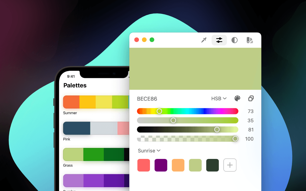

User reviews (0)