
 简体中文
简体中文 English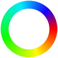
Website review
This review may include AI-generated content and is not individually verified. Domain, certificate and other facts come from the observed data on this page.
What is couleur.io?
couleur.io is a browser-based color tool for building harmonized palettes and copying the result straight into a web project as CSS. You choose a starter hue and a saturation level, and it generates a 10-swatch palette by varying lightness across that hue and saturation, so the colors share a consistent character rather than looking randomly assembled.
It also suggests accent colors by rotating the base hue in 45-degree steps. The site notes that 45° or 315° rotations may not contrast enough, while 90°, 135° or 180° usually work better. A preview panel shows the palette in a light and dark page context—headings, body text, links, a sample article layout—so you can judge it against realistic UI rather than isolated chips.
The CSS-variable angle
The output is framed around HSL values and CSS variables. You can copy a set of variables, then adjust --base-hue, --base-sat and --primary-lightness to shift the whole palette at once, or --accent-hue and --accent-lightness to change just the accent. That makes it useful for a small site or prototype where you want a coherent theme without hand-picking every shade.
Who it suits
- Developers who want a quick palette plus ready-to-paste CSS variables.
- Designers who already have a brand hue and need a lightness ramp plus accent options.
- Anyone building a simple site who wants to test colors in a realistic light/dark preview.
The trade-off: it is deliberately narrow. It works from one hue and one saturation, so it won't produce multi-hue, earthy or highly desaturated schemes, and it isn't a full design system or contrast checker. If you need WCAG contrast verification, check the final text/background pairs separately.
A practical next step: pick your brand hue, set saturation to a moderate level, preview in dark theme, then copy the variables and test them in your actual layout. For broader palette inspiration alongside it, Coolors and Color Hunt are established options.
How does couleur.io generate harmonizing color palettes?
couleur.io builds a palette from two inputs you choose: a starter hue (0–360 on the color wheel, where 0 and 360 are both red) and a saturation level (0–100%). From that single hue-and-saturation pair it produces 10 swatches by varying only lightness. Because every swatch shares the same hue and saturation, the set stays visually related rather than clashing.
How the accent colors are derived
The tool rotates the base hue in 45-degree increments to suggest accent colors. Its own guidance notes that a 45° or 315° shift may be too close to the base to read as a real contrast, while shifts of 90°, 135° or 180° usually work better for accents.
What you get out
- Individual swatches you can pick from.
- A set of CSS variables for the full palette, which you can paste into your project.
- Global controls: adjusting
--base-hue,--base-satand--primary-lightnessshifts the whole palette at once, while--accent-hueand--accent-lightnesschange just the accent. - A preview in context, including a dark-theme preview, so you can judge the colors on a realistic page layout before committing.
A practical way to use it
Start with your brand's dominant hue, set saturation to a moderate level, then scan the 10 lightness steps for a background, a surface, body text and a border. Pick an accent at a 90–180° rotation rather than the nearest 45° step, and test it against both the light and dark previews. If the accent feels weak, nudge --accent-lightness rather than changing the hue.
For comparison, Coolors is built around generating and locking individual colors, whereas couleur.io is narrower: one hue, one saturation, lightness-driven steps, and CSS variables as the deliverable. If you want a controlled, systematic scale, couleur.io's approach is the closer fit.
How can I use the CSS variables from couleur.io in my web project?
Use the generated CSS custom properties as a small design-token layer: set them once near the top of your stylesheet, then reference them by role (background, text, border, accent) throughout your components. The palette is built in HSL, so each color shares the same hue and saturation and only the lightness step changes. That is what makes the set feel like one family rather than ten unrelated swatches.
A practical starting point
:root {
  --base-hue: 210;
  --base-sat: 60%;
  --primary-lightness: 45%;
  --accent-hue: 300;
  --accent-lightness: 55%;
}
Then map the palette swatches to semantic names instead of using the raw steps everywhere:
:root {
  --surface: hsl(var(--base-hue) var(--base-sat) 96%);
  --text: hsl(var(--base-hue) var(--base-sat) 15%);
  --brand: hsl(var(--base-hue) var(--base-sat) var(--primary-lightness));
  --accent: hsl(var(--accent-hue) var(--base-sat) var(--accent-lightness));
}
The advantage of this two-layer approach is that changing --base-hue re-tints the whole interface at once, while your components keep reading stable names like --surface. If a rebrand or seasonal theme arrives, you edit two or three numbers rather than hunting through every rule.
Choosing an accent that actually contrasts
The tool generates accent ideas by rotating the base hue in 45-degree steps. Its own guidance is worth following: a 45 or 315 degree shift is often too close to the base to read as an accent, while 90, 135 and 180 degrees usually separate clearly. If your accent is used for buttons, links or focus rings, check it against the background at the lightness values you actually ship, not just in the swatch grid. A hue rotation changes the color but not the lightness contrast, so you may still need to nudge --accent-lightness for accessible text.
Where this fits and where it does not
This approach suits marketing sites, blogs, dashboards and prototypes where you want a coherent, quickly adjustable palette. It is less suited to projects that need a full multi-hue brand system, precise brand-mandated hex values, or a large semantic token set with success, warning and error states — you would layer those on top yourself.
For related reference, MDN Web Docs documents HSL and custom property behavior, and WebAIM covers the contrast checking you should run before shipping.
Which accent color hue rotations work best for contrast?
Rotations of 90°, 135° and 180° from the base hue usually give the most reliable contrast. Rotations of just 45° or 315° are the weakest options — they sit too close to the base hue to separate clearly.
That guidance comes from the tool's own notes on couleur.io, which generates accent ideas by rotating the starter hue in 45° steps. The reasoning is straightforward: the further you move around the hue circle, the more the accent diverges from the base, until you approach the opposite side.
H3 Practical way to choose
- 45° / 315° — subtle, tonal shifts. Fine for hover states, borders or backgrounds where you want variation without a jolt. Poor for buttons or links that must stand out.
- 90° / 135° — strong, clearly distinct accents that still feel related to the base. Good default for interactive elements.
- 180° — maximum hue separation; the classic complementary pairing. Highest contrast, but also the most likely to look loud if both colors are highly saturated.
H3 A concrete scenario
Say you're building a marketing site with a blue base hue. A 45° rotation lands on a neighbouring blue-violet — your call-to-action button will blend into the page. Rotating 135° gives you a warmer, contrasting accent that reads as a deliberate highlight. If you go 180°, you get an orange accent that pops hard; it works for a single primary button, but using it for every link and badge will feel aggressive.
H3 Decision criterion
Match the rotation to how much attention the element needs. Small, frequent UI (links, tags, focus rings) suits 90–135°. One hero element per screen can carry 180°. Reserve 45° and 315° for states and surfaces rather than for anything the user must find.
If you want to see the trade-off rather than reason about it, the site's preview panel renders a palette in a light and dark page context, which is the quickest way to judge whether an accent actually holds up against real text and backgrounds.
How do I preview a color palette in dark theme context?
Use the preview in dark theme context option in couleur.io's palette preview area. The page shows a light preview and a dark-theme preview side by side, each rendering the same sample layout (nav links, a headline, body text, a "read more" link) so you can see how your chosen colors behave on a dark background.
Couleur.io
What the dark preview actually shows you
- The same 10-swatch palette applied to text, links and UI elements over a dark surface.
- Whether your base hue and saturation still read as intended when lightness is inverted.
- How the generated accent colors hold up against dark backgrounds.
Practical checks to run in it
- Set
--base-hueand--base-satfirst, then look at both previews before touching anything else. - Inspect the accent color specifically. The tool notes that accents rotated only 45 or 315 degrees from the base hue may not contrast enough; 90, 135 or 180 degrees usually work better. Dark themes punish weak contrast faster than light ones.
- Toggle the CSS variables for the full palette and copy them once both previews look right.
- Re-check
--primary-lightnessand--accent-lightnessafter copying — adjusting these two values shifts the whole palette at once, which is the fastest way to fix a dark-mode-only problem.
A concrete scenario
You're building a blog with a light default and a dark mode toggle. Pick a starter hue, refine saturation, then compare the two previews. If the body text looks fine in light but muddy in dark, raise --primary-lightness rather than re-picking the hue — the hue and saturation stay harmonized, and both themes keep the same color identity.
Decision criterion
If your project ships both themes, treat the dark preview as the stricter test: colors that pass there almost always pass in light. If you only ship a dark theme, skip the light preview entirely and tune directly against the dark one.
What is the subscription option for couleur.io?
couleur.io is a free browser-based color tool for building harmonized HSL palettes, and its only visible subscription-like element is a “subscribe” prompt embedded in the blog/article preview. The page evidence does not describe a paid plan, account tier, newsletter, or billing platform behind it, so there is no confirmed subscription product to describe.
The practical takeaway: treat “subscribe” as a generic call-to-action rather than a signup requirement. If you want to evaluate the tool, open couleur.io and test the core workflow without creating an account: pick a starter hue, adjust saturation, preview the palette in light and dark article contexts, and copy the CSS variables.
A useful decision criterion: if you need a palette generator with immediate CSS output and no signup friction, this fits. If you need saved team libraries, version history, or account-based collaboration, the visible page evidence does not show those features.
 NS1
NS1 Netlify
User reviews (0)