
 简体中文
简体中文 English
Website review
This review may include AI-generated content and is not individually verified. Domain, certificate and other facts come from the observed data on this page.
What is heroicons-animated?
heroicons-animated is an open-source (MIT-licensed) set of 316 animated icons for React projects. It takes the familiar Heroicons shapes and adds motion, so icons can animate on interaction or state changes instead of sitting static. It's built with Motion and Heroicons and distributed as copy-paste-ready components, installed through a shadcn-style command rather than a single monolithic package.
What you actually get
- Animated React icons: 316 icons, each an SVG with smooth animation baked in.
- Copy-paste workflow: you add individual icons via the shadcn CLI, so the code lands in your project and you own it.
- MIT license: free for commercial and personal use, with no attribution requirement beyond keeping the license.
- Customizable SVGs: since the source is in your repo, you can tweak stroke, timing, or color directly.
Who it's for
Developers building React interfaces who want a bit of polish — animated toolbars, loading states, hover feedback, empty-state illustrations — without hand-authoring keyframes or pulling in a heavy icon framework. If you're on Vue, Svelte, or plain HTML, this isn't aimed at you; you'd want a framework-agnostic animated icon set instead.
A practical example
Say you're building a dashboard and want the sidebar's "academic cap" icon to animate when a user hovers. With this library you'd run the shadcn add command for that icon, drop the component into your sidebar, and the animation comes along with it. You can then adjust the Motion transition values in the copied file if the default feels too slow or too subtle.
Trade-offs to weigh
| Approach | Upside | Downside |
|---|---|---|
| heroicons-animated | Motion included, MIT, you own the code | React-only; you add icons one at a time |
| Static Heroicons | Tiny, universal, no JS | No animation without your own CSS |
| A packaged icon library | One dependency, broad framework support | Less control, often larger bundles |
The main decision criterion is framework and control: if you're in React and want editable, animated icon source files, this fits. If you need icons across multiple frameworks or want zero animation code, static Heroicons or a similar set is simpler.
Next step: browse the icon list on heroicons-animated, pick two or three you'd realistically use, and add them with the shadcn command to see how the copied components feel in your codebase before committing to a broader rollout. If you want to understand the animation patterns behind it, the site credits the animations.dev course and the lucide-animated project by Dmytro as inspiration — both are reasonable places to learn the underlying techniques.
How do I install and use heroicons-animated in a React project?
Install heroicons-animated by adding individual icons through the shadcn CLI, then importing each animated icon as a React component. The library is an MIT-licensed collection of 316 animated icons built with Motion and Heroicons, so there is no icon package to install globally — you pull in the specific icons you need.
Add an icon with the shadcn CLI
The site shows the shadcn command pattern with a package-manager runner. For pnpm:
pnpm dlx shadcn@latest add @heroicons-animated/academic-cap
Swap academic-cap for the icon you want. The site also lists npm, yarn and bun equivalents, so use whichever runner your project already uses.
Use the component
Once added, import the generated component and render it like any other React component. Because these are Motion-powered SVGs rather than static files, they animate on interaction or mount according to how the component is authored — check the generated file to see its props and animation trigger.
import AcademicCap from "@/components/icons/academic-cap";

export function EmptyState() {
  return (
    <div>
      <AcademicCap />
      <p>No courses yet</p>
    </div>
  );
}
Practical fit and trade-offs
Animated icons work best where motion carries meaning: loading states, success confirmations, empty states, onboarding steps or hover feedback on primary actions. In dense tables, nav bars or long lists, animation becomes noise and can hurt perceived performance, so reserve it for moments where the user's attention should move.
A concrete scenario: a SaaS dashboard shows a static checkmark in a settings list but an animated one on the "Payment successful" screen. Same icon family, different weight of motion.
Two things to verify in your own project: whether the generated component respects prefers-reduced-motion, and whether your bundler tree-shakes unused icons. Because icons are added one at a time rather than imported from a single barrel package, the second concern is largely handled by design.
If you want static Heroicons instead, use Heroicons. For a broader animated icon set in the same spirit, see Lucide.
How can I customize the animation speed or style of these icons?
These icons ship as React components built on Motion (formerly Framer Motion) and Heroicons, so animation speed and style are changed in code rather than through a settings panel. The copy-paste model works in your favour here: once an icon lives in your own repository, its transition values are yours to edit.
Changing speed
Motion components accept a transition prop, so the practical route is to pass a duration or spring configuration into the icon and let it override the default timing. A slower, softer feel suits onboarding screens and empty states; a fast, snappy one suits toolbar buttons and hover feedback. If you want one consistent tempo across a whole app, wrap the icons in a shared component or context that injects the same transition, rather than editing each file. That keeps a single source of truth when a designer later asks for everything to be 20% quicker.
Changing style
Style changes usually mean editing the underlying SVG paths or the animated properties themselves. Because the source is plain SVG plus Motion, you can:
- Swap
easecurves for a linear, ease-out or custom cubic-bezier feel - Replace a spring with a duration-based tween, or the reverse
- Change stroke width, colour and size through standard SVG and Tailwind-style props
- Adjust which parts move by editing the animated variants directly in the component
What to weigh
| Goal | Approach | Trade-off |
|---|---|---|
| Global speed change | Shared wrapper or context | One abstraction layer to maintain |
| One-off tweak | Edit the copied component | Diverges from upstream updates |
| New motion feel | Rewrite variants and easing | Closest to authoring your own icon |
| Brand consistency | Design tokens for duration and easing | Needs discipline across the team |
The library is MIT licensed and free, so there is no restriction on modifying the components. The real cost is maintenance: the further you drift from the original files, the more manual work each update becomes.
A useful next step is to pick one icon, copy it in, and change only its duration value first. If the result feels right, promote that value into a shared constant before touching any other icon. For comparison, Heroicons provides the static originals and Motion documents the transition and easing options you will be editing.
Is it legal to use heroicons-animated in commercial projects under the MIT license?
Yes. The site states that heroicons-animated is released under the MIT License, which permits commercial use, modification and redistribution, provided you keep the copyright and license notice with the code.
What that means in practice
- You can ship these animated icons in client work, SaaS products or paid apps.
- You can modify the animations, colors and sizes to match your design system.
- You can include the components in a product you sell.
- You cannot hold the author liable, and you should not imply endorsement.
The one obligation people miss
MIT requires preserving the license text and copyright notice. In a React project, keep the license file that ships with the package, or add an attribution note in your project's licenses or credits screen. Removing the notice and claiming the icons as your own is where the license stops covering you.
A quick decision rule
If your use is closed-source, commercial and you keep the notice, MIT covers it. If you need to relicense the icons under different terms, strip attribution, or use the creator's name to promote your product, you need separate permission.
Before you commit
Check the repository's LICENSE file directly, since the collection builds on Heroicons and Motion, and those upstream projects carry their own MIT terms. Also confirm the current icon count and package name on the site, as the library is actively evolving.
For the React icon ecosystem generally, compare Heroicons for the static originals and Lucide for a broader icon set, then decide whether animated variants are worth the extra bundle weight in your app.
How does heroicons-animated compare to other animated icon libraries like lucide-animated?
heroicons-animated is an open-source, MIT-licensed set of 316 animated icons for React, built on Heroicons and Motion, and distributed as copy-paste components via a shadcn-style CLI. Its closest reference point is lucide-animated, which the creator explicitly credits as inspiration. The practical difference comes down to which base icon set you already use and how you prefer to install components.
Where they differ
| Aspect | heroicons-animated | lucide-animated |
|---|---|---|
| Base icon set | Heroicons (Tailwind's icon set) | Lucide |
| Icon style | Filled and outline variants typical of Heroicons | Uniform stroke-based line icons |
| Animation layer | Motion | Motion-based |
| Delivery | Copy-paste React components via shadcn CLI | Copy-paste React components |
| License | MIT | Open source |
The page evidence confirms the Heroicons + Motion + MIT + 316 icons + shadcn CLI details; it does not state a specific count or license for lucide-animated, so treat those as things to verify on that project's own site.
How to choose
The deciding factor is usually visual consistency, not animation quality. Both wrap icons in Motion, so the motion feel is broadly similar. What differs is the underlying drawing style:
- If your app already uses Heroicons (common in Tailwind projects), heroicons-animated keeps your static and animated icons visually matched. Mixing Lucide line icons with Heroicons elsewhere in the same UI tends to look inconsistent.
- If your app is built on Lucide, or you prefer a single consistent stroke weight across all icons, lucide-animated avoids that mismatch.
- If you need a specific icon that only exists in one set, that alone can settle it.
A concrete scenario
You are building a Tailwind + React dashboard and already import Heroicons for navigation and status indicators. You want the settings gear and notification bell to animate on hover. With heroicons-animated, the animated versions inherit the same shapes as your static icons, and you add them through the shadcn CLI rather than pulling in a separate icon dependency. If instead your project standardizes on Lucide, adopting heroicons-animated would introduce two icon languages, so Lucide or its animated counterpart would be the more coherent choice.
Next step
Audit which icon library your project already depends on, then pick the animated set that matches it. Check the heroicons-animated icon list for the specific glyphs you need before committing, since 316 icons will not cover every edge case, and confirm current counts and licensing on the lucide-animated project directly rather than assuming parity.
Can I use heroicons-animated icons with frameworks other than React, such as Vue or Svelte?
No, not directly. heroicons-animated is built as a React component library, so its copy-paste components depend on React and the Motion animation library. The underlying artwork comes from Heroicons, which is framework-agnostic SVG, but the animated versions are packaged for React.
What this means in practice
- Vue or Svelte projects: You cannot drop the React components in as-is. You would need to port each icon's markup and animation logic into your framework's component format, or use a wrapper that renders React inside your app (usually more complexity than it is worth for icons).
- Plain HTML/CSS or other stacks: Same issue — the animation behavior is tied to React and Motion, not delivered as standalone animated SVG files.
Practical alternatives
| Approach | Best for | Trade-off |
|---|---|---|
| Port the icon to your framework | A handful of icons you truly need animated | Manual work per icon; you maintain the animation code |
| Use static Heroicons SVGs | Most UI needs | No built-in animation; you animate with CSS yourself |
| Find a framework-native animated icon set | Vue/Svelte projects wanting ready-made motion | Different visual style and icon coverage |
If you want to browse the source icons, Heroicons provides the original static set, and Lucide is a related icon family worth knowing about. For Vue specifically, checking whether a community port exists is your fastest route before committing to manual conversion.
A reasonable decision rule: if you need only a few animated icons, porting them is fine. If animation is central to your UI across many icons, choose a library built for your framework rather than adapting a React one.
 Namecheap
 Vercel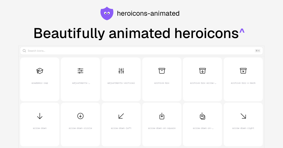

User reviews (0)