Website profiles · Technology insights · Alternatives

moderncss.dev

A series examining modern CSS solutions to problems Stephanie Eckles (@5t3ph), a seasoned frontend developer, has been solving for 15+ years.

No paid content found
Visit website
Profile views 7 Outbound visits 1 Normal
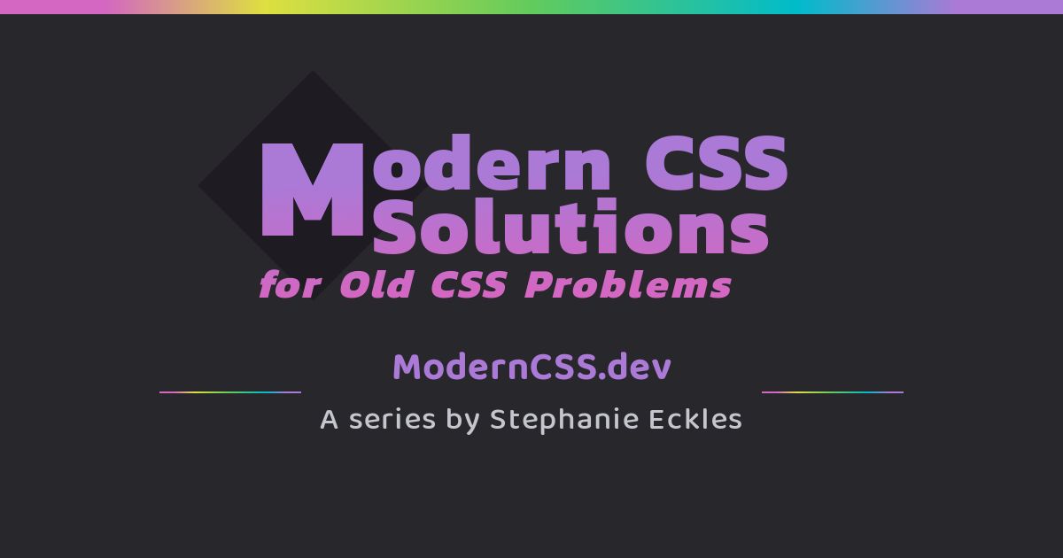
Modern CSS Solutions Full homepage screenshot

At a glance

Category
Development
Language
English
Paid-content signal
No paid content foundObserved
Registered
2020
Hosting
NetlifyInferred
HTTPS certificate trusted
PassedObserved
Last updated

Website review

This review may include AI-generated content and is not individually verified. Domain, certificate and other facts come from the observed data on this page.

What is Modern CSS Solutions?

Modern CSS Solutions is a tutorial site by frontend developer Stephanie Eckles that tackles long-standing CSS problems with current, standards-based techniques. Rather than cataloging every property, it focuses on practical patterns she has used in professional work: custom properties, container queries, intrinsic layout, fluid typography and accessibility-minded styling.

What you'll find

  • Focused articles on specific problems, such as providing type definitions for custom properties with @property, understanding how custom property values are computed, and testing whether a new CSS feature is safe to use.
  • Small, applied upgrades, like the "12 Modern CSS One-Line Upgrades" piece, which is aimed at reducing technical debt and JavaScript while improving user experience.
  • Architecture and theming guidance for component-based projects, including responsive layouts and context-aware components.
  • Companion snippets through SmolCSS, a separate site offering minimal demos for modern layouts and components.
  • Accessibility-oriented CSS, showing how modern features can improve layouts and usability.

Who it's for

Intermediate developers and teams already comfortable with CSS who want to modernize an existing codebase or adopt newer features without breaking older browsers. Beginners may find some articles assume familiarity with custom properties and modern layout; the testing feature-support article is a good starting point if you're unsure what's safe to ship.

How to use it

Treat it as a reference for solving a specific problem rather than a linear course. If you're auditing a legacy stylesheet, start with the one-line upgrades and custom property computation articles, then move to container queries and fluid typography when you're ready to restructure layout. For a broader set of frontend references, see MDN Web Docs and web.dev.

How can I upgrade my existing CSS with modern one-line improvements?

The most practical starting point is the site's own collection of single-property changes: Modern CSS Solutions documents a "12 Modern CSS One-Line Upgrades" article aimed exactly at reducing technical debt, removing JavaScript, and improving user experience without a rewrite. The premise is that many old CSS problems now have a one-line answer, so you can adopt improvements incrementally rather than refactoring a whole stylesheet.

Where one-line changes tend to pay off

  • Layout defaults. Properties that set sensible spacing or sizing behavior let you delete reset hacks and per-component overrides.
  • Responsive sizing. Replacing media-query ladders with intrinsic sizing functions means fewer breakpoints to maintain.
  • Accessibility. Modern CSS can handle focus visibility, reduced-motion preferences, and readable line lengths that previously required scripts or manual testing.
  • Custom properties. Typed custom properties via @property make values safer to reuse, which the site covers alongside a warning that traditional fallback values can fail in ways that are hard to debug.

A realistic reader scenario

Suppose you maintain a component library where every card sets its own margin, and a JavaScript resize listener adjusts a font size. You could swap the margins for a contextual spacing custom property, and the font size for a fluid value built on container query units — two changes, no new dependencies. The trade-off is browser support: newer features may need fallbacks, and the site has a dedicated article on testing feature support and deciding when a feature is safe to ship.

How to decide what to upgrade first

Priority Signal Example move
High Code exists only to work around old CSS Replace with a native property
High JavaScript handles a purely visual concern Move it to CSS
Medium Repeated values across components Centralize as a custom property
Lower Cosmetic polish with no maintenance cost Defer

Pick one rule, apply it across the codebase, and verify in your actual target browsers before moving to the next. For minimal, copy-ready snippets of layouts and components, the companion resource SmolCSS is worth keeping open while you work.

How do I test if a modern CSS feature is safe to use in production?

Start by separating two questions: whether the feature is supported in the browsers your audience actually uses, and whether you have a fallback that keeps the page usable if it is not. For most production work, support data alone is not enough; you also need a way to detect support in the browser and a plan for the unsupported case.

Modern CSS Solutions covers this directly in its article on testing feature support, which walks through finding information on new features, testing for support, deciding when to use a feature, and managing fallbacks and build tools. That is a practical sequence: research, verify, decide, then guard.

A practical workflow

  1. Check support data against your own analytics. Look up the feature on a compatibility source such as Can I Use or MDN Web Docs, then compare its browser versions with the browsers your visitors actually use. A feature with broad global support can still fail if your audience skews toward an older browser.
  2. Test in a real browser, not just a data table. Write a small demo page that uses the feature and open it in the browsers and devices you care about. Support data can lag behind partial implementations or flag-gated behavior.
  3. Use @supports for a deliberate fallback. Wrap the modern rule in an @supports block and keep a simpler rule outside it. This lets older browsers get a workable layout while modern ones get the enhancement.
  4. Decide whether the feature is an enhancement or a requirement. If the page still works without it, ship it behind @supports. If the layout breaks without it, either wait or add a fallback that preserves the core experience.
  5. Consider build-time handling. If you use a build tool, check whether it can transpile or polyfill the feature, and whether that adds weight or complexity you are willing to carry.
/* Fallback first */
.card { display: flex; }

/* Enhancement */
@supports (display: grid) {
  .card { display: grid; }
}

Deciding when it is safe

Situation Reasonable approach
Feature is decorative, page works without it Ship it, optionally behind @supports
Feature affects layout or readability Require broad support or provide a solid fallback
Feature is new and your audience is mixed Use @supports and test on real devices
Feature is central to the design and unsupported browsers matter Wait, or build a non-CSS fallback

A useful next step is to pick one feature you are considering, find its support entry on Can I Use, and write a two-rule @supports test page. If the fallback looks acceptable in an older browser, you have your answer. If it does not, the feature is not yet safe for that audience.

How can I use container query units for fluid typography?

Container query units let you size text relative to the container it sits in rather than the viewport, so the same component can scale differently in a narrow sidebar and a wide main column. The units are cqw, cqh, cqi, cqb, cqmin, and cqmax; cqi (inline size) is usually the most useful for typography because it follows the writing direction.

Modern CSS Solutions covers this directly in its article on container query units and fluid typography, where Stephanie Eckles explores three fluid typography techniques applied via a custom-property "mixin." That is her framing and experimentation; the practical takeaway is that you define a container, then express font size in container units, often wrapped in clamp() so text stays legible at both extremes.

The basic pattern

  1. Establish a containment context on the parent: container-type: inline-size; (and optionally container-name: card;).
  2. Size the text using a container unit inside a clamp():
    .card__title {
      font-size: clamp(1rem, 4cqi, 1.75rem);
    }
    
  3. Tune the middle value and the clamp bounds so the text grows smoothly but never becomes too small or too large.

Where it differs from viewport units

Approach Scales with Best for
vw / vh Viewport Page-level headings, full-width hero text
cqi / cqw Nearest container Reusable components in varied column widths
rem only Root font size Predictable, accessibility-safe base text

The trade-off: container units make components genuinely portable, but they also mean a component's appearance depends on where it is placed, which can surprise teams expecting identical rendering everywhere. Always keep a rem-based minimum in the clamp so users who enlarge their default font size still get readable text.

A concrete scenario

You build a product card used in a three-column grid on desktop and a single column on mobile. With viewport units, the card's title is oversized in the narrow grid cell. With cqi, the title scales to the card itself, so it looks right in both layouts without media queries. For a deeper walkthrough of the mixin approach and the behaviors to watch for, read the container query units article at Modern CSS Solutions. A companion resource worth knowing is SmolCSS, which collects minimal snippets for modern layouts and components.

How does @property improve custom property definitions in CSS?

@property improves custom property definitions by letting you declare what kind of value a custom property holds. A plain --brand-color: #0a58ca is just a token the browser substitutes; with @property, you register it with a syntax, an initial value and an inheritance rule, so the browser knows it is a color, falls back predictably when it is missing or invalid, and can animate or transition between values.

The practical difference is resilience. Traditional fallback values work by substitution, which can fail in ways that are hard to trace: if a custom property resolves to something invalid for the place it is used, the declaration is dropped rather than falling back to an earlier value, and the missing value can be difficult to debug. A registered property with a defined initial value gives the browser a valid value to use instead of an invalid one. This is the behavior Modern CSS Solutions examines in its write-up on providing type definitions for CSS with @property, including why traditional fallbacks can fail and how the feature makes custom property definitions more resilient.

What registration changes

  • Type checking: The browser validates assigned values against the declared syntax, so a value of the wrong type is treated as invalid at the point of registration rather than silently breaking a downstream declaration.
  • Initial values: A registered property can supply a fallback when nothing has been set, which avoids an empty or unresolved value.
  • Inheritance control: You decide whether the property inherits, which matters for theming and component-scoped tokens.
  • Animatable values: Registered properties can be interpolated, so gradients, colors and lengths can transition where unregistered custom properties cannot.

When it is worth the extra line

Registration is most useful for design tokens that carry a type: colors, lengths, angles, numbers and percentages used in calculations. It is less necessary for one-off values that are set immediately and never animated. If you maintain a theme layer, registering the tokens that other rules depend on reduces the chance that a typo or an unset variable quietly removes a declaration.

A concrete scenario: a component sets --gap for spacing and uses it in gap: var(--gap). If a parent theme sets --gap to a value the layout cannot use, an unregistered property can leave the component with no spacing at all. Registering --gap with a length syntax and an initial value keeps the layout intact and makes the mistake visible.

To decide, ask whether the property is part of a shared token set, whether it needs to animate, and whether a missing value would be hard to diagnose. If the answer to any of those is yes, register it; the cost is one declaration, and the benefit is a value the browser can validate instead of one it can only substitute.

How can modern CSS improve web accessibility?

Modern CSS improves accessibility mainly by letting you build layouts and interactions that adapt to users' needs without relying on fragile hacks or extra JavaScript. The techniques below are general front-end practices; they are the kinds of problems the tutorials on Modern CSS Solutions address.

Where modern CSS helps

  • Respecting user preferences. Media queries like prefers-reduced-motion, prefers-color-scheme, and prefers-contrast let you reduce animation, honor dark mode, or increase contrast for people who request it at the OS level.
  • Fluid, readable typography. Functions such as clamp(), min(), and max() keep text at legible sizes across viewports, which helps users who zoom or read on small screens.
  • Resilient custom properties. Defining types with @property makes custom properties behave predictably, so theme values like color or spacing don't silently break and leave unreadable text.
  • Intrinsic, content-aware layout. Grid, flexbox, and container queries let components reflow based on available space, reducing horizontal scrolling and cramped tap targets.
  • Focus and target sizing. Logical properties and modern selectors make it easier to keep visible focus states and adequately sized interactive elements.

A practical next step

Audit one page for a single preference, for example prefers-reduced-motion, and add a media query that disables non-essential transitions. Then check that your focus outlines remain visible after your changes.

Decision criterion

Prefer native CSS solutions when they degrade gracefully: if a browser doesn't support a feature, the fallback should still be usable and readable. Use Modern CSS Solutions when you want concrete, modern examples of these patterns, and verify current browser support before shipping a feature as a hard dependency.

Related questions

More questions →
What is Modern CSS Solutions?

Modern CSS Solutions (moderncss.dev) is an article series by frontend developer Stephanie Eckles that examines modern CSS approaches to long-standing CSS problems. It is aimed at developers who already write CSS and want to replace older workarounds—extra markup, JavaScript, or fragile fallbacks—with current platform features. The site is a reading resource rather than a tool or course: you go there to learn a technique, understand why the older approach fails, and decide whether the modern one is safe to adopt.

What the site covers

The series is organized around specific problems and the modern CSS features that solve them. Topics visible on the site include:

  • Typed custom properties with @property — defining types for custom properties, why traditional fallback values can fail, and how @property makes custom property definitions more resilient.
  • One-line upgrades — a set of properties you can add to an existing project to reduce technical debt, remove JavaScript, and improve user experience without restructuring your CSS.
  • How custom property values are computed — the browser's computation behavior for final custom property values, and how misunderstanding it leads to unexpected or missing values that are hard to troubleshoot.
  • Dynamic, component-based architecture — project architecture, theming, responsive layouts, and context-aware components.
  • Testing feature support — how to find information on a new CSS feature, test for support, decide when to use it, and manage support with fallbacks and build tools.
  • Container query units and fluid typography — fluid typography techniques built on custom properties, intended to stay responsive regardless of context.
  • Contextual spacing — adaptive spacing techniques and a starter set of custom properties for gap, margin, and padding.
  • CSS math functions — practical and unexpected uses of calc(), clamp(), min(), and max(), including inside gradients and color functions and combined with custom properties.
  • Accessibility upgrades — modern CSS capabilities that improve layout accessibility for front-end work.

Who it is for

The material assumes working knowledge of CSS. Articles discuss custom property computation, build tools, and fallback strategy, so they are most useful if you:

  • Maintain an existing codebase and want to reduce JavaScript or legacy hacks.
  • Are deciding whether a newer CSS feature is safe to ship in production.
  • Want to understand a feature's behavior before adopting it, not just copy a snippet.

If you are looking for a complete beginner's CSS course, this is not that. If you want short, minimal code you can drop into a project, the companion site is the better entry point.

Companion site: SmolCSS

ModernCSS has a companion site, SmolCSS (SmolCSS.dev), which offers minimal snippets for modern CSS layouts and components. The division of labor is straightforward: ModernCSS explains the reasoning, behavior, and trade-offs behind techniques; SmolCSS provides the compact demo code. A practical workflow is to read the relevant ModernCSS article to understand the mechanism, then take the snippet from SmolCSS and adapt it.

How to use it

  1. Start from a problem you actually have — for example, a custom property that resolves to nothing in some browsers, or typography that breaks inside a component. The series is indexed by problem, so matching your issue to an article is faster than reading sequentially.
  2. Read the explanation of why the old approach fails — this is where the site adds the most value, because it tells you what breaks and under what conditions.
  3. Check the feature-support guidance before shipping — the article on testing feature support covers how to verify support and when fallbacks or build tools are warranted.
  4. Pull the minimal version from SmolCSS once you understand the technique, then adapt it to your naming and architecture.

What to keep in mind

The site describes itself as a series examining modern CSS solutions, and its content is explanatory. It does not present itself as a framework, a component library, or a hosted service, so there is nothing to install or sign up for in order to read it. Feature support for newer CSS properties changes over time, so treat any support discussion in an article as a starting point and verify current browser support before relying on a technique in production.

Does Modern CSS Solutions Have Additional Resources?

Yes. Modern CSS Solutions has an "Additional Resources" section on the site, and its most concrete companion resource is SmolCSS (SmolCSS.dev), a separate site that provides minimal snippets for modern CSS layouts and components. These resources are aimed at developers who want to move from reading about a technique to actually implementing it in a project.

What the Additional Resources Include

The site's resource offerings fall into two practical categories:

  • SmolCSS — a companion site described as offering "minimal snippets for modern CSS layouts and components." It is positioned as the hands-on counterpart to the longer-form articles on Modern CSS Solutions.
  • An "Additional Resources" section on the main site, which collects further material alongside the article series.

The main site itself is a series examining modern CSS solutions to problems the author, Stephanie Eckles, has been solving over 15+ years as a frontend developer. The resources exist to support that same goal: applying modern CSS in real projects.

When These Resources Are Useful

The companion material is most helpful in specific situations rather than as general background reading:

  • You have read an article on Modern CSS Solutions and want a copy-ready starting point instead of building the pattern from scratch.
  • You need small, minimal snippets for a layout or component rather than a full framework or library.
  • You are working on reducing technical debt, removing JavaScript, or improving user experience with targeted CSS changes — the kind of "one-line upgrade" improvements the site covers.

How to Decide Whether to Use Them

Resource Best for Not ideal for
SmolCSS Minimal, drop-in snippets for layouts and components Full project scaffolding or framework-level architecture
Main site articles Understanding the reasoning behind a technique Quick copy-paste without reading context
"Additional Resources" section Finding further material in one place Replacing the article series itself

If your goal is to understand why a modern CSS approach works, the article series is the starting point. If your goal is to ship a small piece of it quickly, SmolCSS is the more direct route. The two are designed to work together rather than as substitutes.

One note on scope: the available site information describes these resources but does not detail pricing, accounts, or access restrictions for them, so treat any assumption about cost or login requirements as unverified until you check the sites directly.

Who Is the Author of Modern CSS Solutions?

Modern CSS Solutions is written by Stephanie Eckles, who publishes under the handle @5t3ph. The site describes her as a seasoned frontend developer with 15+ years of experience, and frames the publication as "a series examining modern CSS solutions to problems Stephanie Eckles has been solving" over that career. In other words, the material is presented as first-hand practice rather than aggregated documentation: the problems covered are ones the author encountered and worked through herself.

What the author background means for readers

The value of knowing the author is that it tells you what kind of source this is.

  • Experience-based, not spec-based. The site's own framing is that these are solutions to problems the author solved over 15+ years of frontend work. That suggests articles tend to start from a practical failure or friction point, then work toward a modern CSS answer.
  • Modern CSS focus. The tagline "Modern CSS Solutions for Old CSS Problems" signals the scope: newer language features applied to long-standing layout, theming, and component issues.
  • A single consistent voice. Because the series is attributed to one developer, you can expect a coherent set of opinions and techniques rather than a mix of contributors.

Where the author's perspective shows up in the content

The article list on the site reflects the kind of problems a working frontend developer runs into, which is consistent with the stated background:

Topic What it addresses
Providing Type Definitions for CSS with @property Why traditional fallback values can fail, and how typed custom properties improve resilience
12 Modern CSS One-Line Upgrades Small property changes that reduce technical debt and remove JavaScript
How Custom Property Values Are Computed Browser computation behavior that causes unexpected or missing values
Modern CSS For Dynamic Component-Based Architecture Project architecture, theming, responsive layouts, component design
Testing Feature Support for Modern CSS How to judge whether a new feature is "safe" and manage fallbacks
Container Query Units and Fluid Typography Fluid type techniques built on custom properties
Contextual Spacing For Intrinsic Web Design Adaptive spacing via a starter set of custom properties
Practical Uses of CSS Math Functions calc, clamp, min, max, including inside gradients and color functions
Modern CSS Upgrades To Improve Accessibility CSS capabilities that support accessible layouts

Several of these are explicitly about diagnosis — for example, the piece on how custom property values are computed notes that misunderstanding the process "may lead to an unexpected or missing value and difficulty troubleshooting." That is the shape of a practitioner writing from debugging experience.

Related resources from the same author

The site also points to SmolCSS (SmolCSS.dev), described as a companion site offering "minimal snippets for modern CSS layouts and components." If you want to see the author's approach in condensed form rather than as full articles, that companion resource is the natural next stop.

When this background is relevant to you

Knowing the author is Stephanie Eckles with 15+ years of frontend experience matters most if you are:

  • Deciding whether to trust a technique enough to put it in production.
  • Looking for solutions that come from real project constraints rather than isolated demos.
  • Wanting a consistent set of modern CSS patterns across layout, theming, and accessibility.

It matters less if you need formal specification language or browser-implementation details — for that, the primary specs and browser documentation remain the better source, with these articles as practical interpretation.

What Topics Are Covered on Modern CSS Solutions?

Modern CSS Solutions is a series of articles that examines modern CSS techniques for solving long-standing front-end problems. It is written by Stephanie Eckles, a frontend developer with 15+ years of experience, and the content is aimed at developers who want to adopt newer CSS features without breaking existing projects. The site is best understood as a practical, article-based reference rather than a structured course: each piece focuses on a specific problem, explains the underlying mechanism, and shows how to apply it.

Core topic areas

The articles cluster around a few recurring themes. Based on the site's own descriptions, these include:

  • Typed custom properties — using @property to define types for CSS custom properties, why traditional fallback values can fail, and how typed definitions make custom properties more resilient.
  • Custom property computation — how the browser computes final custom property values, and why misunderstanding this process leads to unexpected or missing values that are hard to troubleshoot.
  • Modern CSS upgrades — collections of small, often one-line property changes that reduce technical debt, remove JavaScript, or improve user experience.
  • Dynamic component-based architecture — project architecture, theming, responsive layouts, and component design using current CSS techniques.
  • Feature support testing — how to find information on new CSS features, test whether they are safe to use, and manage support with fallbacks and build tools.
  • Container query units and fluid typography — how container query units behave, demonstrated through fluid typography techniques built with custom properties.
  • Contextual spacing — adaptive spacing techniques for intrinsic web design, including a starter set of custom properties for gap, margin, and padding.
  • CSS math functions — practical and unexpected uses of calc(), clamp(), min(), and max(), including inside gradients and color functions and in combination with custom properties.
  • Accessibility — modern CSS capabilities that can be leveraged to improve accessibility in layouts and other front-end work.

What the articles look like

Each topic is presented as a standalone explainer. A typical article states the problem, walks through the relevant CSS mechanism, and shows the technique in context. For example, the @property article explains why traditional fallback values can fail before introducing typed definitions, and the container query units article builds fluid typography through a custom-property "mixin" so the technique works regardless of context.

The site also links to a companion resource, SmolCSS, which provides minimal snippets for modern CSS layouts and components.

Who it is for

The material assumes working knowledge of CSS and front-end development. It is most useful if you:

  • Are maintaining an existing codebase and want low-risk, incremental improvements.
  • Need to judge whether a newer CSS feature is safe to ship, and how to fall back if it is not.
  • Want to understand why a custom property or math function behaves unexpectedly, not just copy a snippet.

If you are looking for a beginner's introduction to CSS syntax, this is not that. If you want targeted solutions to specific modern CSS problems, the topic list above is a good map of what you will find.

Website Overview

An established domain and managed infrastructure suggest continuity of operations and may support dependable delivery, although neither guarantees service quality. Page metadata, canonical configuration and social previews work together to provide more consistent search and sharing presentation.

Domain and Registration

Registered in 2020, this domain has about 6 years of history. That suggests continuity, although ownership and purpose may have changed. Transfer-protection status is present, helping reduce the risk of unauthorized domain transfers. The registrar is Squarespace Domains II LLC., a widely used domain service provider. The domain uses the common .dev extension, which is not an independent safety signal.

DNS and Email

MX records exist, but SPF, DKIM and DMARC were not detected. Protection against domain impersonation may be incomplete. Nameservers are provided by NS1, indicating managed DNS hosting. MX records point to the Google Workspace email service. No CNAME was found; the observed records resolve directly to addresses. DNSSEC signatures were not detected, so this additional DNS authenticity protection is not confirmed.

TLS and Certificates

The public key uses EC with 256 bits. The server supplied a complete certificate chain. No organization name is present in the certificate; the available fields are consistent with domain validation. The certificate was issued by Let's Encrypt, commonly associated with automated certificate services. The certificate's total validity is about 89 days, consistent with a short renewal cycle.

HTTP and Browser Security

The response lacks these common security headers: CSP, X-Content-Type-Options, Referrer-Policy, Permissions-Policy, clickjacking protection. No X-Powered-By header was found, reducing one common source of backend fingerprinting information. No obvious internal addresses or debug information were found in the headers. The Server header contains the custom value Netlify. No explicit CDN or WAF marker was found in the response headers.

Technology Stack Analysis

The public page identifies eleventy, Netlify without precise versions, leaving fewer clues for version-specific scanning.

Search and Social Sharing

The Generator tag identifies eleventy, making the publishing system easier to fingerprint. Twitter Card metadata is configured. The title has 20 characters, within a common display range. A meta description is present, with 141 characters. The observed directives allow indexing and link following.

Hosting and Email

DNSNS1
HostingNetlify
EmailGoogle Workspace
Approximate IP geolocation (inferred; a CDN or proxy may differ from the origin server) United States flagAshburn, Virginia, United States Inferred 18.208.88.157

Registration details

RDAP / WHOIS

RegistrarSquarespace Domains II LLC.
Registered2020-04-17
Expires2027-04-17
Domain statusclient delete prohibited、client transfer prohibited
Nameserversdns1.p06.nsone.net、dns2.p06.nsone.net、dns3.p06.nsone.net、dns4.p06.nsone.net
DNSSECunsigned

DNS records

DNS

TypeNameValueTTLPriority
Amoderncss.dev18.208.88.157120—
Amoderncss.dev98.84.224.111120—
AAAAmoderncss.dev2600:1f18:16e:df01::258311—
AAAAmoderncss.dev2600:1f18:16e:df01::259311—
MXmoderncss.devaspmx.l.google.com36001
MXmoderncss.devalt1.aspmx.l.google.com36005
MXmoderncss.devalt2.aspmx.l.google.com36005
MXmoderncss.devalt3.aspmx.l.google.com360010
MXmoderncss.devalt4.aspmx.l.google.com360010
NSmoderncss.devdns1.p06.nsone.net3600—
NSmoderncss.devdns2.p06.nsone.net3600—
NSmoderncss.devdns3.p06.nsone.net3600—
NSmoderncss.devdns4.p06.nsone.net3600—

TLS and certificates

TLS / SSL

AssessmentNormal configuration
Supported protocolsTLSv1.2、TLSv1.3
Negotiated protocolTLSv1.3
Certificate subject*.moderncss.dev
IssuerLet's Encrypt
Valid until2026-12-27T06:24 · Remaining when checked: 78 days
Verification detailsCertificate trust: Passed · Hostname match: Passed

HTTP response headers

HTTP

HeaderValue
content-typetext/html; charset=UTF-8
cache-controlpublic,max-age=0,must-revalidate
serverNetlify
strict-transport-securitymax-age=31536000

Identified technologies

eleventyNetlify

Pages, Search and Sharing

Meta descriptionA series examining modern CSS solutions to problems Stephanie Eckles (@5t3ph), a seasoned frontend developer, has been solving for 15+ years.
Canonical URLhttps://moderncss.dev/
LanguageEnglish (default)
Twitter Cardsummary_large_image
All bots 0 allowed · 2 disallowed
  • Disallow/success/
  • Disallow/confirmation/

User reviews (0)

  • No reviews yet.