
 简体中文
简体中文 English
Website review
This review may include AI-generated content and is not individually verified. Domain, certificate and other facts come from the observed data on this page.
What is OrangeYouGlad?
OrangeYouGlad is a small Brooklyn-based creative studio focused on branding and visual design. Its work centers on identity systems, then extends into digital and print: logo design, visual identity, brand refreshes, design systems, style guides and brand books, web and mobile app design, social design, presentation decks, event design, print, and illustration.
The studio's featured projects indicate the range of clients and formats it handles:
- Care.com — branding
- Google — illustration
- MyFitnessPal — UX/UI
- Brooklyn Strategist — branding
- Lighthouse International Film Festival — branding and print design
If you are deciding whether to contact them, the practical test is whether your need starts with identity rather than pure execution. A good fit would be a company that needs a new or refreshed brand, then wants that system carried into a website, app, pitch deck, or campaign materials. If you only need a one-off print job or a standalone website build with no brand work, a specialist in that single discipline may be more direct.
Your next step: browse the featured work and look for a project closest to your situation — a consumer brand, a health/wellness app, or an event identity — then ask about scope, timeline, and who on the studio would lead the work.
How can I see examples of OrangeYouGlad's design work?
The clearest way to see OrangeYouGlad's design work is through the "Featured Work" section on its homepage at OrangeYouGlad. That section lists client projects with short labels describing the type of work, so you can scan it quickly and judge whether the studio's style fits your needs.
What the featured projects show
The homepage names several pieces of work and tags each with a discipline:
- Care.com — Branding
- Google — Illustration
- MyFitnessPal — UX/UI
- Brooklyn Strategist — Branding
- Lighthouse International Film Festival — Branding, Print Design
That mix is useful if you want to see how the studio handles different problems: identity systems for consumer brands, illustration within a larger corporate context, product interface work, and print or event-related design.
How to use this as a next step
If you are evaluating the studio for a project, pick the one or two examples closest to your own need rather than browsing everything. A startup wanting a logo and visual identity should look at the branding entries; a product team should look at the UX/UI entry; someone planning a festival or event should look at the print and event work.
From there, compare what you see against your own brief: does the work feel appropriate for your audience, and does the studio appear to have tackled a similar scale or sector before? If the site does not show enough detail, the natural follow-up is to contact the studio directly and ask for fuller case studies or work relevant to your industry.
A practical comparison
| Your need | Most relevant example on the page | What to check |
|---|---|---|
| New brand or refresh | Care.com, Brooklyn Strategist | Range of identity elements, not just a logo |
| Illustration for campaigns | Whether the style suits your tone | |
| App or product interface | MyFitnessPal | Evidence of UX thinking, not only visuals |
| Print or event materials | Lighthouse International Film Festival | How branding carries into physical formats |
For broader context on the studio's service range — logo design, visual identity, design systems, web and mobile design, presentation and event design, print, and illustration — the same page outlines its offerings, which helps you match an example to the kind of engagement you have in mind.
What types of clients does OrangeYouGlad work with?
OrangeYouGlad presents itself as a Brooklyn-based branding and visual design studio, and the client work it features spans consumer services, tech, healthcare-adjacent platforms, media/events, and community-oriented organizations. Based on the featured projects listed on OrangeYouGlad, the visible client types include:
- Consumer internet and wellness platforms — MyFitnessPal is shown for UX/UI work, suggesting experience with large-scale consumer digital products.
- Marketplace and care services — Care.com is featured for branding, indicating work with service-marketplace companies.
- Major technology companies — Google is listed for illustration, showing they take on focused creative assignments within larger tech organizations.
- Cultural and community organizations — Brooklyn Strategist appears for branding, and Lighthouse International Film Festival for branding and print design, pointing to arts, events, and local institutions.
What this suggests about fit: the studio seems comfortable moving between full brand identities and narrower engagements like illustration or product UX. If you are a founder or marketing lead at a consumer-facing company, a cultural institution, or a product team needing a defined design project, that range is relevant. If you need industrial design, packaging at scale, or long-term in-house embedded staff, the featured work does not demonstrate that.
Next step: look at the individual case studies for Care.com and MyFitnessPal to judge whether the depth of strategic thinking matches your project, then contact the studio with a short brief describing your sector and the specific deliverable.
How does OrangeYouGlad approach a branding project from start to finish?
OrangeYouGlad presents itself as a Brooklyn-based studio focused on branding and visual design, with a portfolio spanning Care.com, Google, MyFitnessPal, Brooklyn Strategist and the Lighthouse International Film Festival. The page evidence shows services organized around branding at the core, from logo design and visual identity through design systems, style guides and brand books, plus web, mobile app, social, presentation, event, print and illustration work.
That service list is the clearest signal of how a project is likely to run: strategy and identity first, then a documented system, then rollout across digital, print and event touchpoints. In practice, that means a client should expect to define positioning and audience before visual exploration, agree on a core identity, and receive guidelines that keep the work consistent after launch. The presence of both "brand refresh" and "design systems" suggests the studio can either rebuild from scratch or extend an existing identity.
A practical way to evaluate fit
- Ask which deliverables you will own at the end: logo files, a style guide or brand book, templates and design system components.
- Clarify how the rollout is scoped. A rebrand that touches web, app, social, decks and print needs a phased plan, not a single launch date.
- Check relevant case studies. If your project is a refresh rather than a new identity, look at how they handled an existing brand's equity.
- Confirm who does the work. A small studio often means senior attention, but also limited parallel capacity.
Next step: before an introductory call, write a one-page brief covering your audience, the problem the current brand has, the touchpoints that must change, and your launch constraints. Then ask the studio to walk you through one comparable project from kickoff to handoff, including what the client was responsible for. That conversation will tell you more about their process than any service list.
For context on the wider branding landscape, you can compare approaches from Pentagram or Landor.
What is included in a brand refresh versus a full rebrand?
A brand refresh updates how an existing brand looks and feels while keeping its core identity intact. A full rebrand rethinks the identity itself — positioning, name, voice, and visual system. The practical difference is scope and risk: a refresh is usually faster, cheaper, and less disruptive; a rebrand is a strategic reset that can change what customers call you and how they recognize you.
Typical scope of each
| Element | Brand refresh | Full rebrand |
|---|---|---|
| Name, tagline, core positioning | Usually unchanged | Often reconsidered |
| Logo | Refined or modernized | New concept |
| Color, typography, imagery | Updated within existing system | Rebuilt from scratch |
| Voice and messaging | Tightened and clarified | Redefined |
| Applications (web, app, print, decks) | Rolled out consistently | Redesigned across the board |
| Timeline and disruption | Shorter, incremental | Longer, company-wide |
OrangeYouGlad lists both Brand Refresh and Branding among its services, alongside Logo Design, Visual Identity, Design Systems, and Style Guide / Brand Books — so the studio can work at either end of that spectrum OrangeYouGlad. Its featured work spans branding, UX/UI, and print, which matters because a refresh is only as good as its rollout across every touchpoint.
How to choose
Ask whether the problem is recognition or relevance. If people recognize you but the look feels dated, a refresh is usually enough. If they recognize you but misunderstand what you do, or the market has shifted, you likely need a rebrand. A middle test: could you keep your name and still solve the problem? If yes, start with a refresh.
A concrete scenario
A Brooklyn-based wellness company with steady customers wants to look current without losing the equity in its name and logo. A refresh — updated palette, cleaner typography, a lightweight design system, and refreshed web and app screens — is the lower-risk path. If the same company were pivoting from retail to B2B licensing, the name and messaging would need rethinking, which points to a full rebrand.
Next step
Before briefing anyone, write one page covering: what must stay, what can change, who approves, and which touchpoints launch first. Use that to decide whether you are buying a refresh or a rebrand — and ask any studio to show work in both categories so you can judge how they handle each.
How does OrangeYouGlad design for both web and mobile apps?
OrangeYouGlad presents web and mobile app design as two expressions of one branding system rather than separate specialties. Its page lists "Web Design" and "Mobile App Design" side by side, alongside branding, identity, design systems, and style guides, and it says all its services have branding at their core. The practical reading: the same visual language — logo, color, type, components — gets defined once in a style guide or design system, then adapted to each screen context.
What the studio's own work suggests
The featured work names Google Illustration and MyFitnessPal UX/UI. MyFitnessPal is a consumer app used on phones and the web, so that credit points to interface work where the brand has to survive small screens, dense data, and frequent interaction. Care.com Branding and Brooklyn Strategist Branding show the upstream identity work that would feed those interfaces. Lighthouse International Film Festival is listed under branding and print design, which is a useful reminder that the studio's range extends beyond screens.
How web and app design typically differ
| Dimension | Web design | Mobile app design |
|---|---|---|
| Layout | Wide, multi-column, browser-resizable | Constrained width, thumb reach, safe areas |
| Navigation | Menus, breadcrumbs, deep linking | Tabs, stacks, gestures, back behavior |
| Input | Mouse and keyboard, hover states | Touch targets, swipes, no hover |
| Content density | More visible at once | Progressive disclosure, shorter steps |
| Brand expression | Hero sections, editorial layout | App icon, splash, micro-interactions |
A shared design system is what keeps these from drifting apart: tokens for color, spacing, and type, plus documented components that can be reflowed per platform.
Who this suits
If you are a startup or mid-size company that needs an identity plus the screens that carry it, a studio structured this way reduces the handoff gap between brand and product. If you already have a mature design system and only need extra production capacity, the branding-first framing may be more than you need.
Next step: ask for one case where the same brand was shipped to both a responsive site and a native app, and request the style guide or design system that governed both. That single artifact tells you more about fit than a portfolio grid. For comparison shopping, look at studios with published design-system work such as IDEO or agencies you can verify directly.
 GoDaddy
 Netlify
 Google Workspace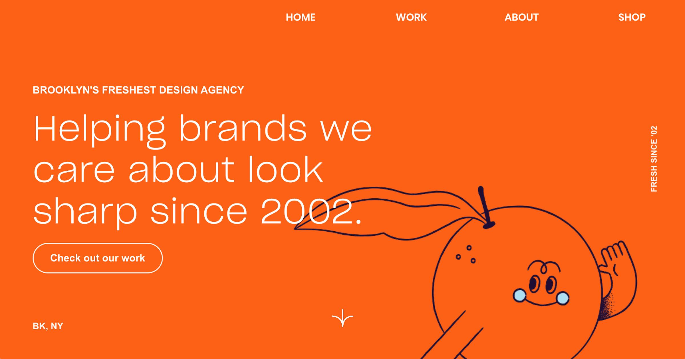

User reviews (0)