
 简体中文
简体中文 English
Website review
This review may include AI-generated content and is not individually verified. Domain, certificate and other facts come from the observed data on this page.
What is Polypane?
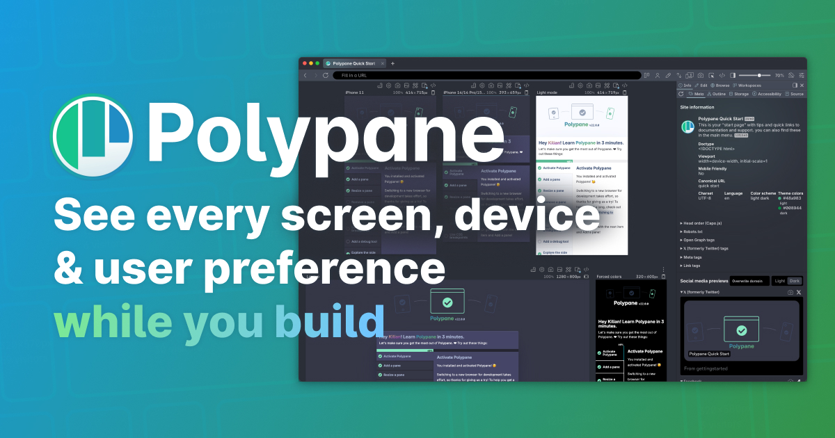
Polypane is a Chromium-based web browser built specifically for people who develop websites, rather than for general browsing. It keeps the normal browser features and layers on tools aimed at building responsive, fast, accessible and search-engine-friendly sites. The core idea from the page is "Build, don't browse": you check your site continuously while you work, so problems surface during development instead of at QA or in production.
H3 What it actually does
- Synchronized multi-viewport previews. You see many breakpoints at once, from mobile to 5K, and scrolling or interacting in one view is mirrored across the others. The page describes this as "every breakpoint visible and synchronized."
- Live feedback while editing. Change your code and the update appears across all the previewed devices, which shortens the edit-check cycle.
- Built-in accessibility checks. Accessibility is evaluated as you build, rather than only in a separate audit later.
- Preference and appearance views. Dark mode, light mode, high contrast and reduced motion can be shown side by side, so you see what different users see.
- Link previews before shipping. The page mentions link previews as one of the things you can verify before publishing.
H3 Who it suits
- Front-end developers and UI engineers who spend the day in DevTools and want fewer manual window resizes.
- Teams that need to catch responsive and accessibility issues early, when fixes are cheap.
- Freelancers or small teams who would otherwise stitch together several extensions and testing tools.
It is less obviously aimed at people who just want a fast everyday browser, or at backend work with little visual output.
H3 How it differs from mainstream browsers
| Typical browser (Chrome, Firefox, Safari) | Polypane |
|---|---|
| Resize the window or drag DevTools to test breakpoints | Multiple synchronized viewports visible at once |
| One viewport, one change at a time | Edits propagate live across all previewed devices |
| Limited or no built-in accessibility tooling | Accessibility checked as you build |
| Preference modes tested separately | Dark, light, high contrast and reduced motion shown together |
The trade-off is straightforward: you adopt a separate browser for development work, and in exchange you get a continuous, multi-viewport view of your site. The page includes a free 14-day trial with no credit card required, and a pricing page for the paid plans.
H3 A concrete scenario
You are fixing a card component that looks fine on desktop but crowds on tablets. In a normal browser you resize, check, resize again, and maybe miss the awkward width between two breakpoints. In Polypane you would have mobile, tablet and desktop visible together, scroll them in sync, and see the spacing problem the moment it appears. One developer quoted on the page, Sara Soueidan, describes exactly this: spotting a spacing issue between two breakpoints she had not been aware of.
H3 Next step
If you build front-end interfaces regularly, start the free trial and open a project you already know well rather than a toy page. Watch for two things: whether the synchronized viewports genuinely replace your resize-and-refresh habit, and whether the accessibility feedback catches issues your current workflow misses. If both hold up on real work, the paid plan is worth evaluating against the cost of the tools it replaces.
For comparison or context, see Polypane and, if you want to weigh alternatives, Chrome DevTools documentation covers the built-in tooling you may already rely on.
How does Polypane's multi-viewport synchronized preview help me catch responsive design issues before QA?
Polypane's multi-viewport synchronized preview means you see several breakpoints at once, side by side, in the same browser window. Instead of resizing one viewport and hoping you remember how the last one looked, you watch all of them react to the same edit simultaneously. That turns responsive bugs from something you discover at QA into something you notice the moment it appears.
What that looks like in practice
- You set up the breakpoints you care about (mobile, tablet, a couple of desktop widths) as separate panes.
- You scroll one pane and the others follow, so you compare the same region of the page across widths.
- You edit your CSS; every pane repaints live, so a change that fixes the mobile layout but breaks the tablet layout is visible immediately.
- Polypane also shows user-preference variations like dark mode, light mode, high contrast and reduced motion at the same time, which is where responsive and theming bugs often hide.
Why it catches issues earlier
The classic failure mode is a spacing or overflow problem that only appears between two breakpoints you happened to test. Sara Soueidan, a front-end engineer and trainer, noted that Polypane helped her spot a spacing issue between two breakpoints she wasn't aware of. That's the core value: continuous side-by-side comparison exposes the in-between states that manual resizing skips.
Vivian Guillen, frontend developer and curator at Tailwind Weekly, described the synchronized scrolling as working "amazingly," and Scott Tolinski of Syntax.fm called it his new favorite development tool. Those are their impressions, not benchmarks — but they point at the same practical benefit: you spend less time re-testing and more time fixing.
A concrete scenario
Say you're building a pricing card grid. On mobile it stacks, on tablet it's two columns, on desktop it's four. With one viewport you'd check each width in sequence and might miss that at 900px the card titles wrap and push the CTA button out of alignment. With all three panes visible, you see the misalignment the instant you change the grid gap.
How to decide if it fits your workflow
| Situation | Multi-viewport preview helps most when… |
|---|---|
| You build responsive layouts daily | You want to validate several breakpoints per edit, not per QA cycle |
| You work with design systems | You need to confirm components hold up across widths and themes |
| You ship to varied devices | You want early warning on overflow, wrapping and spacing drift |
| You mainly fix backend logic | A standard browser plus dev tools may be enough |
Next step
Pick the three breakpoints where your layout changes most, set them up as panes, and make one CSS edit that affects spacing. If you can see the effect everywhere at once without touching a resize handle, the tool is doing its job. Polypane offers a 14-day free trial with no credit card, so you can test that against a real page before committing. More detail is at Polypane.
Can Polypane replace Chrome, Firefox, or Safari for my daily development workflow?
Yes, for most front-end development work — but not for every browsing task. Polypane is a Chromium-based browser built specifically for building and testing websites, so it can serve as your primary development browser while you keep a general-purpose browser for everything else.
Where it genuinely replaces a normal browser
- Multi-viewport previews. Instead of resizing one window or juggling separate browser profiles, you see several breakpoints side by side and scroll them in sync. This is the core difference from Chrome, Firefox or Safari, and it's what makes it practical to use as your working browser rather than an occasional testing tool.
- Continuous checking while you build. Accessibility, structure and metadata feedback appear as you work, so problems surface during development rather than at QA. Polypane's own framing is "build, don't browse" — it assumes you're editing code, not reading articles.
- User-preference views. Dark mode, light mode, high contrast and reduced motion can be viewed simultaneously, which is awkward to replicate with standard dev tools.
- Link previews. Checking where a link points before shipping is built in.
Where you'll still want Chrome, Firefox or Safari
- Cross-engine verification. Polypane is Chromium-based, so it cannot tell you how your site behaves in Firefox's Gecko or Safari's WebKit. If your audience includes Safari users — and for consumer sites it usually does — you still need real Safari, or at least a WebKit-based check.
- Everyday browsing, personal accounts, extensions and password managers tied to another browser.
- Browser-specific quirks, including features that only exist or fail in one engine.
What developers using it say
Front-end engineer Sara Soueidan noted that Polypane helped her spot a spacing issue between two breakpoints she hadn't been aware of — the kind of gap that hides between preset device widths. Kevin Powell described the debugging tools as impressive, and Scott Tolinski called it his new favourite development tool. These are individual impressions from people who work in CSS and front-end tooling, not benchmark results. My read: the recurring theme is catching problems earlier, which matters most if your current workflow involves a lot of manual resizing and late-stage QA.
A practical way to decide
| If your work is mainly… | Polypane as daily driver? |
|---|---|
| Component and layout work across breakpoints | Yes — strongest fit |
| Accessibility and responsive audits | Yes, as a first pass |
| Sites that must work in Safari or Firefox | Partly — pair it with those browsers |
| General browsing, email, personal accounts | No |
A sensible setup is Polypane as the browser you keep open while coding, plus one Chromium browser, Firefox and Safari installed for final cross-engine checks. Start with the free 14-day trial and run it against a real project for a few days; if you find yourself resizing windows out of habit, that's the signal it's worth keeping. See Polypane for the current feature set and trial terms.
How does Polypane check accessibility while I build, and what issues can it catch?
Polypane runs accessibility checks continuously against the pages loaded in its synchronized viewports, rather than as a separate audit step. As you edit and reload, the browser surfaces issues in the same workspace where you see your breakpoints, so problems appear next to the layout they affect instead of in a report you review later.
What the page evidence supports
- Accessibility is described as "checked as you build" and as part of the same continuous feedback loop as structure and metadata.
- It is listed alongside responsive previews, link previews and user-preference views (dark mode, light mode, high contrast, reduced motion) as a core capability of the browser.
- The comparison against Chrome, Firefox and Safari frames missing accessibility issues as a blind spot of one-viewport-at-a-time workflows.
What that means in practice
The practical value is timing. Accessibility defects are cheapest to fix while you are still in the component you just wrote, and most expensive when they are found in QA or production. A browser that flags them during development turns them into ordinary build feedback rather than a discrete compliance project.
It also pairs naturally with the multi-viewport model. Many accessibility failures are conditional — a control that is fine at desktop width but unreachable or overlapping on a narrow screen, or text that only fails contrast in one theme. Seeing the states side by side makes those conditional failures visible instead of hidden behind a resize.
Where the evidence stops
The page does not enumerate specific rules, conformance level or which standards it checks against, so treat the exact rule coverage as something to verify rather than assume. Automated tooling in general catches structural and attribute-level problems well and cannot judge whether your alt text is meaningful or your focus order is logical.
A concrete next step
Take one component you know is imperfect — a modal, a custom dropdown or a form with error states — and build it in Polypane with a narrow viewport, a wide viewport and a high-contrast or reduced-motion view open at once. Note which issues appear automatically and which you only find by tabbing through manually. That split tells you how much of your accessibility work the tool removes and how much still depends on your own testing.
For context on the underlying standards, W3C publishes the Web Content Accessibility Guidelines, and WebAIM offers practical checklists that pair well with in-browser tooling.
Does Polypane offer a free trial, and how much does it cost after the trial?
Yes. Polypane offers a free 14-day trial with no credit card required, so you can evaluate it before paying anything. The site links to a pricing page for current plan costs, but the exact post-trial price isn't stated in the information provided here.
What this means in practice
A 14-day no-card trial suits a focused evaluation: point Polypane at a real project you're already building and see whether its multi-viewport, synchronized previews change your workflow. The trial window is long enough to cover a full feature or bug-fix cycle, which is usually a better test than a quick click-through of the interface.
How to decide after the trial
- If you regularly resize windows or juggle devices to check breakpoints, a tool that shows them side by side and syncs scrolling is likely to save time on most tasks.
- If accessibility and SEO checks are usually deferred to QA, catching them during development is the main value proposition.
- If your work is mostly single-viewport or you already have a smooth review process, the benefit will be smaller.
Next step: check the official pricing page for the current cost and plan terms, then decide before the trial ends.
Polypane
How does Polypane help with SEO-friendly website development, such as link previews and metadata checks?
Polypane approaches SEO as a build-time check rather than a post-launch audit. Its page evidence highlights structure and metadata inspection alongside link previews, so you can catch problems in the same window where you write code instead of discovering them in a crawler report weeks later.
H3 What it actually covers
- Metadata checks while you build. Polypane describes "structure, metadata, accessibility" with "instant feedback while you work," so title tags, meta descriptions and similar head elements can be reviewed as part of your normal editing loop.
- Link previews before you ship. The page lists "Link previews before you ship" as a feature, which is aimed at how a URL renders when shared on social and messaging platforms — the og: and twitter: card data, image, title and description.
- Multi-viewport context. Because every breakpoint is visible and synchronized, you can confirm that metadata-driven layouts and above-the-fold content behave sensibly across sizes, not just on your current window width.
H3 Where it fits and where it doesn't
Polypane is a Chromium-based browser, so it is a development tool. It helps you avoid shipping broken metadata and misleading link previews; it does not replace crawling, indexing, ranking or backlink analysis. Treat it as the first line of defence, not the whole SEO stack.
A practical split:
| Job | Polypane | Dedicated SEO tooling |
|---|---|---|
| Catch missing or duplicated meta tags during development | Yes | Usually after deploy |
| Preview social cards for a specific URL | Yes | Sometimes, as an add-on |
| Crawl hundreds of pages, track rankings, monitor backlinks | No | Yes |
H3 A concrete workflow
If you maintain a marketing site or a docs site with many templates, set up your viewports once, then open a page you have just edited. Check the head section and the link preview panel before you commit. For a page whose social card matters — a launch post, a pricing page, a changelog entry — this takes seconds and prevents the embarrassing "no image, generic title" share. For site-wide issues such as canonical tags, sitemaps or duplicate content across hundreds of URLs, pair it with a crawler; for example, Google Search Central documents how Google handles indexing and structured data, which is the right reference for the rules you are checking against.
Decision criterion: adopt Polypane for SEO work if your bottleneck is noticing metadata and preview problems early; keep separate crawling and analytics tooling if your bottleneck is measuring results across a large site.
 DigitalOcean, LLC
 Fastmail
 Amsterdam, North Holland, The Netherlands

User reviews (0)