

 Visit website
 Updated: 2026-10-03 18:34
 Language: English (default)
 Access: Normal
 Profile views 1
  Outbound visits 0
 Website Review
What is Screenshot Beautifier Pro?
Screenshot Beautifier Pro is a Chrome extension that turns ordinary browser screenshots into polished, presentation-ready mockups without leaving the browser. You capture or upload an image, apply a background, shadow, tilt, and padding, then export a high-resolution PNG.
What it does
- Transforms plain screenshots into visuals suitable for social posts, landing pages, and product docs.
- Offers four input methods: capture the active tab, drag a region, upload an existing image, or paste from the clipboard.
- Provides styling controls including gradient and solid backgrounds, adjustable shadow blur/spread/opacity, 3D tilt, and custom padding.
- Includes a watermark option for adding a name or brand footer.
- Exports in one click as a 2× PNG, with sizes for 1:1, 16:9, 9:16, 4:5, or auto-fit.
Who it's for
Developers, designers, and makers who need clean screenshots quickly but don't want to open a full design tool. It fits workflows where you're already in Chrome and want to publish a screenshot to Twitter, LinkedIn, or a product page immediately.
Trade-offs to weigh
The extension's advantage is speed and staying inside the browser. If you need layered compositions, typography control, or multi-element layouts, a dedicated editor like Figma is still the better fit. The 2× PNG export is convenient for sharing, but check whether that resolution meets your needs for print or very large displays.
A practical next step: install it, capture a tab, shuffle through the gradient presets, and export one image for a platform you actually post to. That single test will tell you whether the styling controls are enough for your typical screenshots.
For broader context on browser-based capture tools, you can compare with Figma if you need full design editing.
How do I create a professional mockup from a screenshot in Chrome?
Use a Chrome extension that keeps capture and styling in the same tab. Screenshot Beautifier Pro is built for exactly this: it captures the active tab, a selected region, a pasted image or an uploaded file, then applies background, shadow, tilt and padding before exporting a 2× PNG. The workflow is three steps — capture, style, export — so you can go from raw screenshot to share-ready visual without opening Figma or Photoshop.
H3 A practical workflow
- Capture the tab or region you want. If the screenshot already exists, paste it from the clipboard or upload it.
- Choose a background: a gradient preset or a solid colour. Use the shuffle option if you want to browse combinations quickly.
- Adjust the details that make a mockup read as intentional: shadow blur, spread and opacity; padding; and a subtle 3D tilt if you want depth.
- Add a footer watermark if the image is going somewhere your brand should travel with it.
- Export at 2× PNG and pick an aspect ratio — 1:1, 16:9, 9:16, 4:5 or auto-fit — based on where it will be posted.
H3 Which background and tilt to pick
- Product pages and landing pages: light gradient, soft shadow, modest padding, no tilt. The goal is clarity, not drama.
- Social posts (Twitter/X, LinkedIn): stronger gradient, more padding, slight tilt. The image needs to stop a scroll.
- Documentation and help articles: solid neutral background, minimal shadow, no tilt. Consistency matters more than flair.
- App store or presentation slides: match the platform's aspect ratio first, then style.
H3 What users report Reviewer Roko Bojanic called it useful for making screenshots look cleaner quickly and noted it works for product screenshots, landing page visuals and social posts, adding that the creator is open to feedback. Allwin Jeba said a professional-looking, share-ready screenshot took just a few clicks. Both are describing speed and low friction rather than deep design control.
My take: that matches the tool's positioning. It is a finishing tool, not a design suite. If you need layered compositions, custom typography or brand-perfect vector work, you will still want a full editor. If you mostly need to stop shipping bare browser screenshots, the in-Chrome loop saves real time.
H3 A concrete scenario You are writing a launch post and have a screenshot of your new dashboard. Capture the tab, apply a gradient that matches your brand, add a soft shadow and a little padding, skip the tilt for a cleaner look, then export at 16:9 for the post and 1:1 for a secondary crop. That is a few minutes of work instead of a detour into a separate design app.
H3 Decision criterion Choose this approach when the screenshot is the subject and you only need presentation polish. Choose a full design tool when the mockup is part of a larger composition — device frames, annotations, multiple panels or custom type.
Next step: install the extension from its Chrome Web Store listing, capture one real screenshot you owe someone, and export it at the aspect ratio of the place you will publish it. If the result feels close but not right, adjust padding and shadow before touching the tilt — those two settings do most of the work.
Can I use Screenshot Beautifier Pro without design skills or Figma?
Yes. Screenshot Beautifier Pro is built for exactly that situation: its own heading says "No design skills required. No external apps," and the workflow is described as three steps — capture, style, export. You pick a preset gradient or solid background, adjust sliders, and export. You never open a separate design tool.
H3 What you actually control
- Backgrounds: dozens of curated gradients plus solid colors, with a one-click shuffle for new combinations.
- Depth: three shadow styles with adjustable blur, spread and opacity; optional 3D tilt; padding sliders for whitespace.
- Branding: an optional footer watermark for your name or brand.
- Export: one-click 2× PNG in 1:1, 16:9, 9:16, 4:5 or auto-fit.
H3 Where the "no Figma" claim holds and where it doesn't
| Task | Fine here | Better in a full design tool |
|---|---|---|
| Polishing a screenshot for a post or docs page | Yes — gradients, shadows, tilt, padding | Overkill |
| Consistent set of 20 images for a launch | Yes, if presets cover your look | Better if you need shared templates and version history |
| Custom illustration, layered annotation, typography | Not the point of the tool | Yes |
H3 A realistic first run
You already have a screenshot from a bug report or a landing-page test. Instead of opening Figma, capturing the tab or pasting from the clipboard, choosing a gradient, nudging padding and shadow, then exporting a 2× PNG in the aspect ratio your target platform wants. That is a two-minute job.
H3 How to decide
If your goal is "make this screenshot look intentional and on-brand," the extension is enough. If your goal is "produce a designed marketing asset with custom type and layout," pair it with a real editor. Reviewers quoted on the page — Roko Bojanic and Allwin Jeba — describe the same experience: few clicks, share-ready results, useful for product screenshots, landing page visuals and social posts.
Next step: install it, run one screenshot through all four capture methods (tab, region, upload, clipboard) to see which fits your routine, then save your preferred gradient, shadow and padding as your default look before exporting at 2×. For comparison, browser-based editors like Figma or Canva handle the heavier design work when a screenshot needs more than styling.
What export sizes and formats does Screenshot Beautifier Pro support for social media?
Screenshot Beautifier Pro exports 2× PNG images and lets you pick from several preset aspect ratios before exporting: 1:1, 16:9, 9:16, 4:5, or auto-fit. Those ratios map cleanly onto the places most people share screenshots — a square or 4:5 crop for feed posts, 16:9 for embedded product shots and landing page visuals, and 9:16 for vertical stories or short-form video frames. The 2× resolution means the exported PNG has double the pixel dimensions of the captured area, so it stays crisp when scaled up in a feed or on a retina display.
Practical notes on the format
- PNG only, as described. That is the right choice for UI screenshots: text and thin borders stay sharp, and there is no JPEG ringing around high-contrast edges. The trade-off is file size — a large 2× export can be several megabytes, which matters if you are attaching it to email or uploading to a platform with a tight limit.
- Ratio presets instead of free-form canvas sizing. This is faster than resizing manually, but if a platform wants an exact pixel dimension you may still need a final crop elsewhere.
- Background and styling are baked into the export. Gradients, shadows, 3D tilt, padding and the optional watermark all become part of the PNG, so there is no layered source file to re-edit later. Keep your original raw screenshot if you might want a different treatment.
A concrete workflow
Say you are writing a launch post for a web app. Capture the active tab, apply a gradient background and a soft shadow, set the ratio to 16:9 for the blog header and export at 2×. Then switch to 1:1 or 4:5 and export again for the social version — same styling, two crops, no re-editing. If you need a vertical story, switch to 9:16 and export a third time.
How to decide
If your main need is fast, consistently styled screenshots for a handful of standard social ratios, the built-in presets cover that without leaving Chrome. If you need exact custom pixel dimensions, layered files for a design team, or formats like WebP or SVG, plan on a dedicated editor as a follow-up step. For a fuller look at what the extension does beyond export, see Screenshot Beautifier Pro.
How do I add my own branding or watermark to a screenshot?
Screenshot Beautifier Pro handles this with a built-in "Custom Branding Watermark" feature: you add your name or brand as a footer watermark and toggle it on or off per export. Because the watermark lives inside the same editor where you style the background and shadows, you get a consistent look without opening a separate design app.
Practical workflow
- Get your screenshot in — capture the active tab, drag a region, upload an image, or paste from the clipboard.
- Style the background (gradient or solid), then adjust shadow, padding, and optional 3D tilt.
- Turn on the watermark and enter your brand text, positioned as a footer.
- Export as a 2× PNG and choose a ratio (1:1, 16:9, 9:16, 4:5, or auto-fit).
When this is the right approach
- You post the same screenshot across Twitter, LinkedIn, and a product page and want one recognizable footer.
- You want the branding to sit on the padded background rather than covering the UI you're showing.
- You're producing many screenshots quickly and don't want a per-image trip to Figma.
Trade-offs to weigh
- A footer watermark is text-based, so a full logo lockup or multi-element brand kit may need a different tool.
- If you also want to keep a clean, unbranded copy, remember to toggle the watermark off before that export.
- Check how the footer reads at small sizes — a 1:1 crop gives it less room than 16:9.
Reviewer Roko Bojanic noted it is "simple to use, saves time, and works well for product screenshots, landing page visuals, and social posts," and Allwin Jeba said a professional-looking, share-ready screenshot took only a few clicks — both consistent with a lightweight in-browser branding step rather than a full design suite.
Next step: decide your watermark format first — a short handle like "@yourbrand" or a plain site name usually survives resizing better than a long tagline, so set that text before you start styling.
Is Screenshot Beautifier Pro free to use?
Yes, Screenshot Beautifier Pro is free to use, according to its own page. The extension is presented as free with no account or signup mentioned, and the workflow is entirely inside Chrome: capture or upload an image, style it, and export a 2× PNG.
What "free" covers here
- All four capture methods: active tab, region select, image upload, and clipboard paste
- The styling controls: gradient and solid backgrounds, shadow blur/spread/opacity, 3D tilt, and padding
- One-click export at 2× PNG in 1:1, 16:9, 9:16, 4:5, or auto-fit
- The branding watermark toggle
That makes it a reasonable fit if you need occasional polished screenshots for docs, a landing page, or social posts and don't want to open a full design tool each time.
A practical caveat
"Free" and "free forever" are not the same claim. The page does not list a paid tier or pricing page, so there's no visible upsell to compare against — but a free Chrome extension can still change terms later. If you plan to rely on it for recurring client work, treat it as a convenience tool rather than a locked-in part of your workflow, and keep your original unedited screenshots so you can re-export elsewhere if needed.
Next step
Install it, run one real screenshot through the full path (capture → style → export), and check the exported PNG at 2× in the size you actually publish. If the output holds up at that size, the free tier is doing the job. If you need finer typography or layout control around the image, a dedicated design tool will still be the better home for that work.
 Hosting and Email
 Namecheap
 Hosting
 Vercel
 Location
 United States
 Pages, Search and Sharing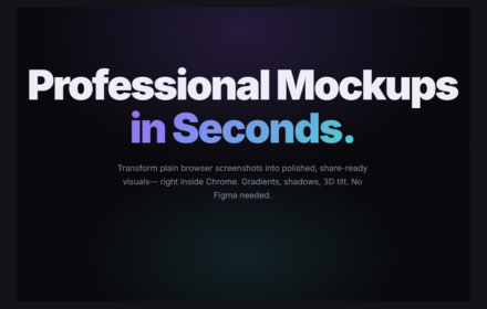


.png)
 Registration details

 Identified technologies
User reviews (0)