
 简体中文
简体中文 English
Website review
This review may include AI-generated content and is not individually verified. Domain, certificate and other facts come from the observed data on this page.
What is Search by Muzli?
Search by Muzli is a design-inspiration and color-palette tool at Search by Muzli. Its focus is on searching, discovering, testing and creating color palettes for design projects, rather than acting as a general-purpose search engine.
What you can do with it
- Search for color combinations and palette ideas to use as a starting point.
- Browse discovered palettes for inspiration when a project's direction is still open.
- Test colors against each other before committing them to a design.
- Create your own palettes rather than only copying existing ones.
Who it suits
It is most useful to people who make visual decisions regularly: UI and web designers choosing a product's color system, brand designers exploring directions, and developers or marketers who need a quick, coherent scheme for a landing page or slide deck. If you already have a fixed brand palette and just need hex codes, a simpler color picker may be faster.
How it compares
| Need | Search by Muzli | General color picker |
|---|---|---|
| Find inspiration | Search and discovery of palettes | Usually none |
| Build a palette | Create and test combinations | Pick and adjust single colors |
| Best for | Early exploration | Precise, known adjustments |
A practical next step: start from a search around the mood you want, such as "warm minimal" or "dark dashboard", then test two or three candidate palettes side by side on a real screen. Judge them in context — a palette that looks balanced as swatches can behave differently once text, buttons and backgrounds are involved. For broader visual research alongside palette work, Dribbble and Behance are useful companions.
How can I find color palettes that match my brand's existing colors?
Start with a color you already own: pull the exact hex values from your brand guidelines, logo file or website CSS, then search those values on a palette tool and let it suggest harmonious neighbors. Search by Muzli is built for this kind of exploration — its stated purpose is to search, discover, test and create color palettes — so it works as a place to audition combinations rather than as a brand-asset manager.
A practical workflow
- Extract, don't eyeball. Open your logo in an image editor or inspect your site's stylesheet to get true hex codes. Screen-picked colors drift.
- Identify the anchor. Decide which one or two colors are non-negotiable (usually the primary brand color plus a neutral).
- Search variations around the anchor. Look for palettes that contain your primary or something close to it, then note which supporting colors repeat across results.
- Test in context. Drop candidates onto a real layout — buttons, body text, a chart — instead of judging swatches in isolation.
- Check accessibility. Verify text-on-background contrast before committing; a palette that looks elegant can still fail readability.
What to look for in a matching palette
| Goal | What to prioritize |
|---|---|
| Extend an existing brand | Keep your primary hue fixed; vary saturation and lightness |
| Add an accent | Choose a hue roughly opposite or triadic to your primary |
| Build a UI system | Ask for tints and shades, not just one accent |
| Seasonal or campaign work | Temporary accents that leave the core palette untouched |
Trade-offs to weigh
Palette generators optimize for harmony, which can push you toward colors that feel pleasant but generic. Brand recognition usually comes from consistency, so a slightly less "balanced" palette that preserves your signature color often beats a mathematically prettier one. If your brand color is highly saturated, resist pairing it with another equally loud hue; use neutrals and one accent instead.
For cross-checking against established color theory while you test, Adobe Color and Coolors are widely used for the same task, and Contrast Ratio helps confirm legibility.
Next step: open your brand's primary hex in a palette search, save three candidate palettes, and apply each to the same mock screen. The one that keeps your logo and key calls-to-action instantly recognizable is your answer.
What are the best ways to test how a color palette looks on a real UI design?
The most reliable way to test a palette on a real UI is to stop looking at swatches and start looking at screens: apply the colors to representative components (navigation, buttons, form fields, cards, tables, alerts, disabled states) and judge them in context, at real size, on the devices your audience actually uses.
Practical testing workflow
- Build a one-screen stress test. Take your most color-heavy screen and recolor it: primary action, secondary action, destructive action, links, hover and focus states, success/warning/error banners, and disabled controls. If the palette can't separate these roles, it will fail in production.
- Check contrast with a calculator, then with your eyes. Run text/background pairs through a contrast checker (WCAG AA needs 4.5:1 for body text, 3:1 for large text and UI boundaries). Then view them on a cheap laptop screen and a phone outdoors — ratios pass, but glare and low-quality panels still make light gray text vanish.
- Test in grayscale. Desaturate the mockup. If hierarchy collapses — buttons and background merge, states become indistinguishable — you're relying on hue alone. Add lightness or weight differences.
- Test states, not just the default. Hover, active, focus ring, selected, error, and disabled are where palettes break. A brand color that looks elegant at rest often turns muddy on hover or invisible as a focus outline.
- Test with real content. Swap lorem ipsum for long labels, numbers, and dense data. Saturated accents behind dense text are far harder to read than the same color behind a headline.
- Test with other people. Show the screen for five seconds and ask what the main action is. If they hesitate, the palette isn't doing its job.
Where a palette tool fits
Search by Muzli is useful for the early, generative part of this loop: you can search and discover palettes and preview combinations before committing to a direction. Treat it as a source of candidates, not a verdict — a palette that looks good in a browser preview still has to survive the component and state tests above. For contrast verification specifically, a dedicated accessibility checker is the better instrument, and for turning a chosen palette into tokens, a design tool or a CSS variable set is where the real test happens.
Quick decision criteria
| Test | What it tells you | Fails when |
|---|---|---|
| Contrast check | Legibility of text and boundaries | Body text below 4.5:1 |
| Grayscale pass | Whether hierarchy survives without hue | Elements merge into one tone |
| State matrix | Whether interactive feedback is clear | Hover/focus/disabled look alike |
| Real content | Performance under density | Accents fight dense text |
| Device check | Behavior on poor screens | Colors only work on a good monitor |
A sensible next step: pick two or three candidate palettes from a discovery tool, apply all of them to the same single screen, and compare them side by side under the five tests above. The palette that wins on the ugliest screen — not the prettiest mockup — is usually the one that holds up in a shipped product.
How do I create a custom color palette from a photo or image?
The straightforward route is to let a tool sample the image for you, then refine the result by hand. Search by Muzli is built around searching, discovering, testing and creating color palettes for projects, so it fits the "start from an image, then adjust" workflow better than a tool that only generates random combinations.
A practical workflow
- Pick a clean source image. Strong, distinct colors and moderate contrast give better extraction than a busy photo with heavy shadows or filters.
- Extract the dominant colors. Automated sampling typically clusters the image's pixels and returns a handful of representative tones. Expect it to surface the colors that cover the most area, not necessarily the ones you noticed first.
- Crop or re-sample if the result misses. If a small but important accent (a sign, a flower, a garment detail) doesn't appear, crop the image to that region and extract again. This is usually faster than dragging sliders.
- Assign roles, don't just collect swatches. Decide which color is the background, which is the primary brand or UI color, and which is the accent. A palette of five equally weighted colors is hard to use; a palette with one dominant, one supporting and one accent is easy.
- Test it in context. Place the colors behind real text and real interface elements. Check contrast between text and background before committing, and view the palette at small sizes, where subtle differences disappear.
- Save and name it. Keep the hex values with the palette so you can reuse it consistently across a site, deck or illustration set.
Where this approach works well and where it doesn't
| Situation | Extraction from a photo | Better alternative |
|---|---|---|
| You have a mood image or brand photo | Fast, gives an authentic starting point | — |
| You need accessible text/background contrast | Extracted colors often fail contrast checks | Adjust lightness manually after extraction |
| You need a precise brand color | Sampling introduces slight shifts | Enter known hex values directly |
| The image is heavily filtered or low quality | Results skew muddy or repetitive | Use a cleaner source image |
Choosing a starting point
If your goal is a website or app interface, start from a photo only for the feel, then convert each extracted color into a usable UI token: a background, a surface, a text color and one accent. If your goal is illustration or branding, the extracted set can stay closer to the original, since exact contrast matters less there.
For comparison, Adobe Color at Adobe Color offers extraction from an uploaded image with harmony rules applied, and Coolors at Coolors lets you generate and lock individual colors while building a scheme. Both are useful when you want more manual control than a single extraction pass gives you.
A concrete next step: take one image you already like, extract five colors, then delete two of them. Working with three forces you to decide what each color is actually for, which is the part that makes a palette usable rather than just attractive.
Which color combinations work best for accessible web design?
The most reliable accessible combinations are the ones with a large lightness gap between text and background, not just a pleasing hue pairing. Black or near-black text on white or off-white, dark navy on pale grey, and white on a deep saturated colour (such as burgundy, forest green or indigo) all tend to pass contrast checks at normal body sizes. Low-contrast favourites like light grey text on white, yellow on white, or mid-tone blue on mid-tone purple usually fail.
What to aim for in practice
- Body text: target a contrast ratio of at least 4.5:1 against its background. This is the common WCAG AA threshold for normal-size text.
- Large text (roughly 24px regular or 19px bold): 3:1 is the usual minimum, which gives you more freedom with mid-tone colours.
- Interactive elements and icons: keep a 3:1 contrast against adjacent colours so buttons, focus rings and input borders remain visible.
- Never rely on colour alone: pair colour with a label, icon, underline or shape change so red/green status indicators still read for colour-blind users.
Combinations that tend to hold up
| Use case | Works well | Watch out for |
|---|---|---|
| Long-form body text | Near-black on white or cream | Pure black on pure white can feel harsh; slight softening is fine if contrast stays high |
| Dark-mode UI | Off-white or light grey on charcoal | Pure white on pure black causes halation for some readers |
| Primary buttons | White text on a dark brand colour | Yellow, lime and pale cyan backgrounds need dark text instead |
| Links in body copy | Dark blue, underlined | Blue that is too close to the body-text colour becomes invisible |
| Charts and data | Distinct lightness steps plus patterns | Rainbow palettes where hues differ but lightness does not |
A concrete workflow
Pick your brand hue first, then derive a darker and lighter version by adjusting lightness rather than saturation alone, and test each pairing before committing. Tools that generate and check palettes make this fast: Search by Muzli lets you search, discover and test colour palettes for projects, which suits the exploration stage when you want several candidate schemes side by side. For verification, run the final pairs through a contrast checker and confirm the ratios rather than trusting how they look on your own monitor.
A useful decision rule: if squinting at the screen makes text blur into its background, the pairing is too close regardless of what any ratio says. Also test on a dimmed phone screen outdoors, since low-contrast grey-on-grey designs often look acceptable on a bright desktop and fail everywhere else.
Can I export a color palette directly into design tools like Figma or Sketch?
Search by Muzli is built around finding and testing color palettes in the browser, not around pushing them into Figma or Sketch with a plugin or one-click sync. Expect to copy color values and recreate the palette in your design tool rather than export a native palette file from this site.
What that means in practice
- Figma: You can add colors as local styles or variables by pasting each hex value. There is no documented direct integration from this site.
- Sketch: You can save colors as document or global presets by entering the hex codes manually. Again, no documented direct integration from this site.
- Other tools: The same copy-and-paste approach works in Adobe XD, Illustrator, Affinity Designer and most CSS workflows.
A practical workflow
- Build and preview the palette on Search by Muzli.
- Copy each hex value.
- In Figma, create a paint style or variable per color and name it by role (for example, "brand/primary", "surface/muted") rather than by hue.
- In Sketch, add the same values to your color presets so the palette travels with the document.
How to decide
If your priority is exploring and testing palettes quickly, browser-based search is fine and the manual handoff is a few minutes of work. If your priority is a palette that updates across a whole design system automatically, look for a tool with a real Figma or Sketch plugin instead. For a one-off project palette, manual entry is usually faster than setting up an integration.
 Cloudflare
 Google Workspace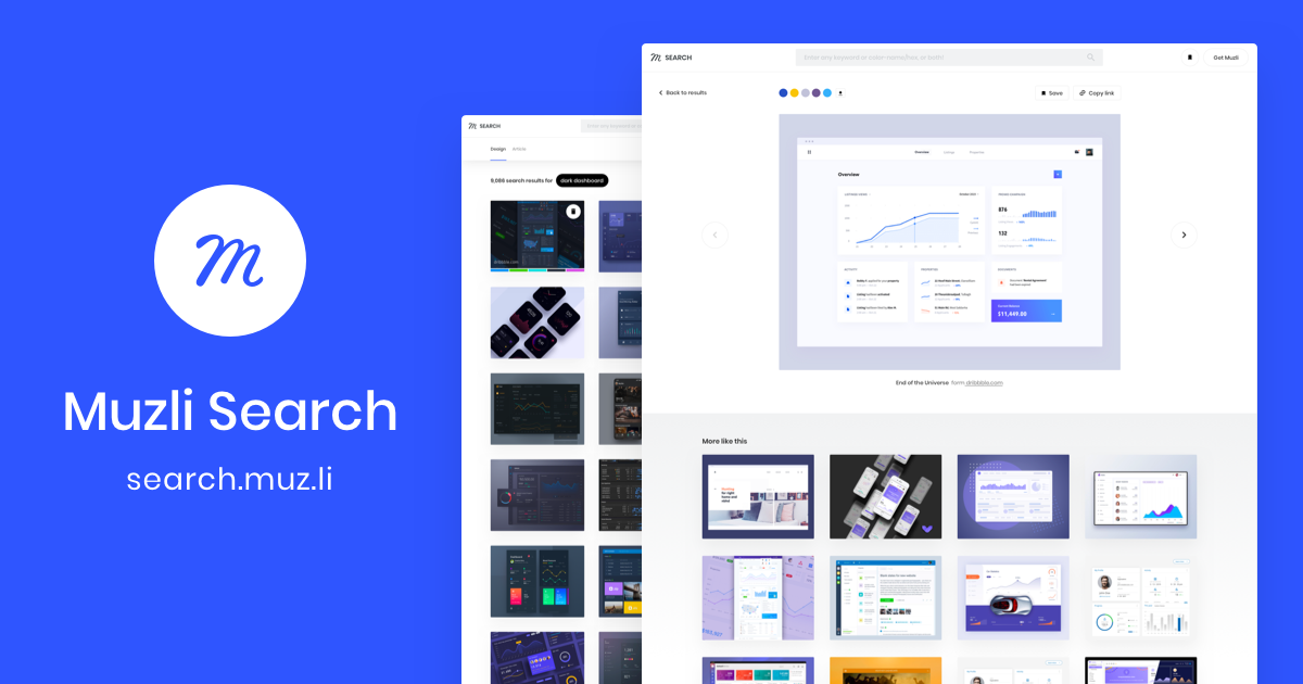

User reviews (0)