
 简体中文
简体中文 English
Website review
This review may include AI-generated content and is not individually verified. Domain, certificate and other facts come from the observed data on this page.
What is useAnimations?
useAnimations is a free library of 300 animated icons for interfaces. Instead of static SVGs, each icon ships with a built-in micro-interaction—hover, click, loop, or replay—so it moves the way it was designed to without extra animation work. It is MIT licensed and offered as React components, shadcn/ui additions, or downloadable SVG and Lottie JSON files. The project describes a player at roughly 8 kB gzipped with zero dependencies.
What you get
- 300 icons across common UI categories—alerts, notifications, navigation, forms, media, commerce, loading, social, and more.
- Six built-in interactions you select with a prop: loop (continuous, for loaders and ambient status), click-toggle (menu/close, play/pause), click-replay (feedback on every click), hover (forward on enter, back on leave), hover-loop (loops while hovered, finishes on leave), and hover-replay (plays once per enter).
- Multiple delivery formats: a React component via
npm i react-useanimations, shadcn/ui integration, or direct SVG/Lottie JSON downloads. - Styling controls for custom color and size.
Who it suits
| Situation | Fit |
|---|---|
| React or shadcn/ui project needing quick motion polish | Strong—install and import, interactions are preconfigured |
| Designer handing Lottie or SVG assets to a developer | Useful—downloads work outside React |
| Product with strict performance or bundle budgets | Check the player cost against your own budget |
| Team wanting fully custom motion design | Less ideal—you get predefined animations, not a blank canvas |
A practical example: a dashboard that shows a sync status could use interaction="loop" on a loading icon, while a settings menu uses interaction="click-toggle" for the burger-to-close transition—both without writing animation code.
How to decide
Start by browsing the icon set and filtering by interaction type to see whether the specific motion you need already exists. If you are in React or shadcn/ui, the component route is the least effort; if you are on another stack, download the Lottie or SVG and wire up the interaction yourself. The main trade-off is convenience versus control: you get consistent, ready-made micro-animations quickly, but your motion vocabulary is limited to what the library provides.
How do I add animated icons to a React project with useAnimations?
Install the package, import individual icons, and choose an interaction prop. useAnimations ships animated icons as React components with the behavior built in, so you do not wire up keyframes or state yourself.
npm i react-useanimations
import { AlertCircle } from 'react-useanimations';

export default function SaveButton() {
  return <AlertCircle size={24} interaction="hover" />;
}
Pick the interaction that matches the moment
The interaction prop is the main decision. Each icon already knows how it is meant to move, and you can override it with a single prop.
| Interaction | Behavior | Good for |
|---|---|---|
loop |
Plays continuously | Loaders, ambient status |
click-toggle |
Switches between two states | Menu/close, play/pause |
click-replay |
Restarts on every click | Action feedback |
hover |
Forward on enter, back on leave | Navigation, secondary actions |
hover-loop |
Loops while hovered, finishes on leave | Emphasized controls |
hover-replay |
Plays once on each enter | Discoverable accents |
A practical default: use hover for anything in a nav bar or toolbar, click-toggle for stateful controls, and loop only where the user expects motion without interacting. Continuous motion in a dense form will read as noise.
Style and sizing
The components are described as small and accessible, with zero dependencies and a gzipped player around 8 kB. You control color and size, so the icons inherit your design tokens rather than fighting them. For shadcn/ui projects, the library is designed to slot in alongside your existing components; for non-React work, the same icons are downloadable as SVG or Lottie JSON.
A realistic first pass
Start with three icons in one screen: a click-toggle burger menu, a hover chevron in a dropdown trigger, and a loop spinner on a pending request. That covers the three interaction families you will use most, and it shows quickly whether the motion feels right at your sizes.
If you want to browse before installing, the icon index at useAnimations lets you filter by interaction and category, and each icon page shows its code plus SVG, Lottie JSON and ZIP downloads. The same set is also useful for non-React stacks where you would drop in the Lottie file with a player such as Lottie or the SVG directly in markup.
How do I use useAnimations icons with shadcn/ui?
useAnimations ships a shadcn/ui integration path: you add the animated icon as a component and control its motion with an interaction prop rather than writing your own animation logic. The library describes 300 icons, six built-in interactions (loop, click-toggle, click-replay, hover, hover-loop, hover-replay), a gzipped player around 8 kB, zero dependencies and an MIT licence, with output available as a React component, a shadcn addition, or downloadable SVG and Lottie JSON.
The practical workflow
- Install the package with the command shown on the site,
npm i react-useanimations(or your package manager's equivalent). - Import the specific icon you need rather than the whole set, so bundlers only pull in what you use.
- Render it like any React component and pass
interaction="..."to choose the behaviour. The default is whatever interaction that icon was designed for, so a loader icon loops and a menu icon toggles unless you override it. - Style it with your existing system — the site notes custom colour and size, which in a shadcn project usually means passing your Tailwind-driven classes or CSS variables through rather than hard-coding values.
- Use the shadcn route if you prefer owning the source: adding it through shadcn puts the component in your codebase so you can edit it like your other UI primitives. The React package route keeps it as a dependency you upgrade. Choose based on whether you want to fork the code or track upstream.
Choosing an interaction for a real interface
| Situation | Sensible interaction | Why |
|---|---|---|
| Button that submits or refreshes | click-replay |
Confirms the click registered |
| Menu button opening a drawer | click-toggle |
Two states map to open/closed |
| Icon button in a toolbar | hover |
Plays forward, reverses on leave, no state to manage |
| Loading placeholder or status dot | loop |
Continuous motion reads as "working" |
| Card or row the user is considering | hover-replay |
Draws the eye without holding state |
Accessibility and restraint
Animated icons are decoration plus feedback, not information. If an icon conveys a state, keep a text label or aria-label alongside it, and respect prefers-reduced-motion in your own wrapper — a looping icon in a dense table can be genuinely distracting. On a dashboard with twenty rows, one looping icon is a signal; twenty is noise. Reserve continuous motion for things that are actually in progress.
If you want a second animated-icon source to compare interaction models and licensing, LottieFiles is the official home of the Lottie format this library exports to.
What are the differences between the six interaction types like hover, click-toggle, and loop?
The six interaction types decide when an animation plays, not what the icon looks like. Each icon ships with a sensible default, and you can override it with a single interaction prop.
| Interaction | Trigger | Behavior | Typical use |
|---|---|---|---|
loop |
None | Plays continuously | Loaders, ambient status, "syncing" |
click-toggle |
Click | Switches between two states | Menu ↔ close, play ↔ pause |
click-replay |
Click | Restarts from the beginning each click | Confirming an action landed |
hover |
Pointer enter/leave | Plays forward on enter, reverses on leave | Navigation arrows, chevrons |
hover-loop |
Pointer enter | Loops while hovered, finishes its cycle on leave | Attention-seeking but reversible |
hover-replay |
Pointer enter | Plays once from the start on every enter | Repeated, non-reversible feedback |
The practical split is between state-switching (click-toggle), where the icon must communicate which of two states is active, and one-shot feedback (click-replay, hover-replay), where the motion is a confirmation rather than information. hover and hover-loop sit in between: they respond to attention, and hover is the safer choice when the icon also needs to look correct in a static screenshot, since it returns to rest.
For a concrete scenario: a dark-mode toggle in a settings panel wants click-toggle, because the icon must stay in the "on" position after the click. A "refresh" button wants click-replay, because the motion signals that the request was accepted while the icon itself stays put. A decorative arrow in a carousel wants hover, because reversing on leave keeps the interface feeling responsive rather than stuck mid-animation.
Next step: pick the interaction by asking whether the icon represents a state or an event. States get click-toggle; events get click-replay or hover-replay; ambient processes get loop. You can preview all six on the icon pages at useAnimations, where each icon lists its code and downloads for React, shadcn/ui, SVG and Lottie JSON.
Can I customize the color and size of useAnimations icons, and how?
Yes. useAnimations is built to be styled rather than locked down: the page lists a custom color control and a size filter alongside the icon browser, and describes the set as "yours to style." You can recolor and resize icons through the component props in React, or by editing the SVG and Lottie files you download.
How customization works in practice
- In React: install the package (
npm i react-useanimations), import an individual icon, and pass color and size values as props on the component. The page's demo mentions switching the interaction with a single prop, which tells you the API is prop-driven — color and size follow the same pattern. - In shadcn/ui: add the icon through the shadcn workflow, then style it with the same props or with your existing utility classes and theme tokens.
- As files: download SVG or Lottie JSON from an individual icon page and edit the fill/stroke colors or dimensions directly in your design tool or code. This suits static sites, Framer, After Effects or any stack that isn't React.
Choosing an approach
| Your situation | Best route | Trade-off |
|---|---|---|
| React or shadcn/ui app | Component with color/size props | Tied to the package version |
| Non-React stack or email/static HTML | Downloaded SVG | You maintain the file yourself |
| Motion design or video | Lottie JSON | Needs a Lottie player; heavier than SVG |
| Theming across a design system | Props mapped to CSS variables or theme tokens | Requires an initial setup pass |
A concrete case: a dashboard team using shadcn/ui wants alert icons that match their brand red and sit at 20px in a table but 48px in an empty state. They import one icon component, bind color to their destructive token and size to a prop, and get both sizes without duplicating assets. A marketing developer building a static landing page instead grabs the SVG and sets fill in CSS — no React needed.
Next step: open a single icon page on useAnimations, check the code snippet shown there, and confirm the exact prop names before wiring it into your theme.
How can I download useAnimations icons as SVG or Lottie JSON for non-React projects?
Yes. useAnimations is not React-only: on useAnimations, each icon page offers downloads in Lottie JSON, SVG and ZIP alongside the React component, so you can pull assets into plain HTML, Vue, Svelte, native mobile, or a design tool without installing the npm package.
How to get the files
- Open the icon library and search or filter by interaction type (loop, click toggle, click replay, hover, hover replay, hover loop) and category.
- Open the individual icon — the site says the icon detail view is where its code and downloads live.
- Choose the format you need: Lottie JSON for animation players, SVG for static or hand-built animation, ZIP if you want the bundled asset set.
Which format fits which project
| Format | Best for | Trade-off |
|---|---|---|
| Lottie JSON | Web and mobile apps using a Lottie player; keeps the built-in motion intact | Needs a Lottie runtime in your stack; JSON is less editable by hand |
| SVG | Plain HTML/CSS, icon systems, design tools; easy to recolor and resize | You lose the authored interaction unless you rebuild it in CSS or JS |
| ZIP | Bulk import into a repo or design library | You still have to wire up playback yourself |
The built-in interactions are the main reason to use this set rather than a generic icon pack: each icon ships with the behaviour it was designed for, so a loader loops and a menu button toggles between two states. Outside React, that behaviour is not automatic — if you download the Lottie JSON you get the animation but you must trigger it with your player (play on hover, replay on click, and so on). If you download the SVG, you get the artwork and nothing else.
Licensing is permissive: the library is MIT-licensed, so commercial use and modification are generally fine, though you should keep the licence notice with redistributed assets.
A practical next step: pick one icon you actually need, such as a loader or a menu toggle, download both the Lottie JSON and the SVG, and test which one your framework handles with less code. For a Vue or Svelte app, a Lottie player plus the JSON is usually the faster route; for a static marketing page, the SVG with a small CSS animation is often lighter.
 Netlify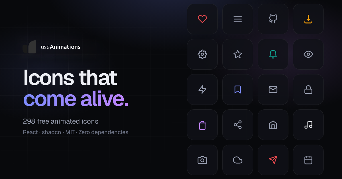

User reviews (0)