Website profiles · Technology insights · Alternatives

3d.khagwal.com

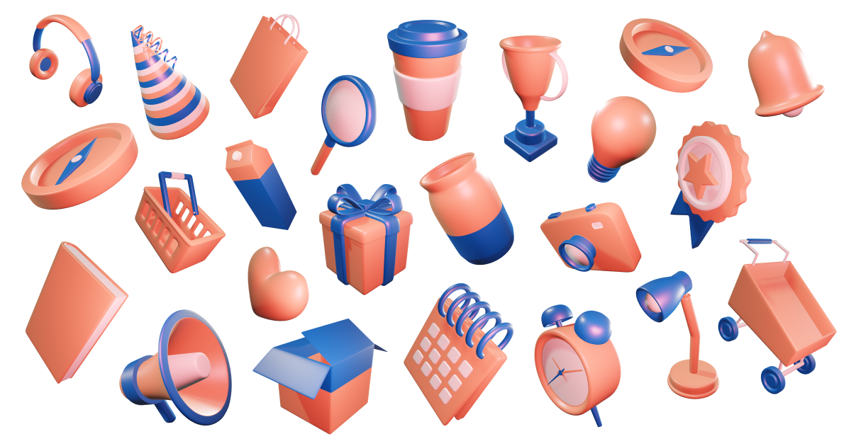
Free 3D illustration pack library for web and mobile app designers. Khagwal 3D has 45 Models in 5 different themes and 5 angles - Get it now.

No paid content found
Visit website
Profile views 11 Outbound visits 1 Normal
Free 3D Illustration Pack Library - Khagwal 3D Full homepage screenshot

At a glance

Category
Design & Creativity
Language
English
Paid-content signal
No paid content foundObserved
Registered
2023
Hosting
CloudflareInferred
HTTPS certificate trusted
PassedObserved
Last updated

Website review

This review may include AI-generated content and is not individually verified. Domain, certificate and other facts come from the observed data on this page.

What is Khagwal 3D?

Khagwal 3D is a free library of 3D illustrations for web and mobile app designers, created by Nitish Khagwal. The site offers about 45 models organized into five hand-curated color themes (Aero, Amber, Charcoal, Elite, Slate) and five viewing angles (front, left, right, top, perspective), so you can match an illustration to an existing design system rather than recolor it yourself.

What you can actually do with it

  • Browse, search, and download illustrations from the site's Explorer.
  • Duplicate the full set from the Figma Community file if your team already works in Figma.
  • Use the assets in commercial or personal projects under a CC0 Public Domain License, with no attribution required.
  • Treat it as a starting point for promotional content, landing pages, onboarding screens, empty states, and app marketing visuals.

Who it suits

  • Product designers who need consistent 3D visuals without commissioning custom renders.
  • Small teams and indie developers who lack an in-house 3D artist.
  • Anyone prototyping in Figma who wants drag-and-drop assets instead of exported PNGs.

Trade-offs to weigh

The five-theme, five-angle structure gives useful consistency, but it also means the library is fixed: if your brand palette sits outside those themes, you'll be adjusting colors yourself. The models are made in Blender, so editing geometry or lighting requires Blender skills, not just a design tool. And because the set is compact, it works best for a focused product surface rather than a large, varied illustration system.

A practical next step

Open the Explorer, pick one theme that matches your product's palette, and download two or three angles of the same object. Drop them into a real screen — a signup flow or an empty state — and check whether the perspective and color hold up next to your existing UI. If they do, duplicate the Figma file so your whole team can pull from the same source. For related free visual assets, unDraw covers flat vector illustrations rather than 3D.

Can I use Khagwal 3D illustrations in commercial projects?

Yes. Khagwal 3D states its illustrations are free for commercial and personal projects under a CC0 Public Domain License, so you can use them in client work, marketing pages, app store screenshots and product UIs without paying or crediting the maker. The library is also described as open source, with the models created in Blender.

Three practical caveats come from the site's own wording:

  • No attribution is required, but the maker asks that you respect the license terms if you rely on CC0.
  • The maker disapproves of redistributing the pack, selling it, claiming ownership of the models, or transferring rights to others. Using the illustrations inside your own project is different from reselling the asset pack itself.
  • Because the source files are 3D models, check that your edits, re-colors or derivative versions still fit your project's needs and your client's brand rules.

A concrete scenario. A small team building a fintech mobile app needs onboarding graphics. They pick a theme, choose front and perspective angles, drop the illustrations into Figma, and ship them in the onboarding flow and App Store screenshots. That is a normal commercial use under the stated license. What they should not do is bundle the raw model files into a paid asset marketplace listing.

Next step. If your use case is unusual — for example, reselling the models as part of a template, or using them in a product where the illustration itself is the main thing being sold — contact the maker before shipping. For standard app, web and promotional use, the site's license statement is the relevant reference. You can browse the pack at Khagwal 3D.

How do I download and use Khagwal 3D illustrations in Figma?

Download the Khagwal 3D set from the Figma Community listing linked as "Available for Figma" on Khagwal 3D, then duplicate the file into your own Figma drafts or a project.

How to get it into Figma

  1. Open the Figma Community page for the pack (the site's "Available for Figma" section points there).
  2. Click Duplicate (or "Open in Figma") to copy the file to your account.
  3. In your copy, browse the frames by theme and angle, then select the illustration you need.

How to use a chosen illustration

  • Copy the illustration frame and paste it into your design file, or right-click and Copy as PNG / export from the Figma export panel.
  • For a single object, select the layer inside the frame and export just that layer.
  • Keep the original file as a library: leave it untouched and duplicate assets out of it, so you always have a clean source.

Choosing theme and angle The set gives every illustration in five themes (Aero, Amber, Charcoal, Elite, Slate) and five angles (front, left, right, top, perspective). Match the theme to your UI palette, and pick the angle that fits the space — a front view for a compact hero, a perspective view when you want depth on a landing page or app onboarding screen.

Need Practical choice
Consistent look across a product page One theme, one angle throughout
Fitting an illustration into a tight layout Front or top view
Adding depth to a hero or empty state Perspective view
Dark UI Charcoal or Elite
Light, warm UI Amber or Aero

A concrete scenario You are designing onboarding screens for a mobile app. Duplicate the Figma file, copy three perspective-view illustrations in Slate to match your dark UI, place them in your onboarding frames, and export each at 2x for the developer handoff. If you later need the same illustration on a light marketing page, switch to the Aero or Amber version instead of recolouring by hand.

Licence and practical cautions The pack is described as open source under a CC0 Public Domain License, free for commercial and personal projects, with no attribution required. The maker states they disapprove of redistribution, resale, ownership claims and transfer of rights, so treat it as assets you use in your own work rather than something to repackage or sell. The illustrations are made in Blender, so if you need editable 3D source rather than Figma layers, check the site's Explorer section for what is actually offered there.

Next step Duplicate the Figma file first, then delete or hide the themes and angles you will not use in that project — it keeps your working file small and your style consistent.

What are the 5 color themes available in Khagwal 3D?

The five color themes are Aero, Amber, Charcoal, Elite, and Slate. Every illustration in the pack is rendered in all five, so you can match a set to a light UI, a dark UI, or a specific brand palette without recoloring anything yourself.

What the themes imply in practice

  • Aero and Slate read as cool, neutral-to-blue tones — a safe fit for SaaS dashboards, fintech screens, or any interface built on blue-grey neutrals.
  • Amber brings a warmer accent, useful for onboarding screens, empty states, or marketing pages that need a friendlier tone than pure corporate blue.
  • Charcoal and Elite sit at the dark end, which is what you want for dark-mode interfaces or hero sections on near-black backgrounds.

Treat these as starting palettes rather than fixed brand colors. Because the pack is open source under CC0, you can drop the assets into a design tool and shift hues to match your own system — but check that shadows and highlights still read correctly after any recolor, since 3D renders depend on consistent lighting.

Next step

Decide your background first, then pick the theme: light backgrounds pair with Aero, Amber, or Slate; dark backgrounds with Charcoal or Elite. The same illustration is also offered in five angles (front, left, right, top, and perspective), so you can keep one visual identity while varying the composition across a page. Files are available through Figma Community or the site's Explorer, and the set was created in Blender by Nitish Khagwal.

What angles are the 3D illustrations available in?

The illustrations come in five angles: front, left, right, top, and perspective. This range lets you pick a consistent viewpoint across a set or mix angles for visual variety within one screen.

Why the angle choice matters

  • Front works best for hero images and feature callouts where the object needs to face the viewer directly.
  • Left and right suit side-by-side layouts, carousels, or directional flows.
  • Top is useful for dashboards, maps, and overhead scenes.
  • Perspective adds depth for landing pages and promotional banners.

Practical next step Before downloading, sketch your layout and decide whether you need one fixed angle across all assets or a mix. If your design uses a grid of cards, a single angle keeps it tidy; if you are building a narrative section, perspective shots can carry more energy. Each illustration is also offered in five color themes, so match the angle and theme to your existing palette rather than recoloring later.

The pack is open source under CC0 and created in Blender, so it fits commercial and personal projects without attribution requirements.

What license applies to Khagwal 3D illustrations?

The Khagwal 3D library is released under the CC0 Public Domain License. The site states that the illustrations are open source and free to use for both commercial and personal projects, with no attribution, credit, or link back required. The maker does, however, ask that you do not redistribute, sell, or claim ownership of the assets.

What this means in practice

Action Allowed under CC0 here?
Use in commercial client work Yes
Use in personal or side projects Yes
Modify, recolor, or crop Yes
Attribution required No
Resell or redistribute the pack itself Discouraged by the maker
Claim you created the illustrations Discouraged by the maker

Next step: If you plan to ship these in a product, keep a short internal note recording the source and license (CC0, Khagwal 3D) alongside your asset folder. It is not legally required, but it protects you if a future client or auditor asks where the artwork came from.

For teams that need a paper trail, you can point colleagues to Khagwal 3D as the origin. If you want assets with a similar permissive model but different styles, compare terms on Blender (the tool used to create these) or other CC0-friendly libraries before mixing packs in one project.

Related questions

More questions →
What Are Open-Source UI Element Libraries and How Do They Differ From UI Frameworks?

An open-source UI element library is a collection of individual, ready-made interface pieces—buttons, cards, inputs, toggles, loaders—that you copy into your own project and adapt. A UI framework, by contrast, is a structured system of components, conventions, and often a theming layer that governs how your whole interface is built. The practical difference: an element library gives you a snippet; a framework gives you a way of working. If you need a polished button in ten minutes, reach for the element library. If you're building a 40-screen product with a team, you probably want the framework.

What "open-source UI element library" actually means

The term gets used loosely, so it helps to separate the parts:

  • Open-source: the code is publicly available, and the license tells you what you may do with it—copy, modify, redistribute, or use commercially.
  • UI element: a single, self-contained piece of interface, usually small enough to read in one sitting. A button with hover states, a pricing card, a search field.
  • Library: a browsable, searchable collection of those elements, typically contributed by many different people.

On a site like Uiverse, elements are shared by a community and written in plain CSS or Tailwind. You find one you like, copy the markup and styles, paste them into your project, and adjust colors, spacing, and text to fit. There's no package to install and no build step required—which is exactly the appeal, and also the source of most of the confusion.

Element library vs. UI framework: the core differences

Dimension Open-source UI element library UI framework / design system
Unit of reuse A single snippet you copy A component you import or call
Installation None; paste into your code Package install, config, sometimes a provider
Consistency Depends on you; each element may look different Enforced by shared tokens and APIs
Theming Manual edits per element Central theme/config file
Updates You own the copy; no upstream updates Version bumps bring fixes and changes
Accessibility Varies per contributor; must be checked Usually tested and documented
Best for Prototypes, landing pages, small sites, one-off needs Multi-page apps, teams, long-lived products
Learning curve Low—read the CSS Higher—learn the API and conventions

The table isn't a verdict. It's a map of trade-offs. Element libraries win on speed and freedom; frameworks win on consistency and maintenance.

Licensing and attribution: what to check before you paste

This is where people get into trouble, and it's worth slowing down for.

  1. Find the license. Every element or collection should state one. Common open-source licenses include MIT, Apache-2.0, and BSD. Some projects use copyleft licenses like GPL, which can impose obligations if you redistribute your code.
  2. Understand what the license permits. MIT and Apache-2.0 are permissive: you can typically use the code in commercial and closed-source projects. Copyleft licenses may require you to release derivative source under the same terms.
  3. Check attribution requirements. Permissive licenses usually require you to keep the copyright notice and license text somewhere in your project. That's a real obligation, not a formality.
  4. Look for per-element terms. On community sites, the site's overall terms and the individual contributor's stated wishes may differ. If a contributor asks for credit, honor it.
  5. When in doubt, ask or avoid. If a snippet has no license at all, you don't have clear permission to reuse it. Treat "no license" as "not open source," even if the code is publicly visible.

This article is general information, not legal advice. For commercial products with real exposure, have someone qualified review the licenses you're relying on.

How to use a community element in your project: a practical workflow

Here's a repeatable process that avoids most of the usual mess.

1. Start from a real need, not a browsing session

Decide what you need first—"a compact primary button with a loading state"—then search. Browsing aimlessly produces a pile of pretty snippets that don't fit together.

2. Copy the smallest version that works

Take the markup and the styles. Strip anything you don't need: demo wrappers, extra animations, decorative layers. Less code means fewer surprises.

3. Convert it to your conventions

If your project uses design tokens or CSS variables, replace hard-coded values:

/* Before: hard-coded */
.button { background: #4f46e5; border-radius: 8px; }

/* After: token-based */
.button { background: var(--color-primary); border-radius: var(--radius-md); }

This one step is what keeps a copied element from looking like a foreign object in your UI.

4. Check accessibility before you ship

Community elements vary widely here. Verify at minimum:

  • Keyboard focus is visible and the element is reachable by Tab.
  • Color contrast meets WCAG AA (4.5:1 for normal text).
  • Interactive elements use semantic HTML (<button>, not a clickable <div>).
  • Form inputs have associated labels.
  • Motion respects prefers-reduced-motion.

5. Test in context

Paste it into a real page with real content. Long labels, small screens, and dark mode break more copied elements than anything else.

6. Note where it came from

Keep a short comment or an internal credits file: source, license, date. Future you—and your legal reviewer—will be grateful.

Where element libraries genuinely shine

  • Prototypes and demos: you need something clickable today, not a design system.
  • Landing pages and marketing sites: a handful of distinctive elements, each custom.
  • Filling gaps: your framework lacks one specific component, and you don't want to build it from scratch.
  • Learning: reading well-made CSS is one of the fastest ways to improve.
  • Small projects: a personal site doesn't need a theming architecture.

Where they fall short

  • Consistency at scale: ten elements from ten contributors rarely look like one product.
  • Maintenance: you own every copy. When your design changes, you edit each one.
  • Accessibility debt: you inherit whatever the contributor did or didn't do.
  • No upstream fixes: a bug fixed in the original won't reach your copy.
  • Integration friction: different naming conventions, different units, different assumptions about resets.

When to choose which

Choose an element library when the scope is small, the timeline is short, or you need a few distinctive pieces rather than a whole system.

Choose a framework or design system when multiple people build multiple screens over months, when consistency is a product requirement, or when accessibility and theming need to be guaranteed rather than checked.

A hybrid works well for many teams: adopt a framework for the structural components—forms, navigation, layout—and borrow individual elements for the places where you want personality. Just route every borrowed element through the same token and accessibility checks, so it lands as part of your system rather than beside it.

The short version: open-source UI element libraries are a fast, flexible way to get good-looking interface pieces into a project. They are not a substitute for a design system, and the license and accessibility details are the part worth reading carefully.

Does Aldersgate United Methodist Church Have a Mobile App?

As of the information available on the church's website, Aldersgate United Methodist Church in Wichita, Kansas does not advertise a dedicated mobile app. The site presents itself as the primary online hub for the congregation, with its mission of "Making Disciples of Jesus Christ for the Transformation of the World" front and center. If a mobile app exists, it is not prominently featured on the homepage. The most reliable way to confirm is to contact the church office directly or check the website for any new announcements.

That said, "no app advertised" is not the same as "no app at all." Churches sometimes launch apps quietly, link them only in weekly bulletins, or roll them out through a congregation-wide email. This article explains what a church mobile app usually includes, how to verify whether Aldersgate has one, and how to stay connected in the meantime.

What a Church Mobile App Typically Offers

Most church apps are built around a handful of core functions. If Aldersgate launches or already operates one, you can reasonably expect some combination of the following:

  • Sermons and worship — audio or video of past services, sometimes with notes or discussion questions.
  • Events calendar — worship times, Bible studies, youth group meetings, outreach days, and seasonal services.
  • Giving — online donations via credit card, debit card, or bank transfer, often with recurring gift options.
  • Prayer requests — a form or feed where members can submit and pray for needs.
  • Groups and ministries — sign-ups, rosters, and communication for small groups, choirs, or volunteer teams.
  • Push notifications — reminders for services, weather cancellations, or special announcements.
  • Connection cards — a digital way for first-time visitors to share contact information.

Not every app includes all of these. Some churches use a general-purpose platform that bundles them together; others rely on separate tools for giving and communication.

How to Check Whether Aldersgate Has an App

Because app availability changes and the website may not always reflect the latest tools, verify through more than one channel:

  1. Search the website. Look for a menu item labeled "App," "Mobile," "Connect," or "Media." Check the footer, too, since app links are sometimes placed there.
  2. Search your phone's app store. Try terms like "Aldersgate United Methodist," "Aldersgate Wichita," or "Aldersgate Church." Be careful to match the correct city and denomination, since other churches share the Aldersgate name.
  3. Call or email the church office. This is the fastest way to get a definitive answer. Ask specifically: "Do we have a mobile app, and if so, what is it called and where do I download it?"
  4. Ask an usher or greeter on Sunday. They often know about new tools before they appear online.
  5. Check the weekly bulletin or newsletter. App launches are frequently announced there first.

If you find an app, confirm it is officially affiliated with the church before entering any personal or payment information.

If There Is No App: Other Ways to Stay Connected

A dedicated app is convenient, but it is not the only way to remain plugged into church life. These alternatives cover most of what an app would do:

Need Alternative
Worship times and location Church website homepage
Sermons Website media page, podcast, or social media
Events Website calendar, bulletin, or email newsletter
Giving Online giving link on the website, or giving during service
Prayer requests Email, phone call, or prayer chain
Announcements Email newsletter, social media, or Sunday bulletin

For a first-time visitor, the simplest starting point is the website's contact page: send a message introducing yourself and ask how the church prefers to communicate. For a long-time member, the church office can add you to the email list or connect you with the right ministry leader.

A Practical Checklist for Getting Connected

Use this sequence whether or not an app exists:

  1. Visit the church website and note the worship times and address.
  2. Find the "Contact" or "About" page and save the office phone number and email.
  3. Sign up for the email newsletter if a sign-up form is available.
  4. Follow the church on any social media accounts linked from the site.
  5. Ask the office directly about a mobile app, online giving, and prayer request channels.
  6. If an app is confirmed, download it, create an account, and enable notifications for the updates you want.

A Note on Accuracy

App availability, features, and download links can change at any time, and a website may lag behind those changes. Nothing in this article should be treated as a guarantee that Aldersgate United Methodist Church does or does not currently offer an app. Treat the church office as the authoritative source, and confirm details before relying on any tool for giving or personal information.

If you are a member or visitor hoping for an app, it is also reasonable to ask the church whether one is planned. Congregations often gauge interest before investing in a new platform, and a simple question can move the conversation forward.

Website Overview

Page metadata, canonical configuration and social previews work together to provide more consistent search and sharing presentation. An active inbound-mail setup with incomplete authentication may leave the domain more open to impersonation. Provider hosting alone does not close that gap.

Domain and Registration

Transfer-protection status is present, helping reduce the risk of unauthorized domain transfers. The domain has about 3 years of registration history; its current configuration provides more context than age alone. The registrar is GoDaddy.com, LLC, a widely used domain service provider. The domain uses the common .com extension, which is not an independent safety signal.

DNS and Email

The observed email authentication setup is incomplete: DMARC is missing. Nameservers are provided by Cloudflare, indicating managed DNS hosting. MX records point to the Apple iCloud Mail email service. No CNAME was found; the observed records resolve directly to addresses. TXT records include verification markers for Google. Such markers may also remain after a service stops being used.

TLS and Certificates

The public key uses EC with 256 bits. The server supplied a complete certificate chain. No organization name is present in the certificate; the available fields are consistent with domain validation. The certificate was issued within the Google Trust Services cloud or CDN ecosystem. The certificate's total validity is about 90 days, consistent with a short renewal cycle.

HTTP and Browser Security

The response lacks these common security headers: HSTS, CSP, Permissions-Policy, clickjacking protection. CORS permits any origin to read this response. This is common for public resources; sensitive responses need narrower handling. No X-Powered-By header was found, reducing one common source of backend fingerprinting information. The cf-ray response header indicates a CDN or caching proxy in the delivery path. No obvious internal addresses or debug information were found in the headers.

Technology Stack Analysis

The public page identifies Google Tag Manager, Cloudflare without precise versions, leaving fewer clues for version-specific scanning.

Search and Social Sharing

Open Graph is partially configured; og:type is missing. Twitter Card metadata is configured. The title has 46 characters, within a common display range. A meta description is present, with 141 characters. The observed directives allow indexing and link following.

Hosting and Email

DNSCloudflare
HostingCloudflare
EmailApple iCloud Mail
Approximate IP geolocation (inferred; a CDN or proxy may differ from the origin server) Location unknown Inferred 104.21.4.202

Registration details

RDAP / WHOIS

RegistrarGoDaddy.com, LLC
Registered2023-02-04
Expires2029-02-04
Domain statusclient delete prohibited、client renew prohibited、client transfer prohibited、client update prohibited
Nameserversuma.ns.cloudflare.com、uriah.ns.cloudflare.com
DNSSECunsigned

DNS records

DNS

TypeNameValueTTLPriority
A3d.khagwal.com104.21.4.202300—
A3d.khagwal.com172.67.132.107300—
AAAA3d.khagwal.com2606:4700:3031::ac43:846b300—
AAAA3d.khagwal.com2606:4700:3033::6815:4ca300—
MXkhagwal.commx01.mail.icloud.com30010
MXkhagwal.commx02.mail.icloud.com30010
NSkhagwal.comuma.ns.cloudflare.com86400—
NSkhagwal.comuriah.ns.cloudflare.com86400—
TXTkhagwal.comapple-domain=E1olDWX9ODZdHAmA300—
TXTkhagwal.comgoogle-site-verification=bhI2cI2A7JRSqkY3yNTQorpKKJphnnR02F3hr_l3jQM300—
TXTkhagwal.comv=spf1 include:icloud.com ~all300—

TLS and certificates

TLS / SSL

AssessmentNormal configuration
Supported protocolsTLSv1.2、TLSv1.3
Negotiated protocolTLSv1.3
Certificate subject3d.khagwal.com
IssuerGoogle Trust Services
Valid until2026-12-27T16:32 · Remaining when checked: 86 days
Verification detailsCertificate trust: Passed · Hostname match: Passed

HTTP response headers

HTTP

HeaderValue
content-typetext/html; charset=utf-8
cache-controlpublic, max-age=0, must-revalidate
servercloudflare
x-content-type-optionsnosniff
referrer-policystrict-origin-when-cross-origin
access-control-allow-origin*

Identified technologies

Google Tag ManagerCloudflare

Pages, Search and Sharing

Meta descriptionFree 3D illustration pack library for web and mobile app designers. Khagwal 3D has 45 Models in 5 different themes and 5 angles - Get it now.
Canonical URLhttps://3d.khagwal.com/
LanguageEnglish (default)
Twitter Cardsummary_large_image

Unknown

No sitemaps found

User reviews (0)

  • No reviews yet.